패키지, 저장소 및 앱 카테고리 검색

credit_card_input_form 표지
패키지 상세v2.3.0

credit_card_input_form

이 패키지는 신용카드 정보 입력 폼의 애니메이션을 통해 시각적으로 아름다운 UX를 제공합니다.

AndroidiOS
30일 다운로드
138
좋아요
62
Pub 점수
110

패키지 설치

flutter pub add credit_card_input_form

패키지 개요

공개 정보를 바탕으로 생성한 선택 가이드입니다.

Flutter 패키지로, 아름답고 애니메이션 효과가 있는 신용카드 입력 폼을 제공하여 결제 정보 입력 시 사용자 경험을 향상시킵니다. 사용자가 카드 정보를 입력할 때 부드러운 애니메이션과 실시간 시각 피드백을 제공하여 참여도를 높이고 입력 오류를 줄입니다. 현대적인 UI 원칙에 따라 설계되어 Android 및 iOS 플랫폼을 모두 지원하며, 기본적으로 고급스러운 외관을 제공합니다. 안전하고 직관적인 카드 정보 수집이 필요한 앱에 이상적입니다.

사용 사례

  • 결제 처리 양식
  • 전자상거래 체크아웃 흐름
  • 모바일 뱅킹 애플리케이션
  • 디지털 지갑 통합
  • 카드 설정을 통한 사용자 온보딩

주요 기능

  • 애니메이션 카드 번호 입력
  • 실시간 카드 유형 감지
  • 부드러운 시각적 전환
  • 모든 화면 크기에 대응하는 반응형 디자인
  • 내장된 플레이스홀더 애니메이션

적합한 대상

  • 정교한 결제 UI를 찾는 개발자
  • 금융 워크플로우에서 사용자 경험에 집중하는 앱
  • 카드 입력에 최소한의 설정이 필요한 프로젝트

고려 사항

  • 백엔드 결제 처리를 포함하지 않습니다
  • 민감한 데이터 보안을 수동으로 처리해야 합니다
  • 스타일링 외의 맞춤 설정 제한
  • 포맷 검사 외에 내장된 검증 없음

원본 README

연결된 소스 저장소의 README 원문 스냅샷입니다. 최신 내용은 저장소에서 확인하세요.


This package provides visually beautiful UX through animation of credit card information input form.

Preview

Installing

  1. Add dependency to pubspec.yaml

    Get the latest version in the 'Installing' tab on pub.dartlang.org

dependencies:
    credit_card_input_form: ^2.3.0
  1. Import the package
import 'package:credit_card_input_form/credit_card_input_form.dart';
  1. Adding CreditCardInputForm

With optional parameters

 CreditCardInputForm(
   cardHeight: 170,
   showResetButton : true,
   onStateChange: (currentState, cardInfo) {
     print(currentState);
     print(cardInfo);
   },
   customCaptions: {...}, 
   frontCardDecoration: cardDecoration,
   backCardDecoration: cardDecoration,
   prevButtonDecoration: buttonStyle,
   nextButtonDecoration: buttonStyle,
   resetButtonDecoration : buttonStyle,
   prevButtonTextStyle: buttonTextStyle,
   nextButtonTextStyle: buttonTextStyle,
   resetButtonTextStyle: buttonTextStyle,
   initialAutoFocus: true, // optional

),

How to use

Check out the example app in the example directory or the 'Example' tab on pub.dartlang.org for a more complete example.
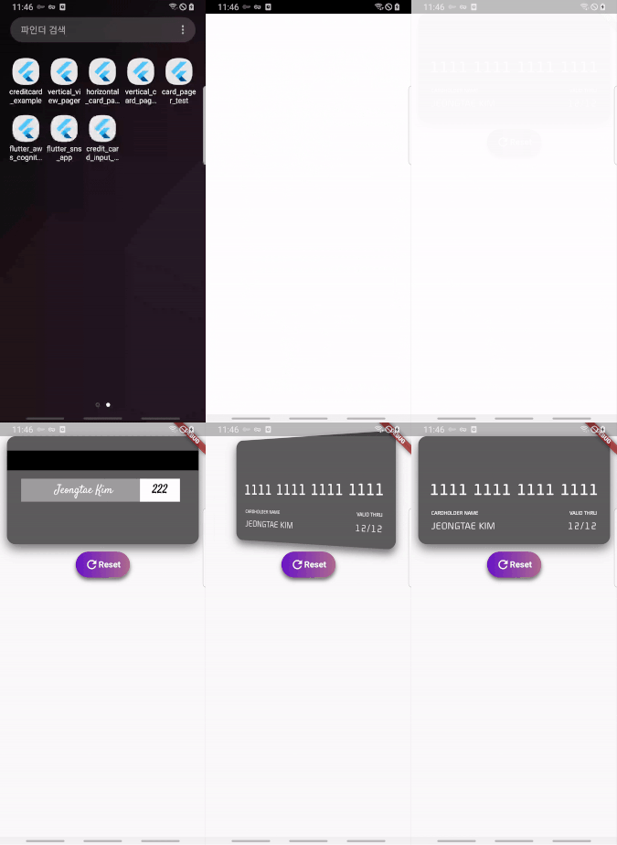
New Feature

v1.3.0

added custom button style feature

Default Custom
default custom
final buttonDecoration = BoxDecoration(
    borderRadius: BorderRadius.circular(30.0),
    gradient: LinearGradient(
        colors: [
          const Color(0xfffcdf8a),
          const Color(0xfff38381),
        ],
        begin: const FractionalOffset(0.0, 0.0),
        end: const FractionalOffset(1.0, 0.0),
        stops: [0.0, 1.0],
        tileMode: TileMode.clamp),
  );

  final buttonTextStyle =
      TextStyle(color: Colors.white, fontWeight: FontWeight.bold, fontSize: 18);

  CreditCardInputForm(
    prevButtonDecoration: buttonDecoration,
    nextButtonDecoration: buttonDecoration,
    prevButtonTextStyle: buttonTextStyle,
    nextButtonTextStyle: buttonTextStyle,
    resetButtonTextStyle: buttonTextStyle,
  ),

v2.0.0

It provides more options using boxdecoration that can only change the color of the card.

Default Custom
image image
  final cardDecoration = BoxDecoration(
    boxShadow: <BoxShadow>[
      BoxShadow(color: Colors.black54, blurRadius: 15.0, offset: Offset(0, 8))
    ],
    gradient: LinearGradient(
        colors: [
          Colors.red,
          Colors.blue,
        ],
        begin: const FractionalOffset(0.0, 0.0),
        end: const FractionalOffset(1.0, 0.0),
        stops: [0.0, 1.0],
        tileMode: TileMode.clamp),
    borderRadius: BorderRadius.all(Radius.circular(15)));


    CreditCardInputForm(
      frontCardDecoration: cardDecoration,
      backCardDecoration: cardDecoration,
    ),
  ]),
v2.1.0

implement a new feature to add an initial value when creating a widget

Code Preview
CreditCardInputForm(
  ....
  cardCVV: '222',
  cardName: 'Jeongtae Kim',
  cardNumber: '1111111111111111',
  cardValid: '12/12',
  intialCardState: InputState.DONE,
),

ezgif com-gif-maker

v2.2.0

Add initialAutoFocus parameter

3rd party library

Flip card

https://pub.dev/packages/flip_card

For use card flip animation

Provider

https://pub.dev/packages/provider

For use state management

Reference

This package's animation is inspired from from this Dribbble art

TODO List

  • [x] add RESET button
  • [x] add box decoration param

카테고리

의존성

의존성 목록 2 개

소스 저장소

이 패키지를 사용하는 프로젝트

아직 데이터가 없습니다.