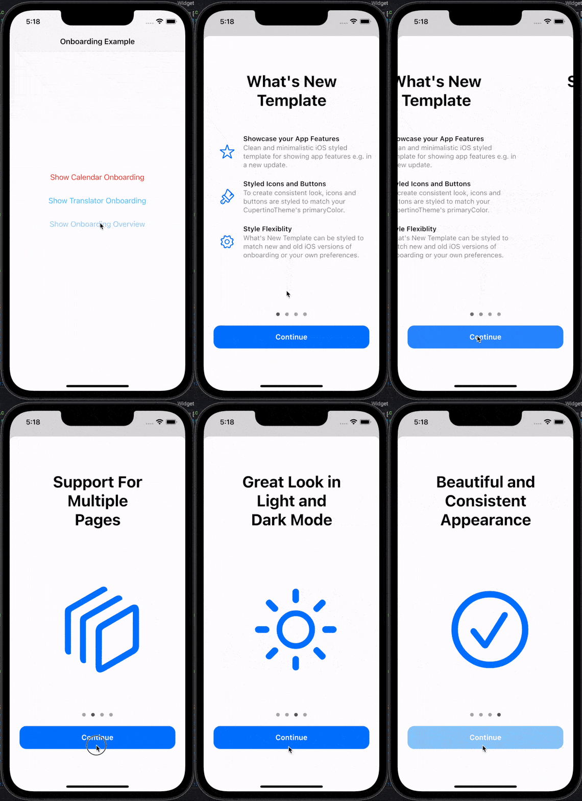
부드러운 전환과 네이티브처럼 보이는 애니메이션을 제공하는 iOS 스타일의 온보딩 경험을 구현하는 플러터 패키지입니다. 애플의 온보딩 인터페이스를 모방하도록 설계되어 앱 기능을 소개하기 위한 깔끔하고 현대적인 카루셀을 제공합니다. 안드로이드, iOS, 웹, 맥OS, 윈도우, 리눅스 등 다양한 플랫폼을 지원하여 장치 간 일관된 UX를 보장합니다. pub add를 통해 쉽게 통합 가능하며, 정교하고 플랫폼에 맞는 외관을 원하는 앱에 적합합니다. 사용자 참여를 높이기 위해 콘텐츠와 스와이프 제스처를 사용자 정의할 수 있습니다.
사용 사례
앱 온보딩 튜토리얼
기능 소개 화면
사용자 온보딩 흐름
모바일 우선 앱 출시
크로스 플랫폼 온보딩 경험
주요 기능
iOS 스타일 디자인
부드러운 스와이프 애니메이션
다중 플랫폼 지원
사용자 정의 콘텐츠
pub를 통한 간편한 통합
반응형 레이아웃
적합한 대상
iOS 영감을 받은 앱 디자인
크로스 플랫폼 모바일 앱
온보딩에 중점을 둔 애플리케이션
네이티브처럼 보이는 UI를 원하는 개발자
현대적인 미학을 겨냥한 앱
고려 사항
iOS 테마를 초과한 사용자 정의는 제한적
비-iOS 브랜딩을 위해 추가 스타일링이 필요할 수 있습니다
외관을 위해 Cupertino 위젯에 의존합니다
스와이프 기반의 온보딩에 적합하지 않음
간단하고 선형적인 온보딩 흐름에 최적
원본 README
연결된 소스 저장소의 README 원문 스냅샷입니다. 최신 내용은 저장소에서 확인하세요.
cupertino_onboarding
Flutter package that provides a beautiful, iOS-like, easy onboarding experience with minimal code.
It's designed to easily showcase your app's features and provide a simple way for users to learn about your app.
Create CupertinoOnboarding widget and pass your pages as parameter:
@overrideWidgetbuild(BuildContext context) {
returnCupertinoOnboarding(
onPressedOnLastPage: () => Navigator.pop(context),
pages: [
// To create What's New page like Calendar or Translator// examples in the readme, use `WhatsNewPage` widget:// Actual code from the Calendar example:WhatsNewPage(
title: constText("What's New in Calendar"),
features: [
// Feature's type must be `WhatsNewFeature`WhatsNewFeature(
icon: Icon(
CupertinoIcons.mail,
color: CupertinoColors.systemRed.resolveFrom(context),
),
title: constText('Found Events'),
description: constText(
'Siri suggests events found in Mail, Messages, and Safari, so you can add them easily, such as flight reservations and hotel bookings.',
),
),
WhatsNewFeature(
icon: Icon(
CupertinoIcons.time,
color: CupertinoColors.systemRed.resolveFrom(context),
),
title: constText('Time to Leave'),
description: constText(
"Calendar uses Apple Maps to look up locations, traffic conditions, and transit options to tell you when it's time to leave.",
),
),
],
),
// To create custom onboarding page, use// `CupertinoOnboardingPage` widget:// Actual code from the GIF example:constCupertinoOnboardingPage(
title: Text('Support For Multiple Pages'),
body: Icon(
CupertinoIcons.square_stack_3d_down_right,
size: 200,
),
),
constCupertinoOnboardingPage(
title: Text('Great Look in Light and Dark Mode'),
body: Icon(
CupertinoIcons.sun_max,
size: 200,
),
),
],
);
}
CupertinoOnboarding can be shown as any other widget, but to match native feel, consider using modal_bottom_sheet package or other modal view.
See API reference for more information about customizing look and feel of the onboarding.
Features, bugs and contributions
Feel free to contribute to this project.
Please file feature requests and bugs at the issue tracker.
If you fixed a bug or implemented a feature by yourself, feel free to send a pull request.
Sponsoring
I am working on my packages in my free time.
If this package is helping you, please consider buying me a coffee, so I can keep updating and maintaining this package.