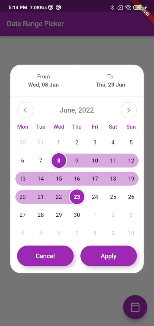
Android, iOS, Web, macOS, Windows, Linux용으로 고도로 사용자 정의 가능한 날짜 범위 선택기 제공하는 플러터 패키지입니다. 부드러운 애니메이션과 우아한 사용자 인터페이스를 갖추고 있어 개발자가 앱 디자인에 맞게 선택기의 외관과 동작을 맞춤 설정할 수 있습니다. 시각적 피드백을 제공하는 직관적인 날짜 선택 기능을 지원하여 예약 시스템, 일정 관리 앱, 데이터 필터링 인터페이스에 적합합니다. 크로스플랫폼 호환성을 고려해 설계되어 다양한 기기에서 일관된 사용자 경험을 보장합니다.
This function displays a custom date range picker dialog box.
Parameters
context (required): The context in which to show the dialog.
dismissible (required): A boolean value indicating whether the dialog can be dismissed by tapping outside of it.
minimumDate (required): A DateTime object representing the minimum allowable date that can be selected in the date range picker.
maximumDate (required): A DateTime object representing the maximum allowable date that can be selected in the date range picker.
startDate (optional): A nullable DateTime object representing the initial start date of the date range selection.
endDate (optional): A nullable DateTime object representing the initial end date of the date range selection.
onApplyClick (required): A function that takes two DateTime parameters representing the selected start and end dates, respectively, and is called when the user taps the "Apply" button.
onCancelClick (required): A function that is called when the user taps the "Cancel" button.
backgroundColor (required): The background color of the dialog.
primaryColor (required): The primary color of the dialog.
fontFamily (optional): The font family to use for the text in the dialog.
Usage
Inside the function, a FocusNode is requested to take focus away from any input field that might be in focus. A showDialog function is then called to show the CustomDateRangePicker dialog box. The CustomDateRangePicker widget is built with the parameters passed to showCustomDateRangePicker, and then passed as the builder parameter of the showDialog function.
When the user interacts with the CustomDateRangePicker dialog box, the onApplyClick and onCancelClick functions are called accordingly.
Many Thanks to the creator of this Repo https://github.com/mitesh77/Best-Flutter-UI-Templates
Getting Started
For help getting started with Flutter, view our online documentation.
For help on editing package code, view the documentation.