대시보드 패키지는 사용자가 자유롭게 구성할 수 있는 동적 위젯을 제공하여 사용자 정의 가능한 레이아웃을 구축할 수 있습니다. 사용자는 대시보드 내에서 위젯을 자유롭게 크기 조정하고 이동하며 재배열할 수 있으며, 간접적인 크기 조정과 자동 재배치를 지원합니다. 인터랙티브한 사용자 맞춤 설정이 필요한 대시보드에 적합하며, 안드로이드, iOS, 웹, 맥OS, 윈도우, 리눅스 등 모든 주요 플랫폼에서 작동합니다. 실시간으로 사용자의 선호도에 맞춰 적응하는 유연하고 반응형 UI를 원하는 개발자를 위한 것입니다.
사용 사례
사용자 정의 가능한 분석 대시보드
사용자 정의 레이아웃 인터페이스
인터랙티브 관리 패널
실시간 데이터 시각화
반응형 그리드 기반 애플리케이션
주요 기능
드래그 앤 드롭 위젯 재배치
자동 재배열이 가능한 크기 조절 가능한 위젯
간접적인 크기 조정/이동 지원
크로스 플랫폼 호환성
동적 레이아웃 지속성
사용자 정의 가능한 그리드 시스템
적합한 대상
인터랙티브 대시보드를 개발하는 개발자
사용자 맞춤형 UI를 필요로 하는 앱
동적 콘텐츠 그리드를 가진 프로젝트
사용자 경험 유연성에 집중하는 프론트엔드 팀
반응형 레이아웃이 필요한 웹 및 모바일 앱
고려 사항
대규모 위젯에 대한 성능 최적화가 필요할 수 있습니다
초기 설정에는 그리드 및 위젯 제약 조건을 구성하는 것이 포함됩니다
기본 레이아웃을 넘어서는 내장 스타일 옵션이 제한적
중대규모의 인터랙티브 인터페이스에 가장 적합
드래그 작업 중 상태 관리에 신중한 조작이 필요합니다
원본 README
연결된 소스 저장소의 README 원문 스냅샷입니다. 최신 내용은 저장소에서 확인하세요.
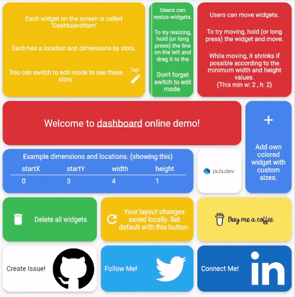
Dynamic dashboard widget that allows your users to create their own layouts. Rezise, move, indirect resize/move, auto re-layout are supported.
Dashboard can be thought of as a dynamic grid. Your users can create their own layouts, add new widgets or remove widgets.
Layout divides the screen into horizontal slots according to the entered value. The aspect ratio of the slots also determine their height. Widgets called DashboardItem are placed in these slots. This layout can be changed later.
Resize
Dashboard Items can be resized both by long pressing on mobile and by holding and moving on desktop/browser.
Move
Dashboard Item locations can be changed by long pressing on mobile or by holding and pulling on desktop/browser.
Slots Changes
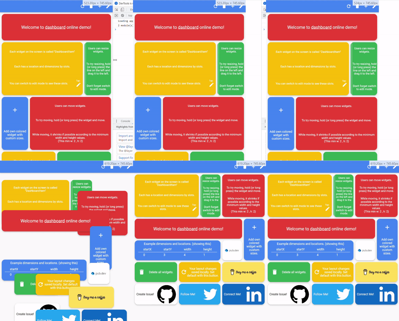
With dynamic slot count, you can re-layout window size changes.
>
Storage Delegate
The layout information of the users can be stored in the database or on the local disk.
Define your storage delegate.
classMyItemStorageextendsDashboardItemStorageDelegate{
@overrideFutureOr<List<DashboardItem>> getAllItems(int slotCount) {
// return items from db.
}
@overrideFutureOr<void> onItemsUpdated(
List<DashboardItem> items, int slotCount) {
// save new layouts to db.
}
//[...]
}
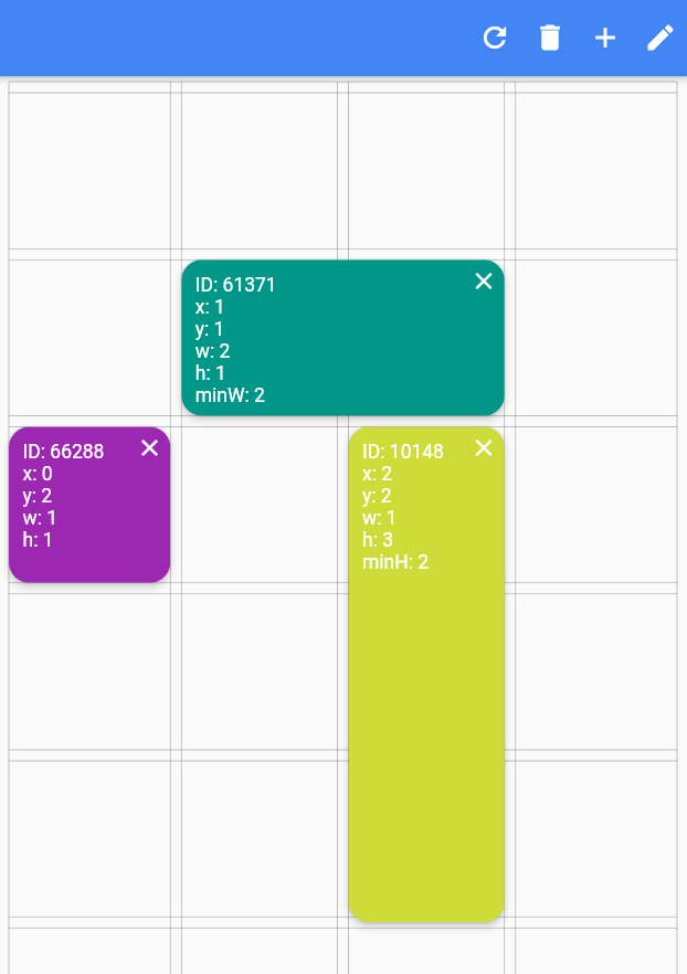
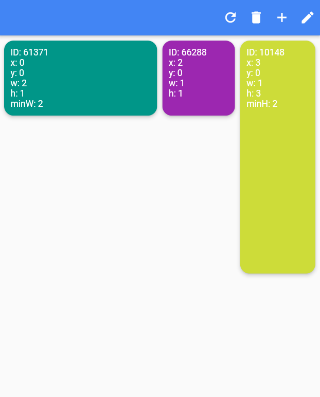
Slide to top items initially. Auto relayout places items to top as possible.
slideToTop: true
Before:
>
After:
>
Shrink
Shrink items when re-layout or editing is possible.
Edit Mode Settings
See code comments for edit mode settings parameters.
All is optional.
EditModeSettings(
// animation settings
curve: Curves.easeInOutCirc,
duration: constDuration(milliseconds: 200),
// fill editing item actual size
fillEditingBackground: true,
// space that can be held to resize
resizeCursorSide: 20,
// draw lines for slots
paintBackgroundLines: true,
// shrink items when editing if possible and necessary
shrinkOnMove: true,
// long press to edit
longPressEnabled: true,
// pan to edit
panEnabled: true,
backgroundStyle: constEditModeBackgroundStyle(
fillColor: Colors.red,
lineWidth: 1.5,
lineColor: Colors.black,
// line by vertical space
dualLineHorizontal: true,
// line by horizontal space
dualLineVertical: true));



 >
 >
 >