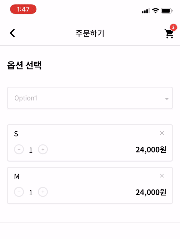
입력 필드 아래에 옵션을 표시하는 사용자 정의 가능한 Flutter 드롭다운 위젯으로, 유연한 스타일과 동작을 통해 사용자 경험을 향상시킵니다. 개발자는 앱 디자인에 맞게 외관, 애니메이션 및 상호작용을 조정할 수 있습니다. 공간과 미적 요소가 중요한 폼 및 선택 인터페이스에 적합합니다. 이 패키지는 모든 주요 플랫폼을 지원하여 다양한 기기에서 일관된 동작을 보장합니다.
사용 사례
드롭다운이 있는 폼 입력
사용자 정의 가능한 선택 메뉴
모바일 및 웹 UI 개선
동적 폼 필드
접근성 중심 디자인
주요 기능
입력 아래에 위치
높은 사용자 정의 가능한 외관
크로스 플랫폼 호환성
부드러운 애니메이션
확장 가능한 API
사용자 정의 위젯 지원
적합한 대상
UI/UX 디자이너
Flutter 개발자
폼 중심 애플리케이션
맞춤형 드롭다운이 필요한 앱
엄격한 디자인 지침을 가진 프로젝트
고려 사항
상태를 수동으로 처리해야 합니다
제한된 내장 검증
복잡한 레이아웃을 위해 추가 스타일링이 필요할 수 있습니다
매우 긴 목록에 최적화되지 않음
고급 기능을 위해 외부 종속성에 의존합니다
원본 README
연결된 소스 저장소의 README 원문 스냅샷입니다. 최신 내용은 저장소에서 확인하세요.
Flutter Dropdown_Below
A Flutter Dropdown library which is customize flutter dropdownbutton widget.
Options
options
description
type
required
itemWidth
dropdown item's box width
double
X
itemTextstyle
dropdown item's text style
double
X
boxTextstyle
seletced box text style
TextStyle
X
boxPadding
seletced box inner padding
EdgeInsetsGeometry
X
boxHeight
seletced box height
double
X
boxWidth
seletced box width
double
X
hint
text before you choose item
Widget
X
value
selected item
T
X
boxDecoration
box's border, borderRadius, color
BoxDecoration
X
icon
widget which is right beside
Widget
X
items
itemsList
List<DropdownMenuItem>
O
onChange
change item function
ValueChanged
O
How to make it Work?
Description for example.
1. datas
_testList's type is always be a list.
If you want to use map or other type, you can customize this package.
  List _testList = [{'no': 1, 'keyword': 'blue'},{'no': 2, 'keyword': 'black'},{'no': 3, 'keyword': 'red'}];
  List<DropdownMenuItem> _dropdownTestItems;
  var _selectedTest;
2. initState & build items to correct type
If you want to customize item's child widget ex) Text -> Container, You can change any widget you want.
  @override
  void initState() {
    _dropdownTestItems = buildDropdownTestItems(_testList);
    super.initState();
  }

  List<DropdownMenuItem> buildDropdownTestItems(List _testList) {
    List<DropdownMenuItem> items = List();
    for (var i in _testList) {
      items.add(
        DropdownMenuItem(
          value: i,
          child: Text(i['keyword']),
        ),
      );
    }
    return items;
  }