패키지, 저장소 및 앱 카테고리 검색

dropdown_textfield 표지
패키지 상세v1.2.0

dropdown_textfield

드롭다운 텍스트필드는 마테리얼 디자인 텍스트필드입니다. 드롭다운 버튼은 값 집합에서 하나의 고유한 값 또는 다수의 값을 선택하는 데 사용할 수 있는 위젯입니다.

AndroidiOSWebmacOSWindowsLinux
30일 다운로드
6천
좋아요
181
Pub 점수
140

패키지 설치

flutter pub add dropdown_textfield

패키지 개요

공개 정보를 바탕으로 생성한 선택 가이드입니다.

DropdownTextfield는 TextField와 DropdownButton을 결합한 Flutter 패키지로, 마테리얼 디자인 인터페이스에서 목록에서 하나 또는 여러 값을 선택할 수 있게 해줍니다. 텍스트 입력 필드 내에서 직관적인 드롭다운 선택 경험을 제공함으로써 폼 입력을 개선합니다. 단일 및 다중 값 선택을 모두 지원하여 동적 데이터 입력 시나리오에 적합합니다. Android, iOS, Web, macOS, Windows, Linux 등 모든 주요 플랫폼과 호환됩니다.

사용 사례

  • 선택 가능한 옵션을 가진 폼 입력
  • 양식 내 다중 선택 드롭다운
  • 마테리얼 디자인 준수 선택 필드
  • 동적 데이터 필터링
  • 사용자 친화적인 값 선택 인터페이스

주요 기능

  • 단일 및 다중 값 선택
  • 머티리얼 디자인 통합
  • 크로스 플랫폼 호환성
  • 사용자 정의 가능한 드롭다운 항목
  • 기존 양식과의 간편한 통합

적합한 대상

  • 양식 중심 앱을 개발하는 개발자
  • 재질 규격에 부합하는 위젯을 찾는 디자이너
  • 유연한 선택 입력이 필요한 앱
  • 크로스 플랫폼 Flutter 프로젝트
  • 드롭다운 기능이 필요한 UI 컴포넌트

고려 사항

  • 다중 선택을 위해 적절한 상태 관리가 필요합니다
  • 사용자 지정 테마에 맞춰 스타일 조정이 필요할 수 있습니다
  • 사전 정의된 값 집합에 제한됨
  • 매우 큰 데이터 세트에는 적합하지 않음
  • 부모 위젯의 레이아웃 제약 조건에 의존

원본 README

연결된 소스 저장소의 README 원문 스냅샷입니다. 최신 내용은 저장소에서 확인하세요.

Flutter DropdownTextfield

A DropdownTextfield is a Material Design TextField. The DropDownButton is a widget that can be used to select one unique value or multiple values from a set of options.

Key Features

  1. Searchable dropdown
  2. Single & multi-selection
  3. Material dropdown
  4. Easily customizable UI
  5. Easy implementation into StatelessWidget
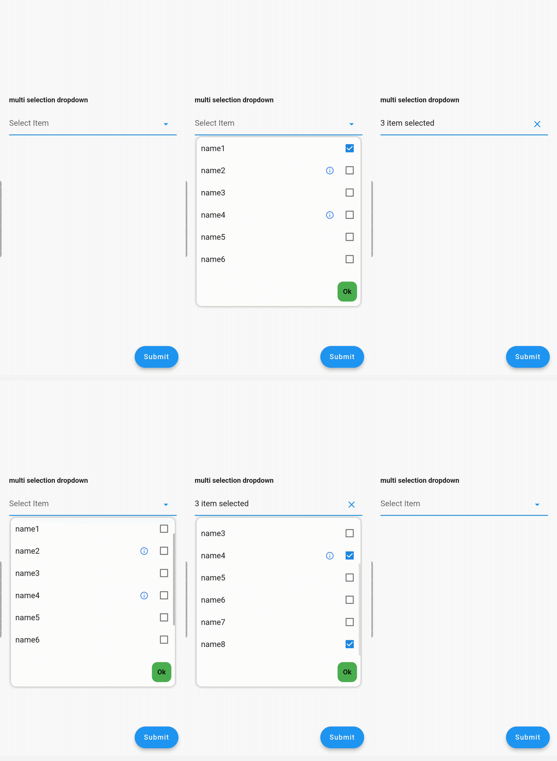
  6. ToolTip dialogue for multi-selection dropdown items

Examples

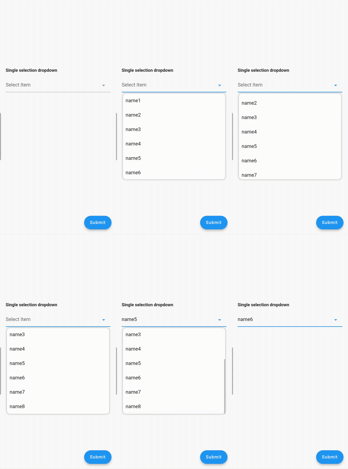
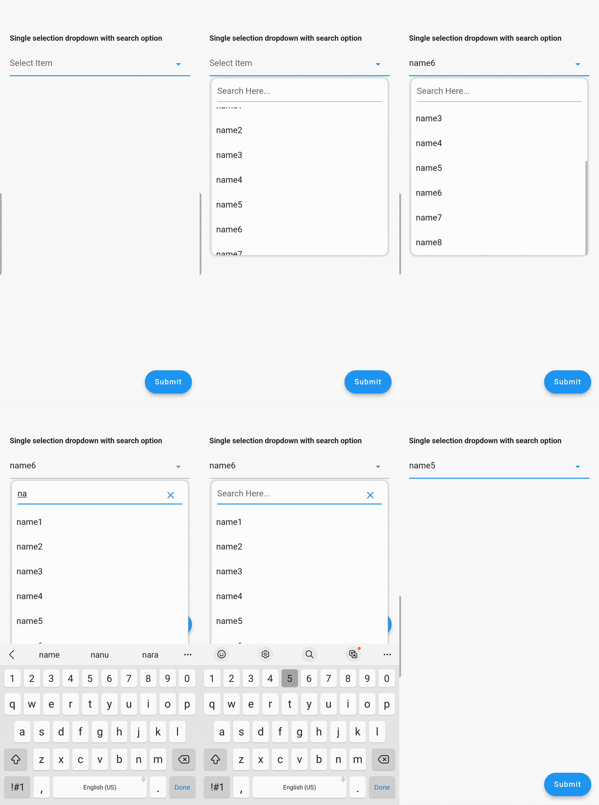
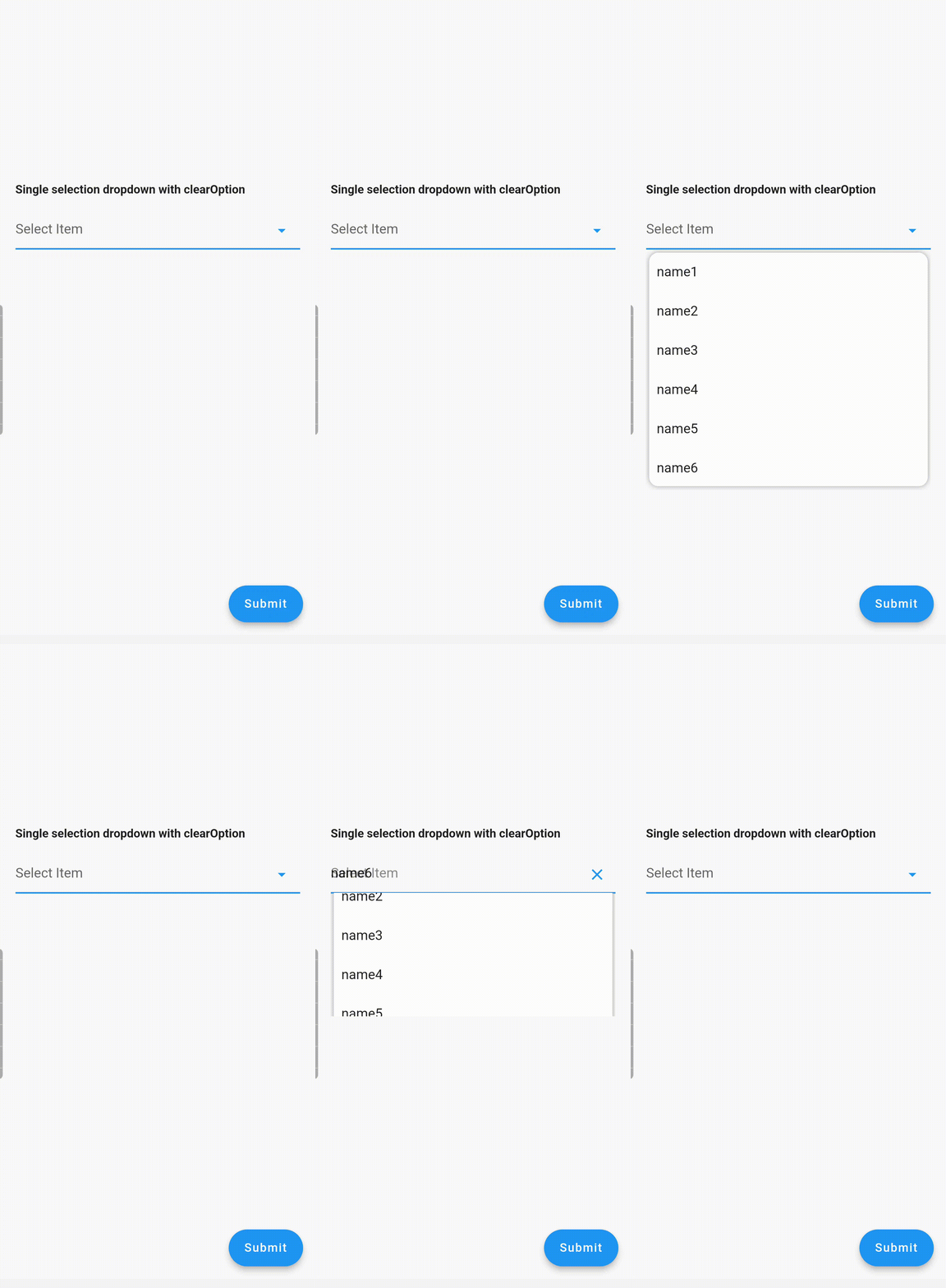
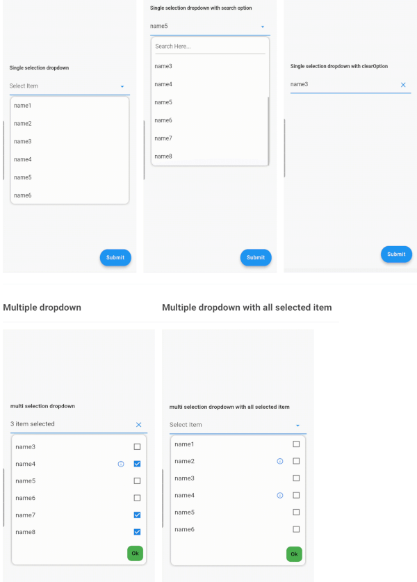
Single Dropdown Single Dropdown with Search Option Single Dropdown with Clear Option
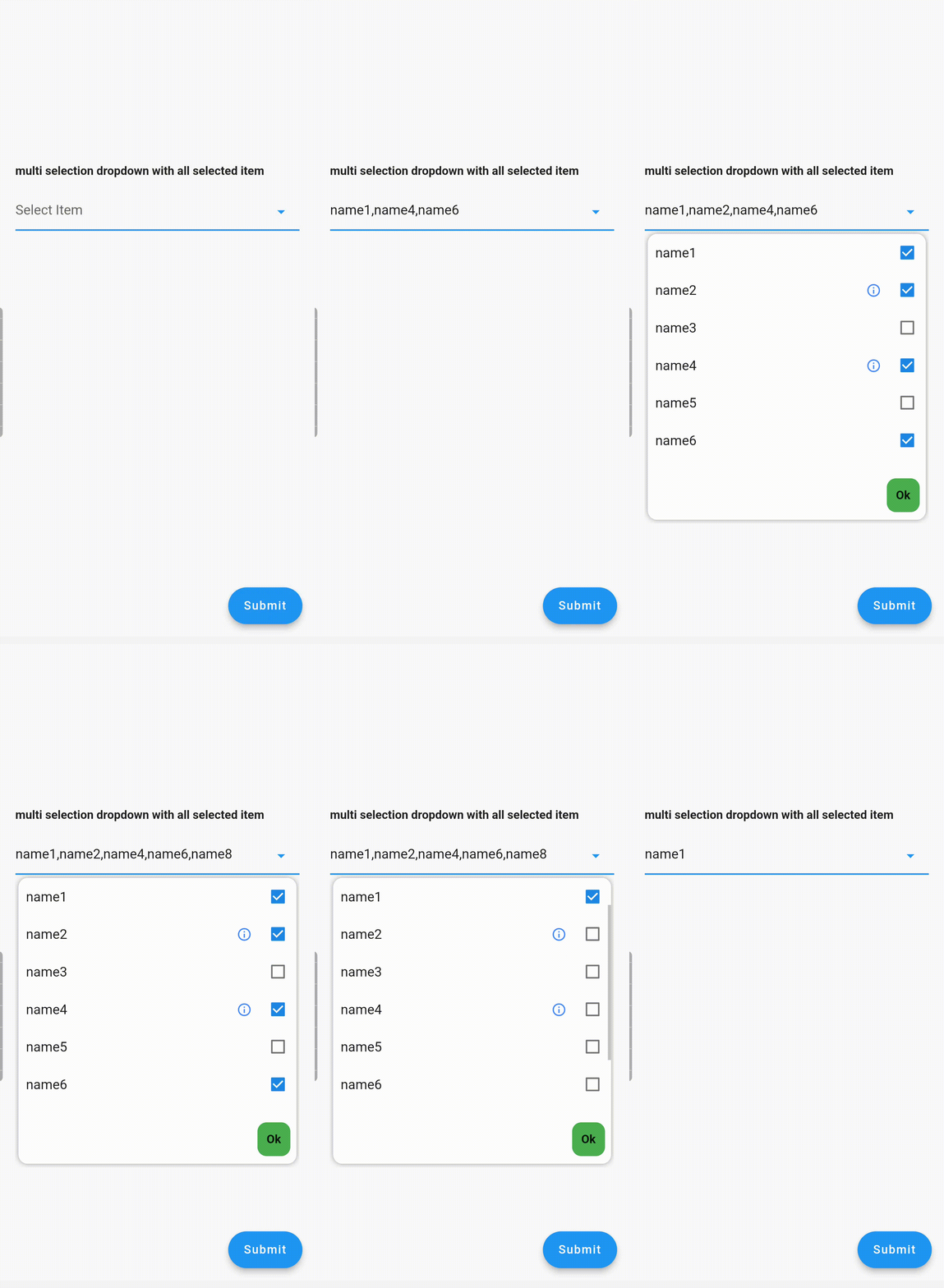
Multiple Dropdown Multiple Dropdown with All Selected Items

Usage

Controllers

You need to use SingleValueDropDownController for single dropdown and MultiValueDropDownController for multiple dropdown.

Properties
  • dropdownRadius: Defines the radius of the dropdown list. Default value is 12.
  • boxDecoration: Add custom BoxDecoration to decorate the dropdown container styling
  • boxMargin: Add custom margins to the dropdown container and override the default vertical: 5, horizontal: 4 margins
  • initialValue: Sets the initial value. If null or not in the dropDownList, it will not display any value.
  • dropDownList: A list of dropdown values of type <DropDownValueModel>.
  • onChanged: Listens for item selection changes. Returns a single DropDownValueModel object for single selection dropdown, and a list of DropDownValueModel objects for multi-selection dropdown.
  • textFieldDecoration: Overrides the default text field decoration.
  • dropDownIconProperty: Customizes the dropdown icon size and color.
  • isEnabled: Set to false to disable the text field. Default value is true.
  • enableSearch: Set to true to enable the search option in the dropdown. Currently available only for single selection dropdown.
  • displayCompleteItem: Set to true to display the complete list of selected items in the text field. Otherwise, it will display as "number_of_items selected".
  • dropDownItemCount: Maximum number of dropdown items to display. Default value is 6.
  • searchKeyboardType: Overrides the default search keyboard type. Applicable only if enableSearch=true.
  • searchTextStyle: Text style for the search text field.
  • searchAutofocus: Set to true to autofocus the search text field. Applicable only if enableSearch=true. Default value is false.
  • searchShowCursor: Set to false to hide the cursor from the search text field. Applicable only if enableSearch=true.
  • clearOption: Set to false to hide the clear suffix icon button from the text field.
  • clearIconProperty: Customizes the clear icon size and color.
  • listSpace: Space between the text field and the list. Default value is 0.
  • listPadding: Padding for dropdown list items.
  • submitButtonText: Text for the multi-dropdown submit button.
  • submitButtonColor: Color of the multi-dropdown submit button.
  • submitButtonTextStyle: Text style for the multi-dropdown submit button.
  • listTextStyle: Text style for dropdown list items.
  • checkBoxProperty: Customizes the properties of multiple checkboxes.

Contributing

Seeking contributions to improve the DropdownTextfield! If you have ideas for new features, optimizations, or bug fixes, please feel free to open a pull request or issue on our GitHub repository. Your contributions are greatly appreciated and will help make this package even better.

카테고리

의존성

의존성 목록 2 개

소스 저장소

이 패키지를 사용하는 프로젝트

아직 데이터가 없습니다.