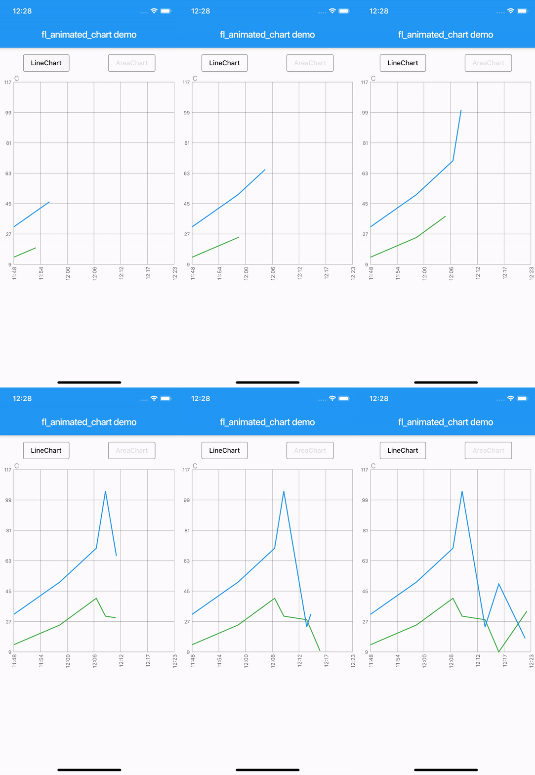
fl_animated_linechart는 대규모 데이터셋에서도 부드러운 성능을 제공하는 애니메이션 선형 및 영역 차트를 생성하기 위한 Flutter 패키지입니다. 다양한 데이터 스케일을 비교하기 위해 다중 Y축을 지원하며, 시간 기반의 X축을 갖추고 있어 시계열 시각화에 적합합니다. 다양한 플랫폼에서 반응성을 최적화하여 실시간 또는 동적 데이터 표시에 적합합니다. Flutter 렌더링 엔진으로 구축되어 시각적 품질을 희생하지 않고도 부드러운 애니메이션과 효율적인 업데이트를 보장합니다.
사용 사례
실시간 데이터 모니터링
시계열 분석
다중 메트릭 대시보드
재무 차트
인터랙티브 데이터 탐색
주요 기능
애니메이션 전환
다중 Y 축 지원
시간 축 X축
대규모 데이터에서의 높은 성능
크로스 플랫폼 호환성
적합한 대상
데이터 시각화 앱
대시보드 개발자
분석 도구
모바일 및 웹 분석
실시간 추적 인터페이스
고려 사항
프레임 속도를 유지하기 위해 대규모 데이터 세트를 신중하게 처리해야 합니다
핵심 차트 유형 외의 사용자 지정은 제한적
복잡한 UI의 경우 추가적인 스타일링이 필요할 수 있습니다
선형 또는 시간 기반 데이터 패턴에 가장 적합
고급 기능을 위해 외부 종속성에 의존합니다
원본 README
연결된 소스 저장소의 README 원문 스냅샷입니다. 최신 내용은 저장소에서 확인하세요.
fl_animated_linechart
An animated chart library for flutter.
Support for datetime axis
Multiple y axis, supporting different units
Highlight selection
Animation of the chart
Possibility of adding legends
Support for both horizontal and vertical markerlines
Tested with more than 3000 points and still performing
There are currently two different charts:
line chart
area chart
Getting Started
Try the sample project or include in your project.
Highlight for the line chart:
Linechart with markerlines, icons, legends and "heat-map" shaded zones:
You can choose to either have a short line or an Icon as the first part of the legend before the title. It is possible set showLeadingLine to true, then a short line will be shown in the color you have defined.
You can change the Color of the line and Icon, and the TextStyle of the String title.
The length of the Legends list must to equal to the length of chartlines which have isMakerLine = true.
When orientation of the screen is in landscape mode, it is possible to have the legends drawn on the right hand side instead of below the graph.
Simply set legendsRightLandscapeMode: true
returnScaffold(
appBar: AppBar(
title: Text(widget.title),
),
body: Container(
child: Column(
mainAxisSize: MainAxisSize.max,
mainAxisAlignment: MainAxisAlignment.spaceBetween,
crossAxisAlignment: CrossAxisAlignment.stretch,
children: [
Expanded(
child: AnimatedLineChart(
lineChart,
toolTipColor: Colors.white,
gridColor: Colors.black54,
textStyle: TextStyle(fontSize: 10, color: Colors.black54),
showMarkerLines:
true, // If this value is not set to true, all defines lines will be filled lines and not dashed
legends: [
Legend(title: 'Critical', color: Colors.red, showLeadingLine: true),
Legend(title: 'Warning', color: Colors.yellow, Icon(Icons.report_problem_rounded, size: 17, color: Colors.yellow)),
],
legendsRightLandscapeMode: true,
),
),
],
),
),
);
Example code with horizontal and vertical markerlines along with icons on the chart and legends:
It is possible to define a maximum of two vertical markerlines.
The verticalMarker variable is a List<DateTime> and the length can be >= 2.
If two vertical markerlines are defined, the area between the two lines will be filled with a color that can be defined with verticalMarkerColor.
It is possible to add an Icon on the point where the vertical markerline crosses the y-axis value by defining the verticalMarkerIcon.
The verticalMarkerIcon variable takes a List<Icon> and the lenght must be equal to the length of the verticalMarker variable.
The possibility of adding a colored background to the icons have been added and can be defined with iconBackgroundColor which takes a Color.
returnScaffold(
appBar: AppBar(
title: Text(widget.title),
),
body: Container(
child: Column(
mainAxisSize: MainAxisSize.max,
mainAxisAlignment: MainAxisAlignment.spaceBetween,
crossAxisAlignment: CrossAxisAlignment.stretch,
children: [
Expanded(
child: AnimatedLineChart(
lineChart,
toolTipColor: Colors.white,
gridColor: Colors.black54,
textStyle: TextStyle(fontSize: 10, color: Colors.black54),
showMarkerLines:
true, // If this value is not set to true, all defines lines will be filled lines and not dashed
legends: [
Legend(title: 'Critical', color: Colors.red),
Legend(title: 'Warning', color: Colors.yellow),
],
verticalMarker:[
DateTime.parse('2012-02-27 12:54:00'),
DateTime.parse('2012-02-27 13:16:00')
],
verticalMarkerColor: Colors.yellow,
verticalMarkerIcon: [
Icon(
Icons.report_problem_rounded,
color: Colors.yellow,
),
Icon(
Icons.check_circle_rounded,
color: Colors.green,
),
],
iconBackgroundColor: Colors.white,
),
),
],
),
),
);
Example code with shaded area between markerlines:
It is possible to have shaded areas between the defined markerlines.
The shaded area will be in the same color as the markerline.
It is important that the order of enums in the List<MaxMin> filledMarkerLinesValues matches the order of defined markerlines to be shown in the graph.
Enums with the value MaxMin.MAX will draw to the top if there is only one markerline defined as MAX, otherwise it will draw from i - 1 where enum values are MAX.
If enum value is MaxMin.MIN the shaded area will draw downwards to i + 1, unless the index is the last in the list, then the shaded area will draw all the way to the bottom of the graph.