패키지, 저장소 및 앱 카테고리 검색

패키지 상세v2.0.0

floating_snackbar

귀하의 프로젝트에 맞춤형 플로팅 스낵바를 제공하는 패키지입니다.

AndroidiOSWebmacOSWindowsLinux
30일 다운로드
953
좋아요
28
Pub 점수
150

패키지 설치

flutter pub add floating_snackbar

패키지 개요

공개 정보를 바탕으로 생성한 선택 가이드입니다.

다양한 플랫폼에서 사용자 피드백을 향상시키기 위해 사용자 정의 가능한 부유형 스낵바를 제공하는 플러터 패키지입니다. 현대적이고 애니메이션 효과가 있는 알림 경험을 제공하도록 설계되었으며, 부드러운 전환과 동적 위치 지정을 지원합니다. 사용자 흐름을 방해하지 않고 짧은 메시지, 경고 또는 확인을 표시하는 데 이상적입니다. 가볍고 최소한의 설정으로 기존 프로젝트에 쉽게 통합할 수 있습니다. 안드로이드, iOS, 웹, macOS, Windows, 리눅스에서 작동하여 장치 간 일관된 동작을 보장합니다.

사용 사례

  • 빠른 상태 업데이트 표시
  • 작업 후 확인 메시지 표시
  • 양식에서 사용자 피드백 제공
  • 성공적인 작업에 대한 사용자 알림
  • 애니메이션 알림으로 UI 개선

주요 기능

  • 사용자 정의 가능한 외관 및 애니메이션
  • 플로팅, 비차단 설계
  • 크로스 플랫폼 호환성
  • 기존 코드와의 간편한 통합
  • 여러 표시 위치 지원

적합한 대상

  • 모바일 및 웹 애플리케이션
  • 경량 알림이 필요한 프로젝트
  • 현대적인 UI 컴포넌트를 찾는 개발자
  • 다양한 플랫폼 간 일관된 피드백을 필요로 하는 앱
  • 사용자 인터페이스 중심의 Flutter 프로젝트

고려 사항

  • 복잡한 디자인을 위해 추가 스타일링이 필요할 수 있습니다
  • 기본적인 스낵바 기능에만 제한됨
  • 자주 사용할 때의 성능 영향
  • 스와이프-투-디미스에 내장된 지원 없음
  • 플랫폼 전용 렌더링 동작에 의존합니다

원본 README

연결된 소스 저장소의 README 원문 스냅샷입니다. 최신 내용은 저장소에서 확인하세요.

floating_snackbar

pub package CI license

Beautiful, customizable floating snackbars / toasts for Flutter. 🚀

Keep the dead-simple one-liner you already know - or reach for variants, positioning, theming, actions, progress bars, and context-free display when you need them. Pure Dart, zero native code, works on every platform.

Android iOS Linux macOS Web Windows
✅ ✅ ✅ ✅ ✅ ✅

📸 Screenshots

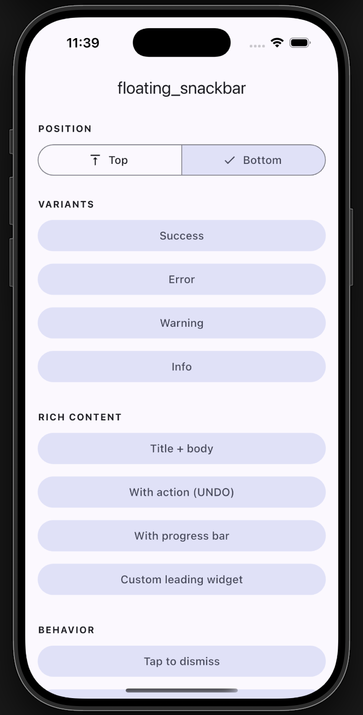
Plain example app screen
Example app
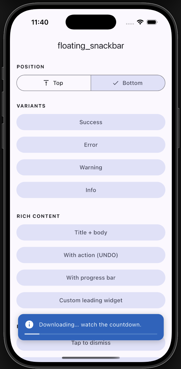
Progress bar
Progress
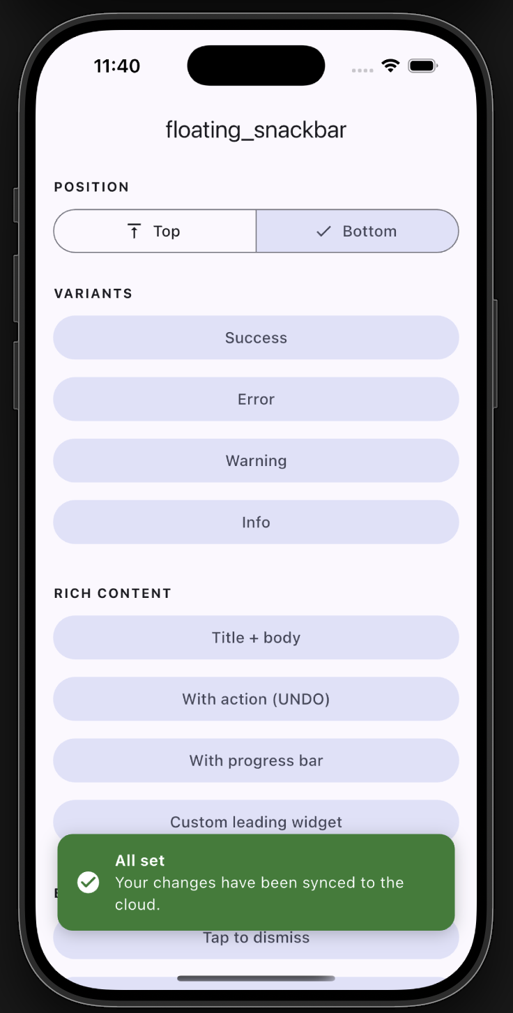
Bottom snackbar with title
Bottom with title
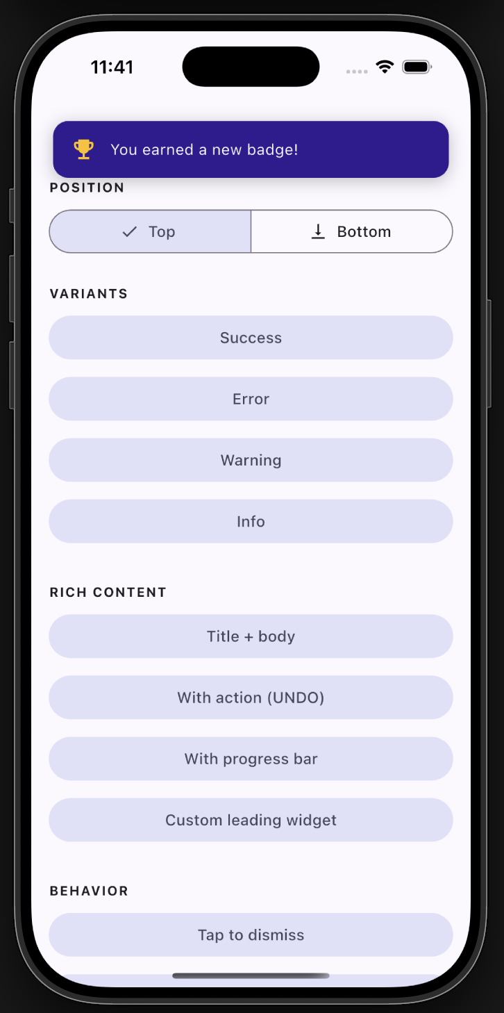
Top position
Top position

✨ Features

  • ✅ Backward compatible - the original floatingSnackBar() still works.
  • 🎨 Variants - success, error, warning, info, with default colors & icons.
  • 📍 Positioning - show at the top or bottom of the screen.
  • 🧩 Rich content - title + body, leading icon/widget, trailing action button.
  • ⏳ Progress bar - optional countdown indicator.
  • 👆 Dismissal - tap-to-dismiss and swipe-to-dismiss.
  • 🌈 Animations - slide, fade, or scale.
  • 🌍 Global theming - set defaults once via FloatingSnackBar.theme.
  • 🪄 Context-free - show from services/blocs with no BuildContext.

📦 Getting started

Add the dependency:

dependencies:
  floating_snackbar: ^2.0.0

Import it:

import 'package:floating_snackbar/floating_snackbar.dart';

🚀 Usage

The simple one-liner (unchanged)
floatingSnackBar(
  message: 'Hi there! I am a floating SnackBar!',
  context: context,
);
Variants
FloatingSnackBar.success(context, 'Saved successfully!');
FloatingSnackBar.error(context, 'Something went wrong.');
FloatingSnackBar.warning(context, 'Battery is running low.');
FloatingSnackBar.info(context, 'A new update is available.');
Positioning
FloatingSnackBar.success(
  context,
  'Shown at the top!',
  position: FloatingSnackBarPosition.top,
);
Title, action & progress
FloatingSnackBar.show(
  context,
  'Item deleted.',
  title: 'Done',
  position: FloatingSnackBarPosition.bottom,
  showProgress: true,
  duration: const Duration(seconds: 5),
  action: FloatingSnackBarAction(
    label: 'UNDO',
    onPressed: () => restoreItem(),
  ),
);
Custom leading widget & colors
FloatingSnackBar.show(
  context,
  'You earned a new badge!',
  leading: const Icon(Icons.emoji_events, color: Colors.amber),
  backgroundColor: const Color(0xFF311B92),
  animation: FloatingSnackBarAnimation.scale,
);
Context-free (no BuildContext)

Wire the navigator key into your app once:

MaterialApp(
  navigatorKey: FloatingSnackBar.navigatorKey,
  // ...
);

Then call from anywhere - a service, a bloc, an interceptor:

FloatingSnackBar.info(null, 'No BuildContext needed!');

Already have a navigator key? Just assign it: FloatingSnackBar.navigatorKey = myExistingKey;

Global theming

Set your defaults once (e.g. in main) and every snackbar follows them:

FloatingSnackBar.theme = const FloatingSnackBarTheme(
  defaultPosition: FloatingSnackBarPosition.top,
  borderRadius: 16,
  duration: Duration(seconds: 3),
  successColor: Colors.teal,
  animation: FloatingSnackBarAnimation.slide,
);
Dismiss programmatically
FloatingSnackBar.dismiss(context); // or dismiss() with the navigatorKey set

📋 API reference

FloatingSnackBar.show(context, message, { ... })
Parameter Type Description
context BuildContext? Required unless navigatorKey is wired up.
message String The body text.
title String? Optional bold title above the message.
type FloatingSnackBarType normal / success / error / warning / info.
position FloatingSnackBarPosition? top or bottom.
animation FloatingSnackBarAnimation? slide / fade / scale.
duration Duration? Visible time before auto-dismiss.
leading Widget? Custom leading widget (overrides the type icon).
action FloatingSnackBarAction? Trailing action button.
backgroundColor Color? Overrides the type/theme background.
textColor Color? Overrides the text color.
textStyle TextStyle? Overrides the message style.
titleStyle TextStyle? Overrides the title style.
dismissOnTap bool? Tap the card to dismiss.
showProgress bool? Show a countdown bar.
replace bool Replace the current snackbar (default) or queue.

success / error / warning / info are thin wrappers over show with the matching type. Every unset argument falls back to FloatingSnackBar.theme.


🧪 Example

A full demo of every feature lives in example/. Run it with:

cd example
flutter run

🤝 Support

Found a bug or have an idea? Open an issue. 🐛


Enjoy building delightful Flutter apps with floating_snackbar! 🎉

카테고리

소스 저장소

이 패키지를 사용하는 프로젝트