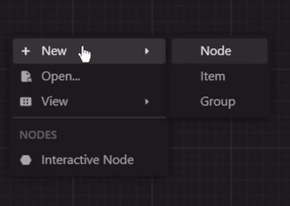
다양한 플랫폼에서 사용자 정의 가능한 컨텍스트 메뉴를 생성하고 표시할 수 있도록 해주는 플러터 패키지입니다. 사용자가 위젯을 길게 누르거나 마우스 오른쪽 버튼을 클릭했을 때 일관된 방식으로 작업 옵션을 제공하여 앱 내 사용자 상호작용을 향상시킵니다. 이 패키지는 Android, iOS, 웹, macOS, Windows, Linux 등 주요 모든 플랫폼을 지원하며 광범위한 호환성을 보장합니다. 유연한 사용자 정의 옵션을 통해 개발자는 앱 디자인에 맞게 메뉴의 외관과 동작을 조정할 수 있습니다. 직관적이고 플랫폼 인식형의 컨텍스트 작업을 추가하는 데 이상적입니다.
사용 사례
데스크톱 앱에서 마우스 오른쪽 클릭 메뉴 추가
모바일에서 길게 누르기 동작 구현
맥락 기반 선택을 사용하여 상호작용형 UI 만들기
빠른 작업으로 생산성 도구 개선
다중 플랫폼 애플리케이션 지원
주요 기능
크로스 플랫폼 지원
사용자 정의 메뉴 항목
기존 위젯과의 간편한 통합
길게 누르기 및 오른쪽 클릭에 반응
사용자 정의 가능한 스타일 및 레이아웃
적합한 대상
풍부한 상호작용을 갖춘 데스크톱 또는 모바일 앱을 개발하는 개발자
다중 플랫폼을 대상으로 하는 팀
맥락적 사용자 작업이 필요한 앱
고려 사항
제스처 충돌을 신중하게 처리해야 합니다
일관성을 위해 추가 스타일링이 필요할 수 있습니다
간단한 단발성 작업에 적합하지 않습니다
원본 README
연결된 소스 저장소의 README 원문 스냅샷입니다. 최신 내용은 저장소에서 확인하세요.
Flutter Context Menu
A Flutter library that provides a flexible and customizable solution for creating and displaying context menus in Flutter applications. It allows you to easily add context menus to your UI, providing users with a convenient way to access additional options and actions specific to the selected item or area.
ContextMenu: The package includes a highly customizable context menu system that can be
easily integrated into your Flutter application. It provides a seamless and intuitive user
experience, enhancing the usability of your app.
Hierarchical Structure: The context menu supports a hierarchical structure with submenu
functionality. This enables you to create nested menus, providing a clear and organized
representation of options and suboptions.
Selection Handling: The package includes built-in selection handling for context menu items.
It allows you to define callback functions for individual menu items, enabling you to execute
specific actions or logic when an item is selected.
Customization Options: Customize the appearance and behavior of the context menu to match your
app's design and requirements. Modify the style, positioning, animation, and interaction of the
menu to create a cohesive user interface.
Built-in Components: The package includes built-in components, such as MenuItem,
MenuDivider, and MenuHeader, that can be used in your context menu.
Cross Platform Support: The package is compatible with multiple platforms, including Android,
iOS, Web, and Desktop.
Theme: By default, the context menu and its items uses the MaterialApp's theme data for
styling. However, you can customize the appearance and behavior of the context menu by modifying
the theme data. Or individually by specifying a BoxDecoration in the boxDecoration property of
the ContextMenu.
Custom Entries: You can create your own context menu entries by subclassing the
ContextMenuEntry class. This allows you to customize the appearance, behavior, and functionality
of the context menu items.
Learn More
More info: Full documentation will be provided, inshallah 🙏