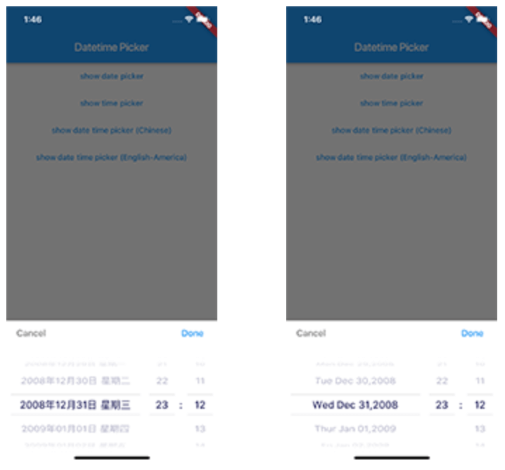
Flutter용 사용자 정의 가능한 날짜 및 시간 선택기로 영어, 네덜란드어, 중국어에서 날짜, 시간 또는 둘 다를 선택할 수 있습니다. 지역화된 인터페이스를 제공하며 개발자가 앱의 특정 요구 사항에 맞게 선택기 내용을 조정할 수 있도록 합니다. Android, iOS, Web, macOS, Windows, Linux와 호환되어 모든 플랫폼에서 원활한 사용자 경험을 제공합니다. 통합이 쉬우며 UI 커스터마이징에 유연성을 제공하도록 설계되었습니다.
If you want to customize your own style of date time picker, there is a class called CommonPickerModel, every type of date time picker is extended from this class, you can refer to other picker model (eg. DatePickerModel), and write your custom one, then pass this model to showPicker method, so that your own date time picker will appear, it’s easy, and will perfectly meet your demand
By default every picker shows a Cancel/Done bar above the wheels. Pass a
titleActionsBuilder to any DatePicker.show* method to replace it with your
own widget. The builder receives onCancel / onConfirm callbacks (which
dismiss the picker the same way the default buttons do) and the currently
selected DateTime:
The bar is laid out within the theme's titleHeight, so keep your widget
within that height (or raise titleHeight via a custom DatePickerTheme). The
builder is only used when showTitleActions is true (the default).
Getting Started
For help getting started with Flutter, view our online documentation.
For help on editing package code, view the documentation.