패키지, 저장소 및 앱 카테고리 검색

flutter_neumorphic 표지
패키지 상세v3.2.0

flutter_neumorphic

Flutter용 완전하고 즉시 사용 가능한 네오모포닉 UI 키트입니다. 다크 테마 호환 및 완전히 사용자 정의 가능합니다.

30일 다운로드
1.8천
좋아요
1.8천
Pub 점수
70

패키지 설치

flutter pub add flutter_neumorphic

패키지 개요

공개 정보를 바탕으로 생성한 선택 가이드입니다.

Flutter Neumorphic은 Flutter 애플리케이션에서 부드럽고 현실적이며 현대적인 뉴모포닉 디자인을 만들기 위한 포괄적인 UI 키트입니다. 뉴모포닉의 특징인 미묘한 깊이와 조명 효과를 모방하는 사용자 정의 가능한 위젯 세트를 제공하며, 다크 테마 및 완전한 사용자 정의 옵션을 지원합니다. 이 패키지는 개발자가 최소한의 노력으로 시각적으로 매력적인 인터페이스를 구축할 수 있게 해주며, 촉각적이고 3D처럼 보이는 미학을 필요로 하는 앱에 이상적입니다. 기존의 Flutter 프로젝트에 원활하게 통합되며 커뮤니티에 의해 지속적으로 유지 관리되고 있습니다.

사용 사례

  • 현대적인 앱 인터페이스 만들기
  • 부드러운 터치 버튼과 카드 디자인
  • 다크 테마의 뉴모포빅 레이아웃 구축
  • 인터랙티브 UI 컴포넌트 프로토타이핑
  • 깊이 효과를 통해 시각적 매력 향상

주요 기능

  • 완전히 사용자 정의 가능한 그림자와 색상
  • 다크 테마 호환성
  • 사용 준비 완료된 뉴모포닉 위젯
  • 라이트 모드와 다크 모드 모두 지원
  • 기존 Flutter 프로젝트와의 간편한 통합

적합한 대상

  • 뉴모포닉 미학을 추구하는 UI 디자이너
  • 현대적인 모바일 앱을 개발하는 개발자
  • 부드럽고 촉감 있는 UI 요소가 필요한 프로젝트
  • 시각적 완성도와 사용자 경험에 집중하는 팀
  • 프리미엄 또는 미니멀리스트 디자인 스타일을 타겟으로 하는 앱

고려 사항

  • 저사양 기기에서 성능에 영향을 줄 수 있습니다
  • 접근성에 대한 주의 깊은 색 대비가 필요합니다
  • 모든 디자인 시스템에 적합하지 않습니다
  • 과도하게 사용할 경우 시각적으로 압도될 수 있습니다
  • 표준 Flutter 위젯에 비해 원본 지원이 제한적

원본 README

연결된 소스 저장소의 README 원문 스냅샷입니다. 최신 내용은 저장소에서 확인하세요.

flutter_neumorphic

A complete, ready to use, Neumorphic ui kit for Flutter

flutter_logo

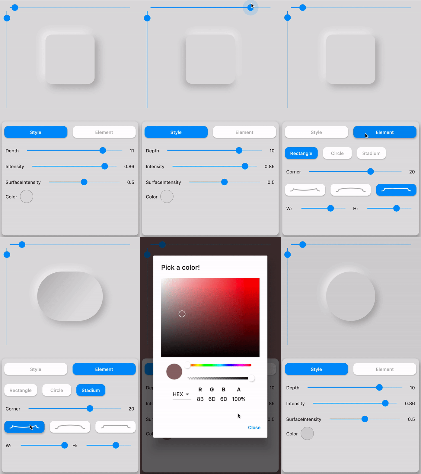
Try Flutter-Neumorphic on your browser : 👉 https://flutter-neumorphic.firebaseapp.com/ 🌐

neumorphic_playground

⚙️ Installation

https://pub.dev/packages/flutter_neumorphic

pub package pub package

dependencies:
  flutter_neumorphic: ^3.0.3

//requires flutter > 1.13.18

The in your .dart files

import 'package:flutter_neumorphic/flutter_neumorphic.dart';

🗂 Widgets

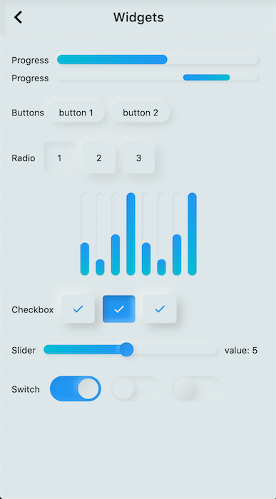
Preview Widget Description
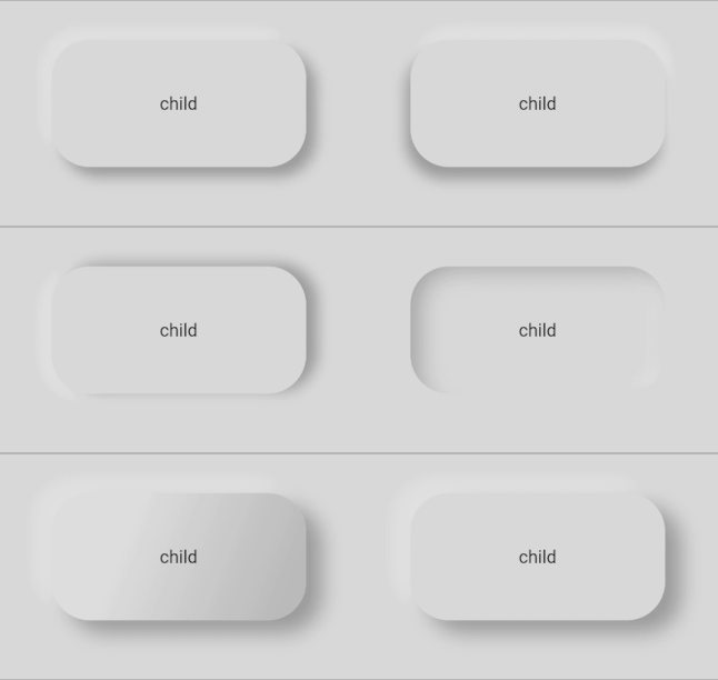
Neumorphic The main Neumorphic Widget, a container which adds white/dark gradient depending on a lightsource and a depth
NeumorphicButton A neumorphic button that plays with the depth to respond to user interraction
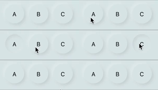
NeumorphicRadio A set of neumorphic button whith only one selected at time, depending on a value and groupValue
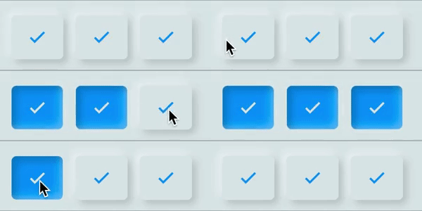
NeumorphicCheckbox A button associated with a value, can be checked/unckecked, if checked, takes the accent color
NeumorphicText A Neumorphic text (only work with positive depth)
NeumorphicIcon A Neumorphic icon (only work with positive depth)
material.TextField For TextFields, just surround your existing material textfield widget with a Neumorphic (container)
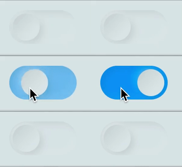
NeumorphicSwitch An On/Off toggle, associated with a value, if toggled, takes the accent color
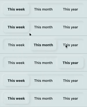
NeumorphicToggle An mutiple value toggle, associated with a selecteedIndex
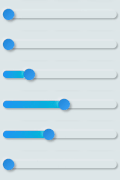
NeumorphicSlider A Neumorphic seekbar (range slider), the user can select a value in a range
NeumorphicProgress A determinate progress, takes the displayed percentage
NeumorphicProgressIndeterminate An inderminate progress-bar
NeumorphicBackground Take the background color of the theme, can clip the screen with a borderRadius
NeumorphicApp An application that uses Neumorphic design. Handle theme, navigation, localisation, and much more
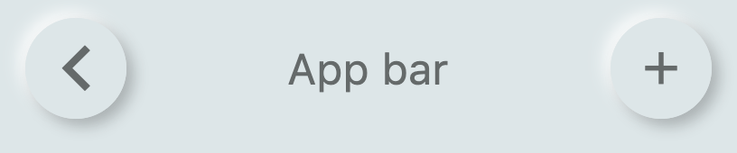
NeumorphicAppBar A Neumorphhic design app bar. Can be used inside Scaffold

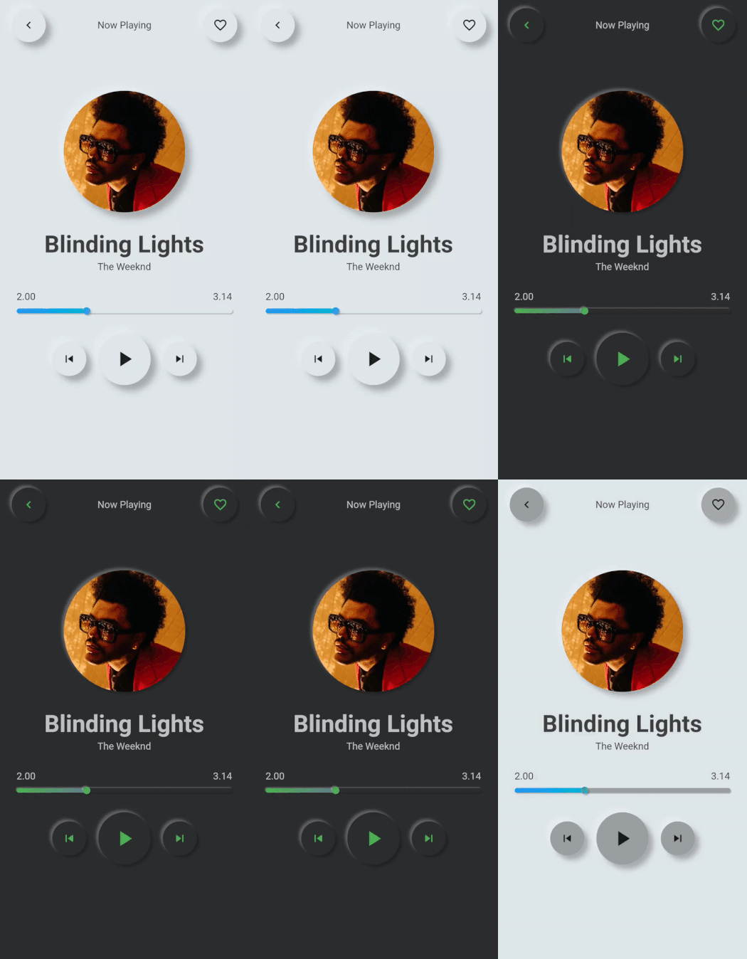
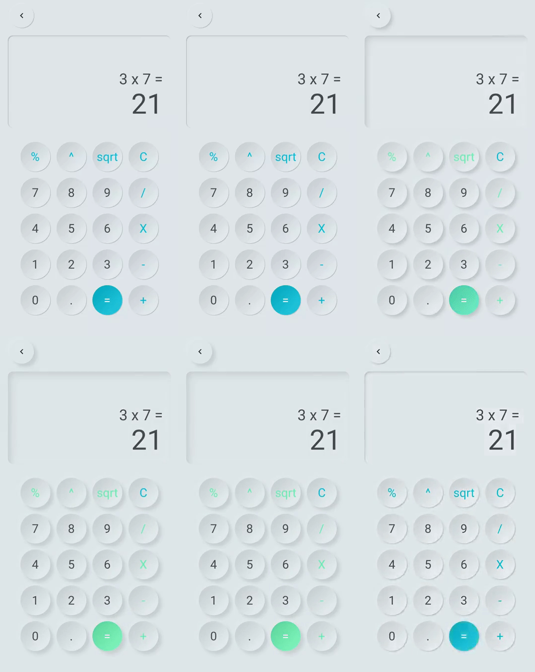
👀 Showcases

Neumorphic Neumorphic

Neumorphic Neumorphic

📦 Neumorphic


Neumorphic(
  style: NeumorphicStyle(
    shape: NeumorphicShape.concave,
    boxShape: NeumorphicBoxShape.roundRect(BorderRadius.circular(12)), 
    depth: 8,
    lightSource: LightSource.topLeft,
    color: Colors.grey
  ),
  child: ...
)

Neumorphic Neumorphic

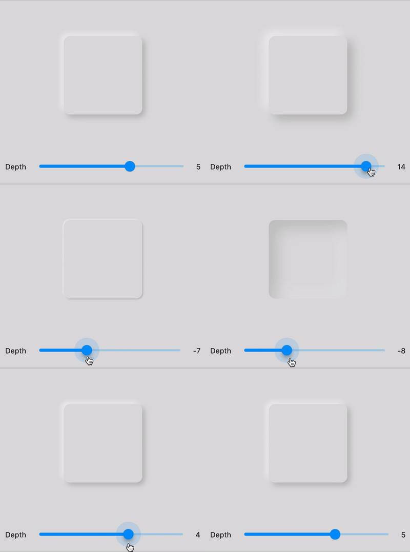
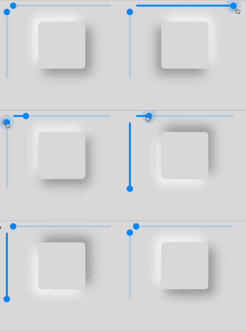
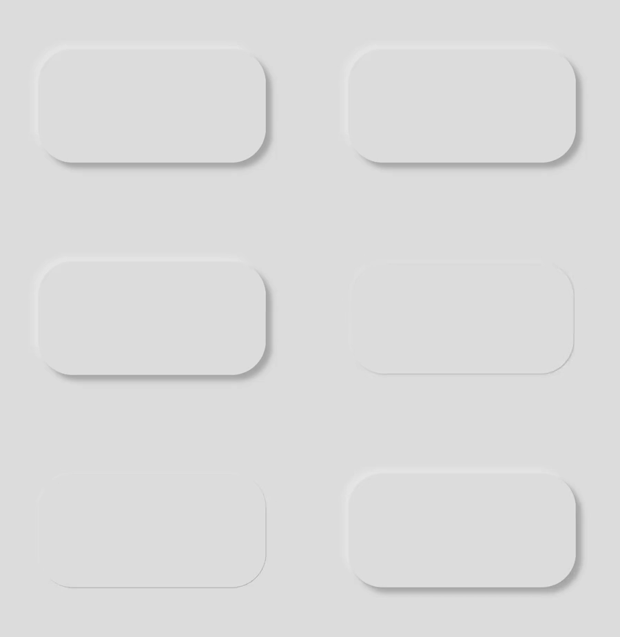
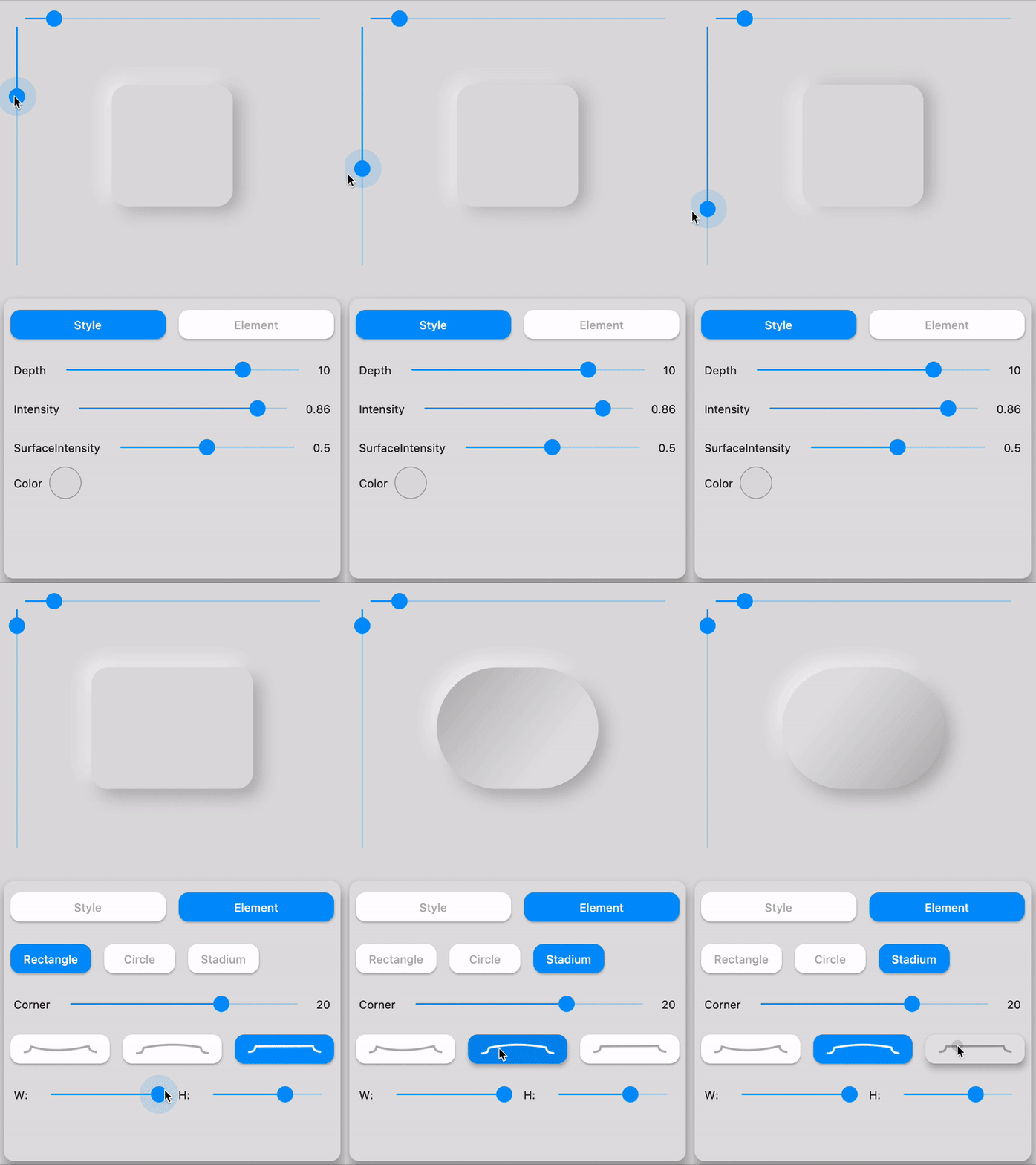
☝️ Playing with LightSource & Depth

🛠️ Attributes
Attributes Values Description
LightSource TopLeft, BottomRight, etc. / (dx, dy) The source of light specifit to the theme or the widget, used to project white/dark shadows on neumorphic elements
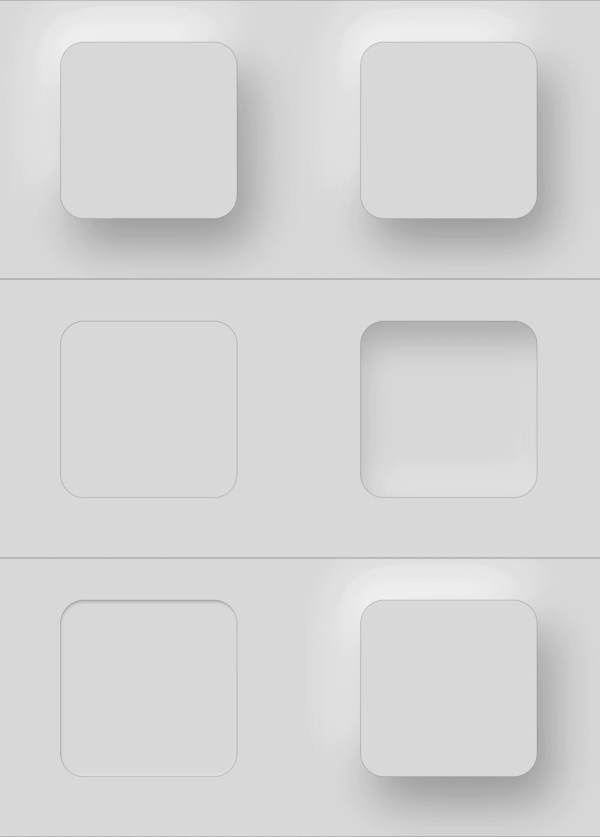
Shape Concave / Convex / Flat The shape of the curve used in the neumorphic container
Depth -20 <= double <= 20 The distance of the widget to his parent. Can be negative => emboss. It influences on the shadow's color and its size/blur
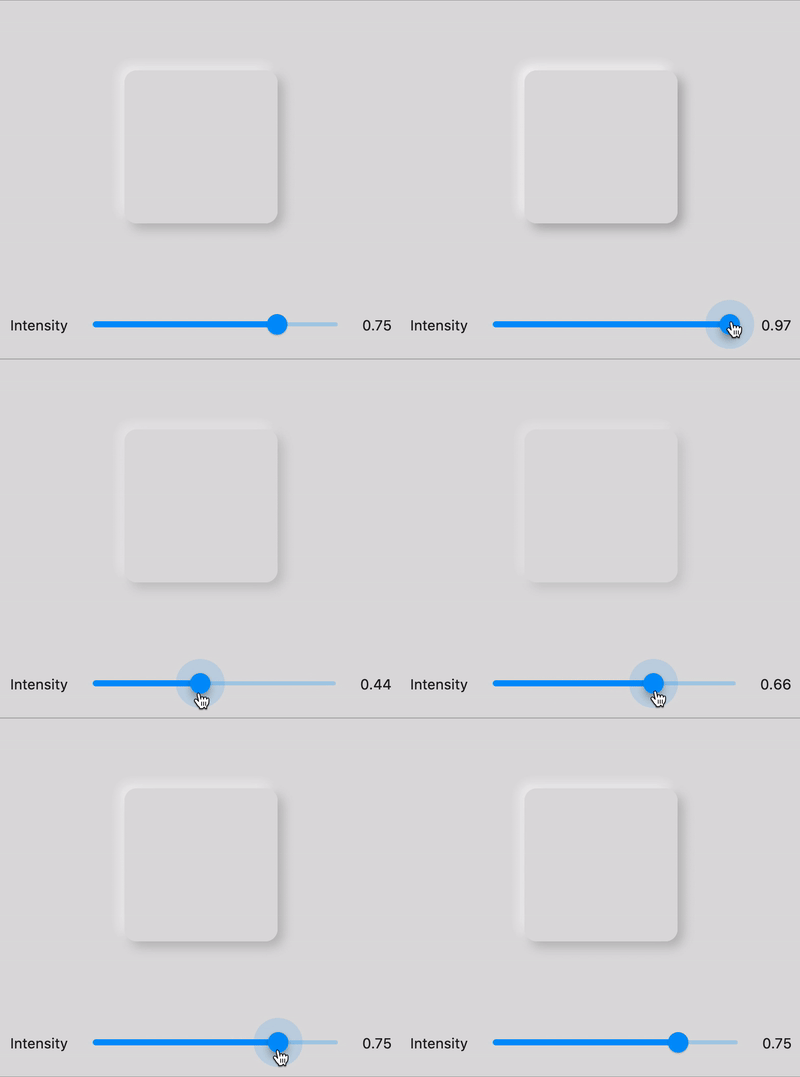
Intensity 0 <= double <= 1 The intensity of the Light, it influences on the shadow's color
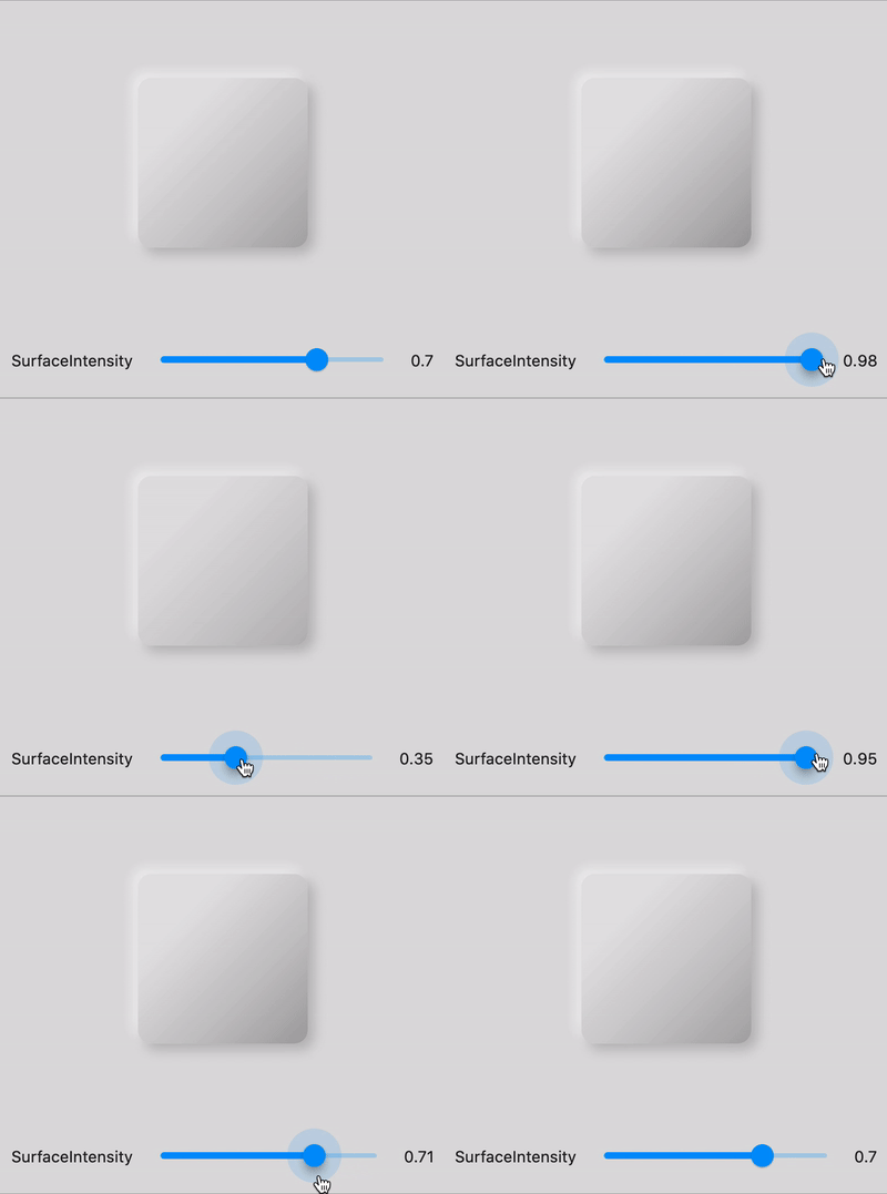
SurfaceIntensity 0 <= double <= 1 The intensity of the Surface, it influences on the concave/convex darkness
Color any Color The default color of Neumorphic elements
Accent any Color The default accent color of the Neumorphic element when activated (eg: checkbox)
Variant any Color The default secondary color of the Neumorphic element (eg: used as second color on the progress gradient)
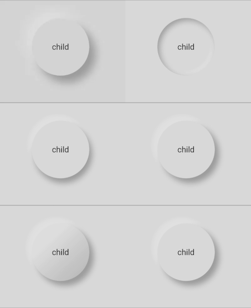
BoxShape Circle, RoundRect(radius), Stadium, Path The box shape of a Neumorphic element. Stadium : roundrect with cirlces on each side
Border NeumorphicBorder A border (color/width) to enhance contrast with background and others elements

Neumorphic Neumorphic Neumorphic Neumorphic

🔧 Shapes
Shape Widget Image Condition
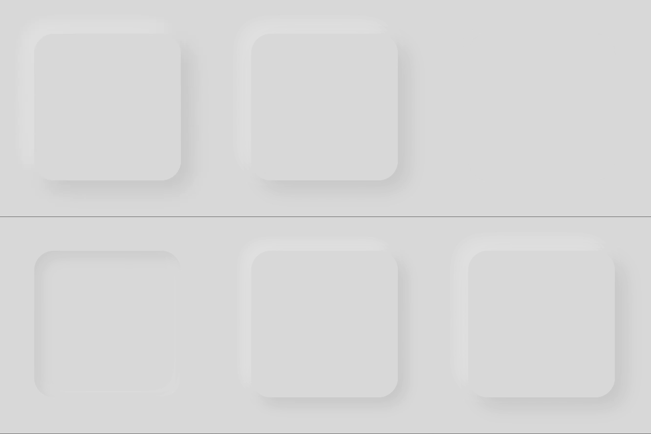
Flat depth >= 0 && shape == Flat
Convex depth >= 0 && shape == Convex
Concave depth >= 0 && shape == Concave
Emboss depth < 0

Neumorphic Text

text

Text only handle positive depth

child: NeumorphicText(
        "I love flutter",
        style: NeumorphicStyle(
          depth: 4,  //customize depth here
          color: Colors.white, //customize color here
        ),
        textStyle: NeumorphicTextStyle(
          fontSize: 18, //customize size here
          // AND others usual text style properties (fontFamily, fontWeight, ...)
        ),
    ),

Neumorphic Icon

custom_shape

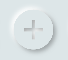
child: NeumorphicIcon(
        Icons.add_circle,
        size: 80,
    ),

How to display SVG icons ?

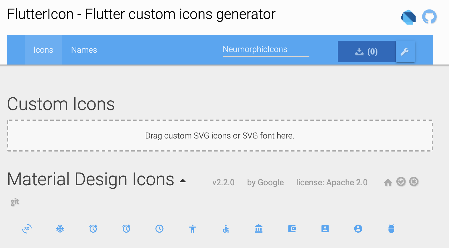
Simply use https://fluttericon.com/ to export your svg as .ttf & use NeumorphicIcon(YOUR_ICON)

custom_shape

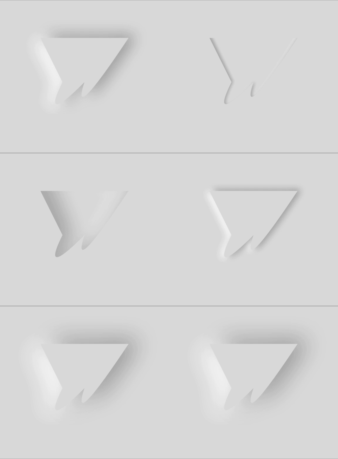
🎨 Custom Shape

custom_shape

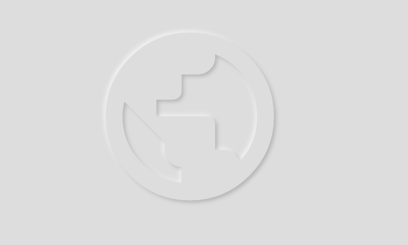
Flutter Neumorphic supports custom shapes, just provide a path to

class MyShapePathProvider extends NeumorphicPathProvider {
  @override
  bool shouldReclip(NeumorphicPathProvider oldClipper) {
    return true;
  }

  @override
  Path getPath(Size size) {
    return Path()
      ..moveTo(0, 0)
      ..lineTo(size.width/2, 0)
      ..lineTo(size.width, size.height/2)
      ..lineTo(size.width/2, size.height/2)
      ..lineTo(size.width, size.height)
      ..lineTo(0, size.height)
      ..close();
  }
}

And use NeumorphicBoxShape.path

Neumorphic(
  style: NeumorphicStyle(
     boxShape: NeumorphicBoxShape.path(MyShapePathProvider()),
  ),
  ...
),

You can import the Flutter logo as a custom shape using

Neumorphic(
  style: NeumorphicStyle(
    shape: NeumorphicBoxShape.path(NeumorphicFlutterLogoPathProvider()),
  ),
  ...
),

🔲 Accessibility / Border

For design purposes, or simply to enhance accessibility, you can add a border on Neumorphic widgets

Neumorphic

Neumorphic(
      style: NeumorphicStyle(
        border: NeumorphicBorder(
          color: Color(0x33000000),
          width: 0.8,
        )
      ),
      ...
)

You can enable/disable it (eg: listening an Accessibility Provider) with isEnabled

border: NeumorphicBorder(
    isEnabled: true,
    color: Color(0x33000000),
    width: 0.8,
)

Note that borderColor and borderWidth default values has been added to NeumorphicThemeData

🎨 Neumorphic Theme

neumorphic_theme neumorphic_theme

NeumorphicTheme(
    themeMode: ThemeMode.light, //or dark / system
    darkTheme: NeumorphicThemeData(
        baseColor: Color(0xff333333),
        accentColor: Colors.green,
        lightSource: LightSource.topLeft,
        depth: 4,
        intensity: 0.3,
    ),
    theme: NeumorphicThemeData(
        baseColor: Color(0xffDDDDDD),
        accentColor: Colors.cyan,
        lightSource: LightSource.topLeft,
        depth: 6,
        intensity: 0.5,
    ),
    child: ...
)

To retrieve the current used theme :

final theme = NeumorphicTheme.currentTheme(context);
final baseColor = theme.baseColor;
final accentColor = theme.accentColor;
...

Toggle from light to dark

NeumorphicTheme.of(context).themeMode = ThemeMode.dark;

Know if using dark

if(NeumorphicTheme.of(context).isUsingDark){
  
}

NeumorphicApp

You can use direcly in your project a NeumorphicApp, surrounding your code

It handle directly NeumorphicTheme & Navigation (and all possibilities of MaterialApp )

void main() => runApp(MyApp());

class MyApp extends StatelessWidget {
  // This widget is the root of your application.
  @override
  Widget build(BuildContext context) {
    return NeumorphicApp(
      debugShowCheckedModeBanner: false,
      title: 'Neumorphic App',
      themeMode: ThemeMode.light,
      theme: NeumorphicThemeData(
        baseColor: Color(0xFFFFFFFF),
        lightSource: LightSource.topLeft,
        depth: 10,
      ),
      darkTheme: NeumorphicThemeData(
        baseColor: Color(0xFF3E3E3E),
        lightSource: LightSource.topLeft,
        depth: 6,
      ),
      home: MyHomePage(),
    );
  }
}

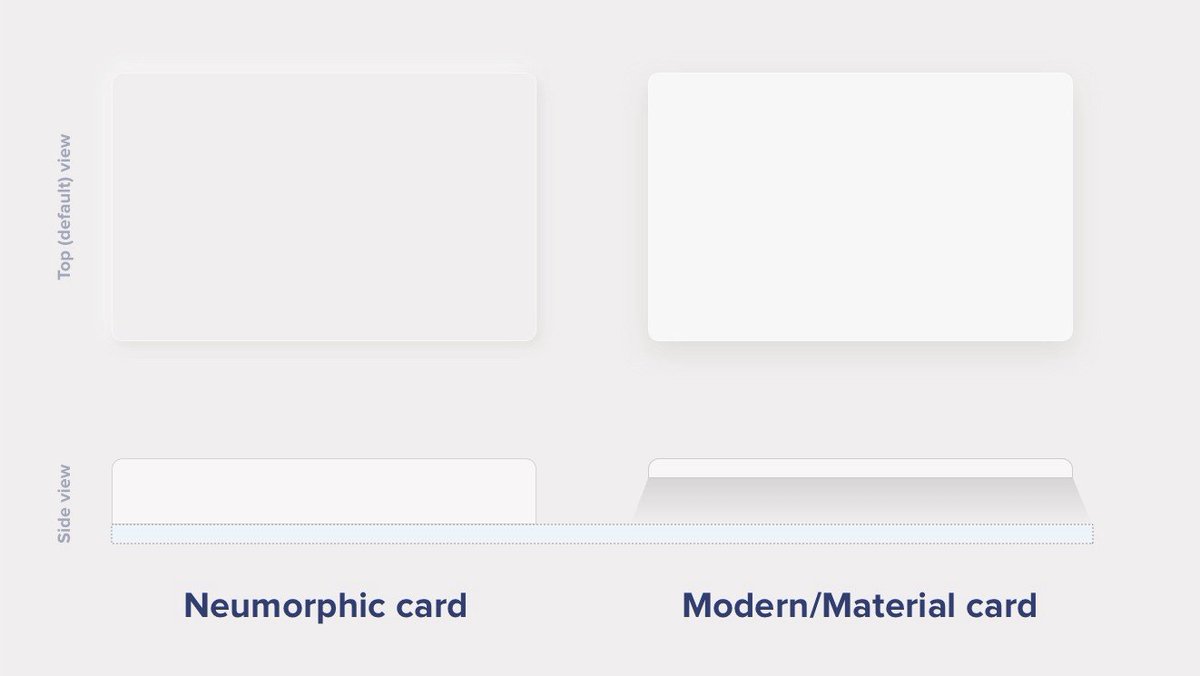
What's neumorphic

neumorphic

Material Cards

A Modern / Material (upgraded) card usually is a surface floating on top of our perceived background and casting a shadow onto it. The shadow both gives it depth and also in many cases defines the shape itself — as it’s quite often borderless.

Neumorphic cards

Neumorphic card however pretends to extrude from the background. It’s a raised shape made from the exact same material as the background. When we look at it from the side we see that it doesn’t “float”.

neumorphic_button

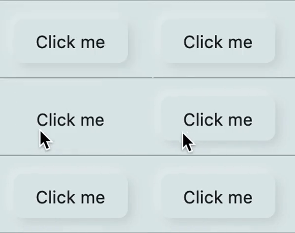
Here's a Nereumorphic Button tap (slowed x2) from the sample app, you can see how the element seems to change its depth to its surface.

👥 Contributors

Contributors
florent Florent Champigny
olivier Olivier Bonvila
gyl Gyl Jean Lambert
jaumard Jimmy Aumard
Overman775 Overman775
schopy schopy

📄 License

Flutter-Neumorphic is released under the Apache2 license. See LICENSE for details.

If you use the open-source library in your project, please make sure to credit and backlink to www.idean.com

bottom_banner

카테고리

소스 저장소

이 패키지를 사용하는 프로젝트