패키지, 저장소 및 앱 카테고리 검색

flutter_pin_code_fields 표지
패키지 상세v2.2.0

flutter_pin_code_fields

사용자 정의 가능한 핀 코드 필드를 생성하는 데 도움이 되는 플러터 패키지입니다. 로그인 핀 또는 OTP에 사용할 수 있습니다.

AndroidiOSWebmacOSWindowsLinux
30일 다운로드
2.5천
좋아요
28
Pub 점수
150

패키지 설치

flutter pub add flutter_pin_code_fields

패키지 개요

공개 정보를 바탕으로 생성한 선택 가이드입니다.

로그인 PIN 또는 OTP 입력에 적합한 사용자 정의 가능한 Flutter 패키지입니다. 다양한 스타일 옵션과 입력 검증을 지원하는 깔끔하고 재사용 가능한 인터페이스를 제공합니다. Android, iOS, Web, macOS, Windows, Linux 등 모든 주요 플랫폼에서 호환됩니다. 간단함과 유연성을 고려하여 설계되어 개발자가 앱에 안전하고 사용자 친화적인 PIN 입력 경험을 쉽게 통합할 수 있도록 합니다.

사용 사례

  • OTP 인증 흐름
  • PIN으로 사용자 로그인
  • 보안 인증 인터페이스
  • 숫자 코드가 필요한 폼 입력
  • 다단계 온보딩 프로세스

주요 기능

  • 사용자 정의 가능한 필드 표시
  • 다양한 입력 유형 지원
  • 내장 검증
  • 크로스 플랫폼 호환성
  • 폼 컨트롤러와의 간편한 통합
  • 모든 기기용 반응형 디자인

적합한 대상

  • 인증 기능을 구축하는 개발자
  • 보안 PIN 입력이 필요한 앱
  • OTP 입력 필드가 필요한 프로젝트
  • 숫자 입력을 포함한 UI 중심 폼
  • 일관된 UX를 갖춘 모바일 및 웹 애플리케이션

고려 사항

  • 제출 로직을 수동으로 처리해야 합니다
  • 제한된 내장 오류 피드백
  • 생체 인식 백업에 대한 내장 지원 없음
  • 복잡한 테마를 위해 추가 스타일링이 필요할 수 있습니다
  • 6~8자 이상의 매우 긴 PIN에 최적화되지 않음

원본 README

연결된 소스 저장소의 README 원문 스냅샷입니다. 최신 내용은 저장소에서 확인하세요.

Flutter Pin Code Fields

GitHub workflow status Version GitHub license

A Flutter package to generate customizable pin code fields.

⭐️ to show support!

Features

  • Highly customizable
  • Responsive
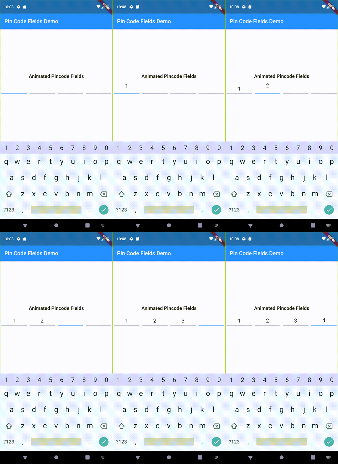
  • Supports animations
  • Supports autofocus
  • Supports autofill
  • Supports obscuring text with custom character

Usage

Add flutter_pin_code_fields as a dependency in your pubspec.yaml file.

# pubspec.yaml

dependencies:
  flutter_pin_code_fields: <latest_version>
import import 'package:flutter_pin_code_fields/flutter_pin_code_fields.dart';

class MyApp extends StatelessWidget {
  @override
  Widget build(BuildContext context) {
    return PinCodeFields(
      onComplete(text) => print(text);
    );
  }
}

Examples

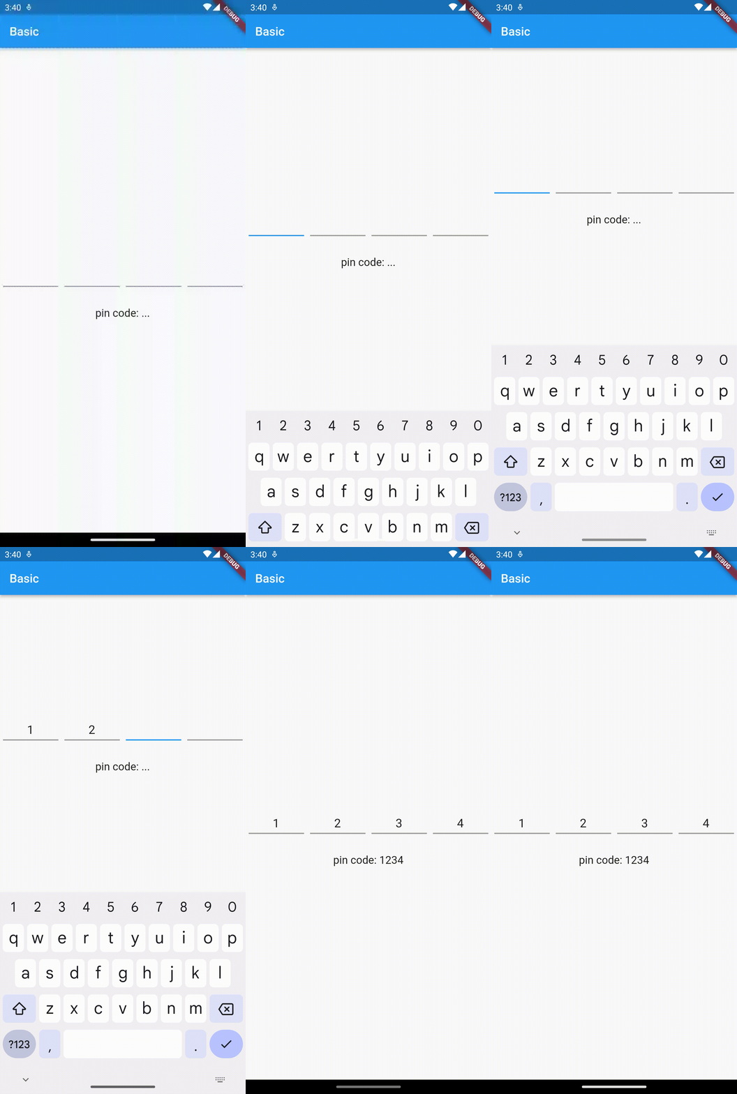
Basic

Complete example at example/lib/basic.dart.

Example - Basic
PinCodeFields(
  onComplete(text) => print(text),
)

Obscuring text

Complete example at example/lib/obscuring_text.dart.

Example - Obscuring text
PinCodeFields(
  length: 6,
  obscureText: true,
  obscureCharacter: "🔴",
  onComplete(text) => print(text),
)

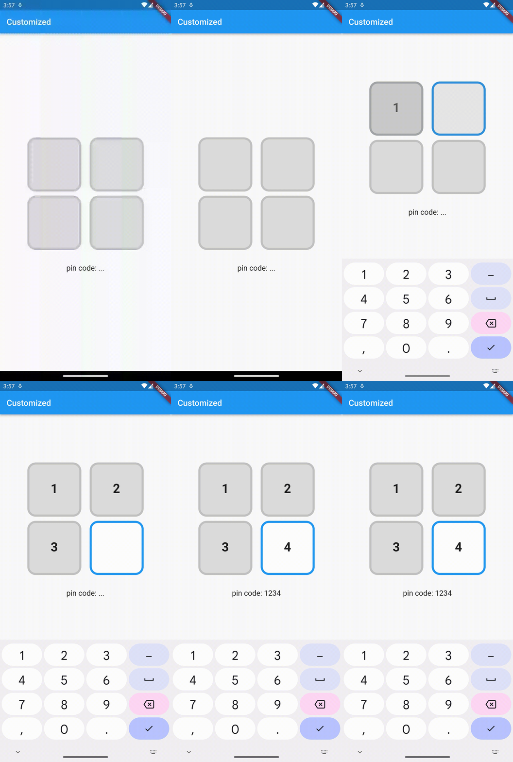
Customized

Complete example at example/lib/customized.dart.

Example - Customized
PinCodeFields(
  length: 4,
  fieldBorderStyle: FieldBorderStyle.square,
  responsive: false,
  fieldHeight: 130.0,
  fieldWidth: 130.0,
  borderWidth: 5.0,
  activeBorderColor: Colors.blue,
  activeBackgroundColor: Colors.white,
  borderRadius: BorderRadius.circular(20.0),
  keyboardType: TextInputType.number,
  inputFormatters: [FilteringTextInputFormatter.digitsOnly],
  autoHideKeyboard: false,
  fieldBackgroundColor: Colors.black12,
  borderColor: Colors.black12,
  textStyle: TextStyle(
    fontSize: 30.0,
    fontWeight: FontWeight.bold,
  ),
  onComplete(text) => print(text),
)

Animated

Complete example at example/lib/animated.dart.

Example - Animated
PinCodeFields(
  obscureText: true,
  obscureCharacter: "❌",
  animation: Animations.rotateRight,
  animationDuration: Duration(milliseconds: 250),
  animationCurve: Curves.bounceInOut,
  switchInAnimationCurve: Curves.bounceIn,
  switchOutAnimationCurve: Curves.bounceOut,
)

Properties

Name Type Default Description
length int 4 Total number of pin code fields.
margin EdgeInsets EdgeInsets.all(5.0) Margin between the fields.
padding EdgeInsets EdgeInsets.only(bottom: 5.0) Padding within the field.
fieldHeight double Height of the field.
fieldWidth double Width of the field.
borderWidth double 2.0 Width of the border of the field.
borderRadius BorderRadius Border raduis of the field.
borderColor Color Colors.grey Border color of the field.
activeBorderColor Color Colors.blue Border color of the active field.
fieldBorderStyle FieldBorderStyle FieldBorderStyle.bottom Border styles of the field.
fieldBackgroundColor Color Colors.transparent Background color of the fields.
activeBackgroundColor Color Colors.transparent Background color of the active field.
enabled bool true Enable/ disable editing the fields.
responsive bool true Adjust the size of the fields automatically to the available space.
autofocus bool false Enable/ disabled autofocus.
textStyle TextStyle Text style for the fields.
obscureText bool false Enable/ disable obscuring the text in the fields.
obscureCharacter String * Character to obscure the text in the fields.
keyboardType TextInputType TextInputType.visiblePassword Keyboard type.
inputFormatters List<TextInputFormatter> Input formatters for the fields.
autoHideKeyboard bool true Hides the keyboard automatically on complete.
animation Animations Animations.fade Animation for the fields.
animationDuration Duration Duration(milliseconds: 150) Duration of the animation.
animationCurve Curve Curves.easeInOut Animation curve.
switchInAnimationCurve Curve Curves.easeIn Switch in animation curve.
switchOutAnimationCurve Curve Curves.easeOut Switch out animation curve.
controller TextEditingController Text editing controller for the fields.
focusNode FocusNode Focus node for the fields.
onChange ValueChanged<String> Callback that returns text on input.
onComplete [required] ValueChanged<String> Callback that returns text on filling all the fields.

카테고리

소스 저장소

이 패키지를 사용하는 프로젝트