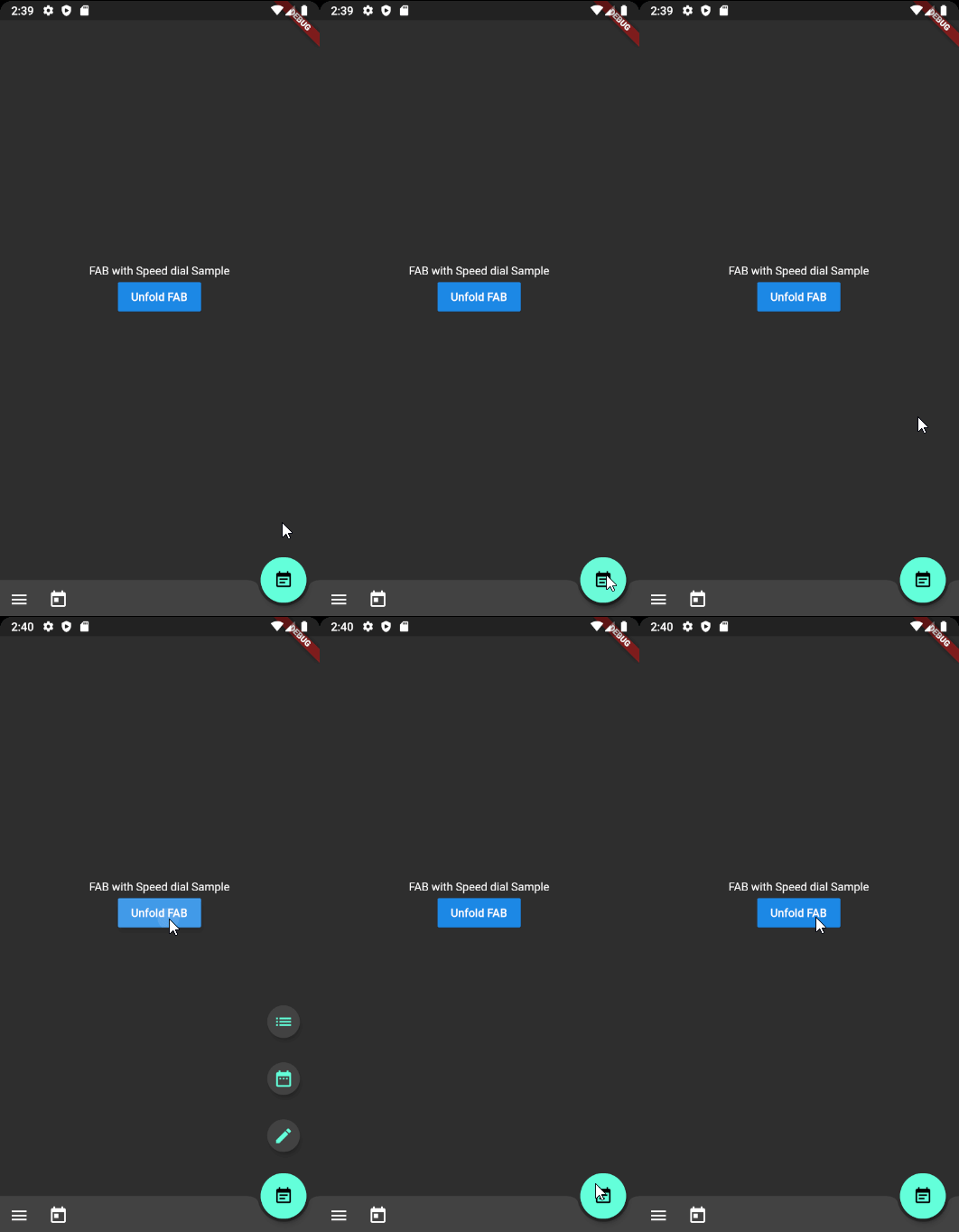
Material Design 스피드 다이얼을 구현하는 플러터 플러그인으로, 확장 가능한 메뉴 옵션을 가진 플로팅 액션 버튼입니다. 전환과 상호작용에 대해 Material Design 지침을 따르며, 단일 FAB를 통해 여러 작업에 접근할 수 있도록 합니다. 사용자 정의 가능한 아이콘, 레이블 및 애니메이션 스타일을 지원하여 모바일 앱의 사용자 인터페이스 효율성을 향상시키기에 적합합니다. 최소한의 설정으로 기존 플러터 프로젝트에 원활하게 통합됩니다.
사용 사례
모바일 앱에 빠른 액세스 작업 메뉴 추가하기
작업 중심 인터페이스 내 탐색 개선
Material Design 기준을 통해 UI 일관성 향상
작지만 기능이 풍부한 플로팅 버튼 만들기
깔끔한 레이아웃에서 보조 작업에 대한 접근을 단순화
주요 기능
Material Design 준수 애니메이션
사용자 정의 가능한 메뉴 항목 및 아이콘
레이블 및 툴팁 지원
기존 Flutter 위젯과의 간편한 통합
사용자 정의 가능한 전개 방향 및 속도
적합한 대상
Material Design 앱을 개발하는 개발자
빠른 작업 액세스가 필요한 사용자 인터페이스 중심 응용 프로그램
정교하고 현대적인 인터페이스를 목표로 하는 프로젝트
재사용 가능한 FAB 컴포넌트를 찾는 모바일 앱 개발자
Google의 디자인 가이드라인을 따르는 팀
고려 사항
제한된 플랫폼별 사용자 지정
비 Material 테마에 대한 추가 스타일링이 필요할 수 있습니다
매우 큰 메뉴 세트에 최적화되지 않음
구형 기기에서는 애니메이션 성능이 다를 수 있습니다
키보드 탐색에 대한 내장 지원 없음
원본 README
연결된 소스 저장소의 README 원문 스냅샷입니다. 최신 내용은 저장소에서 확인하세요.
Flutter Speed dial of Material Design style
Flutter package which applies Material design Speed dial
Preview
There are several packages that provide fancy speed dial.
However, as most of those do not work properly on docked FAB using notch, I referenced Andrea Bizzoto and Matt Carroll's idea/code specified here to make it work fine with notch as well.
Truly appreciate to Andrea and Matt for sharing such an awesome idea and codes.
Usage
Basic usage
Widgetbuild(BuildContext context) {
returnScaffold(
body: SafeArea(child: _buildBody()),
floatingActionButton: _buildFloatingActionButton(),
floatingActionButtonLocation: FloatingActionButtonLocation.endDocked,
bottomNavigationBar: _buildBottomBar(),
);
}
Widget_buildFloatingActionButton() {
final icons = [
SpeedDialAction(child: Icon(Icons.mode_edit)),
SpeedDialAction(child: Icon(Icons.date_range)),
SpeedDialAction(child: Icon(Icons.list)),
];
returnSpeedDialFloatingActionButton(
actions: icons,
// Make sure one of child widget has Key value to have fade transition if widgets are same type.
childOnFold: Icon(Icons.event_note, Key: UniqueKey()),
childOnUnfold: Icon(Icons.add),
useRotateAnimation: true,
onAction: _onSpeedDialAction,
);
}
_onSpeedDialAction(int selectedActionIndex) {
print('$selectedActionIndex Selected');
}
Using controller
SpeedDialController _controller = SpeedDialController();

SpeedDialFloatingActionButton(
      controller: _controller,
      ...
    );

// Use anywhere to mannually unfold
_controller.unfold();
Fade Transition animation between child widgets
In order to apply fade transition between [childOnFold] and [childOnUnfold], make sure one of those has Key field. (eg. ValueKey(value) or UniqueKey()).
As we using AnimatedSwitcher for transition animation, no key with same type of child will perform no animation. It is AnimatedSwitcher's behaviour.
TO-DOs
[ ] Ability to display/hide speed dial when it is needed. (ex. hiding on scroll)
[X] Unfold function to force close the dial
[ ] Providing option for modal background with color parameter
[X] Text labels on each action widgets (Thanks to @CarlosHJuniior)
Contributing
Any pull requests for implementing To-Do functions are always welcome!
If the package was useful or saved your time, please do not hesitate to buy me a cup of coffee! ;)
The more caffeine I get, the more useful projects I can make in the future.