패키지, 저장소 및 앱 카테고리 검색

glossy 표지
패키지 상세v0.0.5

glossy

Glossy: 현대적인 앱 디자인과 세련된 사용자 인터페이스에 적합한 슬림한 글래스모픽 UI 효과를 만들기 위한 Flutter 패키지입니다.

AndroidiOSWebmacOSWindowsLinux
30일 다운로드
2.8천
좋아요
115
Pub 점수
140

패키지 설치

flutter pub add glossy

패키지 개요

공개 정보를 바탕으로 생성한 선택 가이드입니다.

Glossy는 개발자가 세련된 글래스모픽 UI 효과를 쉽게 구현할 수 있도록 해주는 Flutter 패키지입니다. 현대적인 앱 디자인에 적합한 사용자 정의 가능한 반투명하고 서리 낀 유리 같은 컴포넌트를 제공합니다. Android, iOS, Web, macOS, Windows, Linux 등 모든 주요 플랫폼을 지원하며 깊이감과 시각적 매력으로 사용자 인터페이스를 향상시킵니다. 가볍고 간단한 pub add 명령어로 기존 Flutter 프로젝트에 원활하게 통합됩니다. 세련된 오버레이, 카드, 부유하는 요소를 현대적인 미학으로 만들기에 완벽합니다.

사용 사례

  • 현대적인 앱 인터페이스 만들기
  • 부유형 UI 카드 디자인
  • 프로스트 글라스 오버레이 구현
  • 투명도를 활용한 앱 미적 요소 향상
  • 세련된 탐색 막대 만들기
  • UI 구성 요소에 깊이 추가하기

주요 기능

  • pub를 통한 간편한 통합
  • 크로스 플랫폼 호환성
  • 사용자 정의 가능한 블러 및 투명도
  • 그림자와 테두리를 지원합니다
  • 경량이고 성능이 뛰어남
  • 사전 정의된 글래스모픽 위젯

적합한 대상

  • 현대적인 외관을 원하는 UI 디자이너
  • 스타일리시한 앱을 개발하는 개발자
  • 반투명 효과가 필요한 프로젝트
  • Flutter 초보자가 고급 UI 탐색 중
  • 프리미엄 사용자 경험을 목표로 하는 앱

고려 사항

  • 저사양 기기에서의 성능 영향
  • 블러와 색상 외에 맞춤 설정이 제한적입니다
  • 다른 화면 밀도에서 테스트가 필요할 수 있습니다
  • 고대비 접근성 요구 사항에 적합하지 않습니다
  • 섬세한 디자인 요소와 함께 사용하는 것이 가장 좋습니다

원본 README

연결된 소스 저장소의 README 원문 스냅샷입니다. 최신 내용은 저장소에서 확인하세요.

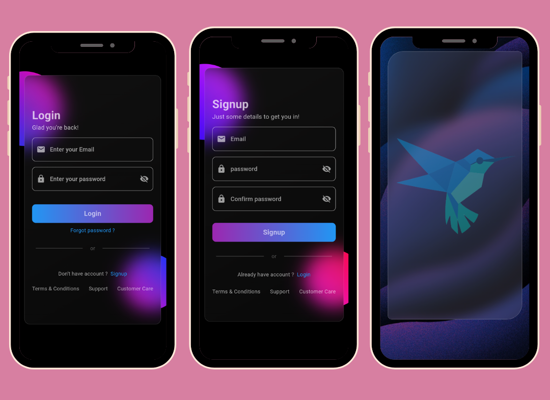
Screenshots

App Screenshot

Overview

This Flutter package allows you to easily create glass morphism effects in your Flutter applications. Glass morphism is a design trend that involves using blurred, semi-transparent elements to create a frosted glass-like effect.

Installation

To use this package, add glossy as a dependency in your pubspec.yaml file:

dependencies:
  flutter:
    sdk: flutter
  glossy: ^0.0.5

OR

Open your termilar in the project level and run this command.

flutter pub add glossy

Usage

You can use the GlossyContainer widget provided by this package to create glass morphism effects. Here's a basic example:

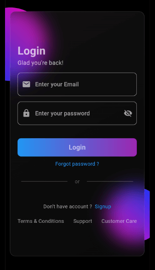
import 'package:flutter/material.dart';
import 'package:glossy/glossy.dart';

void main() {
  runApp(const MyApp());
}

class MyApp extends StatelessWidget {
  const MyApp({super.key});

  @override
  Widget build(BuildContext context) {
    return MaterialApp(
      home: Scaffold(
        backgroundColor: Colors.black,
        appBar: AppBar(
          title: const Text('Glass Morphism Example'),
        ),
        body: Center(
          child: SizedBox(
            width: 300,
            height: 300,
            child: Stack(
              children: [
                Container(
                  height: 140,
                  width: 140,
                  decoration: (BoxDecoration(
                      color: Colors.purple,
                      borderRadius: BorderRadius.circular(70))),
                ),
                Align(
                  alignment: Alignment.bottomRight,
                  child: Container(
                    height: 140,
                    width: 140,
                    decoration: (BoxDecoration(
                        color: Colors.purple,
                        borderRadius: BorderRadius.circular(70))),
                  ),
                ),
                Align(
                  alignment: Alignment.center,
                  child: GlossyContainer(
                    width: 200,
                    height: 200,
                    borderRadius: BorderRadius.circular(12),
                    child: const Center(
                      child: Text(
                        'Glass Morphism',
                        style: TextStyle(
                          fontSize: 20,
                          fontWeight: FontWeight.bold,
                          color: Colors.white,
                        ),
                      ),
                    ),
                  ),
                ),
              ],
            ),
          ),
        ),
      ),
    );
  }
}

Parameters

  • width: The width of the container required.
  • height: The height of the container required.
  • borderRadius: The border radius of the container.
  • blur: The amount of blur to apply to the container.
  • child: The widget placed inside the glass container.
  • color: Background color of the container.
  • opacity: Opacity of the container.
  • strengthX: Strength of blur in the horizontal direction.
  • strengthY: Strength of blur in the vertical direction.
  • border: Border of the container.
  • blendMode: Blend mode for applying filter.
  • gradient: Gradient of the container.
  • boxShadow: Box shadows for the container.
  • image: Background image of the container.
  • imageOpacity: Opacity of the background image.

Support

If you find this project helpful and would like to support its development, you can connect with me on social media:

Your support and feedback are greatly appreciated and will help in further improving this project.

카테고리

소스 저장소

이 패키지를 사용하는 프로젝트