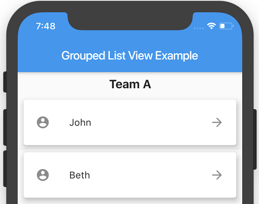
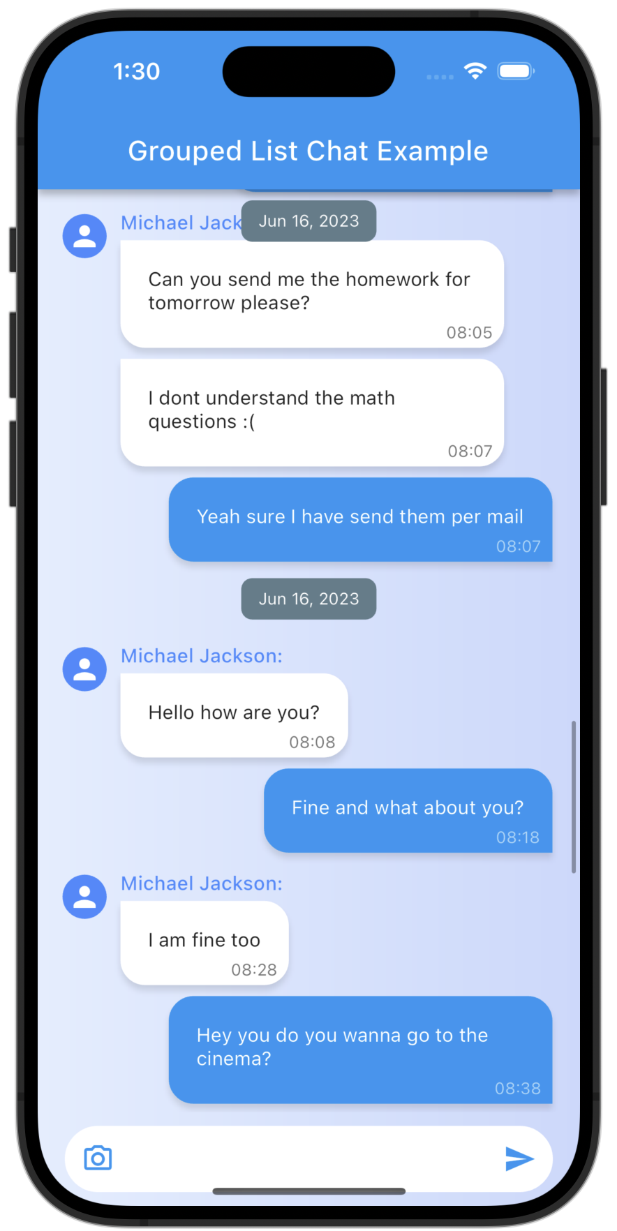
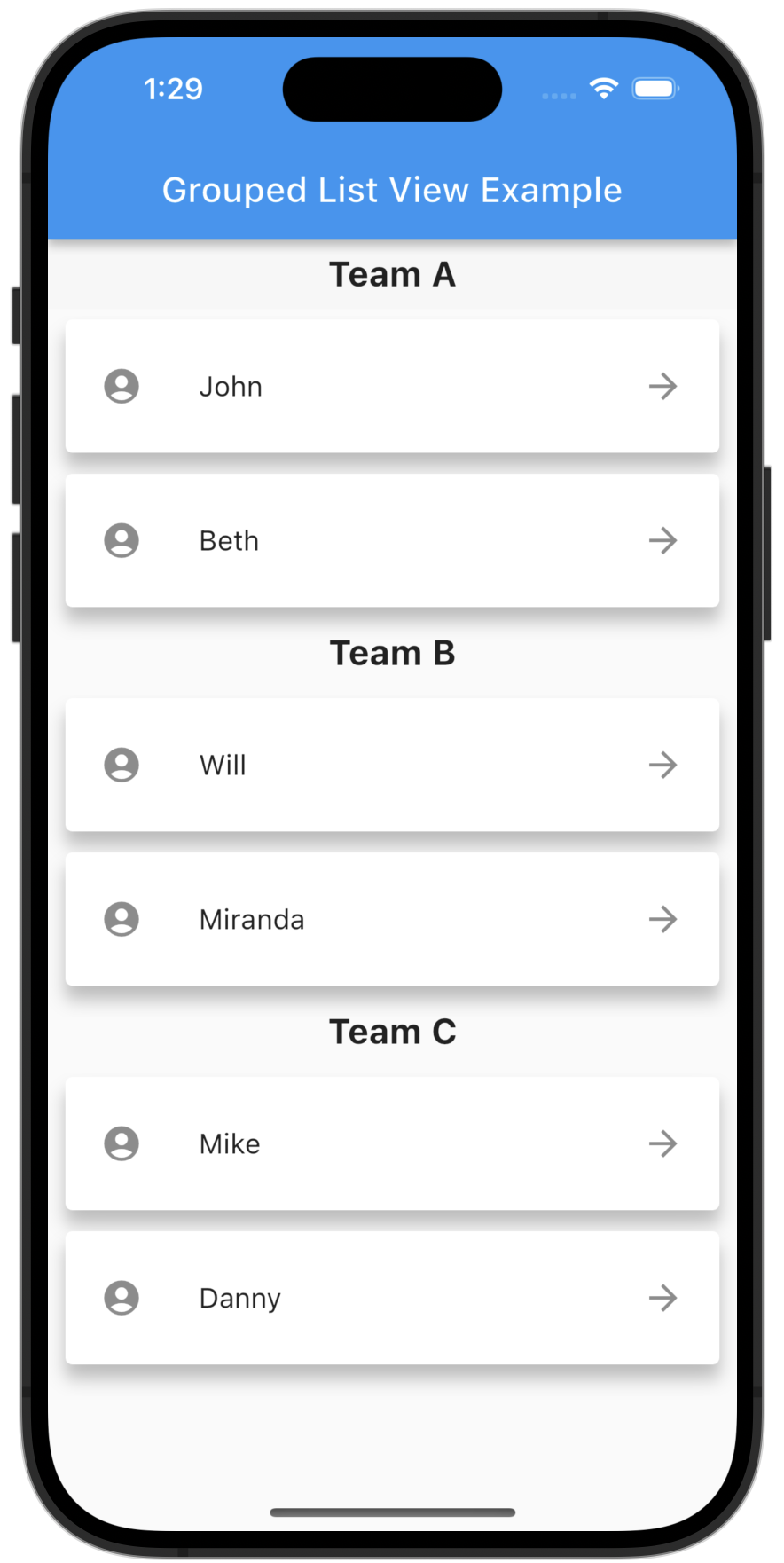
항목을 접을 수 있는 또는 접을 수 없는 섹션으로 정리할 수 있는 ListView를 생성할 수 있는 플러터 패키지입니다. 개발자가 그룹 헤더를 정의하고 아이템 그룹화 로직을 효율적으로 관리할 수 있도록 하여 그룹화된 데이터 표시를 간소화합니다. 연락처, 캘린더, 분류된 콘텐츠와 같은 목록에 적합하며, 사용자 지정 스타일링과 동적 업데이트를 지원합니다. 이 패키지는 가볍고 모든 주요 플랫폼에서 기존 플러터 앱과 원활하게 통합됩니다.
사용 사례
분류된 연락처 표시
시간 기반 이벤트 목록 표시
접을 수 있는 제품 카테고리 만들기
날짜별로 사용자 생성 콘텐츠 정리하기
구조화된 탐색 메뉴 만들기
주요 기능
섹션 헤더를 지원합니다
접을 수 있는 그룹을 허용합니다
사용자 정의 가능한 그룹 및 항목 빌더
효율적인 목록 렌더링
크로스 플랫폼 호환성
동적 데이터 업데이트
적합한 대상
구조화된 목록을 구축하는 개발자
그룹화된 데이터 표시가 필요한 앱
접을 수 있는 섹션을 필요로 하는 프로젝트
계층적 콘텐츠를 가진 UI
다중 플랫폼 앱을 위한 Flutter 사용 팀
고려 사항
그룹 데이터 구조를 수동으로 처리해야 함
제한된 내장 정렬 옵션
복잡한 그룹화를 위해 추가 로직이 필요할 수 있습니다
페이지네이션 없이 초대규모 데이터 세트에 최적화되지 않음
헤더 사용자 정의는 위젯 조합에 대한 이해가 필요합니다
원본 README
연결된 소스 저장소의 README 원문 스냅샷입니다. 최신 내용은 저장소에서 확인하세요.
Grouped list package for Flutter.
A flutter ListView in which list items can be grouped to sections.
Features
Sound null safety support!
Easy creation of chat dialog.
List Items can be separated in groups.
For the groups an individual header can be set.
Almost all fields from ListView.builder available.
Getting Started
Add the package to your pubspec.yaml:
grouped_list:^6.0.0
In your dart file, import the library:
import'package:grouped_list/grouped_list.dart';
Instead of using a ListView create a GroupedListView Widget:
Function which returns an Widget which defines the item. * indexedItemBuilder provides the current index as well. * interdependentItemBuilder provides the previous and next items as well. * groupItemBuilder provides information if the item is the first or last element inside a group. indexedItemBuilder is preferred over interdependentItemBuilder and interdependentItemBuilder is preferred overitemBuilder.
yes, either of them
-
groupSeparatorBuilder / groupHeaderBuilder
Function which returns a Widget which defines the group headers. While groupSeparatorBuilder gets the groupBy-value as parameter groupHeaderBuilder gets the whole element. If both are defined groupHeaderBuilder is preferred
yes, either of them
-
groupStickyHeaderBuilder
Function which returns a Widget which defines the sticky group header, when useStickyGroupSeparators is true. If not defined groupSeparatorBuilder or groupHeaderBuilder will be used as described above.
no
-
useStickyGroupSeparators
When set to true the group header of the current visible group will stick on top
no
false
floatingHeader
Whether the sticky group header float over the list or occupy it's own space
no
false
stickyHeaderBackgroundColor
Defines the background color of the sticky header. Will only be used if useStickyGroupSeparators is used
no
Color(0xffF7F7F7)
separator
A Widget which defines a separator between items inside a group
no
no separator
groupComparator
Can be used to define a custom sorting for the groups. Otherwise the natural sorting order is used
no
-
itemComparator
Can be used to define a custom sorting for the elements inside each group. Otherwise the natural sorting order is used
no
-
order
Change to GroupedListOrder.DESC to reverse the group sorting
no
GroupedListOrder.ASC
footer
Widget at the bottom of the list
no
-
Also the fields from ListView.builder can be used.
Highlight - SilverGroupedList
Now supporting a grouped list based on a silver list. Just use SilverGroupedListView instead of GroupedListView. An example can be found under example/lib/example_silver.
Note that some options of the GroupedListView are currently not available in SilverGroupedListView.
Highlight - Chat Dialog
Easy creation of chat dialogs.
Just set the option reverse to true and order to GroupedListOrder.DESC. A full example can be found in the examples.
The list will be scrolled to the end in the initial state and therefore scrolling will be against redeaing direction.
My other packages :
For easy creation of chat-like dialogs:
Check out my other package StickyGroupedList, which is based on the scrollable_positioned_list.