연결된 소스 저장소의 README 원문 스냅샷입니다. 최신 내용은 저장소에서 확인하세요.
horizontal_data_table


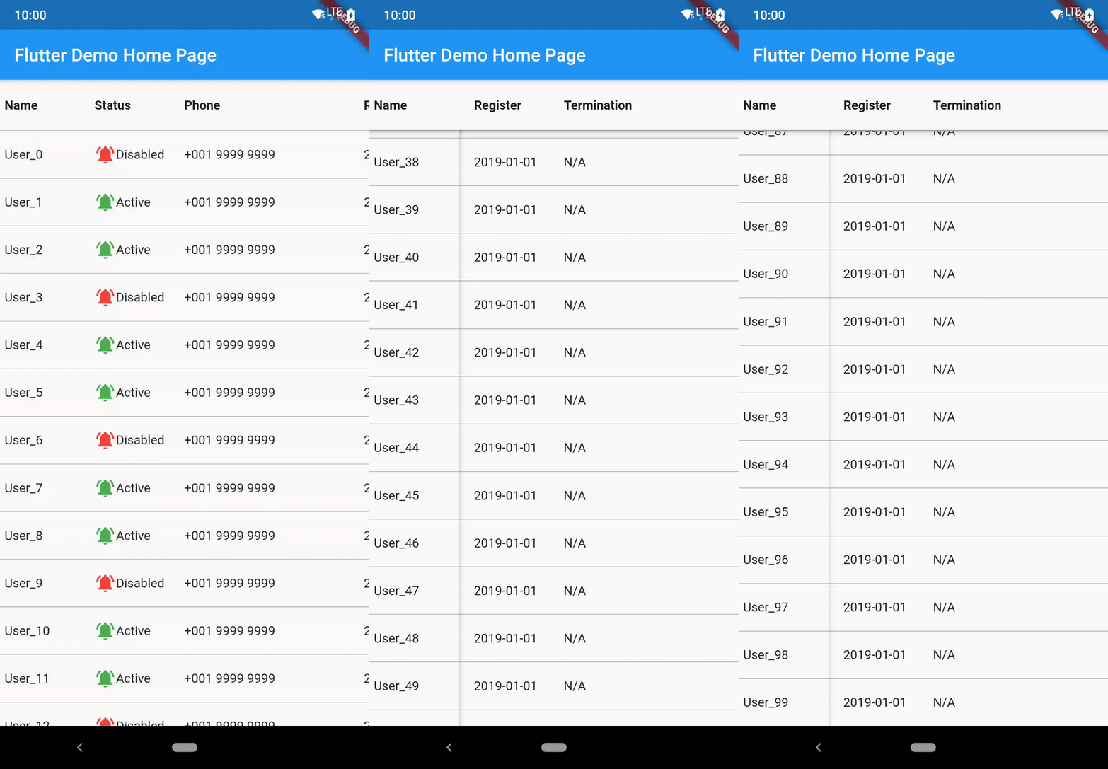
A Flutter Widget that create a horizontal table with fixed first column.
Installation
The following is the guide for installation with different dart sdk and flutter version.
| minium dart sdk |
flutter version (stable) |
package version |
| <2.12.0 |
<2.0.1 |
2.5.1 |
| <2.12.0 |
=2.0.1 |
2.5.2 |
| >=2.12.0 (enabled null-safety) |
>=2.0.1 && <3.0.0 |
3.6.2+1 |
| >=2.12.0 |
>=3.0.0 && <3.3.0 |
4.1.1+3 |
| >=2.12.0 && < 2.18.0 |
>=3.3.0 && <3.7.0 |
4.1.4 |
| >=2.18.0 && <2.19.0 |
>=3.7.0 |
4.2.0 |
| >=2.19.0 |
>=3.7.0 |
latest |
Run this command to install latest:
flutter pub add horizontal_data_table
Breaking Change Upgrading to 4.xx
- horizontalScrollController and verticalScrollController is removed. Please use onScrollControllerReady to get the returned ScrollController.
  onScrollControllerReady: (vertical, horizontal) {
    _verticalScrollController = vertical;
    _horizontalScrollController = horizontal;
  },
Usage
This shows Widget's full customizations:
HorizontalDataTable(
{
required double leftHandSideColumnWidth,
required double rightHandSideColumnWidth,
this.tableHeight,
this.isFixedHeader = false,
this.headerWidgets,
this.isFixedFooter = false,
this.footerWidgets,
IndexedWidgetBuilder? leftSideItemBuilder,
IndexedWidgetBuilder? rightSideItemBuilder,
this.itemCount = 0,
List<Widget>? leftSideChildren,
List<Widget>? rightSideChildren,
this.rowSeparatorWidget = const Divider(
color: Colors.transparent,
height: 0.0,
thickness: 0.0,
),
this.elevation = 3.0,
this.elevationColor = Colors.black54,
Color leftHandSideColBackgroundColor = Colors.white,
Color rightHandSideColBackgroundColor = Colors.white,
this.onScrollControllerReady,
this.verticalScrollbarStyle,
this.horizontalScrollbarStyle,
this.enablePullToRefresh = false,
this.refreshIndicatorHeight = 60.0,
this.htdRefreshController,
this.onRefresh,
this.refreshIndicator,
this.fixedSidePlaceHolderRefreshIndicator,
this.enablePullToLoadNewData = false,
this.onLoad,
this.loadIndicator,
this.fixedSidePlaceHolderLoadIndicator,
this.scrollPhysics,
this.horizontalScrollPhysics,
this.itemExtent,
this.leftIntrusion = true,
this.topIntrusion = true,
this.rightIntrusion = true,
this.bottomIntrusion = true,
}
)
HorizontalDataTable.rtl({...same as the above})
- Fixed side column(ltr: leftHandSideColumnWidth, rtl: rightHandSideColumnWidth) and horizontal scollable side maximum scrollable area width(ltr: rightHandSideColumnWidth, rtl: leftHandSideColumnWidth) are required to input.
- tableHeight is for manually set the table widget's height. The table widget height is using the smaller value of tableHeight and available height. Default is set to null, which is equal to using available height.
- isFixedHeader is to define whether use fixed top row header. If true, headerWidgets is required. Default is false.
- isFixedFooter is to define whether use fixed bottom row footer. If true, footerWidgets is required. Default is false.
- This widget allow set children in two ways,
a. Directly add list of child widget (leftSideChildren and rightSideChildren)
b. (Recommended) Using index builder to assign each row's widget. itemCount is required to count the number of row.
- rowSeparatorWidget is to add Divider of each Row. Default is turned off.
- elevation is the shadow between the header row and the left column when scroll start. Default set to 5.0. If want to disable the shadow, please set to 0.0.
- elevationColor is for changing shadow color. This should be useful when using dark table background.
- added leftHandSideColBackgroundColor and rightHandSideColBackgroundColor for setting the default background of the back of table. Default is set to white following the Material widget.
- added horizontalScrollController and verticalScrollController allow maunally jump to certain offset position. added onScrollControllerReady returning vertical and horizontal ScrollController for external use. Please aware that if you have enabled the pull to refresh function, the jump to action may conflict with the pull to refresh action.
- verticalScrollbarStyle and horizontalScrollbarStyle are a ScrollbarStyle class object which allows customizing isAlwaysShown, thumbColor, thickness and radius. Default is using system style scrollbar.
- enablePullToRefresh is to define whether enable the pull-to-refresh function. Default is setting to false. Detail you may reference to the Pull to Refresh/Load section.
- enablePullToLoadNewData is to define whether enable the pull-to-load function. Default is setting to false. Detail you may reference to the Pull to Refresh/Load section.
- scrollPhysics and horizontalScrollPhysics are to set scroll physics of the data table. Please aware scrollPhysics may causing conflict when enabling pull-to-refresh feature.
- itemExtent is ListView's itemExtent. To fix the child extent in order to enhance the performance.
- leftIntrusion, topIntrusion, rightIntrusion, bottomIntrusion are for SafeArea Intrusion. Default following flutter's default setting, which is all true.
Pull to Refresh/Load
The pull to refresh action is impletemented based on the 'pull-to-refresh' package code. Currently only part of the function is available.
HorizontalDataTable(
      {
        ...
      this.enablePullToRefresh = true,
      this.refreshIndicator: const WaterDropHeader(),
      this.fixedSidePlaceHolderRefreshIndicator,
      this.onRefresh: _onRefresh,
      this.enablePullToLoadNewData = true,
      this.onLoad: _onLoad,
      this.loadIndicator: const ClassicFooter(),
      this.fixedSidePlaceHolderLoadIndicator,
      this.htdRefreshController: _hdtRefreshController,
      }
     )
-
refreshIndicator is the header widget when pull to refresh.
Supported refreshIndicator:
- ClassicHeader
- WaterDropHeader
- CustomHeader
- BezierHeader
- PlaceholderHeader
Basically single level header with a certain height while refreshing. For the on-top header is currently not supported.
Since refreshIndicator is a Widget type field, you may customize yourself on the header, but you must set the height of the header. The detail usage you may reference to the pull-to-refresh package.
-
fixedSidePlaceHolderRefreshIndicator is the fixed column side part refresh indicator. This aims to synchronize the action on both side. Prefer using PlaceholderHeader.
-
refreshIndicatorHeight is the height of the refreshIndicator. Default is set to 60.
-
onRefresh is the callback from the refresh action.
-
loadIndicator is the header widget when pull to load.
Supported refreshIndicator:
- ClassicFooter
- CustomFooter
- PlaceholderFooter
-
fixedSidePlaceHolderLoadIndicator is the fixed column side part load indicator. This aims to synchronize the action on both side. Prefer using PlaceholderFooter.
-
onLoad is the callback from the load action.
-
htdRefreshController is the wrapper controller for returning the refresh or load result.
This is the example on how to use onRefresh and htdRefreshController.
void _onRefresh() async {
if(isError){
_hdtRefreshController.refreshFailed();
}else{
_hdtRefreshController.refreshCompleted();
}
},
void _onLoad() async {
if(isError){
_hdtRefreshController.loadFailed();
}else if(isNoMoreData){
_hdtRefreshController.loadNoData();
}else{
_hdtRefreshController.loadCompleted();
}
},
All of this 4 params are required when enablePullToRefresh is set to true.
Example
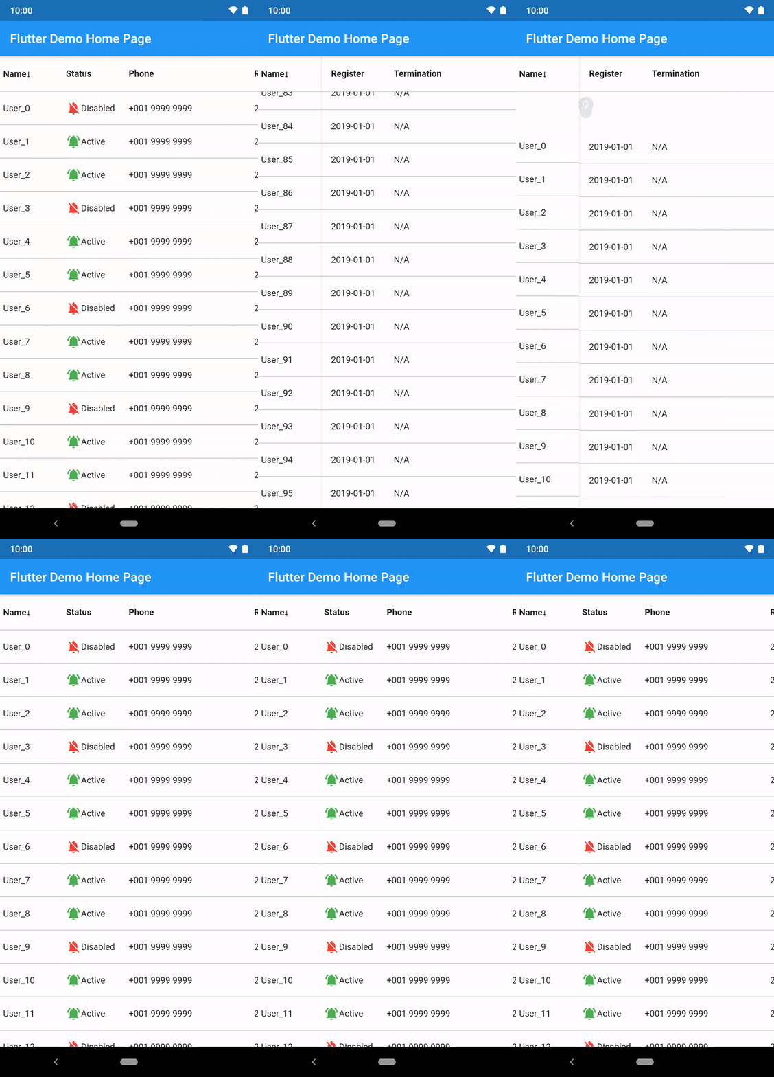
import 'package:flutter/material.dart';
import 'package:horizontal_data_table/horizontal_data_table.dart';

import 'data/user.dart';

class SimpleTablePage extends StatefulWidget {
  const SimpleTablePage({
    Key? key,
    required this.user,
  }) : super(key: key);
  final User user;

  @override
  State<SimpleTablePage> createState() => _SimpleTablePageState();
}

class _SimpleTablePageState extends State<SimpleTablePage> {
  @override
  void initState() {
    widget.user.initData(3000);
    super.initState();
  }

  @override
  Widget build(BuildContext context) {
    return Scaffold(
      appBar: AppBar(title: const Text('Simple Table')),
      body: HorizontalDataTable(
        leftHandSideColumnWidth: 100,
        rightHandSideColumnWidth: 600,
        isFixedHeader: true,
        headerWidgets: _getTitleWidget(),
        isFixedFooter: true,
        footerWidgets: _getTitleWidget(),
        leftSideItemBuilder: _generateFirstColumnRow,
        rightSideItemBuilder: _generateRightHandSideColumnRow,
        itemCount: widget.user.userInfo.length,
        rowSeparatorWidget: const Divider(
          color: Colors.black38,
          height: 1.0,
          thickness: 0.0,
        ),
        leftHandSideColBackgroundColor: const Color(0xFFFFFFFF),
        rightHandSideColBackgroundColor: const Color(0xFFFFFFFF),
        itemExtent: 55,
      ),
    );
  }

  List<Widget> _getTitleWidget() {
    return [
      _getTitleItemWidget('Name', 100),
      _getTitleItemWidget('Status', 100),
      _getTitleItemWidget('Phone', 200),
      _getTitleItemWidget('Register', 100),
      _getTitleItemWidget('Termination', 200),
    ];
  }

  Widget _getTitleItemWidget(String label, double width) {
    return Container(
      width: width,
      height: 56,
      padding: const EdgeInsets.fromLTRB(5, 0, 0, 0),
      alignment: Alignment.centerLeft,
      child: Text(label, style: const TextStyle(fontWeight: FontWeight.bold)),
    );
  }

  Widget _generateFirstColumnRow(BuildContext context, int index) {
    return Container(
      width: 100,
      height: 52,
      padding: const EdgeInsets.fromLTRB(5, 0, 0, 0),
      alignment: Alignment.centerLeft,
      child: Text(widget.user.userInfo[index].name),
    );
  }

  Widget _generateRightHandSideColumnRow(BuildContext context, int index) {
    return Row(
      children: <Widget>[
        Container(
          width: 100,
          height: 52,
          padding: const EdgeInsets.fromLTRB(5, 0, 0, 0),
          alignment: Alignment.centerLeft,
          child: Row(
            children: <Widget>[
              Icon(
                  widget.user.userInfo[index].status
                      ? Icons.notifications_off
                      : Icons.notifications_active,
                  color: widget.user.userInfo[index].status
                      ? Colors.red
                      : Colors.green),
              Text(widget.user.userInfo[index].status ? 'Disabled' : 'Active')
            ],
          ),
        ),
        Container(
          width: 200,
          height: 52,
          padding: const EdgeInsets.fromLTRB(5, 0, 0, 0),
          alignment: Alignment.centerLeft,
          child: Text(widget.user.userInfo[index].phone),
        ),
        Container(
          width: 100,
          height: 52,
          padding: const EdgeInsets.fromLTRB(5, 0, 0, 0),
          alignment: Alignment.centerLeft,
          child: Text(widget.user.userInfo[index].registerDate),
        ),
        Container(
          width: 200,
          height: 52,
          padding: const EdgeInsets.fromLTRB(5, 0, 0, 0),
          alignment: Alignment.centerLeft,
          child: Text(widget.user.userInfo[index].terminationDate),
        ),
      ],
    );
  }
}
Contribution
Thank you for the contribution!

Issues Report and Feature Request
Thank you for your reporting and suggestion making this package more complete!
Since many developers get in touch with this package in different places (pub.dev, GitHub, and others website recommandation), I have received your voice regarding to feature request, issue report and question via different channels.
To avoid missing of the messages, I have created the issue templates on GitHub which allow our conversations with ease, especially some discussions are complex when they need to talk with the sample code.
License
MIT