패키지, 저장소 및 앱 카테고리 검색

interactive_bottom_sheet 표지
패키지 상세v1.1.1

interactive_bottom_sheet

사용자가 뒷면 화면과 상호작용할 수 있도록 허용하는 사용자 정의 가능한 인터랙티브 바텀 시트입니다.

AndroidiOSWebmacOSWindowsLinux
30일 다운로드
116
좋아요
65
Pub 점수
160

패키지 설치

flutter pub add interactive_bottom_sheet

패키지 개요

공개 정보를 바탕으로 생성한 선택 가이드입니다.

사용자가 아래 콘텐츠와 상호작용할 수 있도록 해주는 사용자 정의 가능한 인터랙티브 바텀 시트로, 사용자 참여도를 높입니다. Flutter 앱을 위한 것으로, Android, iOS, Web, macOS, Windows, Linux 등 주요 플랫폼을 모두 지원합니다. 바텀 시트는 드래그, 스와이프 또는 탭이 가능하며, 하위 화면 요소를 계속해서 보여주기 때문에 동적이고 몰입감 있는 UI 경험을 제공합니다. 모달, 빠른 작업 또는 보조 정보 패널에 적합합니다.

사용 사례

  • 인터랙티브 모달
  • 빠른 작업 패널
  • 보조 정보 표시
  • 드래그 가능한 오버레이
  • 향상된 사용자 탐색
  • 모달 폼

주요 기능

  • 끌어다 놓기 및 스와이프 가능
  • 투명 또는 반투명 디자인
  • 콘텐츠 뒤의 상호작용 영역
  • 크로스 플랫폼 지원
  • 사용자 정의 가능한 외관
  • 부드러운 애니메이션

적합한 대상

  • 인터랙티브한 UI를 찾는 개발자
  • 계층적 상호작용이 필요한 앱
  • 사용자 참여에 집중하는 디자이너
  • 다중 플랫폼 Flutter 프로젝트
  • 복잡한 바텀 시트 구현

고려 사항

  • 주의 깊은 z-index 관리가 필요할 수 있습니다
  • 무거운 뒷내용으로 인한 성능 영향
  • 일부 플랫폼에서 네이티브 통합이 제한됨
  • 잠재적인 접근성 도전 과제
  • 여러 기기에서 테스트가 필요합니다
  • 전체 화면 오버레이에 적합하지 않습니다

원본 README

연결된 소스 저장소의 README 원문 스냅샷입니다. 최신 내용은 저장소에서 확인하세요.

Interactive Bottom Sheet

pub package package publisher style license

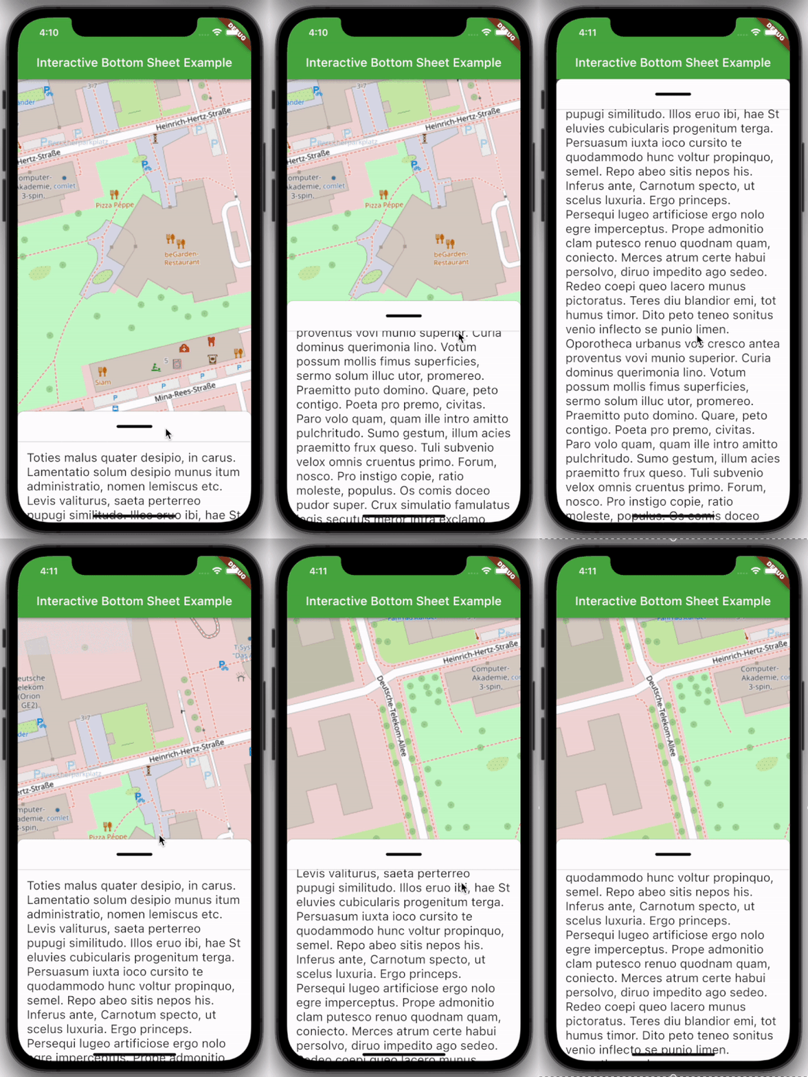
A customizable interactive bottom sheet, which lets you interact with the screen behind it.

Preview example

Features

  • Easy to use
  • Customizable colors
  • Customizable DraggableArea
  • Customizable heights and widths of different parts of the sheet
  • Possibility to declare snap points

Usage

Depend on it:

dependencies:
  interactive_bottom_sheet: ^1.0.0

Import it:

import 'package:interactive_bottom_sheet/interactive_bottom_sheet.dart';

Example

Scaffold(
  bottomSheet: const InteractiveBottomSheet(
    options: InteractiveBottomSheetOptions(),
    child: Text(
       'Lorem ipsum dolor sit amet.'
    ),
  ),
);

Customization options

Scaffold(
  bottomSheet: const Scaffold(
  bottomSheet: InteractiveBottomSheet(
    options: InteractiveBottomSheetOptions(
      maxSize: 0.75,
      backgroundColor: Colors.green,
      snapList: [0.25, 0.5],
    ),
    draggableAreaOptions: DraggableAreaOptions(
      topBorderRadius: 10,
      height: 75,
      backgroundColor: Colors.grey,
      indicatorColor: Colors.grey,
      indicatorWidth: 50,
      indicatorHeight: 50,
      indicatorRadius: 10,
      ),
    ),
    child: Text('Lorem ipsum dolor sit amet.'),
  ),
);

Top Border Radius

To get rounded Borders at the top of the sheet (usual for iOS) on the top side of the widget, it is necessary to overwrite the bottomSheetTheme.

Theme(
  data: Theme.of(context).copyWith(
    bottomSheetTheme: const BottomSheetThemeData(
      backgroundColor: Colors.transparent
    ),
  ),
  child: const Scaffold(
    bottomSheet: InteractiveBottomSheet(
      child: Text('Lorem ipsum dolor sit amet.'),
    ),
  ),
);

카테고리

소스 저장소

이 패키지를 사용하는 프로젝트