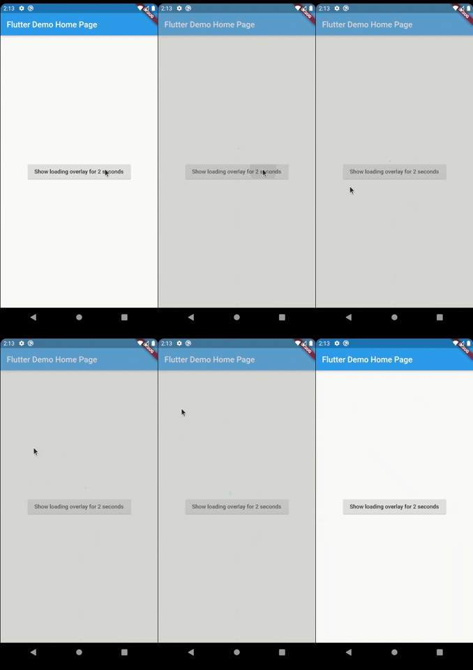
LoaderOverlay는 비동기 작업 중 화면 관리를 간소화하는 Flutter 패키지입니다. API 호출이나 데이터 처리와 같은 작업이 진행되는 동안 사용자 상호작용을 방지하기 위해 로딩 오버레이를 표시합니다. 오버레이는 쉽게 켜고 끌 수 있으며, 작업이 완료될 때까지 입력을 차단함으로써 원활한 사용자 경험을 보장합니다. Android, iOS, Web, macOS, Windows, Linux 등 모든 주요 플랫폼을 지원합니다. 복잡한 커스텀 구현 없이 로딩 상태에서 UX를 향상시키기에 이상적입니다.
사용 사례
비동기 작업 중에 UI 차단
로딩 중에 부주의한 탭을 방지
양식에 로딩 표시기 표시
장시간 실행되는 백그라운드 작업 관리
앱 반응성 향상
로딩 상태 처리 간소화
주요 기능
간단한 오버레이 활성화
자동 UI 차단
크로스 플랫폼 지원
비동기 작업과의 간편한 통합
사용자 정의 가능한 로딩 표시
비침입적 설계
적합한 대상
빠른 로딩 오버레이를 찾는 개발자
자주 비동기 작업을 수행하는 앱
명확한 로딩 피드백이 필요한 UI
UX 일관성을 우선시하는 팀
최소한의 보일러플레이트가 필요한 프로젝트
고려 사항
수동으로 오버레이를 닫아야 할 수 있습니다
제한된 사용자 정의 옵션
자주 전환할 경우 성능에 미치는 영향
복잡한 로딩 애니메이션에 적합하지 않습니다
적절한 비동기 작업 조정에 의존
원본 README
연결된 소스 저장소의 README 원문 스냅샷입니다. 최신 내용은 저장소에서 확인하세요.
Introduction
Have you ever found yourself in the situation of doing some async processing your screen and wanting
to prevent the user from interacting with the screen while the application is loading? If so, this
package was made just for you.
Basic Usage
The most simple usage is just wrap the widget that you want an overlay on LoaderOverlay. Default
loader will be shown.
This simple step will already configure the loader overlay for use.
After that configuration you can just call:
context.loaderOverlay.show();
This will show the overlay with the default loading indicator. The default loading configured is to
just show a centered CircularProgressIndicator
To hide the overlay (after the async processing, for example), just call:
context.loaderOverlay.hide();
You can check if overlay is visible:
final isVisible = context.loaderOverlay.visible;
*Note: You will always need the context to show or hide the loader overlay
Basic Usage on Navigation
To use this package with named routes you can just wrap your MaterialApp with GlobalLoaderOverlay.
This widget has all the features of LoaderOverlay but it is provided for all the routes of the app.
Your overlay loader widget can be any widget you want. For example you can import the
package flutter_spinkit and customise your widget like this.
To do that just pass your widget to overlayWidget and set useDefaultLoading to false.
Another customisation you can do is configure the color and opacity of the overlay.
The default opacity is grey with 0.4 opacity, but you can change it with
the overlayColor: Colors.yellow.withValues(alpha: 0.8).
If you pass widget to context.loaderOverlay.show, then defaultLoader and widgetOverlay will be
ignored;
Progress
If you want to show some progress while the loader overlay is visible, you can do it with the
context.loaderOverlay.show(progress: 'Doing progress #0',) for an initial progress, and with
context.loaderOverlay.progress('Doing progress #1'); every time the progress need to change.
Both this methods pass the progress to the current widgetBuilder on every call.
You can also remove by complete the overlayColor (set to transparent), set the useDefaultLoading to false,
and use a fully personalized overlayWidgetBuilder to make your own 100% customizable overlay.
By default, the overlay does not animate in or out. You can enable animations by passing the
appropriate parameters to LoaderOverlay. Internally, an AnimatedSwitcher is used to manage
animations, so the parameters are passed directly to the AnimatedSwitcher. By specifying
a duration and reverseDuration, the overlay will animate in and out using a fade (the default
transition used by AnimatedSwitcher). You can also pass curves, a transition builder and a layout
builder for further customisation.