Material Design 3의 색상 시스템의 핵심 알고리즘을 구현하는 Dart 패키지로, 이미지에서 동적 테마를 생성하고 정밀한 색조를 만들 수 있습니다. 더 정확하고 시각적으로 일관된 결과를 위해 새로운 인지 색 공간에서 작동합니다. 이 패키지는 색조 조화, 대비 최적화 및 입력 이미지 기반 테마 사용자 지정과 같은 고급 기능을 지원하여 플랫폼 간 접근성과 미적 품질을 보장합니다.
사용 사례
이미지 배경에서 테마 생성
접근성 있는 색상 팔레트 만들기
UI 색상 테마 자동화
반응형 앱 테마 설계
동적 테마 구현
시각적 일관성 향상
주요 기능
정확한 표현을 위한 감각 색 공간
이미지 기반 색상 추출
빛/어두운 변형을 가진 톤 생성
접근성 인식형 대비 조정
Material Design 3 사양 지원
크로스 플랫폼 호환성
적합한 대상
UI 디자이너가 Material Design 3 구현 중
다이나믹 테마 시스템을 구축하는 개발자
자동 색상 테마 생성이 필요한 앱
접근성과 시각적 조화에 중점을 둔 프로젝트
다중 플랫폼 앱에 플러터를 사용하는 팀
고려 사항
Material Design 3 원칙을 이해해야 합니다
복잡한 이미지 입력을 위해 추가 처리가 필요할 수 있습니다
최적의 결과를 얻기 위해 디자인 가이드라인과 함께 사용하는 것이 가장 좋습니다
색상 시스템 논리에 국한됨 — UI 구성 요소 없음
일반적인 색상 조작을 위한 것이 아님
원본 README
연결된 소스 저장소의 README 원문 스냅샷입니다. 최신 내용은 저장소에서 확인하세요.
Material Color Utilities
Color is a foundational part of the
Material Design system, alongside typography and
shape. In products, color can communicate brand, reinforce meaning through
semantic roles, and improve usability through
accessible contrast.
Historically, teams hand-picked many colors to cover all UI use cases. In
Material 3,
dynamic color
shifts
Need another platform/language? Check the
existing issues
or open a new one.
Capabilities Overview
The library consists of various components, each having its own folder and
tests, designed to be as self-contained as possible. This enables seamless
integration of subsets into other libraries, like Material Design Components
and Android System UI. Some consumers do not require all components, for
example, MDC doesn’t need quantization, scoring, image extraction.
Components
Purpose
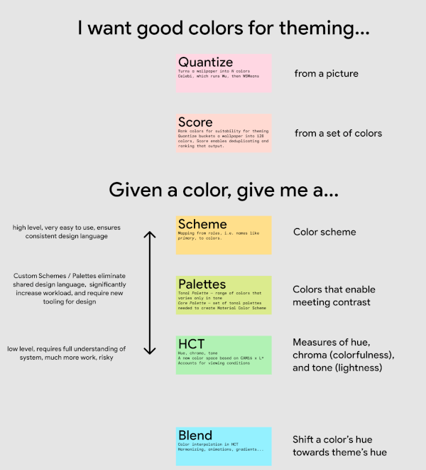
blend
Interpolate, harmonize, animate, and gradate colors in HCT
contrast
Measure contrast, obtain contrastful colors
dislike
Check and fix universally disliked colors
dynamiccolor
Obtain colors that adjust based on UI state (dark theme, style, preferences, contrast requirements, etc.)
hct
A new color space (hue, chrome, tone) based on CAM16 x L*, that accounts for viewing conditions
palettes
Tonal palette — range of colors that varies only in tone Core palette — set of tonal palettes needed to create Material color schemes
quantize
Turn an image into N colors; composed of Celebi, which runs Wu, then WSMeans
scheme
Create static and dynamic color schemes from a single color or a core palette
score
Rank colors for suitability for theming
temperature
Obtain analogous and complementary colors
utilities
Color — convert between color spaces needed to implement HCT/CAM16 Math — functions for ex. ensuring hue is between 0 and 360, clamping, etc. String - convert between strings and integers
We recommend incorporating the Material Theme Builder
Figma plugin
and web tool
into the design workflow. With them, designers can easily experiment with
different dynamic color themes and see how they transform their designs with
just a few clicks.