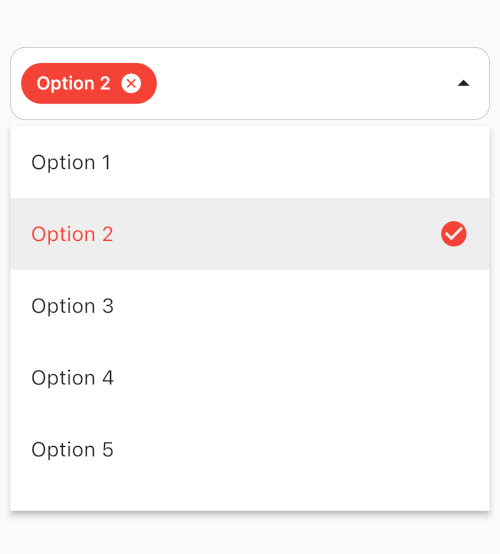
연결된 소스 저장소의 README 원문 스냅샷입니다. 최신 내용은 저장소에서 확인하세요.
MultiSelect Dropdown
A powerful and highly customizable multi-select dropdown widget for Flutter. Supports single & multi-select, search, form validation, programmatic control, and extensive visual customization.
Preview
Features
✅ Multi-select & single-select modes
✅ Searchable dropdown with customizable search field
✅ Form validation support with autovalidateMode
✅ Programmatic control via MultiSelectController
✅ Async data loading with MultiDropdown.future()
✅ Extensive decoration classes (chips, field, dropdown, items, search)
✅ Pre-selected & disabled items
✅ Max selection limit with maxSelections
✅ Chip overflow control with maxDisplayCount
✅ Custom item builders & selected item builders
✅ Header & footer widgets in the dropdown
✅ Expand direction control (auto, up, down)
✅ Close on back button support
✅ Full InputDecoration override for form consistency
✅ Grouped items with customizable section headers
✅ Select All / Deselect All toggle with customizable labels
✅ Custom search filter for fuzzy matching and multi-field search
✅ Bottom sheet mode for mobile-friendly item selection
Installation
Add to your pubspec.yaml:
dependencies:
  multi_dropdown: ^3.2.1
Quick Start
Basic Multi-Select
MultiDropdown <String >(
items: [
DropdownItem (label: 'Australia' , value: 'AU' ),
DropdownItem (label: 'Canada' , value: 'CA' ),
DropdownItem (label: 'India' , value: 'IN' ),
DropdownItem (label: 'United States' , value: 'US' ),
],
onSelectionChange: (selectedItems) {
debugPrint ('Selected: $selectedItems ' );
},
);
Single Select
MultiDropdown <String >(
items: items,
singleSelect: true ,
fieldDecoration: FieldDecoration (
hintText: 'Choose a role' ,
suffixIcon: const Icon (Icons .keyboard_arrow_down_rounded),
),
onSelectionChange: (values) {
debugPrint ('Selected: ${values.first} ' );
},
);
Searchable Dropdown
MultiDropdown <String >(
items: items,
searchEnabled: true ,
searchDecoration: SearchFieldDecoration (
hintText: 'Type to search...' ,
),
);
With Form Validation
MultiDropdown <String >(
items: items,
maxSelections: 4 ,
autovalidateMode: AutovalidateMode .onUserInteraction,
validator: (selectedItems) {
if (selectedItems == null || selectedItems.isEmpty) {
return 'Please select at least one item' ;
}
return null ;
},
);
Async Data Loading
MultiDropdown <int >.future (
future: () async {
final response = await http.get (Uri .parse ('https://api.example.com/users' ));
final data = jsonDecode (response.body) as List ;
return data.map ((e) => DropdownItem (
label: e['name' ] as String ,
value: e['id' ] as int ,
)).toList ();
},
);
Controller
Use MultiSelectController to programmatically control the dropdown:
final controller = MultiSelectController <String >();
controller.setItems (items);
controller.addItem (item);
controller.addItems (items);
controller.selectAll ();
controller.clearAll ();
controller.selectAtIndex (0 );
controller.selectWhere ((i) => i.value == 'dart' );
controller.unselectWhere ((i) => i.value == 'dart' );
controller.toggleWhere ((i) => i.value == 'dart' );
controller.disableWhere ((i) => i.value == 'admin' );
controller.openDropdown ();
controller.closeDropdown ();
controller.clearSearch ();
controller.items;
controller.selectedItems;
controller.disabledItems;
controller.isOpen;
Examples
The example app contains 8 dedicated examples , each in its own file:
Run the example:
cd example
flutter run
API Reference
MultiDropdown
Parameter
Type
Description
Default
items
List<DropdownItem<T>>The list of dropdown items
Required
singleSelect
boolSingle-select mode
false
chipDecoration
ChipDecorationChip styling configuration
ChipDecoration()
fieldDecoration
FieldDecorationField styling configuration
FieldDecoration()
dropdownDecoration
DropdownDecorationDropdown panel configuration
DropdownDecoration()
searchDecoration
SearchFieldDecorationSearch field configuration
SearchFieldDecoration()
dropdownItemDecoration
DropdownItemDecorationItem styling configuration
DropdownItemDecoration()
itemBuilder
DropdownItemBuilder<T>?Custom item widget builder
null
selectedItemBuilder
SelectedItemBuilder<T>?Custom selected item builder
null
itemSeparator
Widget?Separator between items
null
validator
String? Function(...)Form validation callback
null
autovalidateMode
AutovalidateModeWhen to auto-validate
.disabled
controller
MultiSelectController<T>?Programmatic controller
null
maxSelections
intMax selectable items (0 = unlimited)
0
enabled
boolWhether the dropdown is enabled
true
searchEnabled
boolWhether search is enabled
false
focusNode
FocusNode?Custom focus node
null
future
FutureRequest<T>?Async item loading
null
onSelectionChange
OnSelectionChanged<T>?Selection change callback
null
onSearchChange
ValueChanged<String>?Search text change callback
null
closeOnBackButton
boolClose on back button press
false
DropdownItem
Parameter
Type
Description
Default
label
StringDisplay label
Required
value
TAssociated value
Required
disabled
boolWhether item is disabled
false
selected
boolWhether item is pre-selected
false
ChipDecoration
Parameter
Type
Description
Default
deleteIcon
Widget?Chip delete icon
Icon(Icons.close)
backgroundColor
Color?Chip background color
Color(0xFFE0E0E0)
labelStyle
TextStyle?Chip label text style
null
padding
EdgeInsetsChip padding
EdgeInsets.symmetric(horizontal: 12, vertical: 4)
border
BoxBorderChip border
Border()
spacing
doubleSpacing between chips
8.0
runSpacing
doubleSpacing between chip rows
12.0
borderRadius
BorderRadiusGeometryChip border radius
BorderRadius.circular(12)
wrap
boolWrap chips or scroll horizontally
true
maxDisplayCount
int?Max visible chips (shows "+N more")
null
FieldDecoration
Parameter
Type
Description
Default
labelText
String?Label text above the field
null
hintText
String?Hint text in the field
'Select'
border
InputBorder?Field border
null
focusedBorder
InputBorder?Border when focused
null
disabledBorder
InputBorder?Border when disabled
null
errorBorder
InputBorder?Border on validation error
null
suffixIcon
Widget?Trailing icon
Icon(Icons.arrow_drop_down)
prefixIcon
Widget?Leading icon
null
labelStyle
TextStyle?Label text style
null
hintStyle
TextStyle?Hint text style
null
borderRadius
doubleBorder radius
12.0
animateSuffixIcon
boolAnimate suffix icon rotation
true
padding
EdgeInsets?Content padding
EdgeInsets.symmetric(horizontal: 12, vertical: 8)
backgroundColor
Color?Background fill color
null
showClearIcon
boolShow clear/deselect icon
true
selectedItemTextStyle
TextStyle?Selected item text style (single-select)
null
inputDecoration
InputDecoration?Full InputDecoration override
null
DropdownDecoration
Parameter
Type
Description
Default
backgroundColor
ColorDropdown background color
Colors.white
elevation
doubleDropdown elevation
1.0
maxHeight
doubleMaximum dropdown height
400.0
borderRadius
BorderRadiusDropdown border radius
BorderRadius.circular(12)
marginTop
doubleGap between field and dropdown
0.0
header
Widget?Header widget inside dropdown
null
footer
Widget?Footer widget inside dropdown
null
noItemsFoundText
StringText when no items match search
'No items found'
expandDirection
ExpandDirectionDropdown expand direction
ExpandDirection.auto
SearchFieldDecoration
Parameter
Type
Description
Default
hintText
StringSearch hint text
'Search'
border
InputBorder?Search field border
OutlineInputBorder(...)
focusedBorder
InputBorder?Border when focused
OutlineInputBorder(...)
searchIcon
IconSearch icon
Icon(Icons.search)
textStyle
TextStyle?Search input text style
null
hintStyle
TextStyle?Search hint text style
null
fillColor
Color?Search field fill color
null
filled
bool?Whether search field is filled
null
cursorColor
Color?Cursor color
null
showClearIcon
boolShow clear button in search
true
autofocus
boolAuto-focus search on open
false
DropdownItemDecoration
Parameter
Type
Description
Default
backgroundColor
Color?Item background color
null
disabledBackgroundColor
Color?Disabled item background color
null
selectedBackgroundColor
Color?Selected item background color
null
selectedTextColor
Color?Selected item text color
null
textColor
Color?Item text color
null
disabledTextColor
Color?Disabled item text color
null
selectedIcon
Widget?Selected item trailing icon
Icon(Icons.check)
disabledIcon
Widget?Disabled item trailing icon
null
textStyle
TextStyle?Item label text style
null
selectedTextStyle
TextStyle?Selected item label text style
null
Migration from v2.x
See the CHANGELOG for details on breaking changes in v3.0.0.
Key changes:
MultiSelectDropDown → MultiDropdownValueItem → DropdownItem.network() → .future()onOptionsSelected → onSelectionChange
License
MIT License