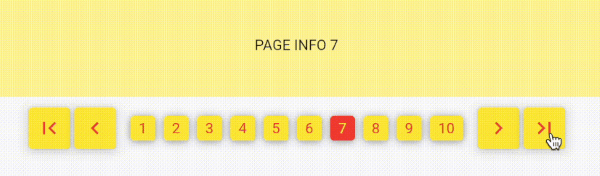
NumberPagination은 이산적인 번호 링크를 통한 페이지 탐색이 필요한 애플리케이션에 적합한 전통적인 숫자 기반 페이징 인터페이스를 제공하는 Flutter 패키지입니다. 고전적인 웹 스타일의 페이징을 모방하여 무한 스크롤에 의존하지 않고 특정 페이지로 직접 이동할 수 있도록 합니다. 이 패키지는 Android, iOS, Web, macOS, Windows, Linux 등 여러 플랫폼을 지원하여 크로스플랫폼 앱에 유연하게 활용할 수 있습니다. 깔끔하고 사용자 정의 가능한 UI를 제공하며, 페이지 범위 표시, 첫 페이지/마지막 페이지 버튼, 구성 가능한 스타일링 기능을 내장하고 있습니다. 정확한 탐색이 필수적인 데이터가 많은 인터페이스에 이상적입니다.
사용 사례
구조적으로 대규모 데이터 세트 표시
다시보드에서 사용자 친화적인 탐색 만들기
검색 결과 페이징 구현
페이지 컨트롤을 사용하여 관리 패널 구축하기
콘텐츠 목록에서 직접 페이지 이동 활성화
주요 기능
번호 매겨진 페이지 버튼
첫 번째/마지막 페이지 탐색 지원
사용자 정의 스타일 옵션
크로스 플랫폼 호환성
사용자 정의 가능한 페이지 범위 표시
모든 화면 크기에 대응하는 반응형 디자인
적합한 대상
웹과 유사한 페이지네이션을 구축하는 개발자
구조화된 데이터 탐색이 필요한 앱
무한 스크롤보다 사용성 우선의 프로젝트
다중 플랫폼 배포를 목표로 하는 팀
간단하고 직관적인 페이지 컨트롤을 원하는 사용자
고려 사항
사용자 정의 테마를 위해 추가 스타일링이 필요할 수 있습니다
성능 최적화 없이 매우 큰 데이터 세트에는 적합하지 않음
숫자 기반 탐색에 제한됨(무한 스크롤 없음)
페이지 데이터 로딩을 수동으로 처리해야 합니다
알려진 총 페이지 수가 있는 시나리오에 가장 적합
원본 README
연결된 소스 저장소의 README 원문 스냅샷입니다. 최신 내용은 저장소에서 확인하세요.
number_pagination
Implementing Flutter Number Pagination using a Popular Web Approach.
This package is very simple. Without depending on other packages.
Its usage is also simple and easy.
NumberPagination
A customizable pagination widget for Flutter applications.
Overview
NumberPagination is a Flutter widget that provides an intuitive and flexible way to implement pagination in your applications. It displays page numbers and navigation controls, allowing users to easily navigate through multiple pages of content.
Features
Page number buttons
Navigation controls (first, previous, next, last)
Customizable appearance
Responsive design
Installation
Add this to your package's pubspec.yaml file:
dependencies:number_pagination:^1.1.0
Customization Options for NumberPagination Widget
The NumberPagination widget offers a wide range of customization options to tailor its appearance and behavior to your needs. Below is a comprehensive list of these options:
Page Display
Option
Type
Description
Default
visiblePagesCount
int
Number of page numbers to display at once
10
currentPage
int
Currently displayed page number
Required
totalPages
int
Total number of pages available
Required
Text Styling
Option
Type
Description
Default
fontSize
double
Font size for the page numbers
15
fontFamily
String?
Font family for the page numbers
null
Button Styling
Option
Type
Description
Default
buttonElevation
double
Elevation of the buttons
5
buttonRadius
double
Radius of the buttons
0
controlButtonSize
Size
Size of the control buttons
Size(48, 48)
numberButtonSize
Size
Size of the number buttons
Size(48, 48)
Colors
Option
Type
Description
Default
selectedTextColor
Color
Text color for the selected page button
Colors.white
unSelectedTextColor
Color
Text color for unselected page buttons
Colors.black
selectedButtonColor
Color
Background color of the selected page button
Colors.black
unSelectedButtonColor
Color
Background color of unselected page buttons
Colors.white
controlButtonColor
Color
Background color of control buttons
Colors.white
Icons
Option
Type
Description
Default
firstPageIcon
Widget
Icon for the "first page" button
Icon(Icons.first_page)
previousPageIcon
Widget
Icon for the "previous page" button
Icon(Icons.keyboard_arrow_left)
nextPageIcon
Widget
Icon for the "next page" button
Icon(Icons.keyboard_arrow_right)
lastPageIcon
Widget
Icon for the "last page" button
Icon(Icons.last_page)
Spacing
Option
Type
Description
Default
navigationButtonSpacing
double
Spacing between navigation buttons
4.0
sectionSpacing
double
Spacing between navigation buttons and page number buttons
10.0
betweenNumberButtonSpacing
double
Spacing between individual number buttons
3
Callback
Option
Type
Description
onPageChanged
Function(int)
Callback function triggered when the page changes
These customization options allow you to fine-tune the appearance and behavior of the NumberPagination widget to seamlessly integrate with your app's design and functionality.