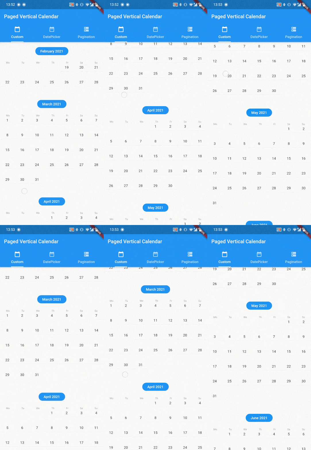
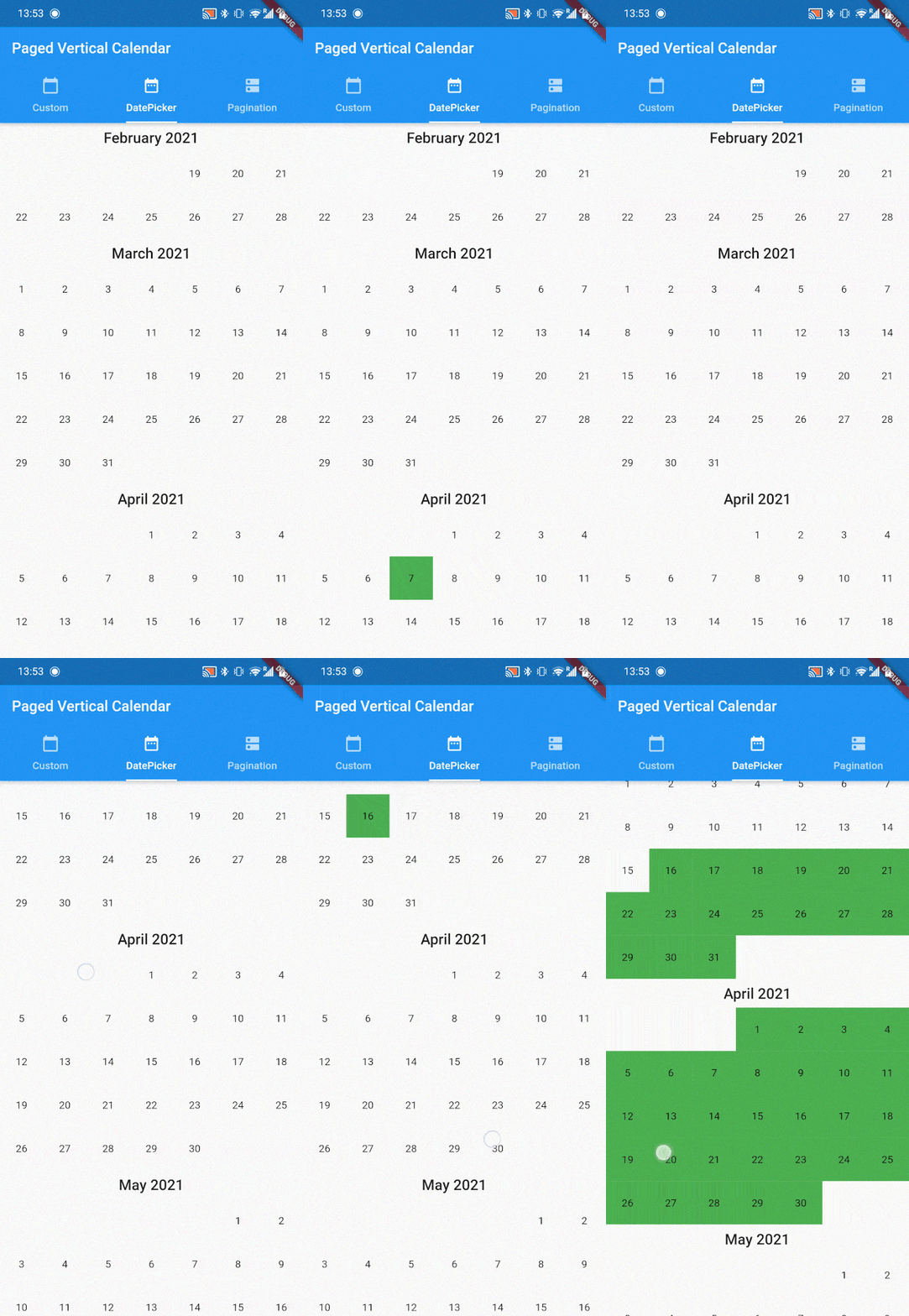
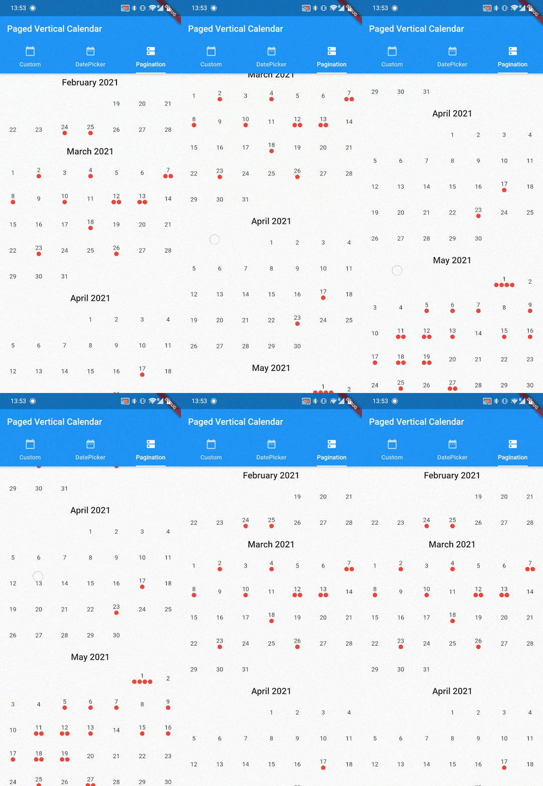
플러터 패키지로, 일정 기반 인터페이스를 구축하기 위한 간단하고 페이지 단위로 나누어진 수직 캘린더 프레임워크를 제공합니다. 여러 플랫폼에서 내장된 페이지네이션 지원을 통해 날짜 간의 부드러운 탐색이 가능합니다. 개발자가 수직 스크롤 레이아웃에서 날짜 범위를 표시하고 상호작용할 수 있는 가벼운 솔루션을 찾는 데 적합합니다. 스케줄링 앱, 플래너 또는 직관적인 날짜 탐색이 필요한 모든 애플리케이션에 이상적입니다.
사용 사례
스케줄링 애플리케이션
일일 계획 인터페이스
날짜 선택 위젯
이벤트 관리 대시보드
시간 추적 도구
주요 기능
수직 날짜 페이징
크로스 플랫폼 호환성
간단한 통합
사용자 정의 날짜 렌더링
내장 스크롤 처리
적합한 대상
캘린더 UI를 구축하는 개발자
날짜 탐색이 필요한 앱
경량 캘린더 솔루션
Flutter 초보자가 UI 패턴 배우기
다중 플랫폼 캘린더 앱
고려 사항
제한된 사전 구축된 스타일 옵션
복잡한 레이아웃을 위해 사용자 정의 구현이 필요합니다
내장된 이벤트 관리 없음
가로 달력에 최적화되지 않음
고급 사용 사례를 위한 최소 구성
원본 README
연결된 소스 저장소의 README 원문 스냅샷입니다. 최신 내용은 저장소에서 확인하세요.
:calendar: Paged Vertical Calendar :calendar:
A simple paginated framework for implementing calendar based interfaces.
:hammer: How it works
paged_vertical_calendar is a very minimalistic framework that automatically loads months based on scoll behavior. It provides many useful callbacks to implement your own calendar interactions and builders to customize the calendar as much as you want. Check the example for several implementations like date range selection and paginated data visualisation.
PagedVerticalCalendar has no required parameters and can be dropped in anywhere providing it has a fixed height.
Scaffold(
  body: PagedVerticalCalendar(),
);
:loudspeaker: functionality
Several callback are provided to facilitate easy implementation of any calendar interactions
onMonthLoaded is a callback that fires for every month added to the list. When this function fires can be altered by setting the invisibleMonthsThreshold pararamter.
invisibleMonthsThreshold decides how many months outside of the widgets view should be loaded. In other words, how many months should be preloaded before the user reaches that scroll position. It defaults to 1.
onDayPressed Is a simple onPressed callback but also provides the DateTime of the day that has been pressed.
If your app is localized for countries where the week starts on Sunday, you can flip startWeekWithSundayto true.
If a minDate is provided the calendar will stop scrolling up at that date. make sure minDate < maxDate.
If a maxDate is provided the calendar will stop scrolling down at that date. make sure maxDate > minDate.
If an initialDate is provided the calendar start by displaying this date (otherwise DateTime.now()). make sure minDate < initialData < maxDate.
Finally when a minDate or maxDate is provided to the PagedVerticalCalendar, the onPaginationCompleted callback can be used. it will return a PaginationDirection to indicate what side of the calendar has been reached.
and many many more, see the docs!!!
:art: Customization
PagedVerticalCalendar provides default calendar styling, but these can be fully customized. To do so, several builders are provided:
PagedVerticalCalendar(
  monthBuilder: (context, month, year) {
    // provide a month header widget
  },
  dayBuilder: (context, date) {
    // provide a day widget
  },
  listPadding: // provide EdgeInset value
);
monthBuilder provides the year and month as integers. this builder has to return a widget that will form the header of ever month. the intl package works well here for date formatting.
dayBuilder provides the day as a DateTime. this builder wil be called for every day. You usually want to provide at least a text widget with the current day number.
listPadding can be provided in case you need the list to have padding.
:wave: Get Involved
If this package is useful to you please :thumbsup: on pub.dev and :star: on github. If you have any Issues, recommendations or pull requests I'd love to see them!