패키지, 저장소 및 앱 카테고리 검색

quickalert 표지
패키지 상세v1.1.0

quickalert

QuickAlert를 사용하면 성공, 오류, 경고, 확인, 로딩 또는 사용자 정의 대화 상자와 같은 애니메이션 알림 대화 상자를 즉시 표시할 수 있습니다.

AndroidiOSWebmacOSWindowsLinux
30일 다운로드
2.2만
좋아요
591
Pub 점수
150

패키지 설치

flutter pub add quickalert

패키지 개요

공개 정보를 바탕으로 생성한 선택 가이드입니다.

QuickAlert는 성공, 오류, 경고, 확인 및 로딩과 같은 사전 정의된 유형을 가진 애니메이션 효과가 있는 사용자 지정 가능한 알림 대화 상자를 빠르게 표시할 수 있도록 해주는 Flutter 패키지입니다. 최소한의 코드로 사용자 피드백을 쉽게 표시할 수 있으며, Android, iOS, Web, macOS, Windows, Linux 등 다양한 플랫폼을 지원합니다. 부드러운 애니메이션과 단일 메서드 호출을 통한 간편한 통합으로 즉각적인 시각적 피드백이 필요한 앱의 사용자 경험을 향상시키기에 이상적입니다. 고유한 사용 사례를 위한 커스텀 대화 상자도 지원됩니다.

사용 사례

  • 폼 제출 후 성공 메시지 표시
  • 잘못된 입력에 대한 오류 경고 표시
  • 예/아니오 프롬프트로 작업 확인하기
  • 비동기 작업 중 로딩 상태 표시
  • 특정 UI 요구 사항에 맞는 사용자 정의 경고 디자인 만들기

주요 기능

  • 사전 정의된 경고 유형 (성공, 오류, 경고 등)
  • 시각적 매력용 애니메이션 전환
  • 사용자 정의 대화 내용 지원
  • 간단한 한 줄 호출
  • 크로스 플랫폼 호환성
  • 경량이며 통합이 쉬움

적합한 대상

  • 초보자 플러터 개발자
  • 빠른 사용자 피드백이 필요한 앱
  • 양식 및 인증 흐름
  • 자주 알림이 발생하는 인터랙티브 UI
  • 빠른 구현을 우선시하는 프로젝트

고려 사항

  • 기본 스타일링을 초과한 사용자 정의는 제한적
  • 복잡한 레이아웃을 위해 추가 스타일링이 필요할 수 있습니다
  • 매우 동적 또는 지속적인 대화 상자에 적합하지 않음
  • 임시 알림에 가장 적합
  • 효과를 위해 외부 애니메이션 라이브러리에 의존합니다

원본 README

연결된 소스 저장소의 README 원문 스냅샷입니다. 최신 내용은 저장소에서 확인하세요.

QuickAlert Banner

An instantly ready, full-featured alerts for development on any platform with flutter. Enabling you to complete projects and deploy quickly. With QuickAlert, you can display animated alert dialogs such as success, error, warning, confirm, loading or even a custom dialog.

Key Features 🔮

Easy To Use

The alerts are very flexible and can be customized very easily. In QuickAlert, the QuickAlert.show() triggers the alert, which informs the user about the situations that need acknowledgment.

Predefined Beautiful Alert Styles

Make use of the predefined alerts are very beautiful and can also be customized very easily. In QuickAlert there are 6 different types of alerts, they are Success, Error, Warning, Info, Confirm & Loading.

Predefined Title & Actions

In QuickAlert all the 6 different types of alerts have predefined title & actions matching the alert type.

Super Customizable

Build your custom alert with power of QuickAlert using the flutter widgets.

Change Animation

Set your favorite animation by choosing from scale, rotate, slideInDown, slideInUp, slideInLeft, slideInRight.

Set Auto close

Auto close the alert by setting auto close duration.

Set Overlay Tap to Dismiss

Control the alert's Barrier Dismissible Property by setting barrierDismissible to true or false.

And Many More...


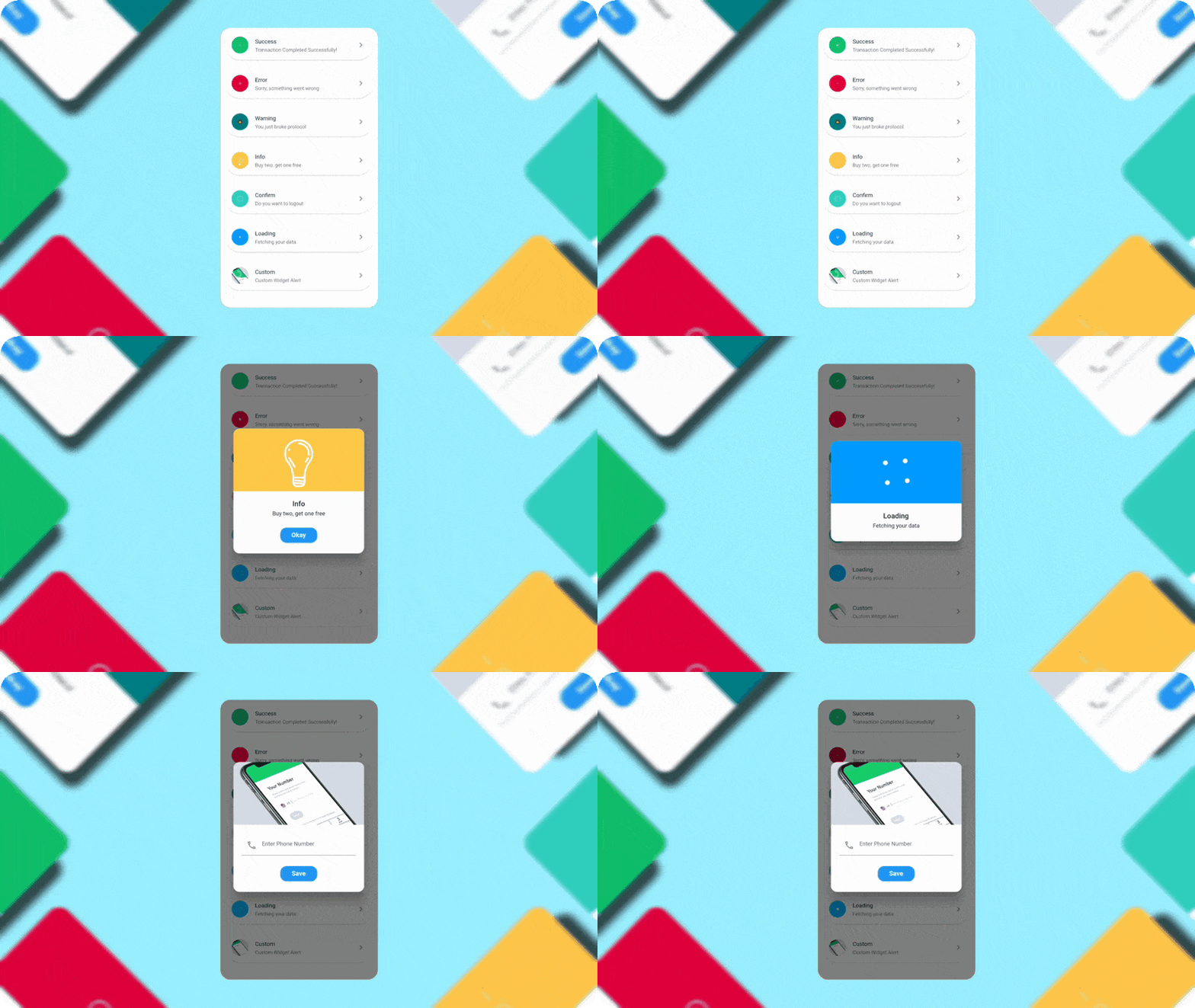
QuickAlert Demo

QuickAlert Demo

Getting Started 🔥

Start by adding the library as a dependency to your project.

dependencies:
  quickalert: <latest version>

Run the command get the dependency

$ flutter pub get

Import it in your dart code, you can use

import 'package:quickalert/quickalert.dart';

To display alert use QuickAlert.show() and define the type of alert.

QuickAlert.show(
  context: context,
  type: QuickAlertType.success,
); // That's it to display an alert, use other properties to customize.

Examples ⚡

There is a detailed example project in the example folder. You can directly run and play on it. There are code snippets from example project below.

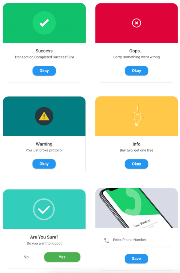
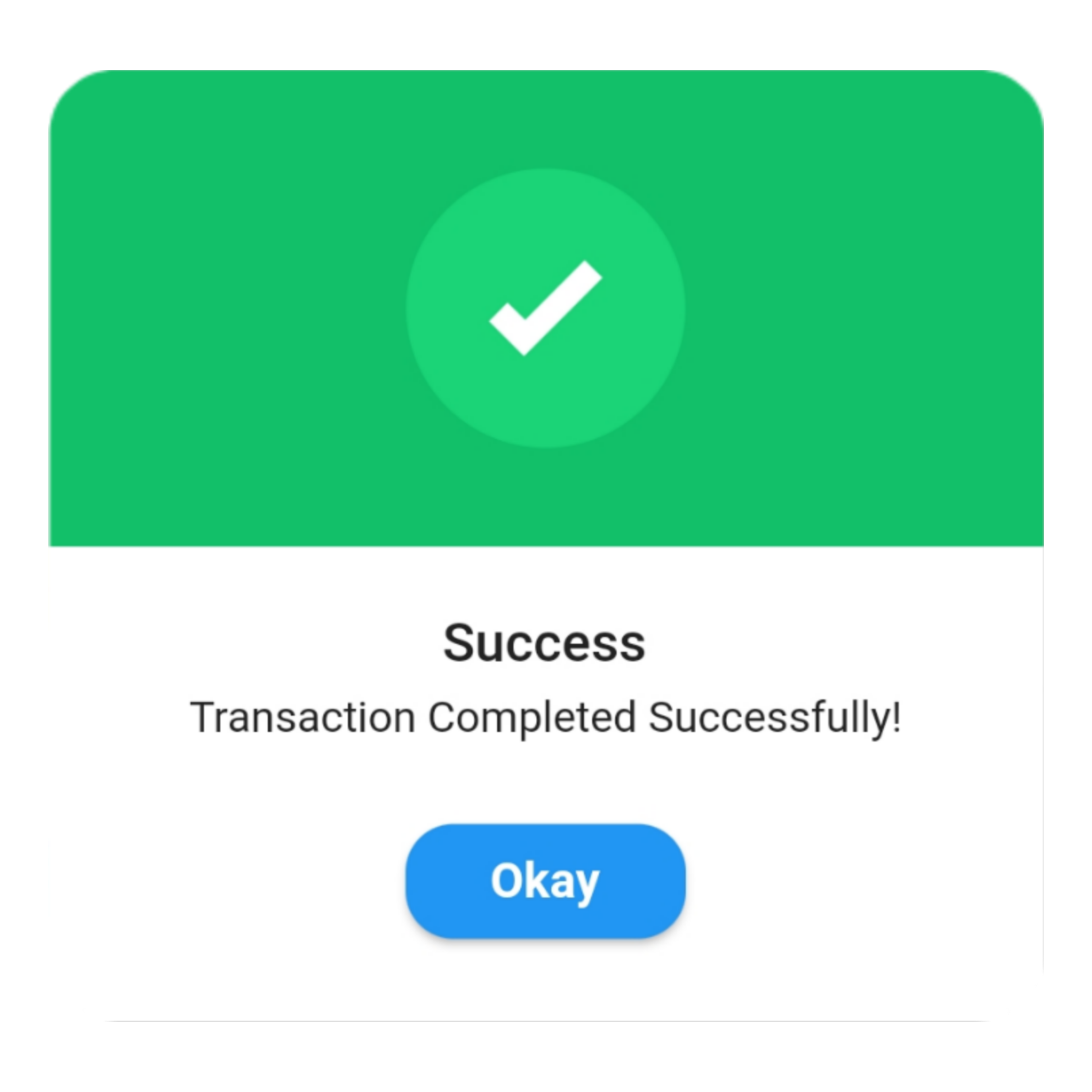
Success
QuickAlert.show(
 context: context,
 type: QuickAlertType.success,
 text: 'Transaction Completed Successfully!',
);

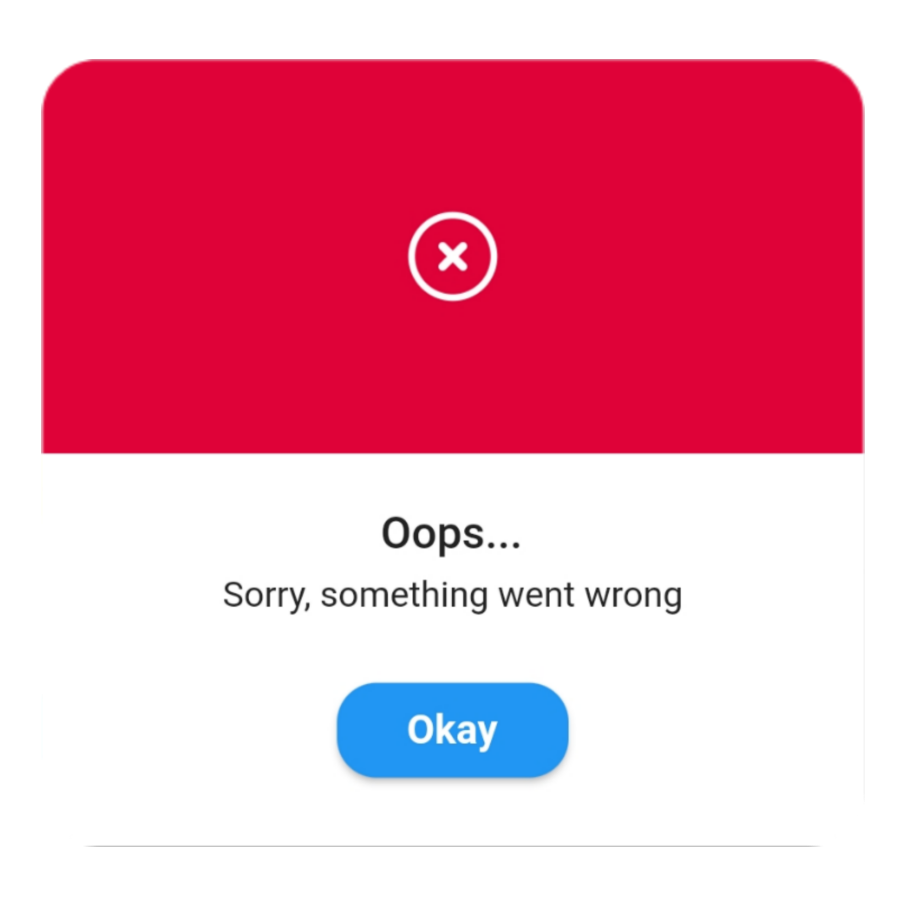
Error
QuickAlert.show(
 context: context,
 type: QuickAlertType.error,
 title: 'Oops...',
 text: 'Sorry, something went wrong',
);

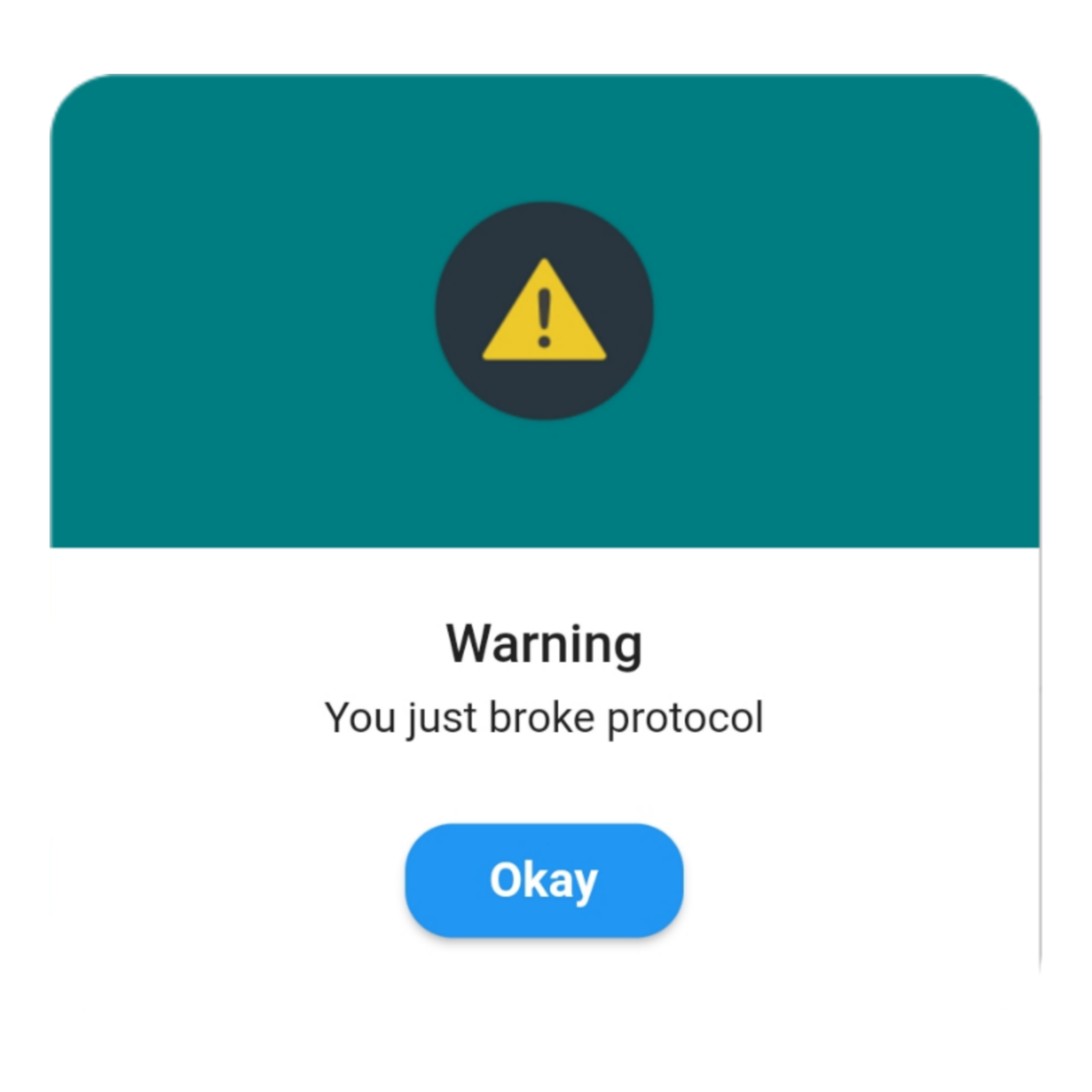
Warning
QuickAlert.show(
 context: context,
 type: QuickAlertType.warning,
 text: 'You just broke protocol',
);

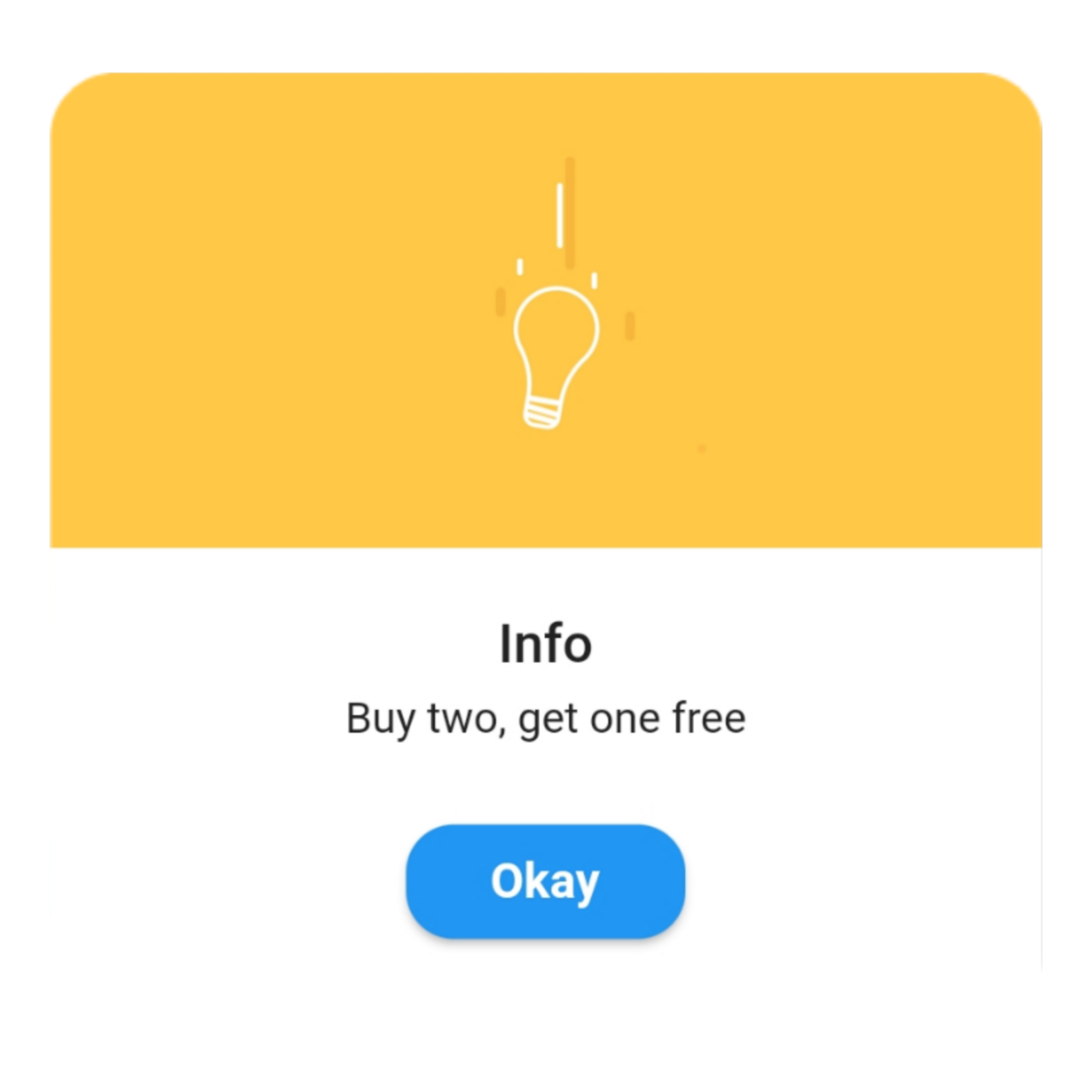
Info
QuickAlert.show(
 context: context,
 type: QuickAlertType.info,
 text: 'Buy two, get one free',
);

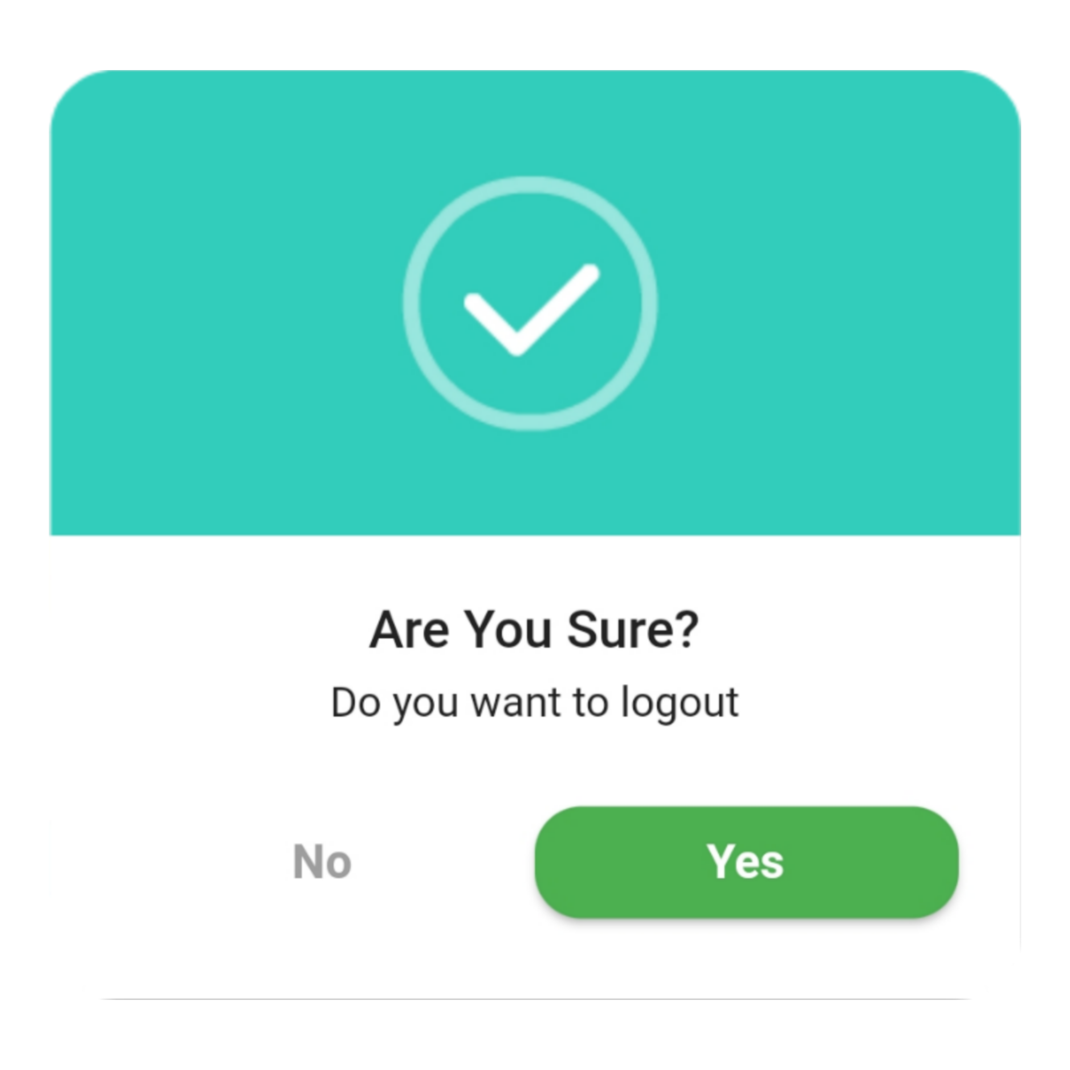
Confirm
QuickAlert.show(
 context: context,
 type: QuickAlertType.confirm,
 text: 'Do you want to logout',
 confirmBtnText: 'Yes',
 cancelBtnText: 'No',
 confirmBtnColor: Colors.green,
);

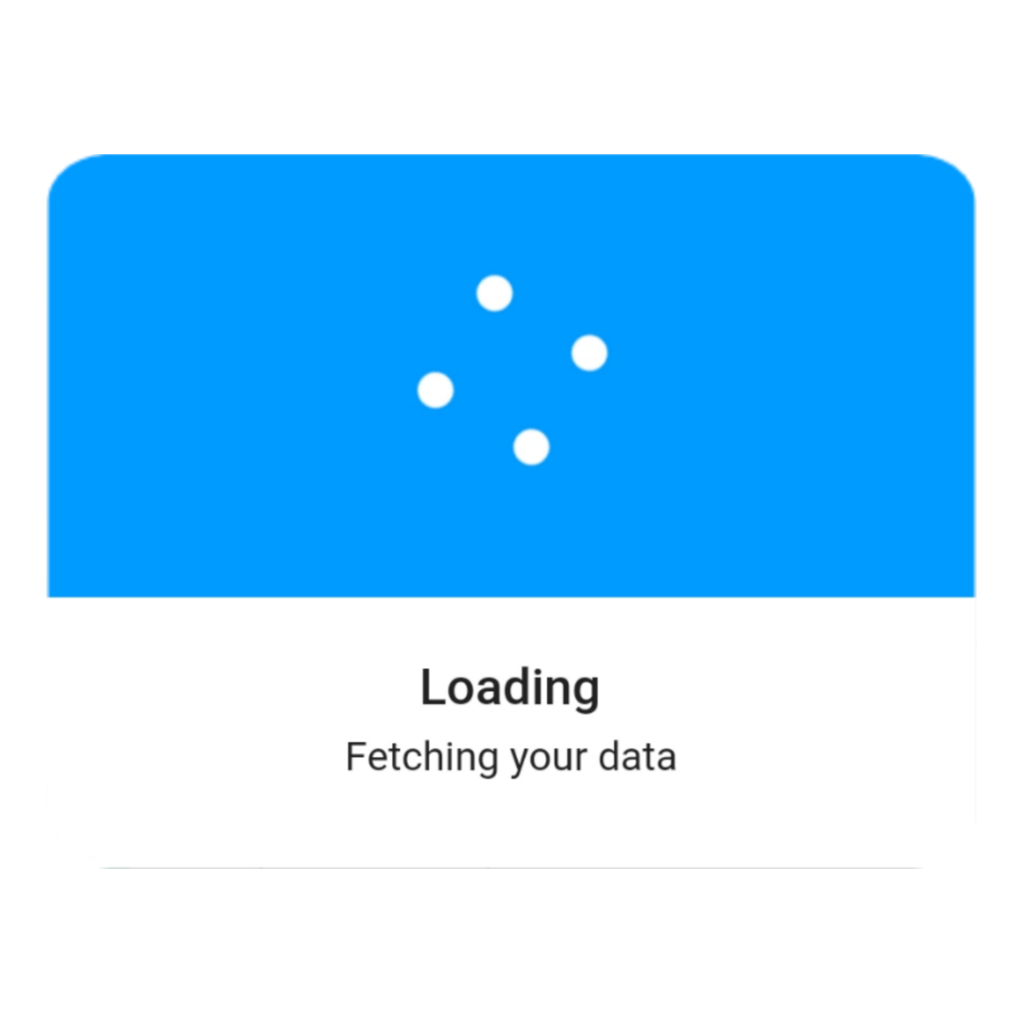
Loading
QuickAlert.show(
 context: context,
 type: QuickAlertType.loading,
 title: 'Loading',
 text: 'Fetching your data',
);

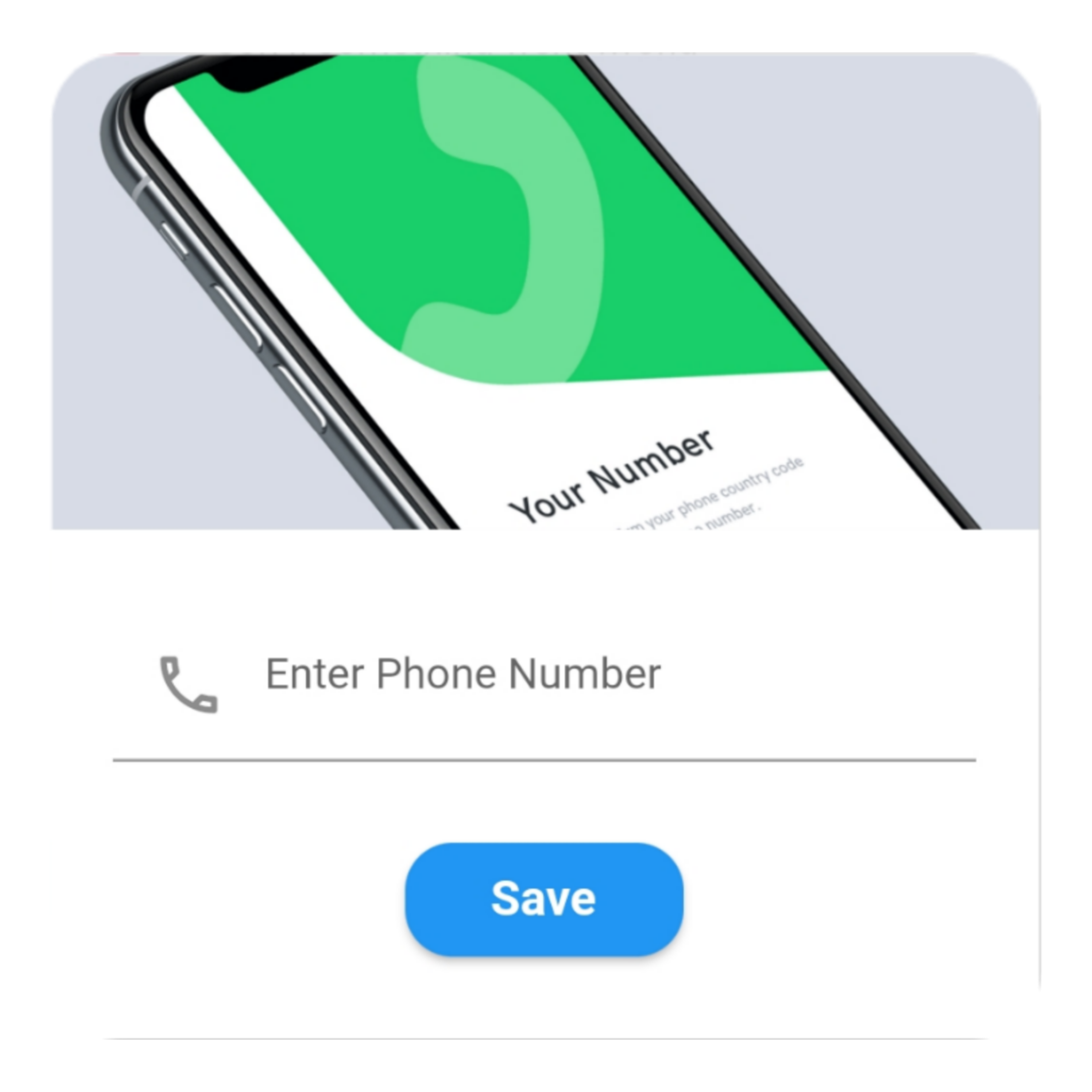
Custom
QuickAlert.show(
  context: context,
  type: QuickAlertType.custom,
  barrierDismissible: true,
  confirmBtnText: 'Save',
  customAsset: 'assets/custom.gif',
  widget: TextFormField(
  decoration: const InputDecoration(
     alignLabelWithHint: true,
     hintText: 'Enter Phone Number',
     prefixIcon: Icon(
     Icons.phone_outlined,
     ),
    ),
    textInputAction: TextInputAction.next,
      keyboardType: TextInputType.phone,
      onChanged: (value) => message = value,
    ),
    onConfirmBtnTap: () async {
     if (message.length < 5) {
      await QuickAlert.show(
       context: context,
       type: QuickAlertType.error,
       text: 'Please input something',
      );
      return;
    }
    Navigator.pop(context);
     await Future.delayed(const Duration(milliseconds: 1000));
     await QuickAlert.show(
      context: context,
      type: QuickAlertType.success,
      text: "Phone number '$message' has been saved!.",
     );
    },
  );
 },
 title: 'Custom',
 text: 'Custom Widget Alert',
 leadingImage: 'assets/custom.gif',
); 

Screenshots ✨

Here are some screenshots of the QuickAlert Dialogs.

QuickAlert Options 📖

These are the options available in QuickAlert Class.

Attribute Data type Description Default Value
context BuildContext @required BuildContext N/A
type QuickAlertType @required - Type of alert dialog, ex: QuickAlertType.success for success dialogs NULL
title String Set a custom title for dialog Based on the QuickAlertType selected
text String Set the description text of the dialog. NULL
widget Widget Set custom widget of the dialog. NULL
confirmBtnText String Text of confirm button 'Okay'
onConfirmBtnTap Function Function that handle click of confirm button () => Navigator.pop(context)
confirmBtnColor Color Color of confirm Button Colors.blue
showCancelBtn bool Determines if cancel button is shown or not false
showConfirmBtn bool Determines if confirm button is shown or not true
cancelBtnText String Text of cancel button 'Cancel'
onCancelBtnTap Function Function that handle click of cancel button () => Navigator.pop(context)
barrierDismissible bool Dismiss dialog on touch overlay true
animType QuickAlertAnimType Type of dialogue enter animation QuickAlertAnimType.scale
confirmBtnTextStyle TextStyle Confirm button text theme TextStyle(color: Colors.white, fontWeight:FontWeight.w600,fontSize: 18.0)
cancelBtnTextStyle TextStyle Cancel button text theme TextStyle(color: Colors.grey, fontWeight:FontWeight.w600,fontSize: 18.0)
backgroundColor Color Color of dialog background Colors.white
headerBackgroundColor Color Background Color of dialog Header Background Colors.white
titleColor Color Color of title Colors.black
textColor Color Color of text Colors.black
barrierColor Color Color of Barrier NULL
customAsset String Asset path of your custom asset NULL
autoCloseDuration Duration Determines how long the dialog stays open for before closing NULL
width double Dialog width MediaQuery.of(context).size.shortestSide
titleAlignment TextAlign Title Alignment of the dialog NULL
textAlignment TextAlign Text Alignment of the dialog NULL
borderRadius double Dialog's border radius 15.0
disableBackBtn bool Determines if the dialog should be closed when back button is pressed false

카테고리

의존성

의존성 목록 1 개

소스 저장소

이 패키지를 사용하는 프로젝트