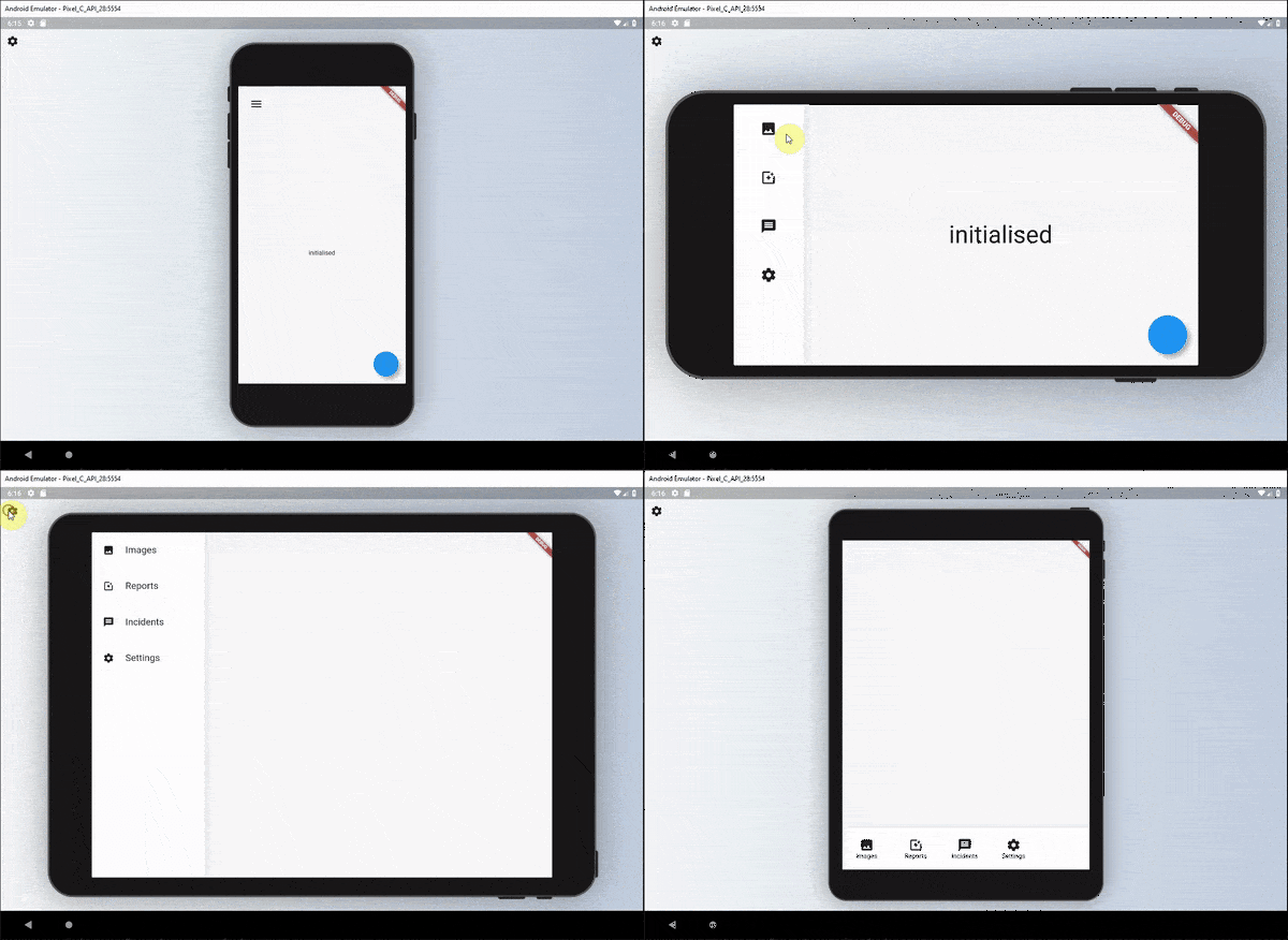
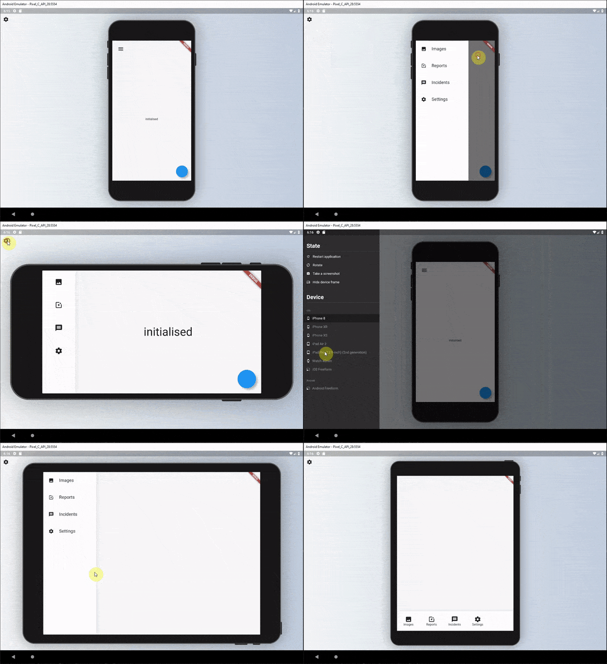
ResponsiveBuilder는 화면 크기와 기기 유형에 따라 레이아웃을 쉽게 조정할 수 있도록 도와주는 위젯을 제공함으로써 반응형 사용자 인터페이스를 만드는 것을 간소화하는 Flutter 패키지입니다. 다양한 브레이크포인트에 대해 서로 다른 UI 구조를 정의할 수 있어 Android, iOS, 웹, macOS, Windows, Linux에서 최적의 표시를 보장합니다. 너비, 높이, 방향과 같은 장치 특성에 기반한 직관적인 조건부 렌더링을 통해 반응형 코드의 가독성과 유지보수성을 향상시킵니다. 복잡한 로직이나 반복 코드 없이 적응형 디자인을 만들기에 이상적입니다.
사용 사례
다양한 화면 크기에 맞는 적응형 레이아웃 구축
반응형 대시보드 만들기
일관된 UI를 갖춘 크로스 플랫폼 앱 설계
모바일과 데스크톱용으로 다른 UI 구현
태블릿 및 대형 화면을 위한 콘텐츠 레이아웃 최적화
주요 기능
브레이크포인트 기반 반응형 디자인
모든 주요 플랫폼 지원
반응형 논리용 깔끔하고 가독성 높은 구문
내장 장치 유형 감지
기존 Flutter 프로젝트와의 간편한 통합
적합한 대상
크로스 플랫폼 Flutter 앱을 개발하는 개발자
기기 간 UI 일관성에 중점을 두는 팀
웹 및 모바일용 적응형 레이아웃이 필요한 프로젝트
반응형 디자인에 중점을 둔 프론트엔드 개발자
모바일 및 데스크톱 사용자를 대상으로 하는 앱
고려 사항
기기 유형 간 추가 테스트가 필요할 수 있습니다
사용자 정의 로직 없이 고도로 동적 레이아웃에는 적합하지 않습니다
명확한 브레이크포인트 정의와 함께 사용할 때 가장 효과적입니다
성능에 미치는 영향은 무시할 수 있지만 복잡성에 따라 달라짐
반응형 디자인 원칙을 이해해야 합니다
원본 README
연결된 소스 저장소의 README 원문 스냅샷입니다. 최신 내용은 저장소에서 확인하세요.
Responsive Builder 💻➡️🖥➡️📱➡️⌚️
The responsive builder package contains widgets that allows you to create a readable responsive UI. The package is inspired by the Responsive UI Flutter series created by FilledStacks.
It aims to provide you with widgets that make it easy to build different UI's along two different Axis. Orientation x ScreenType. This means you can have a separate layout for Mobile - Landscape, Mobile - Portrait, Tablet - Landscape and Tablet-Portrait.
If you follow along with the series you will have a complete understanding of how it's built and how to use it. Part 2 goes over how we build the example included in this project.
Installation
Add responsive_builder as dependency to your pubspec file.
responsive_builder:
Usage
This package provides a widget called ResponsiveBuilder that provides you with a builder function that returns the current SizingInformation. The SizingInformation includes the DeviceScreenType, screenSize and localWidgetSize. This can be used for fine grained responsive control from a view level down to per widget responsive level.
Responsive Builder
The ResponsiveBuilder is used as any other builder widget.
// import the packageimport'package:responsive_builder/responsive_builder.dart';
// Use the widgetResponsiveBuilder(
builder: (context, sizingInformation) {
// Check the sizing information here and return your UIif (sizingInformation.deviceScreenType == DeviceScreenType.desktop) {
returnContainer(color:Colors.blue);
}
if (sizingInformation.deviceScreenType == DeviceScreenType.tablet) {
returnContainer(color:Colors.red);
}
if (sizingInformation.deviceScreenType == DeviceScreenType.watch) {
returnContainer(color:Colors.yellow);
}
returnContainer(color:Colors.purple);
},
},
);
}
This will return different colour containers depending on which device it's being shown on. A simple way to test this is to either run your code on Flutter web and resize the window or add the device_preview package and view on different devices.
Orientation Layout Builder
This widget can be seen as a duplicate of the OrientationBuilder that comes with Flutter, but the point of this library is to help you produce a readable responsive UI code base. As mentioned in the follow along tutorial I didn't want responsive code riddled with conditionals around orientation, MediaQuery or Renderbox sizes. That's why I created this builder.
The usage is easy. Provide a builder function that returns a UI for each of the orientations.
// import the packageimport'package:responsive_builder/responsive_builder.dart';
// Return a widget function per orientationOrientationLayoutBuilder(
portrait: (context) => Container(color: Colors.green),
landscape: (context) => Container(color: Colors.pink),
),
This will return a different coloured container when you swap orientations for your device. In a more readable manner than checking the orientation with a conditional.
Sometimes you want your app to stay in a certain orientation. use mode property in OrientationLayoutBuilder to enforce this.
This widget is similar to the Orientation Layout Builder in that it takes in Widgets that are named and displayed for different screen types.
// import the packageimport'package:responsive_builder/responsive_builder.dart';
// Construct and pass in a widget per screen typeScreenTypeLayout(
mobile: Container(color:Colors.blue)
tablet: Container(color: Colors.yellow),
desktop: Container(color: Colors.red),
watch: Container(color: Colors.purple),
);
If you don't want to build all the widgets at once, you can use the widget builder. A widget for the right type of screen will be created only when needed.
// Construct and pass in a widget builder per screen typeScreenTypeLayout.builder(
mobile: (BuildContext context) => Container(color:Colors.blue),
tablet: (BuildContext context) => Container(color:Colors.yellow),
desktop: (BuildContext context) => Container(color:Colors.red),
watch: (BuildContext context) => Container(color:Colors.purple),
);
Custom Screen Breakpoints
If you wish to define your own custom break points you can do so by supplying either the ScreenTypeLayout or ResponsiveBuilder widgets with a breakpoints argument.
To get a more in depth run through of this package I would highly recommend watching this tutorial where I show you how it was built and how to use it.
Global Screen Breakpoints
If you want to set the breakpoints for the responsive builders once you can call the line below before the app starts, or wherever you see fit.
This will then reflect the screen types based on what you have set here. You can then still pass in custom break points per ScreenTypeLayout if you wish that will override these values for that specific ScreenTypeLayout builder.
Screen Type specific values
Sometimes you don't want to write an entire new UI just to change one value. Say for instance you want your padding on mobile to be 10, on the tablet 30 and desktop 60. Instead of re-writing UI you can use the getValueForScreenType function. This is a generic function that will return your value based on the screen type you're on. Take this example below.
It will return the value you give it for the DeviceScreen you're viewing the app on. For instance you want to hide a widget on mobile and not on tablet?
That will return true on tablet devices and false on mobile.
Responsive Sizing
In addition to providing specific layouts per device type there's also the requirement to size items based on the screen width or height. To use this functionality we added some responsive extensions. To use this wrap your Material or Cupertino App with the ResponsiveApp widget.
This is required to use the following functionality.
Responsive Sizing
To use the responsive sizing all you need to do is the following.
import'package:responsive_builder/responsive_builder.dart';
SizedBox(height: 30.screenHeight); // Or sh for shorthandText('respond to width', style: TextStyle(fontSize: 10.sw));
Use the number you want as the percentage and call the screenHeight or screenWidth extension. These also have shorthand extensions sh and sw.
Contribution
Fork it!
Create your feature branch: git checkout -b my-new-feature
Commit your changes: git commit -am 'Add some feature'
Push to the branch: git push origin my-new-feature