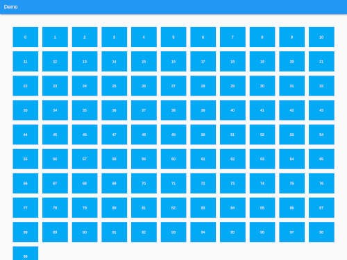
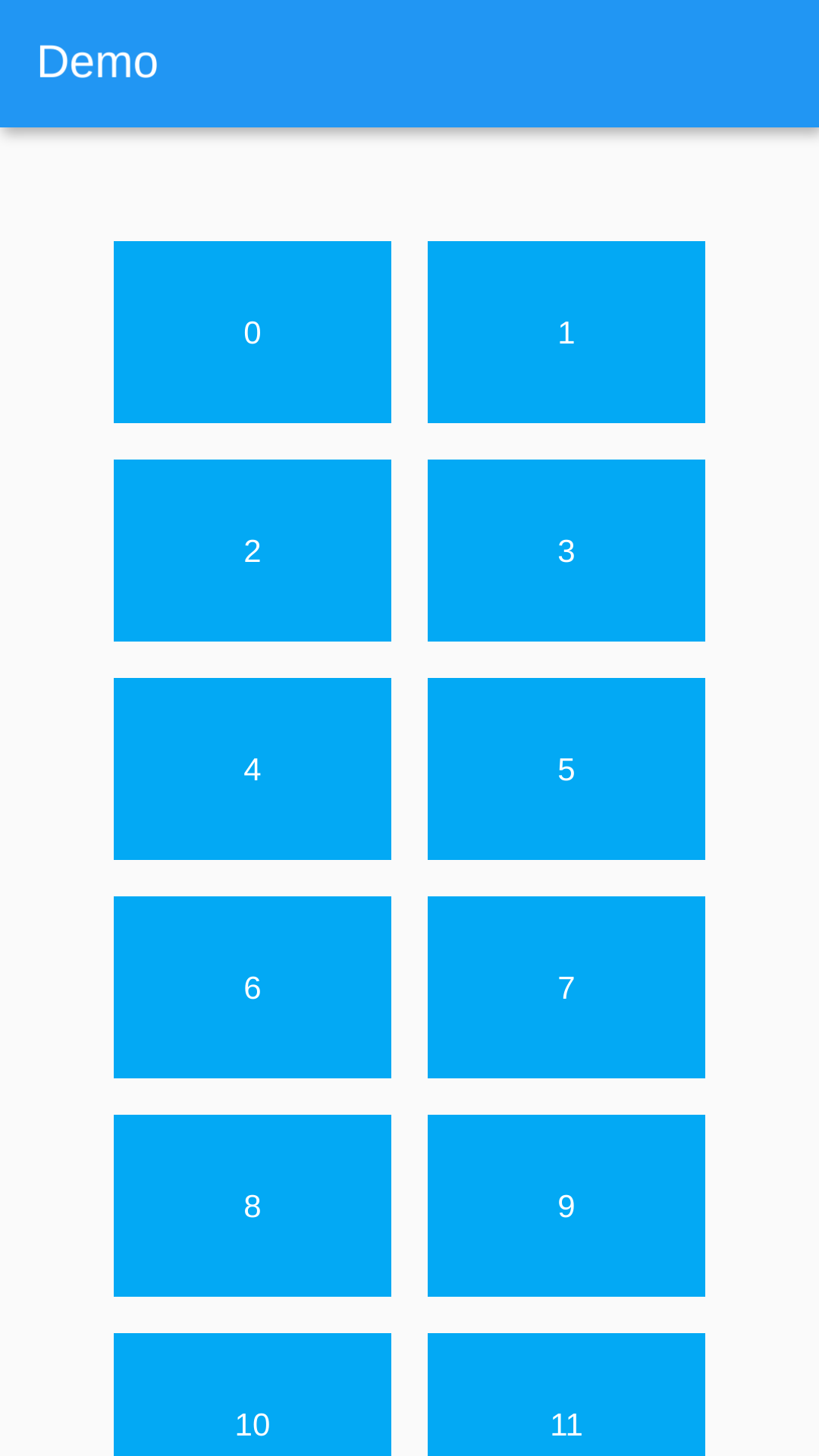
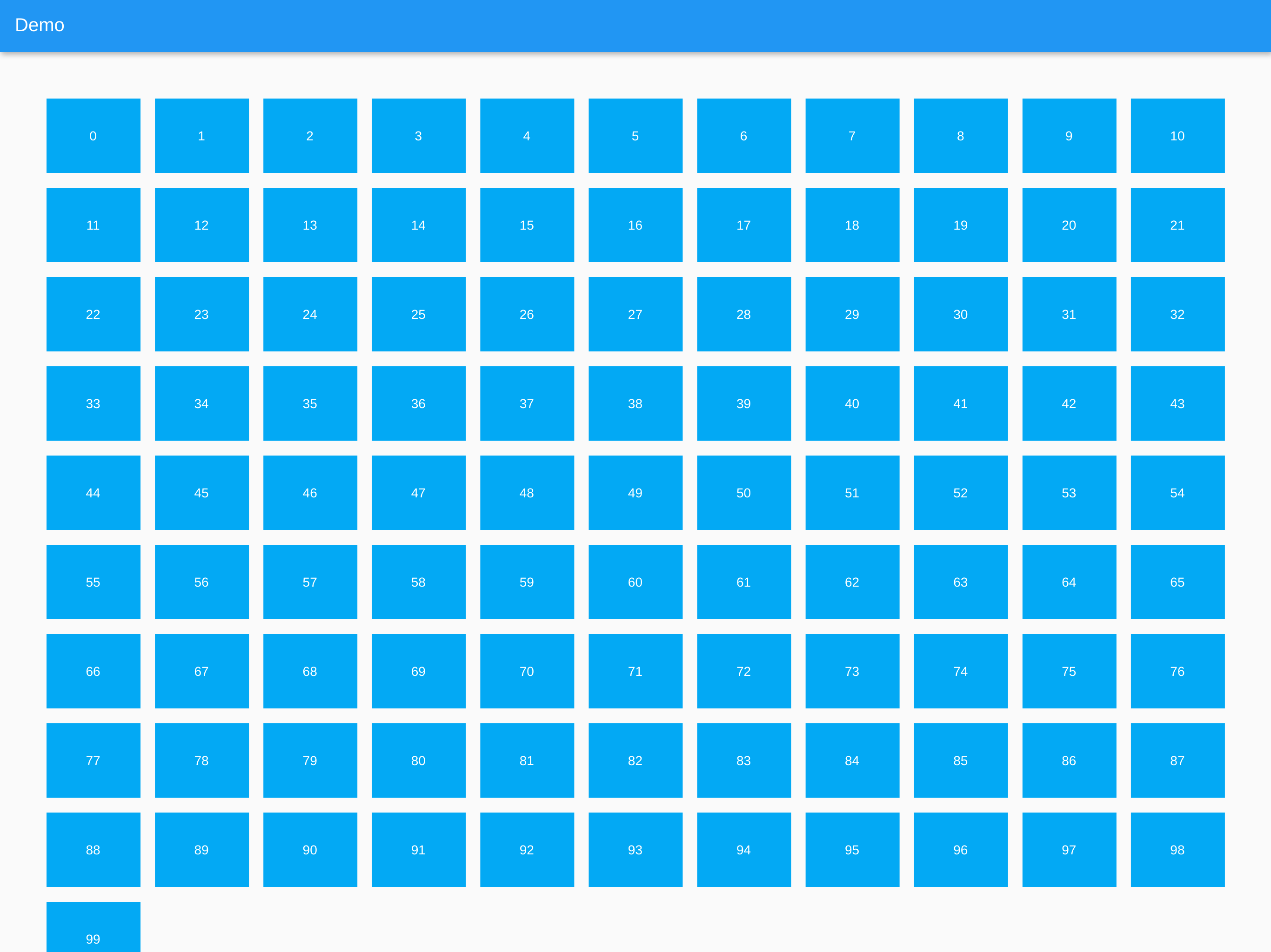
ListView.builder() 또는 SliverList와 SliverChildBuilderDelegate를 사용하여 반응형 그리드 목록을 생성할 수 있는 플러터 패키지입니다. 화면 크기에 따라 열의 수를 자동으로 조정하여 모든 기기에서 최적의 레이아웃을 보장합니다. 이미지, 카드, 제품 등의 항목 컬렉션을 유연하고 적응형 방식으로 표시하기에 이상적입니다. 이 패키지는 Android, iOS, 웹, macOS, Windows, Linux 등 모든 주요 플랫폼을 지원합니다.
사용 사례
이미지 갤러리 표시
제품 카탈로그 구축
적응형 카드 레이아웃 만들기
반응형 대시보드 구현
동적 콘텐츠 그리드 렌더링
주요 기능
화면 크기에 따라 열을 자동으로 조정합니다
ListView.builder 및 SliverList를 지원합니다
크로스 플랫폼 호환성
기존 위젯과의 간단한 통합
유연한 항목 크기 조정
적합한 대상
반응형 UI를 구축하는 개발자
다양한 기기 크기에 대응하는 앱
콘텐츠 중심 애플리케이션
그리드 일관성을 요구하는 디자인 시스템
고려 사항
항목의 비율을 신중하게 다뤄야 합니다
맞춤 간격 조정이 필요할 수 있습니다
매우 복잡한 격자 패턴에는 적합하지 않습니다
성능은 항목의 복잡성에 따라 달라집니다
고급 사용자 정의 없이 기본 그리드 동작에 제한됨
원본 README
연결된 소스 저장소의 README 원문 스냅샷입니다. 최신 내용은 저장소에서 확인하세요.
Responsive Grid List
A Flutter plugin to create responsive grid lists using ListView.builder(), SliverList with a SliverChildBuilderDelegate or any other list.
The provided Widgets essentially work like a Flutter Wrap Widget but they are more performant with large lists because of the internal use of ListView.builder() functions.
The items in the grid are all the same width and have the same height per row. This means when a Card widget for example is higher because of a large description or so, the whole row will get higher. The row after that can be lower since it will be the height of it's highest child.
A Responsive Grid List which uses ListView.builder() internally.
ResponsiveGridList(
    horizontalGridSpacing: 16, // Horizontal space between grid items
    verticalGridSpacing: 16, // Vertical space between grid items
    horizontalGridMargin: 50, // Horizontal space around the grid
    verticalGridMargin: 50, // Vertical space around the grid
    minItemWidth: 300, // The minimum item width (can be smaller, if the layout constraints are smaller)
    minItemsPerRow: 2, // The minimum items to show in a single row. Takes precedence over minItemWidth
    maxItemsPerRow: 5, // The maximum items to show in a single row. Can be useful on large screens
    listViewBuilderOptions: ListViewBuilderOptions(), // Options that are getting passed to the ListView.builder() function
    children: [...], // The list of widgets in the list
);
ResponsiveSliverGridList
A Responsive Grid List which uses SliverList with a SliverChildBuilderDelegate internally.
ResponsiveSliverGridList(
    horizontalGridSpacing: 16, // Horizontal space between grid items
    verticalGridSpacing: 16, // Vertical space between grid items
    horizontalGridMargin: 50, // Horizontal space around the grid
    verticalGridMargin: 50, // Vertical space around the grid
    minItemWidth: 300, // The minimum item width (can be smaller, if the layout constraints are smaller)
    minItemsPerRow: 2, // The minimum items to show in a single row. Takes precedence over minItemWidth
    maxItemsPerRow: 5, // The maximum items to show in a single row. Can be useful on large screens
    sliverChildBuilderDelegateOptions: SliverChildBuilderDelegateOptions(), // Options that are getting passed to the SliverChildBuilderDelegate() function
    children: [...], // The list of widgets in the list
);
ResponsiveGridListBuilder
A Responsive Grid List which offers a builder in which every List / Column can be used with this package.
ResponsiveGridListBuilder(
horizontalGridSpacing: 16, // Horizontal space between grid items
verticalGridSpacing: 16, // Vertical space between grid items
horizontalGridMargin: 50, // Horizontal space around the grid
verticalGridMargin: 50, // Vertical space around the grid
minItemWidth: 300, // The minimum item width (can be smaller, if the layout constraints are smaller)
minItemsPerRow: 2, // The minimum items to show in a single row. Takes precedence over minItemWidth
maxItemsPerRow: 5, // The maximum items to show in a single row. Can be useful on large screens
gridItems: [...], // The list of widgets in the grid
builder: (context, items) {
// Place to build a List or Column to access all properties.// Set [items] as children attribute for example.
}
);
Extending AbstractResponsiveGridList
To create a Responsive Grid you can extend the AbstractResponsiveGridList class and access the getResponsiveGridListItems(double maxWidth) function to generate the grid and pipe it into your custom list.
classMyResponsiveGridListextendsAbstractResponsiveGridList{
/// Constructor etc...
[...]
@overrideWidgetbuild(BuildContext context) {
returnLayoutBuilder(
builder: (BuildContext context, BoxConstraints constraints) {
// The abstract class has a function to generate the grid from// the constructor's paramters and the layout constraints max widthvar items = getResponsiveGridListItems(constraints.maxWidth);
return [...]
},
);
}
}
Future Features
[x] Optional padding at the edges of the grid
[x] Tests
[ ] Optional delta in which the width of the children can vary instead of setting the just the minimum width
[ ] Option to constrain the height of the items to a fixed value
Probably better to use the Flutter GridView instead. It offers aspectRatio.