Scaled_App은 참조 디자인 너비를 기준으로 전체 UI를 비례적으로 확대/축소할 수 있는 Flutter 패키지입니다. 위젯을 동적으로 스케일링함으로써 다양한 화면 크기에서 레이아웃과 타이포그래피의 일관성을 보장합니다. 고정 너비 기반 디자인에 적합하며, 수동 조정 없이도 시각적 정확성을 유지합니다. 이 패키지는 모바일, 웹, 데스크톱을 포함한 모든 주요 플랫폼을 지원하여 정밀한 UI 제어가 필요한 크로스플랫폼 애플리케이션에 적합합니다.
사용 사례
고정 폭 디자인 적응
다중 플랫폼 UI 일관성
반응형 레이아웃 스케일링
디자인 시스템 구현
디바이스 간 UI 정밀도
주요 기능
비례 UI 스케일링
참고 설계 폭 지원
크로스 플랫폼 호환성
자동 위젯 크기 조정
필수 최소 구성
적합한 대상
고정 폭 디자인 사양을 가진 개발자
디자인 시스템을 사용하는 팀
여러 화면 크기에 대응하는 앱
픽셀 단위의 UI 복제가 필요한 프로젝트
엄격한 디자인 제약이 있는 Flutter 앱
고려 사항
고정 폭 디자인 워크플로에 가장 적합
참고 너비를 위한 초기 설정이 필요할 수 있습니다
유동적 또는 동적 레이아웃에 적합하지 않음
성능에 미치는 영향은 무시할 수 있지만 복잡성에 따라 달라짐
대상 장치에서 신중한 테스트가 필요합니다
원본 README
연결된 소스 저장소의 README 원문 스냅샷입니다. 최신 내용은 저장소에서 확인하세요.
Scale the entire UI design proportionally.
Button, image, font, every widget is scaled simultaneously.
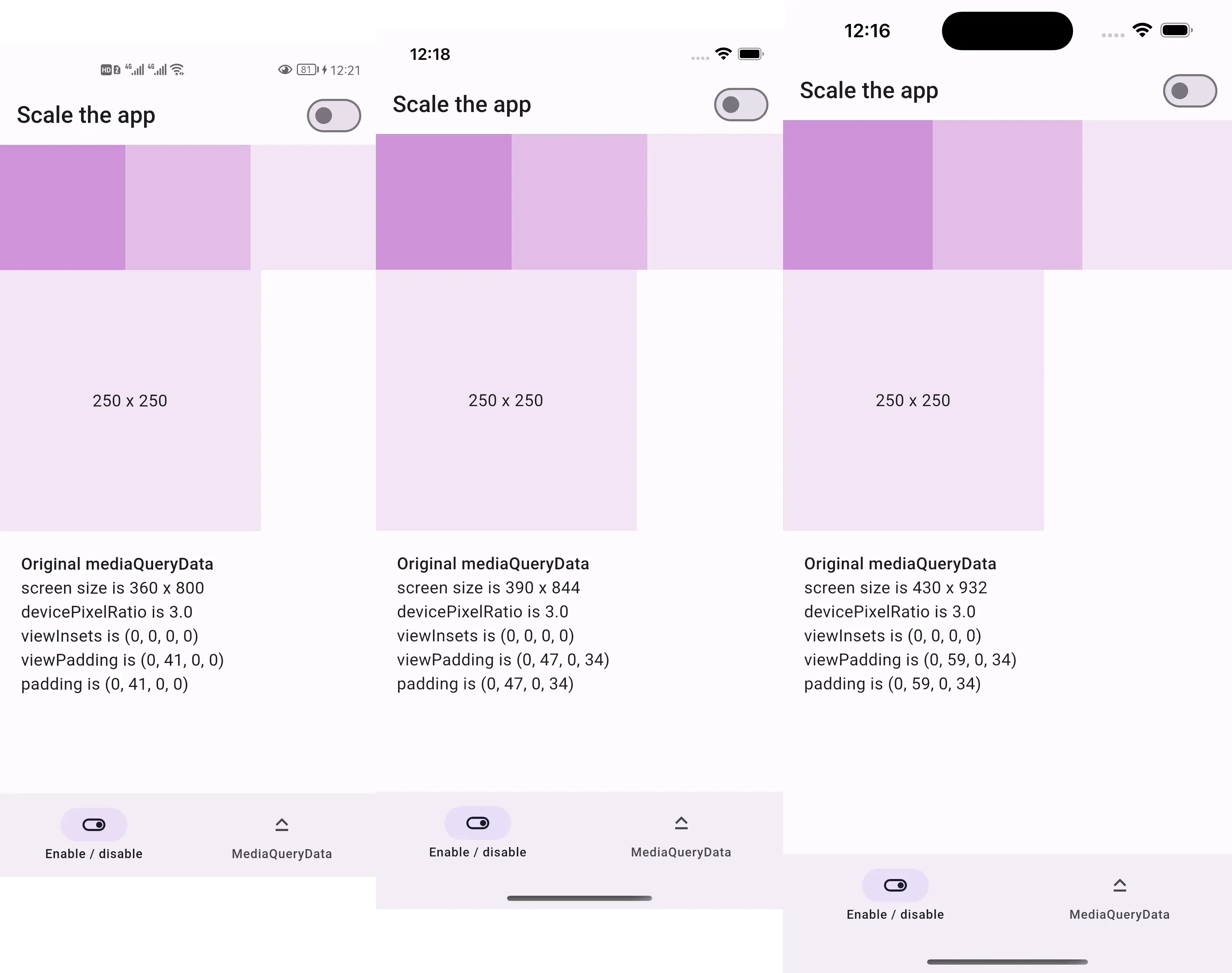
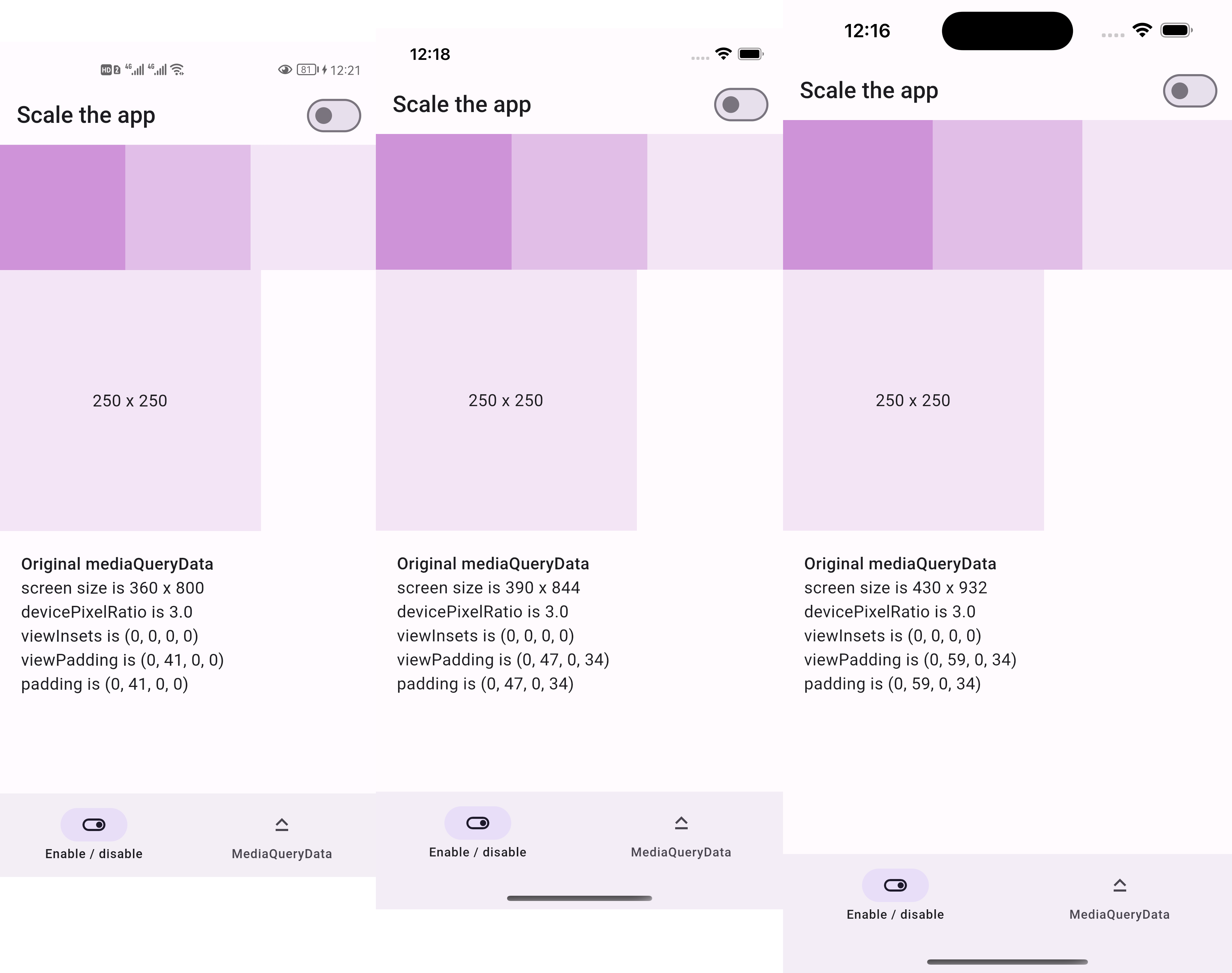
Before:
250x250 square is the same size across devices
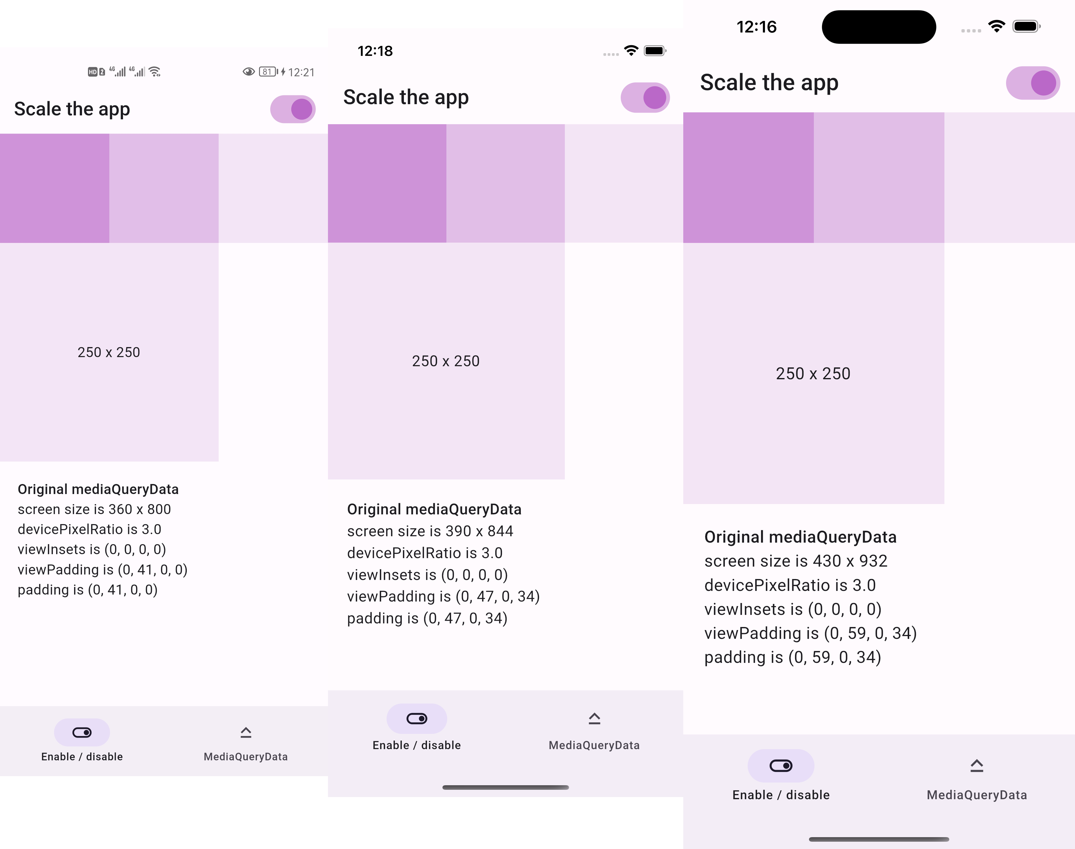
After:
250x250 square is two thirds the screen width across devices
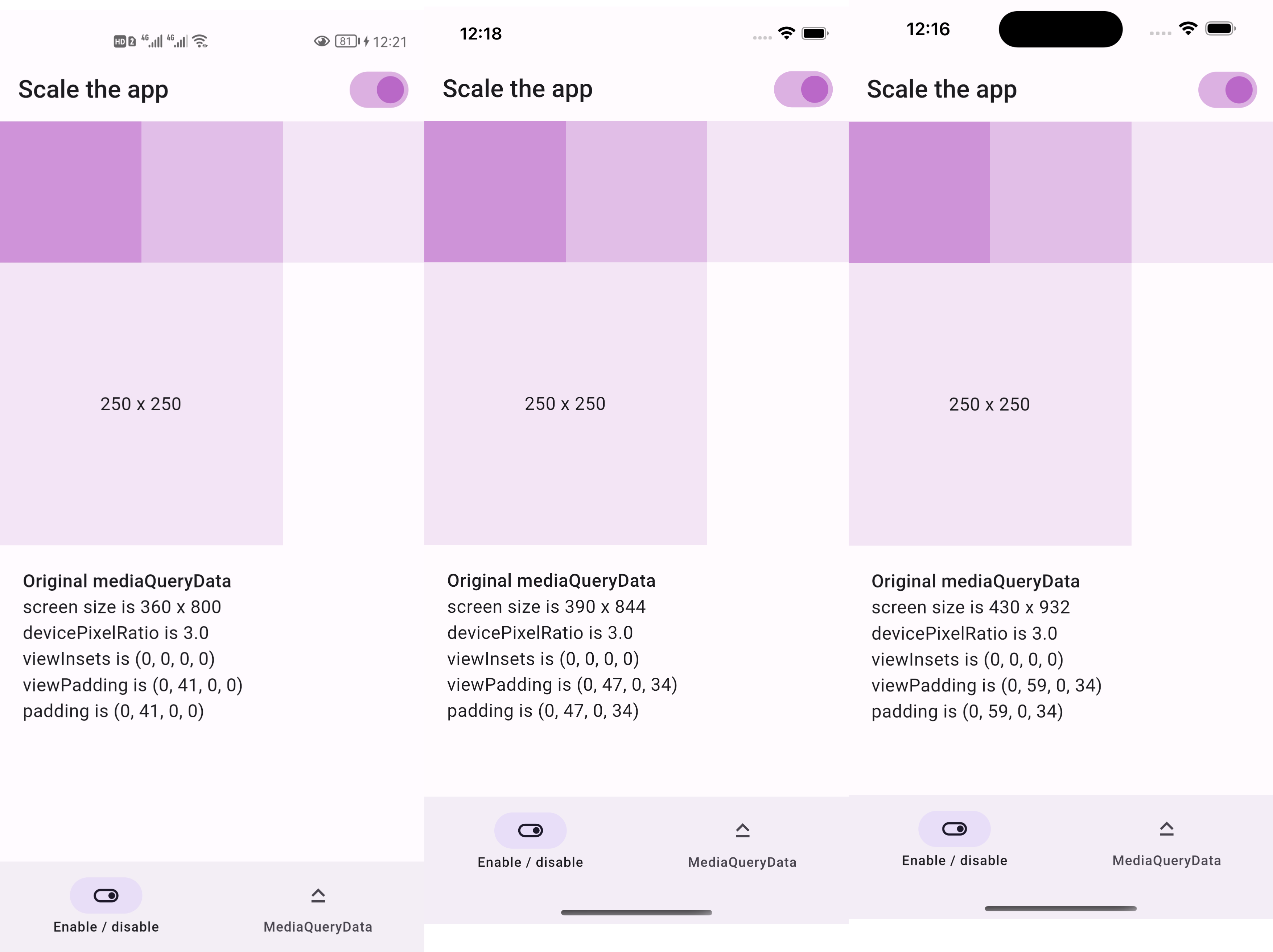
if we resize the screenshots above to be the same width
then everything appears the same size as below
Sponsor
This package is sponsored by 庞征博引, which breaks complex subjects into 5–10 minute reads you work through, and ask questions about, at your own pace.
you want to scale the entire UI, not just part of it
Usage
Firstly, replace runApp with runAppScaled
voidmain() {
// 1st way to use this packagerunAppScaled(constMyApp(), scaleFactor: (deviceSize) {
// screen width used in your UI designconstdouble widthOfDesign = 375;
return deviceSize.width / widthOfDesign;
});
}
Or, replace WidgetsFlutterBinding with ScaledWidgetsFlutterBinding
voidmain() {
// 2nd way to use this package// Scaling will be applied based on [scaleFactor] callback.ScaledWidgetsFlutterBinding.ensureInitialized(
scaleFactor: (deviceSize) {
// screen width used in your UI designconstdouble widthOfDesign = 375;
return deviceSize.width / widthOfDesign;
},
);
runApp(constMyApp());
}
Then, use MediaQueryData.scale to scale size, viewInsets, viewPadding, etc.