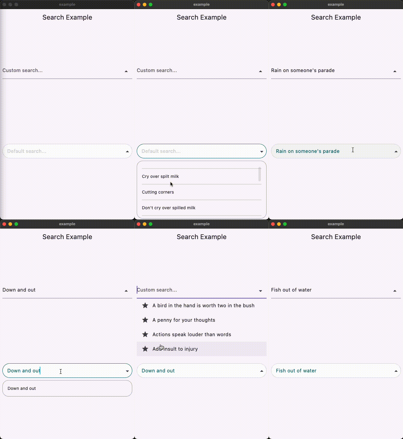
사용자 정의 가능한 드롭다운과 Cubit 또는 BLoC 상태 관리와의 원활한 통합을 지원하는 자동 완성 검색 기능을 구현하기 위한 플러터 위젯입니다. 사용자가 텍스트를 입력하면 실시간으로 제안을 받을 수 있도록 하여 검색 중심 애플리케이션의 사용자 경험을 향상시킵니다. 이 패키지는 안드로이드, iOS, 웹, macOS, 윈도우, 리눅스 등 여러 플랫폼을 지원하여 크로스플랫폼 개발에 유연하게 활용할 수 있습니다. 깔끔하고 모듈식 디자인으로 반응형이고 상호작용적인 검색 인터페이스 생성을 간소화합니다.
사용 사례
앱에서 실시간 검색
대규모 데이터셋 필터링
사용자 입력 경험 향상
사용자 정의 가능한 제안 드롭다운
크로스 플랫폼 검색 UI
주요 기능
사용자 정의 가능한 드롭다운 UI
Cubit/BLoC 통합
실시간 필터링
다중 플랫폼 지원
빠른 설정을 위한 간단한 API
적합한 대상
전자상거래 앱의 검색 기능
다시보드에서의 데이터 필터링
사용자 친화적인 입력 필드
BLoC/Cubit 사용 개발자
크로스 플랫폼 Flutter 프로젝트
고려 사항
상태 관리 지식이 필요합니다
스타일 맞춤 설정이 필요할 수 있습니다
성능은 데이터 크기에 따라 달라집니다
제한된 내장 테마
중간 규모의 데이터 세트에 가장 적합
원본 README
연결된 소스 저장소의 README 원문 스냅샷입니다. 최신 내용은 저장소에서 확인하세요.
Search Autocomplete Flutter Package
Overview
This Flutter package provides a SearchAutocomplete widget for implementing autocomplete functionality with a dropdown menu. The package offers extensive customization options for the search field, dropdown items, and includes hooks for search logic.
Installation
To use this package, add search_autocomplete as a dependency in your pubspec.yaml file:
dependencies:
  search_autocomplete: ^1.0.3
Features
Customizable search field
Customizable dropdown items
Hooks for search logic
Initial value support
Placeholder text support
Widget to display when the dropdown is empty
State Management Compatibility
Designed to work seamlessly with Cubit/Bloc and other orthodox state managers. Since the list updating logic resides higher up in the widget tree, it allows for a clean separation between UI and logic.
Usage
Here's a simple example demonstrating how to use the SearchAutocomplete widget:
Basic example:
SearchAutocomplete<String>(
  options: state.filteredItems, // Like: ['Apple', 'Banana', 'Orange'],
  initValue: state.currentItem, // Like: 'Apple',
  getString: (item) => item,
  onSearch: (query) {
    // Call your Bloc/Cubit/Provider method to filter options based on the query
    context.read<SearchCubit>().search(query);
  },
  onSelected: (item) {
    // Update your Bloc/Cubit/Provider state when an item is selected
    context.read<SearchCubit>().select(item);
  },
  hintText: 'Search fruits...',
)
Customization example:
You can customize both the search field and dropdown items appearance using provided builders: