Simple Animations는 최소한의 코드로 부드럽고 사용자 정의 가능한 애니메이션을 만들 수 있도록 해주는 Flutter 패키지입니다. 키프레임, 트윈잉, 타이밍 제어를 사용하여 위젯을 애니메이션화할 수 있는 깔끔하고 직관적인 API를 제공합니다. 페이드, 슬라이드, 스케일 전환과 같은 UI 요소에 동적 효과를 추가하는 데 이상적이며, 복잡한 애니메이션 로직을 단순화하면서도 모든 플랫폼에서 성능을 유지합니다. 이 패키지는 모든 주요 Flutter 플랫폼을 지원하므로 크로스플랫폼 앱에 매우 유연하게 활용할 수 있습니다.
사용 사례
UI 컴포넌트에 대한 진입 애니메이션 만들기
애니메이션 텍스트 및 이미지 전환
인터랙티브 앱 인터페이스 구축
버튼에 미세 인터랙션 추가하기
로딩 인디케이터 설계
사용자 정의 스크롤 기반 애니메이션 구현
주요 기능
사용하기 쉬운 키프레임 기반 애니메이션 시스템
다양한 애니메이션 유형(fade, slide, scale 등) 지원
내장된 타이밍 곡선 및 이징 함수
크로스 플랫폼 호환성
최소한의 보일러플레이트 코드
기존 Flutter 위젯과의 원활한 통합
적합한 대상
초보자에서 중급자까지의 Flutter 개발자
풍부한 시각적 피드백이 필요한 앱
디자이너와 개발자들이 협력하는 방식
사용자 경험 향상에 중점을 둔 프로젝트
인터랙티브 UI 프로토타이핑
고려 사항
기본 애니메이션 개념을 배워야 할 수 있습니다
과도한 중첩 애니메이션으로 인한 성능 영향
낮은 수준의 애니메이션 컨트롤러에 비해 고급 기능이 제한됨
복잡한 상태 기반 애니메이션보다는 선언형 애니메이션에 더 적합합니다
높은 사용자 정의 또는 물리 기반 애니메이션에 적합하지 않음
원본 README
연결된 소스 저장소의 README 원문 스냅샷입니다. 최신 내용은 저장소에서 확인하세요.
🎬 Simple Animations
Simple Animations simplifies the process of creating beautiful custom animations:
Easily create custom animations in stateless widgets
Animate multiple properties at once
Create staggered animations within seconds
Simplified working with AnimationController instances
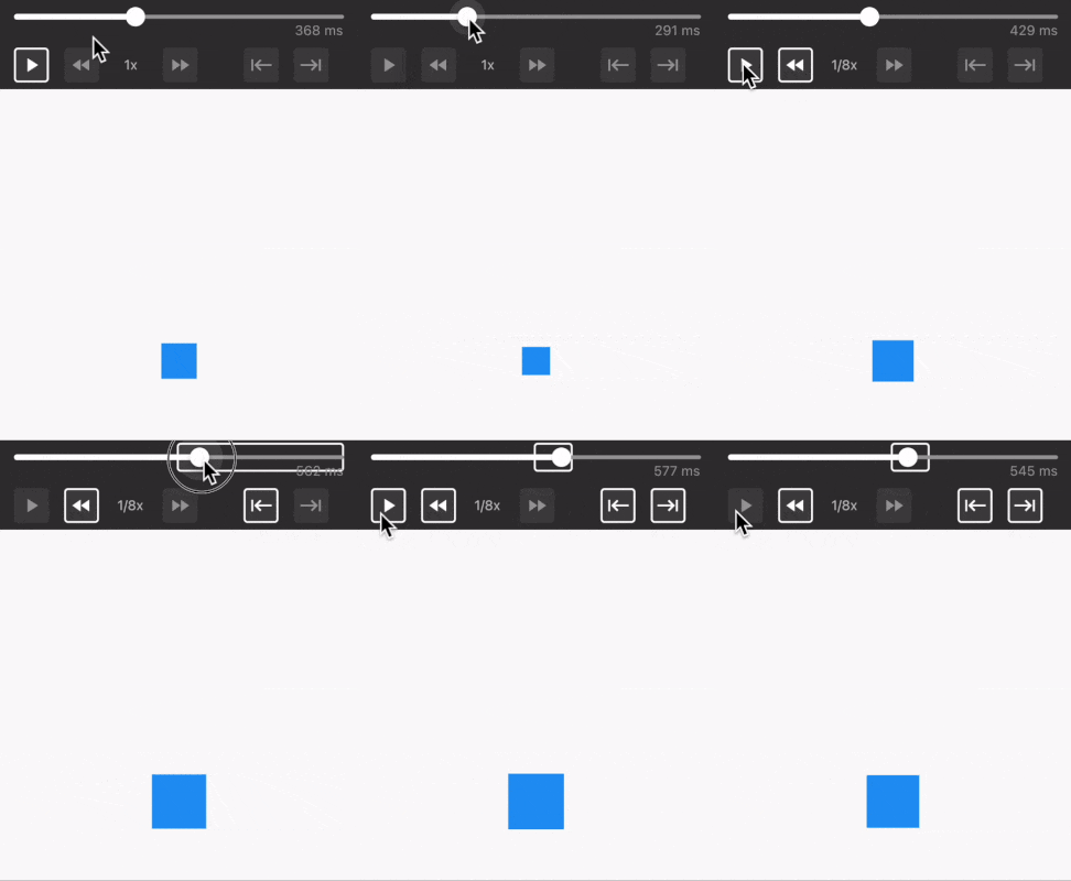
The Animation Developer Tools widget helps you fine-tune animations. It allows you to pause anywhere, scrub through the timeline, speed up, slow down, or focus on a specific part of an animation.
Animation Builder enables developers to craft custom animations with simple widgets.
Essential parts of the animation
You need three things to create an animation:
tween: What value is changing within the animation?
duration: How long does the animation take?
builder: How does the UI respond to the changing value?
Tween
The tween describes your animation. It usually changes a value from A to B. Tweens describe what will happen, but not how fast it will happen.
import'package:flutter/material.dart';
// Animate a color from red to bluevar colorTween = ColorTween(begin: Colors.red, end: Colors.blue);
// Animate a double value from 0 to 100var doubleTween = Tween<double>(begin: 0.0, end: 100.0);
To animate multiple properties, use a Movie Tween.
Duration
The duration is the time the animation takes.
Builder
The builder is a function that is called for each newly rendered frame of your animation. It takes three parameters: context, value and child.
context is your Flutter BuildContext
value is the current value produced by the tween. If your tween is Tween<double>(begin: 0.0, end: 100.0), the value is a double somewhere between 0.0 and 100.0.
child can be a widget that you pass into an Animation Builder widget. This widget stays constant and is not affected by the animation.
How often the builder function is called depends on the animation duration and the frame rate of the device.
Limit the frame rate
All Animation Builder widgets accept an optional fps parameter. This limits how often the widget rebuilds while the animation is running. It can be useful for expensive custom animations where you do not need to rebuild at the device's full frame rate.
PlayAnimationBuilder
The PlayAnimationBuilder is a widget that plays an animation once.
import'package:flutter/material.dart';
import'package:simple_animations/simple_animations.dart';
// Use type `Color?` because ColorTween produces type `Color?`var widget = PlayAnimationBuilder<Color?>(
tween: ColorTween(begin: Colors.red, end: Colors.blue), // define tween
duration: constDuration(seconds: 5), // define duration
builder: (context, value, _) {
returnContainer(
color: value, // use animated color
width: 100,
height: 100,
);
},
);
Delay
By default, animations will play automatically. You can set a delay to make PlayAnimationBuilder wait for a given amount of time.
The delay is ignored when developerMode is enabled because the Animation Developer Tools take over playback control.
Parts of the UI that are not affected by the animated value can be passed as a Widget into the child property. That Widget is available within the builder function.
It will not rebuild when the animated value changes, which improves performance.
If Flutter swaps out a PlayAnimationBuilder with a different PlayAnimationBuilder in a rebuild, it may recycle the first one.
This may lead to undesired behavior.
In such a case, use the key property.
Use CustomAnimationBuilder if the animation widgets discussed above aren't sufficient for your use case. In addition to all parameters mentioned for PlayAnimationBuilder, it lets you actively control the animation.
Control the animation
The control parameter can be set to the following values:
Control.VALUE
Description
stop
Stops the animation at the current position.
play
Plays the animation from the current position to the end.
playReverse
Plays the animation from the current position in reverse to the start.
playFromStart
Resets the animation position to the beginning (0.0) and starts playing to the end.
playReverseFromEnd
Resets the position of the animation to the end (1.0) and starts playing backwards to the start.
loop
Endlessly plays the animation from the start to the end.
mirror
Endlessly plays the animation from the start to the end, then reverses to the start, then plays forward again, and so on.
You can bind the control value to a state variable and change it during the animation. The CustomAnimationBuilder will adapt to that.
When developerMode is enabled, CustomAnimationBuilder does not apply the control instruction. The connected Animation Developer Tools control playback instead.
import'package:flutter/material.dart';
import'package:simple_animations/simple_animations.dart';
voidmain() => runApp(
constMaterialApp(
home: Scaffold(body: Center(child: SwappingButton())),
),
);
classSwappingButtonextendsStatefulWidget{
constSwappingButton({super.key});
@override_SwappingButtonStatecreateState() => _SwappingButtonState();
}
class_SwappingButtonStateextendsState<SwappingButton> {
var control = Control.play; // define variablevoid_toggleDirection() {
setState(() {
// let the animation play in the opposite direction
control = control == Control.play ? Control.playReverse : Control.play;
});
}
@overrideWidgetbuild(BuildContext context) {
returnCustomAnimationBuilder<double>(
control: control, // bind variable to control instruction
tween: Tween<double>(begin: -100.0, end: 100.0),
duration: constDuration(seconds: 1),
builder: (context, value, child) {
// moves child from left to rightreturnTransform.translate(offset: Offset(value, 0), child: child);
},
child: OutlinedButton(
// clicking button changes animation direction
onPressed: _toggleDirection,
child: constText('Swap'),
),
);
}
}
Start position
By default, the animation starts from the beginning (0.0). You can change this by setting the startPosition parameter. It can be set to a value between 0.0 (beginning) and 1.0 (end).
import'package:flutter/material.dart';
import'package:simple_animations/simple_animations.dart';
var widget = CustomAnimationBuilder<Color?>(
control: Control.play,
startPosition: 0.5, // set start position at 50%
duration: constDuration(seconds: 5),
tween: ColorTween(begin: Colors.red, end: Colors.blue),
builder: (context, value, child) {
returnContainer(color: value, width: 100, height: 100);
},
);
Animation lifecycle
You can react to the animation status by setting callbacks.
You can add scenes anywhere in your tween's timeline by using tween.scene(). You just need to provide two of these parameters:
begin (start time of the scene)
duration (duration of the scene)
end (end time of the scene)
final tween = MovieTween();
// start at 0ms and end at 1500msfinal scene1 = tween.scene(duration: constDuration(milliseconds: 1500));
// start at 200ms and end at 900msfinal scene2 = tween.scene(
begin: constDuration(milliseconds: 200),
duration: constDuration(milliseconds: 700),
);
// start at 700ms and end at 1400msfinal scene3 = tween.scene(
begin: constDuration(milliseconds: 700),
end: constDuration(milliseconds: 1400),
);
// start at 1000ms and end at 1600msfinal scene4 = tween.scene(
duration: constDuration(milliseconds: 600),
end: constDuration(milliseconds: 1600),
);
Relative scenes
You can also make scenes depend on each other by using thenFor().
It is also possible to add an optional delay to add more time between scenes.
Overlapping scenes
Avoid overlapping tweens for the same property unless you intentionally want the earlier matching scene to keep control until it ends. Overlaps are supported, but non-overlapping scenes are usually easier to reason about and maintain.
Hint on code style
By using builder-style Dart syntax and comments, you can easily create a readable animation.
You can use tween() to specify a tween for a single property.
final tween = MovieTween();
final scene = tween.scene(end: constDuration(seconds: 1));
scene.tween('width', Tween(begin: 0.0, end: 100.0));
scene.tween('color', ColorTween(begin: Colors.red, end: Colors.blue));
You can fine-tune the timing with shiftBegin or shiftEnd for each property.
scene.tween(
'width',
Tween(begin: 0.0, end: 100.0),
shiftBegin: constDuration(milliseconds: 200), // start later
shiftEnd: constDuration(milliseconds: -200), // end earlier
);
Curves
You can customize the default easing curve on the MovieTween, scene, or property tween level.
final tween = MovieTween(curve: Curves.easeIn);
// scene1 will use Curves.easeIn defined by the MovieTweenfinal scene1 = tween.scene(duration: constDuration(seconds: 1));
// scene2 will use Curves.easeOutfinal scene2 = tween.scene(
duration: constDuration(seconds: 1),
curve: Curves.easeOut,
);
// will use Curves.easeIn defined by the MovieTween
scene1.tween('value1', Tween(begin: 0.0, end: 100.0));
// will use Curves.easeOut defined by scene2
scene2.tween('value2', Tween(begin: 0.0, end: 100.0));
// will use Curves.easeInOut defined by property tween
scene2.tween(
'value3',
Tween(begin: 0.0, end: 100.0),
curve: Curves.easeInOut,
);
Extrapolation
All values that are not explicitly set in the timeline will be extrapolated per property. Before the first tween of a property, MovieTween uses that property's first value. After the last tween of a property, it keeps that property's last value.
Only properties that are part of the MovieTween can be read from the resulting Movie. Accessing a property that was never tweened is an error.
final tween = MovieTween()
// implicitly use 100.0 for width values from 0.0s - 1.0s// 1.0s - 2.0s
..scene(
begin: constDuration(seconds: 1),
duration: constDuration(seconds: 1),
).tween('width', Tween<double>(begin: 100.0, end: 200.0))
// implicitly use 200.0 for width values from 2.0s - 3.0s// 3.0s - 4.0s
..scene(
begin: constDuration(seconds: 3),
end: constDuration(seconds: 4),
).tween('height', Tween<double>(begin: 400.0, end: 500.0));
Use developer tools
Creating complex tweens with multiple or staggered properties can be time-consuming to create and maintain. Use the Animation Developer Tools to streamline this process.
Animation duration
Normally, an Animatable or Tween doesn't contain duration information. The MovieTween class has a duration property that stores the total duration of the animation.
💪 The AnimationMixin generates a preconfigured AnimationController as controller. You can use it directly. No need to worry about initialization or disposal.
The managed controllers automatically call setState() while they animate, so you can read animation values directly inside build().
Create multiple AnimationController instances
With multiple AnimationController instances, you can have many parallel animations at the same time.
AnimationMixin adds createController() to your state class, allowing you to create multiple managed AnimationController instances. ("Managed" means that you don't need to handle initialization or disposal.)
Create a managed AnimationController
First, create a class variable of type AnimationController. Then call createController() inside the initState() {...} method. That's all.
Use createController(fps: 30) to limit rebuilds for expensive animations. Use createController(unbounded: true) when you need an AnimationController.unbounded, for example for physics-style animations that can move beyond the default 0.0 to 1.0 range.
Shortcuts for AnimationController
The extension for AnimationController adds four convenience methods:
controller.play() plays the animation and stops at the end.
controller.playReverse() plays the animation in reverse and stops at the start.
controller.loop() repeatedly plays the animation from the start to the end.
controller.mirror() repeatedly plays the animation forward, then backwards, then forward again, and so on.
Each of these methods takes an optional duration named parameter to configure your animation action in one line of code.
Passing duration updates the controller's duration property. Future playback calls will keep using that value until you change it again.
have a constructor parameter developerMode that can be set to true. It will connect to the closest AnimationDeveloperTools widget.
With developerMode enabled, the developer toolbar drives the animation. The widget's normal playback instruction, such as control or delay, is not applied while debugging.
If your stateful widget uses AnimationMixin to manage your AnimationController instances, you can call enableDeveloperMode() to connect to the closest AnimationDeveloperTools widget.