Flutter용 간단하고 사용자 정의 가능한 슬라이드 버튼 위젯으로, 사용자가 트랙을 따라 엄지손가락을 끌어다 액션을 트리거할 수 있습니다. 사용자 지정 스타일, 애니메이션 및 슬라이더를 움직이거나 해제했을 때 콜백 이벤트를 지원합니다. 여러 플랫폼 대상 앱에서 토글, 확인 또는 인터랙티브 컨트롤에 적합합니다. 패키지는 가볍고 최소한의 구성으로 쉽게 통합할 수 있습니다.
사용 사례
폼 확인 슬라이더
토글 스위치
인터랙티브 온보딩 요소
사용자 정의 가능한 작업 트리거
사용자 동의 프롬프트
주요 기능
완전히 사용자 정의 가능한 외관
드래그 제스처 지원
드래그 및 해제 시 콜백
부드러운 애니메이션
크로스 플랫폼 호환성
간단한 API 통합
적합한 대상
경량 슬라이더를 찾는 개발자
인터랙티브 요소가 필요한 UI 디자이너
사용자 확인 조작이 필요한 앱
다중 플랫폼 Flutter 프로젝트
사용자 정의 폼 컴포넌트
고려 사항
제한된 내장 테마
내장된 접근성 기능 없음
경계 사례에 대한 수동 처리가 필요합니다
복잡한 슬라이더 상호작용에 적합하지 않음
기본 사용법을 넘어서는 최소 문서
원본 README
연결된 소스 저장소의 README 원문 스냅샷입니다. 최신 내용은 저장소에서 확인하세요.
slidable_button
A simple flutter plugin for Slidable Button.
Note : This plugin is cloned and remade from swipe_button.
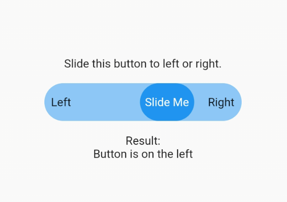
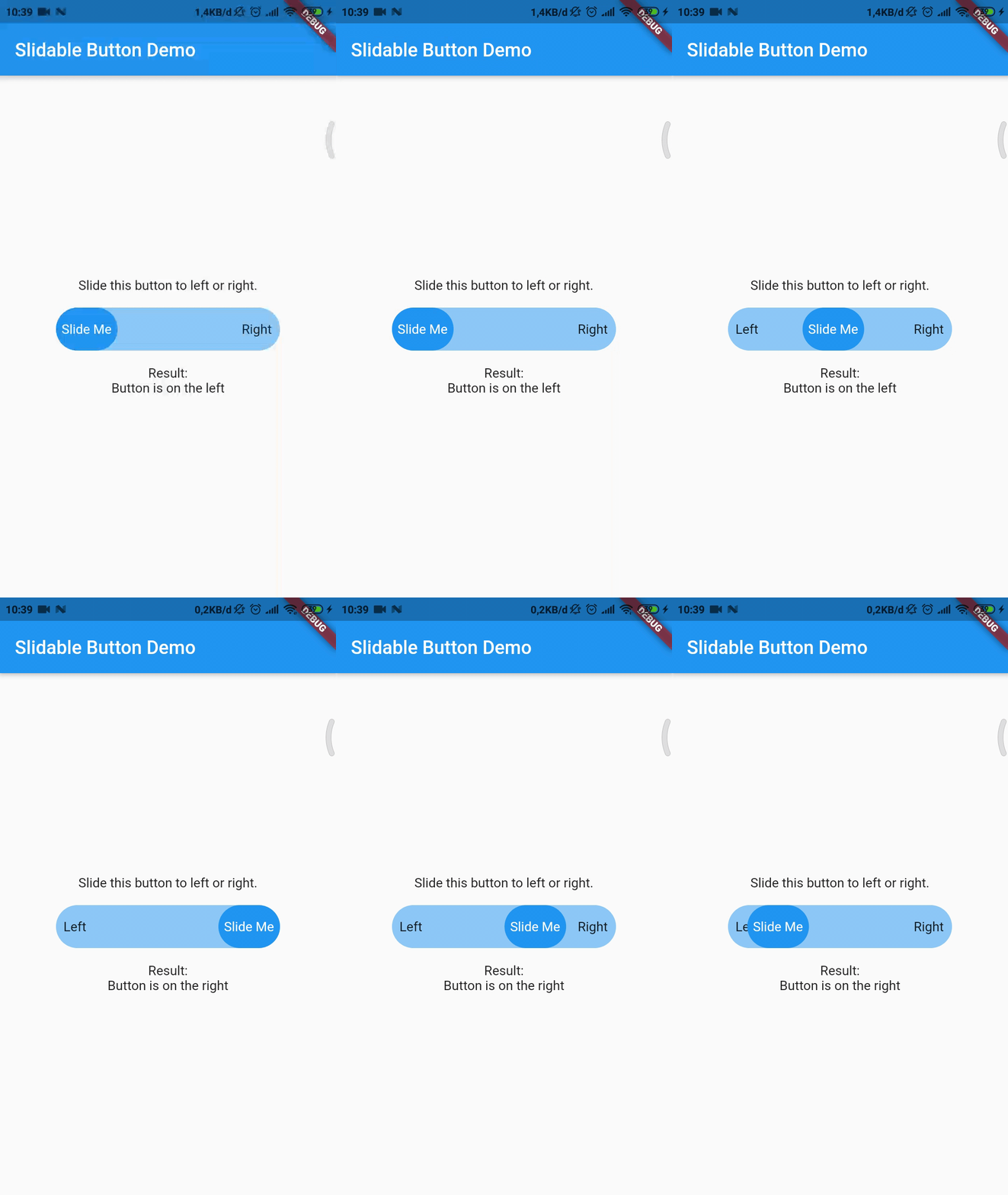
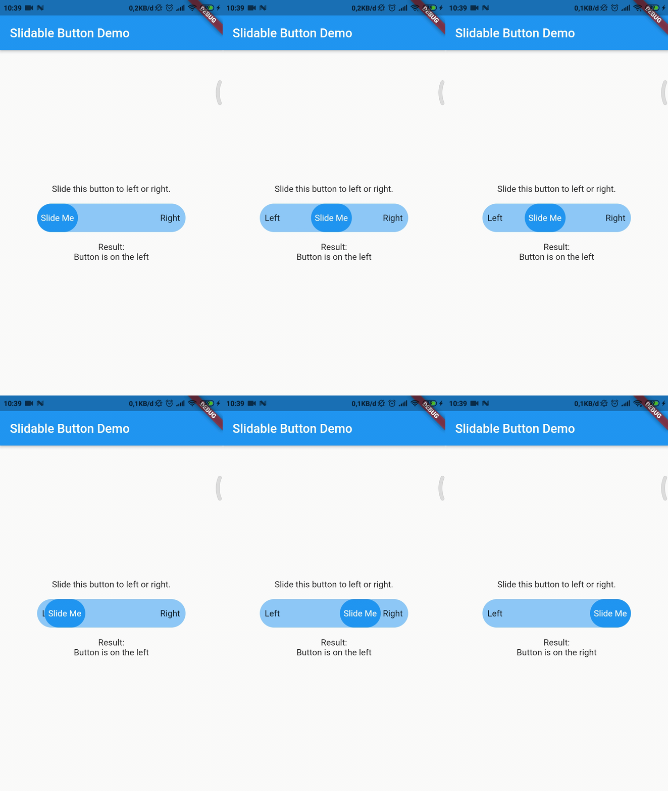
Now you can make your slidable button vertically or horizontally by using one of them widget. For horizontal usage example :
HorizontalSlidableButton(
width: MediaQuery.of(context).size.width / 3,
buttonWidth: 60.0,
color: Theme.of(context).accentColor.withOpacity(0.5),
buttonColor: Theme.of(context).primaryColor,
dismissible: false,
label: Center(child: Text('Slide Me')),
child: Padding(
padding: constEdgeInsets.all(8.0),
child: Row(
mainAxisAlignment: MainAxisAlignment.spaceBetween,
children: [
Text('Left'),
Text('Right'),
],
),
),
onChanged: (position) {
setState(() {
if (position == SlidableButtonPosition.end) {
result = 'Button is on the right';
} else {
result = 'Button is on the left';
}
});
},
),
Vertical usage example :
VerticalSlidableButton(
height: MediaQuery.of(context).size.height / 3,
buttonHeight: 60.0,
color: Theme.of(context).accentColor.withOpacity(0.5),
buttonColor: Theme.of(context).primaryColor,
dismissible: false,
label: Center(child: Text('Slide Me')),
child: Padding(
padding: constEdgeInsets.all(8.0),
child: Column(
mainAxisAlignment: MainAxisAlignment.spaceBetween,
children: [
Text('Top'),
Text('Bottom'),
],
),
),
onChanged: (position) {
setState(() {
if (position == SlidableButtonPosition.end) {
result = 'Button is on the bottom';
} else {
result = 'Button is on the top';
}
});
},
),
Migration Guide
If you already use this package before v3.x.x you may need to migrate your code to HorizontalSlidableButton or VerticalSlidableButton for specific direction usage because SlidableButton class has been removed start from v3.0.0.