Aus öffentlichen Paketdaten erstellte Orientierung.
Adaptive Scrollbar ist ein Flutter-Paket, das eine Desktop-Stil-Schublade bereitstellt, die ihre Position und Erscheinung automatisch an die Plattform und den Kontext anpasst. Sie kann entweder links oder rechts von einem scrollbaren Widget platziert werden und bietet so eine konsistente Benutzererfahrung über verschiedene Geräte hinweg. Für moderne Benutzeroberflächen entwickelt, verbessert sie die Benutzerfreundlichkeit sowohl bei Touch- als auch bei Nicht-Touch-Interfaces. Die Scrollleiste passt sich unterschiedlichen Bildschirmgrößen und Eingabemethoden an und ist daher ideal für Anwendungen, die mehrere Plattformen wie Mobilgeräte, Web und Desktop ansprechen.
Anwendungsfälle
Plattformübergreifende Anwendungen mit scrollbarem Inhalt
Desktop-ähnliche Erlebnisse auf Mobilgeräten
Verbesserte Barrierefreiheit für lange Listen
anpassbare Scrollindikatoren
Reaktive Benutzeroberflächen für Web und Desktop
Hauptmerkmale
Automatisches Positionieren links oder rechts
Plattformbewusste Gestaltung
Unterstützt Touch- und Nicht-Touch-Geräte
Konfigurierbare Erscheinung
Nahtlose Integration mit ScrollViews
Geeignet für
Entwickler, die auf mehrplattformige Apps abzielen
Designer, die Desktop-Stil-Oberflächen suchen
Apps, die eine zugängliche Scrollfunktion erfordern
Projekte mit langen Inhalten
Web- und Desktop-fokussierte Flutter-Anwendungen
Hinweise
Kann zusätzliche Stilisierung für benutzerdefinierte Themen erfordern
Leistungsbeeinträchtigung bei sehr großen Listen
Eingeschränkte Anpassungsmöglichkeiten jenseits der grundlegenden Positionierung
Nicht geeignet für minimalistische Designs
Erfordert sorgfältige Platzierung in komplexen Layouts
Original-README
Originaler README-Schnappschuss aus dem verknüpften Quell-Repository. Aktuelle Inhalte finden Sie im Repository.
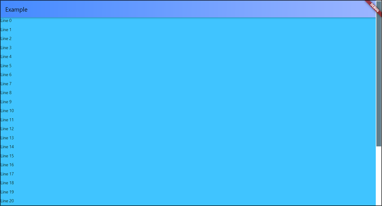
Adaptive Scrollbar is a library that allows you to create one or more desktop-style
scrollbars on a single screen, each of which is bound only to its own object
and placed in its own place on the screen.
Just wrap with AdaptiveScrollbar your widget that contains your ScrollView
object and specify the controller that is attached to this ScrollView object.
You can add multiple scrollbars to the screen at once. The controller
is a required parameter in order to track changes to only one object
if there are several ScrollView objects in your widget.
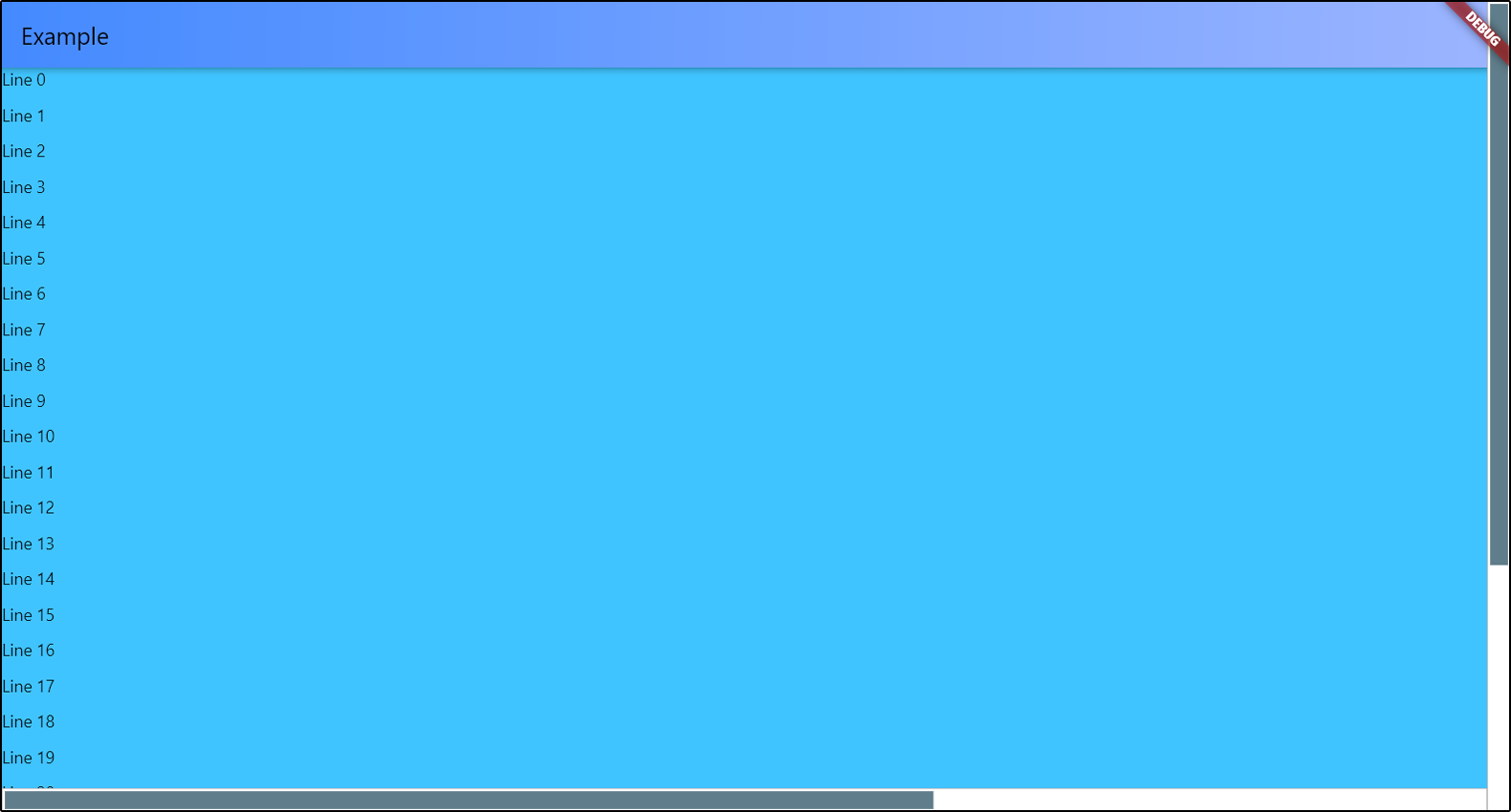
You can position your scrollbar on any of the 4 sides of the screen.
There is only one thing - if you choose ScrollbarPosition.top or
ScrollbarPosition.bottom, your scrollbar will actually be rotated 90 degrees,
and the top will be on the left. Do not forget about this if you specify
the spacings for slider and under the slider part. I'll think about how to simplify this.
AdaptiveScrollbar(
controller: verticalScroll,
width: verticalWidth,
child: AdaptiveScrollbar(
controller: horizontalScroll,
position: ScrollbarPosition.bottom,
//the horizontal scrollbar will have a padding// on the RIGHT by the width of the vertical scrollbar
underSpacing: EdgeInsets.only(bottom: verticalWidth),
width: horizontalWidth,
child: ...
),
To set slider width, you can set the horizontal sliderSpacing.
The vertical sliderSpacing will determine the padding of the slider
from the start and the end of the bottom. The height of the slider
is determined automatically based on the size of the ScrollView object.
If ScrollView object has nowhere to scroll, the scrollbar will not be displayed
on the screen.
You can set colors for slider and under the slider part, or completely set
the decorations for them.
Slider scroll-to-click speed
You can set your own speed parameters for moving the slider in the direction
of the click. scrollToClickDelta is the distance that the slider will move
in one move. scrollToClickFirstDelay is the duration of the first delay
between the slider moves in the direction of the click, in milliseconds.
scrollToClickOtherDelay is the duration of the remaining delays between scrolls
in the click direction, in milliseconds.