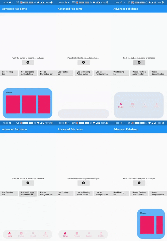
Eine schwebende Aktionsschaltfläche, die sich selbst ausbreitet, um ihren versteckten Widget zu zeigen. Sie kann auch als Navigationsleiste oder eine schwebende Spacebar verwendet werden.
Aus öffentlichen Paketdaten erstellte Orientierung.
adv_fab ist ein Flutter-Paket, das die Standard-Floating-Action-Button-Funktion verbessert, indem es ermöglicht, dass der Button sich erweitert und versteckte Widgets enthüllt, wodurch dynamische Interaktionen möglich werden. Es unterstützt die Verwendung als anpassbare NavigationBar oder eine schwimmende Space-Bar, ideal für moderne UI-Designs mit intuitiver Navigation und visueller Hierarchie. Das Paket ist leichtgewichtig und lässt sich nahtlos in bestehende Flutter-Projekte mit minimalem Setup integrieren. Sein erweiterbarer Funktionsumfang verbessert die Zugänglichkeit und Benutzerengagement in mobilen Anwendungen.
Anwendungsfälle
Unterer Navigationsbereich mit erweiterbaren Aktionen
Verbesserte Floating-Action-Buttons in Dashboards
Interaktive App-Werkzeugleisten
Anpassbare Navigationsleisten
Schwimmende Platzhalter in scrollbaren Layouts
Hauptmerkmale
Erweiterbarer FAB mit sanften Animationen
Unterstützt mehrere Kind-Widgets
Wiederverwendbar als NavigationBar oder floatingSpaceBar
Leichtgewichtig und einfach zu integrieren
Konfigurierbare Erweiterungsrichtung und -zeit
Geeignet für
Entwickler, die interaktive Flutter-Apps erstellen
Designer, die moderne UI-Muster suchen
Apps, die zugängliche schwebende Steuerungen erfordern
Projekte mit komplexen Anforderungen an die untere Navigation
UI-intensive Anwendungen mit dynamischen Layouts
Hinweise
Kann eine sorgfältige Layoutverwaltung erfordern
Die Animationsleistung hängt vom Gerät ab
Eingeschränkte plattformspezifische Anpassung
Nicht geeignet für einfache statische FABs
Am besten mit klarer visueller Hierarchie verwenden
Original-README
Originaler README-Schnappschuss aus dem verknüpften Quell-Repository. Aktuelle Inhalte finden Sie im Repository.
AdvFAB (More Than Just A Floating Action Button)
AdvFAB is An Advanced floating action button that expands itself to reveal its hidden widget. It can also be used as an AnimatedbottomNavigationbar or just an AnimatedFloatingActionBar with the same expansion capabilities.
Have a look at the gif below
Image 1
Image 2
NOTE: This package has lots of functionalities and parameters to customize your AdvFab please refer to the example floder and the full documentation in order to take advantage of this package to the fullest. Use this quick guide to setup your work environment and understand the basics :)
Create an Advanced FLoating Action Button (AdvFab)
First import the package inside your project
import'package:adv_fab/adv_fab.dart';
In your project, create a AdvFabController
AdvFabController controller;
//now inside the inti function@overridevoidinitState() {
super.initState();
controller = AdvFabController();
}
This controller will allow you to expand, collapse and more importantly "setExpandedWidgetConfiguration". It will also give you the state of the AdvFab( true or false depending on whether the widget is expanded or not)
IMPORTANT : The "setExpandedWidgetConfiguration" shall be called at least once in the life time of your widget, to configure what has to be displayed once the AdvFab is expanded else you will get an error.
Create an AdvFab widget inside the floatingActionButton of the scaffold
Scaffold(
	floatingActionButton: AdvFab(
		//controller shall not be null (actually it can but still....)
		controller: controller
	),
)
Use flags
AdvFab allows you to create a navigation bar, an empty bar (where you can add a ny widget you want) or just a normal floating action button. To enable these functionalities, here are the flags to toggle
useAsFloatingSpaceBar: false (by default )
useAsFloatingActionButton: true ( by default )
useAsNavigationBar: false (by default )
IMPORTANT : There can be only one value as "true", if you set more than one value as true, then a priority rule will be applied and will set the flag with higher priority to true and you will get a configuration error warning
Important Note
In order to maintain the screen adaptability of this widget (to make it look even on all screens), I opted for a formula based on percentages of the screen.
This means that every width and height shall be given by you in the range [0 - 100],100 inclusive.
Example:
To help you debug your code easily, I included a log facility, You just have to set the ShowLogs property to true and you will get all of them.
When you use AdvFab as a floating Action Button, the default Icon displayed will be a warning icon in red, just use the floatingActionButtonIconColor and floatingActionButtonIcon properties to change them; The floating action button also has its idenpendent ontap property called onFloatingActionButtonTapped
To use the AnimatedBottomNavigationBar, the body of the scaffold shall be a AdvBottomBarBody
Conclusion
Thank you for using my package, if you have any question feel free to contact me on instagram or directly on my mail emile@emilecode.com