Pakete, Repositories und App-Kategorien suchen

Cover von animated_bottom_navigation_bar
Paketdetailsv1.4.1

animated_bottom_navigation_bar

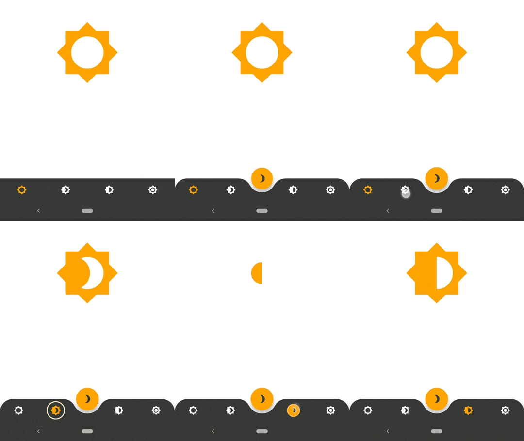
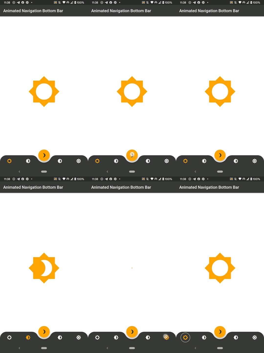
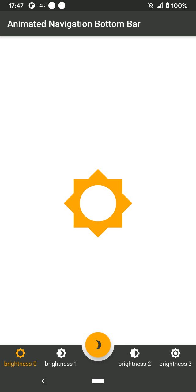
Animierte Bottom-Navigation-Bar-Widget-Implementierung, inspiriert durch https://dribbble.com/shots/7134849-Simple-Tab-Bar-Animation

AndroidiOSWebmacOSWindowsLinux
30-Tage-Downloads
19.300
Likes
1450
Pub-Punkte
150

Paket installieren

flutter pub add animated_bottom_navigation_bar

Paketübersicht

Aus öffentlichen Paketdaten erstellte Orientierung.

Ein Flutter-Paket, das ein animiertes Bottom-Navigation-Bar-Widget bereitstellt, inspiriert von einem Dribbble-Design. Es bietet reibungslose, visuell ansprechende Übergänge zwischen Tabs mit anpassbaren Animationen, Farben und Symbolen. Das Widget ist leichtgewichtig und einfach in jede Flutter-App zu integrieren und unterstützt mehrere Plattformen wie Android, iOS, Web, macOS, Windows und Linux. Ideal zur Verbesserung der Benutzererfahrung mit dynamischen Navigationsoberflächen.

Anwendungsfälle

  • Mobile App-Navigation
  • Web-Anwendungs-Dashboards
  • Cross-Platform-UI-Verbesserungen
  • Interaktive Registerwechsel
  • Modernes App-Design

Hauptmerkmale

  • Glatte Animationsübergänge
  • Anpassbare Farben und Symbole
  • Reaktives Design über Plattformen hinweg
  • Einfache Integration in bestehende Flutter-Projekte
  • Unterstützung für mehrere Plattformziele

Geeignet für

  • Entwickler, die moderne UI-Komponenten suchen
  • designorientierte Flutter-Anwendungen
  • Apps, die ansprechende Navigationserlebnisse erfordern
  • Plattformübergreifende mobile und Web-Anwendungen
  • UI/UX-Designer, die interaktive Elemente umsetzen

Hinweise

  • Kann zusätzliche Stilisierung für komplexe Layouts erfordern
  • Die Animationsleistung sollte auf günstigeren Geräten getestet werden
  • Eingeschränkte Anpassung über grundlegende Eigenschaften hinaus
  • Am besten geeignet für Apps mit 3–5 Navigationspunkten
  • Nicht empfehlenswert für sehr komplexe Navigationsstrukturen

Original-README

Originaler README-Schnappschuss aus dem verknüpften Quell-Repository. Aktuelle Inhalte finden Sie im Repository.

SWUbanner

AnimatedBottomNavigationBar is a customizable widget inspired by dribble shot.

pub package

"Buy Me A Coffee"

With AnimatedBottomNavigationBar.builder you are able to customize tab view however you need. In this case you are responsible to handle an active(inactive) state of tabs.

Getting Started

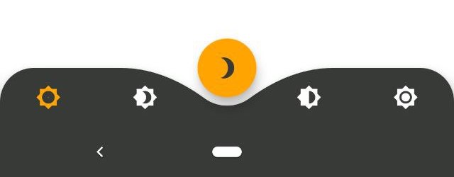
To get started, place your AnimatedBottomNavigationBar or AnimatedBottomNavigationBar.builder in the bottomNavigationBar slot of a Scaffold. The AnimatedBottomNavigationBar respects FloatingActionButton location. For example:

Scaffold(
   body: Container(), //destination screen
   floatingActionButton: FloatingActionButton(
      //params
   ),
   floatingActionButtonLocation: FloatingActionButtonLocation.centerDocked,
   bottomNavigationBar: AnimatedBottomNavigationBar(
      icons: iconList,
      activeIndex: _bottomNavIndex,
      gapLocation: GapLocation.center,
      notchSmoothness: NotchSmoothness.verySmoothEdge,
      leftCornerRadius: 32,
      rightCornerRadius: 32,
      onTap: (index) => setState(() => _bottomNavIndex = index),
      //other params
   ),
);

There is also a more flexible way to build bottomNavigationBar with Builder (see example for more insights):

Scaffold(
   body: Container(), //destination screen
   floatingActionButton: FloatingActionButton(
      //params
   ),
   floatingActionButtonLocation: FloatingActionButtonLocation.centerDocked,
   bottomNavigationBar: AnimatedBottomNavigationBar.builder(
      itemCount: iconList.length,
      tabBuilder: (int index, bool isActive) {
        return Icon(
          iconList[index],
          size: 24,
          color: isActive ? colors.activeNavigationBarColor : colors.notActiveNavigationBarColor,
        );
      activeIndex: _bottomNavIndex,
      gapLocation: GapLocation.center,
      notchSmoothness: NotchSmoothness.verySmoothEdge,
      leftCornerRadius: 32,
      rightCornerRadius: 32,
      onTap: (index) => setState(() => _bottomNavIndex = index),
      //other params
   ),
);

Customization

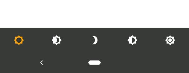
AnimatedBottomNavigationBar is customizable and works with 2, 3, 4, or 5 navigation elements.

Scaffold(
   bottomNavigationBar: AnimatedBottomNavigationBar(
      icons: iconList,
      activeIndex: _bottomNavIndex,
      onTap: (index) => setState(() => _bottomNavIndex = index),
      //other params
   ),
);
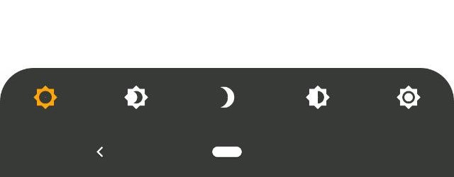
Scaffold(
   bottomNavigationBar: AnimatedBottomNavigationBar(
      icons: iconList,
      activeIndex: _bottomNavIndex,
      leftCornerRadius: 32,
      rightCornerRadius: 32,
      onTap: (index) => setState(() => _bottomNavIndex = index),
      //other params
   ),
);
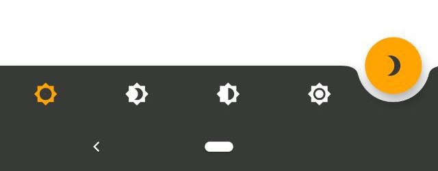
Scaffold(
   floatingActionButton: FloatingActionButton(
      //params
   ),
   floatingActionButtonLocation: FloatingActionButtonLocation.endDocked,
   bottomNavigationBar: AnimatedBottomNavigationBar(
      icons: iconList,
      activeIndex: _bottomNavIndex,
      gapLocation: GapLocation.end,
      notchSmoothness: NotchSmoothness.defaultEdge,
      onTap: (index) => setState(() => _bottomNavIndex = index),
      //other params
   ),
);
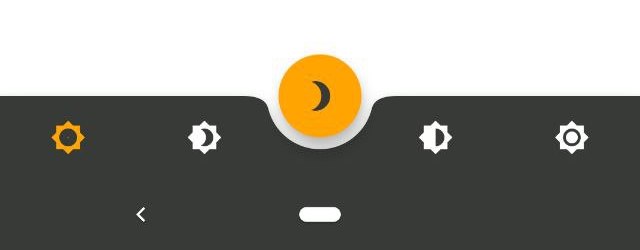
Scaffold(
   floatingActionButton: FloatingActionButton(
      //params
   ),
   floatingActionButtonLocation: FloatingActionButtonLocation.centerDocked,
   bottomNavigationBar: AnimatedBottomNavigationBar(
      icons: iconList,
      activeIndex: _bottomNavIndex,
      gapLocation: GapLocation.center,
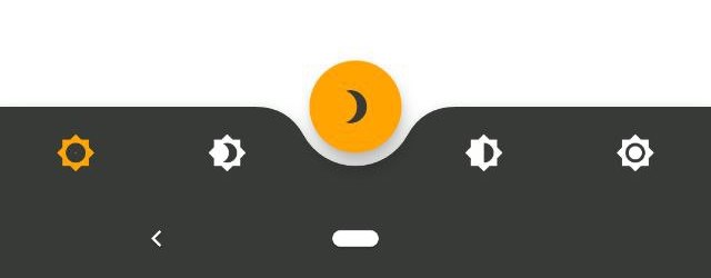
      notchSmoothness: NotchSmoothness.defaultEdge,
      onTap: (index) => setState(() => _bottomNavIndex = index),
      //other params
   ),
);
Scaffold(
   floatingActionButton: FloatingActionButton(
      //params
   ),
   floatingActionButtonLocation: FloatingActionButtonLocation.centerDocked,
   bottomNavigationBar: AnimatedBottomNavigationBar(
      icons: iconList,
      activeIndex: _bottomNavIndex,
      gapLocation: GapLocation.center,
      notchSmoothness: NotchSmoothness.softEdge,
      onTap: (index) => setState(() => _bottomNavIndex = index),
      //other params
   ),
);
Scaffold(
   floatingActionButton: FloatingActionButton(
      //params
   ),
   floatingActionButtonLocation: FloatingActionButtonLocation.centerDocked,
   bottomNavigationBar: AnimatedBottomNavigationBar(
      icons: iconList,
      activeIndex: _bottomNavIndex,
      gapLocation: GapLocation.center,
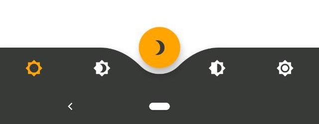
      notchSmoothness: NotchSmoothness.smoothEdge,
      onTap: (index) => setState(() => _bottomNavIndex = index),
      //other params
   ),
);
Scaffold(
   floatingActionButton: FloatingActionButton(
      //params
   ),
   floatingActionButtonLocation: FloatingActionButtonLocation.centerDocked,
   bottomNavigationBar: AnimatedBottomNavigationBar(
      icons: iconList,
      activeIndex: _bottomNavIndex,
      gapLocation: GapLocation.center,
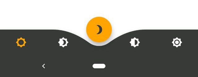
      notchSmoothness: NotchSmoothness.verySmoothEdge,
      onTap: (index) => setState(() => _bottomNavIndex = index),
      //other params
   ),
);

Driving Navigation Bar Changes

You have to change the active navigation bar tab programmatically by passing a new activeIndex to the AnimatedBottomNavigationBar widget.

class _MyAppState extends State<MyApp> {
  int activeIndex;

  /// Handler for when you want to programmatically change
  /// the active index. Calling `setState()` here causes
  /// Flutter to re-render the tree, which `AnimatedBottomNavigationBar`
  /// responds to by running its normal animation.
  void _onTap(int index) {
    setState((){
      activeIndex = index;
    });
  }

  Widget build(BuildContext context) {
    return AnimatedBottomNavigationBar(
      activeIndex: activeIndex,
      onTap: _onTap,
      //other params
    );
  }
}

Kategorien

Quell-Repository

Projekte, die dieses Paket verwenden