Aus öffentlichen Paketdaten erstellte Orientierung.
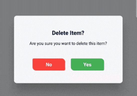
Ein Flutter-Paket, das anpassbare Bestätigungsdialoge mit optionalen 3D-Kippanimationen und einer modernen, schicken Benutzeroberfläche bietet. Es verbessert die Benutzerinteraktion durch reibungslose visuelle Rückmeldungen bei Bestätigungsaktionen. Entwickler können die Erscheinung, die Schaltflächen und das Verhalten des Dialogs problemlos an die Designsprache ihrer App anpassen. Das Paket unterstützt mehrere Plattformen wie Android, iOS, Web, macOS, Windows und Linux und sorgt so für konsistente Erlebnisse über Geräte hinweg.
Anwendungsfälle
Benutzeraktion bestätigen
Formular-Einreichungs-Überprüfung
Löschen oder Vorgänge abbrechen
App-Einstellungsänderungen
Bestätigungen zum Onboarding-Schritt
Sicherheitsbezogene Hinweise
Hauptmerkmale
Anpassbare Dialog-Stilisierung
Optionale 3D-Kippanimation
Modernes und reaktives Benutzeroberfläche
Plattformübergreifende Kompatibilität
Einfache Integration mit Flutter
Konfigurierbare Schaltflächenbeschriftungen und Aktionen
Geeignet für
Entwickler, die verfeinerte Dialoginteraktionen suchen
Apps, die intuitive Benutzerbestätigungen erfordern
Projekte, die visuelle Rückmeldung betonen
Plattformübergreifende mobile und Web-Anwendungen
UI-orientierte Flutter-Anwendungen
Hinweise
Kann zusätzliche Stilisierung für komplexe Themen erfordern
Animationsleistung auf Geräten mit geringer Leistungsfähigkeit
Beschränkt auf Bestätigungsfälle
Abhängig vom Animation Framework von Flutter
Nicht geeignet für nicht-interaktive Popups
Original-README
Originaler README-Schnappschuss aus dem verknüpften Quell-Repository. Aktuelle Inhalte finden Sie im Repository.
animated_confirm_dialog
A customizable Flutter package for displaying confirmation dialogs with optional 3D flip animations and modern UI. This package allows you to easily show stylish confirmation dialogs with a clean and modern design, making it highly customizable.
Features
Customizable Dialogs: Easily adjust the title, message, and button text.
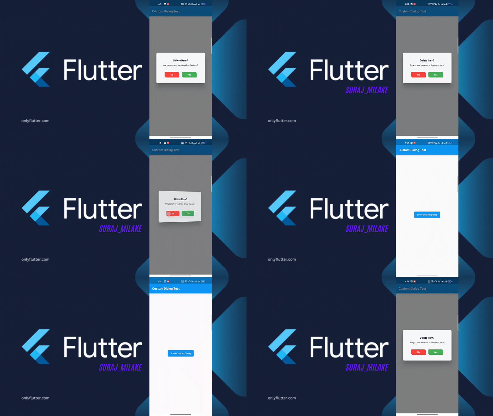
Animations: Includes optional 3D flip animation for dialog transitions.
Modern UI: A visually appealing, modern design with customizable button styles and colors.
Dismissable: Optionally control if the dialog can be dismissed by tapping outside.
Demo Video
Getting Started
To use animated_confirm_dialog in your Flutter project, follow these simple steps.
Prerequisites
Before starting, ensure that you have the following installed:
Flutter SDK: >=3.0.0
Dart SDK: >=3.1.3 <4.0.0
Installation
Open your pubspec.yaml file.
Under dependencies, add the following line:
dependencies:animated_confirm_dialog:^1.0.2
Usage
Once you’ve installed the package, you can use the showCustomDialog function to display the confirmation dialog. Here’s an example of how to use it:
import'package:animated_confirm_dialog/animated_confirm_dialog.dart';
showCustomDialog(
context: context,
title: 'Delete Item?',
message: 'Are you sure you want to delete this item?',
cancelButtonText: 'No',
confirmButtonText: 'Yes',
cancelButtonColor: Colors.red,
cancelButtonTextColor: Colors.white,
confirmButtonColor: Colors.green,
confirmButtonTextColor: Colors.white,
onCancel: () {
// Action when cancel button is pressedNavigator.of(context).pop();
},
onConfirm: () {
// Action when confirm button is pressedNavigator.of(context).pop();
},
isFlip: true, // You can set isFlip to true for 3D rotation effect
);
Customization
You can customize various aspects of the dialog by passing different parameters. Below is a list of customizable options:
Parameter
Description
Default
title
The title of the dialog.
'Logout Confirmation'
message
The message displayed inside the dialog.
'Are you sure you want to log out?'
cancelButtonText
Text for the cancel button.
'Cancel'
confirmButtonText
Text for the confirm button.
'Logout'
backgroundColor
Background color of the dialog.
Color(0xFFF5F5F5)
titleColor
Color of the title text.
Color(0xFF000000)
messageColor
Color of the message text.
Color(0xFF000000)
cancelButtonColor
Background color of the cancel button.
Color(0xFF007BFF)
cancelButtonTextColor
Color of the cancel button text.
Colors.white
confirmButtonColor
Background color of the confirm button.
Colors.white
confirmButtonTextColor
Color of the confirm button text.
Color(0xFF007BFF)
onCancel
A callback function triggered when the cancel button is tapped.
null (no action)
onConfirm
A callback function triggered when the confirm button is tapped.
null (no action)
isFlip
Enables a 3D flip animation when the dialog is shown.
false
dismissible
Controls whether the dialog can be dismissed by tapping outside.
true
Licence
This project is licensed under the MIT License. You can view the full license in the LICENSE file.