Pakete, Repositories und App-Kategorien suchen

Cover von animated_cross_fade_plus
Paketdetailsv0.0.4

animated_cross_fade_plus

Ein Flutter-Paket, das eine erweiterte Version von AnimatedCrossFade mit Unterstützung für mehrere Kinder und anpassbare Animationen bereitstellt.

AndroidiOSWebmacOSWindowsLinux
30-Tage-Downloads
61
Likes
7
Pub-Punkte
160

Paket installieren

flutter pub add animated_cross_fade_plus

Paketübersicht

Aus öffentlichen Paketdaten erstellte Orientierung.

AnimatedCrossFadePlus erweitert Flutter's AnimatedCrossFade durch Unterstützung mehrerer Kinder und anpassbare Animationen. Es ermöglicht reibungslose Übergänge zwischen mehr als zwei Widgets und ist somit ideal für dynamische Benutzeroberflächen mit komplexen Zustandsänderungen. Das Paket erweitert die Kernfunktionen mit flexiblen Konfigurationsoptionen für Fade-Dauer, Kurve und Ausrichtung, um flüssige und reaktive visuelle Effekte über alle Plattformen hinweg sicherzustellen. Speziell für Entwickler konzipiert, die fortgeschrittenes Übergabesteuerung ohne Boilerplate-Code suchen.

Anwendungsfälle

  • Zustandsübergänge mehrerer Widgets
  • Dynamischer Austausch von Benutzeroberflächeninhalten
  • Anpassbare Fade-Animationen
  • Komplexe Bildschirmübergänge
  • Interaktive App-Oberflächen
  • Glatte Themen- oder Moduswechsel

Hauptmerkmale

  • Unterstützung für mehrere Kinder
  • anpassbare Animationskurven
  • Konfigurierbare Fade-Dauer
  • Flexible Ausrichtungsoptionen
  • Plattformübergreifende Kompatibilität
  • Minimale Einrichtung erforderlich

Geeignet für

  • Entwickler, die mehrstufige Übergänge benötigen
  • UI-Designer, die sich auf fließende Animationen konzentrieren
  • Apps mit dynamischer Inhaltsumschaltung
  • Projekte, die wiederverwendbare Übergangskomponenten erfordern
  • Teams, die interaktive Dashboards oder Wizard erstellen

Hinweise

  • Kann die Komplexität bei vielen Kindern erhöhen
  • Erfordert sorgfältige Abstimmung der Animationsparameter
  • Nicht geeignet für einfache ein-zu-ein-Übergänge
  • Leistungseinfluss bei schweren Widgets
  • Beschränkte Dokumentation über die grundlegende Verwendung hinaus
  • Am besten mit leichtgewichtigen oder optimierten Kind-Widgets verwenden

Original-README

Originaler README-Schnappschuss aus dem verknüpften Quell-Repository. Aktuelle Inhalte finden Sie im Repository.

Animated Cross Fade Plus

A powerful Flutter package that enhances the traditional AnimatedCrossFade widget with support for multiple children, auto-play capabilities, and smooth transitions.

pub package github likes license

Demo

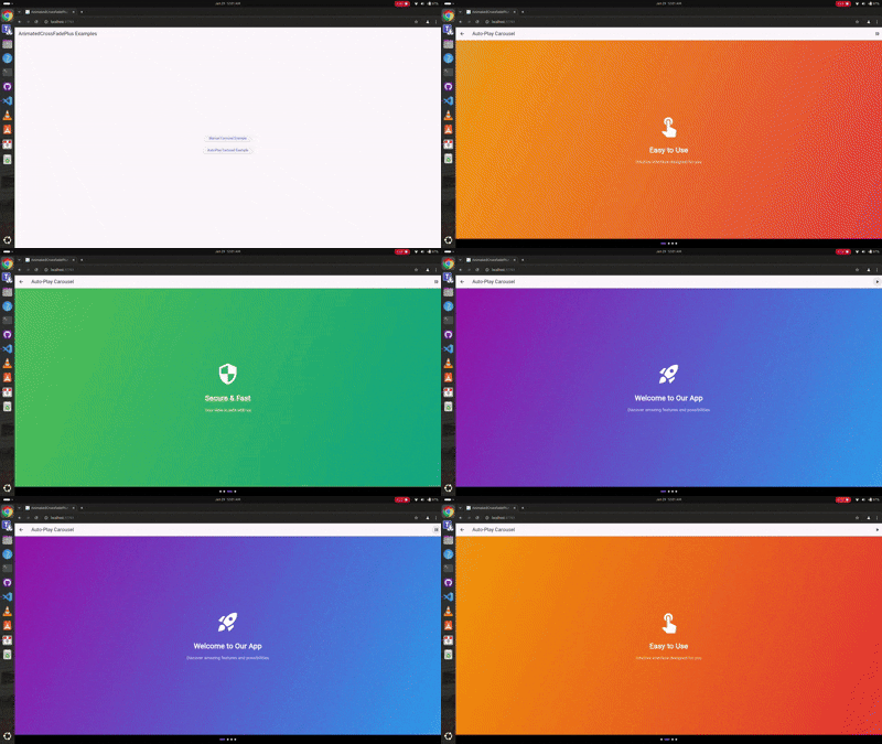
Auto-Play Carousel

Auto-play Demo

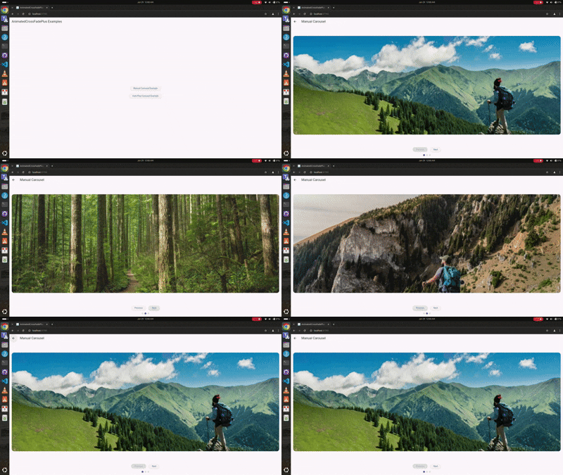
Manual Navigation

Manual Navigation Demo

Youtube Video

🎥 Check out the tutorial video on my YouTube channel to see it in action! Youtube video

Features 🚀

  • ✨ Support for unlimited children (not just two like AnimatedCrossFade)
  • 🎮 Manual navigation controls
  • 🎯 Auto-play functionality
  • 🎨 Multiple transition types (fade, slide, scale, slideAndFade)
  • 📱 Separate enter and exit animations
  • 🎭 Customizable transition configurations
  • 🔄 Built-in play/pause controls
  • 📍 Progress indicators

Installation 💻

Add this to your package's pubspec.yaml file:

dependencies:
  animated_cross_fade_plus: ^0.0.4

Usage 🎯

Basic Auto-Play Carousel
class AutoPlayExample extends StatefulWidget {
  @override
  _AutoPlayExampleState createState() => _AutoPlayExampleState();
}

class _AutoPlayExampleState extends State<AutoPlayExample> {
  final List<SlideContent> _slides = [
    SlideContent(
      title: 'Welcome',
      gradient: [Colors.purple, Colors.blue],
      icon: Icons.rocket_launch,
    ),
    SlideContent(
      title: 'Easy to Use',
      gradient: [Colors.orange, Colors.red],
      icon: Icons.touch_app,
    ),
  ];

  @override
  Widget build(BuildContext context) {
    return AnimatedCrossFadePlus(
      children: _slides.map((slide) => _buildSlide(slide)).toList(),
      transitionType: CrossFadeTransitionType.scale,
      enterConfig: const TransitionConfig(
        curve: Curves.easeInOutCubic,
        duration: Duration(milliseconds: 1000),
      ),
      exitConfig: const TransitionConfig(
        curve: Curves.easeInOutCubic,
        duration: Duration(milliseconds: 1000),
      ),
      autoPlay: true,
      autoPlayDuration: const Duration(seconds: 3),
    );
  }
}
Manual Navigation Carousel
class ManualExample extends StatefulWidget {
  @override
  _ManualExampleState createState() => _ManualExampleState();
}

class _ManualExampleState extends State<ManualExample> {
  final GlobalKey<AnimatedCrossFadePlusState> _key = GlobalKey();
  int _currentIndex = 0;

  @override
  Widget build(BuildContext context) {
    return Column(
      children: [
        AnimatedCrossFadePlus(
          key: _key,
          children: _items.map((item) => _buildItem(item)).toList(),
          transitionType: CrossFadeTransitionType.slideAndFade,
          enterConfig: const TransitionConfig(
            curve: Curves.easeInOutCubic,
            duration: Duration(milliseconds: 800),
            direction: AxisDirection.left,
          ),
          exitConfig: const TransitionConfig(
            curve: Curves.easeInOutCubic,
            duration: Duration(milliseconds: 800),
            direction: AxisDirection.right,
          ),
          onIndexChanged: (index) => setState(() => _currentIndex = index),
        ),
        Row(
          children: [
            ElevatedButton(
              onPressed: () => _key.currentState?.animateToIndex((_currentIndex - 1) % _items.length),
              child: Text('Previous'),
            ),
            ElevatedButton(
              onPressed: () => _key.currentState?.animateToIndex((_currentIndex + 1) % _items.length),
              child: Text('Next'),
            ),
          ],
        ),
      ],
    );
  }
}

Parameters ⚙️

Parameter Type Description
children List List of widgets to animate between
transitionType CrossFadeTransitionType Type of transition animation
enterConfig TransitionConfig Configuration for entering widget animation
exitConfig TransitionConfig Configuration for exiting widget animation
initialIndex int Starting index
autoPlay bool Enable/disable auto-play
autoPlayDuration Duration? Time between auto-play transitions
alignment AlignmentGeometry Alignment of children
constraints BoxConstraints? Optional size constraints
clipChildren bool Whether to clip children during animation
onIndexChanged Function(int)? Callback when index changes

Transition Types 🎭

enum CrossFadeTransitionType {
  fade,           // Simple fade transition
  slide,          // Slide animation
  scale,          // Scale animation
  slideAndFade,   // Combined slide and fade
}

TransitionConfig Properties 🛠️

class TransitionConfig {
  final Curve curve;              // Animation curve
  final Duration duration;        // Animation duration
  final AxisDirection direction;  // Slide direction (for slide transitions)

  const TransitionConfig({
    this.curve = Curves.linear,
    this.duration = const Duration(milliseconds: 300),
    this.direction = AxisDirection.right,
  });
}

Controller Methods 🎮

final GlobalKey<AnimatedCrossFadePlusState> _key = GlobalKey();

// Navigation
_key.currentState?.animateToIndex(2);   // Navigate to specific index

// Auto-play control is handled through the autoPlay property
// Toggle by updating the widget's autoPlay value

Complete Examples 📱

Check out the example folder for complete implementation examples:

  • Auto-play carousel with scale transitions
  • Manual navigation with slide and fade transitions
  • Progress indicators
  • Play/pause controls

Contributing 🤝

Contributions are welcome! Please feel free to submit issues and pull requests.

  1. Fork it
  2. Create your feature branch (git checkout -b feature/amazing)
  3. Commit changes (git commit -am 'Add amazing feature')
  4. Push to branch (git push origin feature/amazing)
  5. Open a Pull Request

License 📄

This project is licensed under the MIT License - see the LICENSE file for details.

Maintainers 👥

Kategorien

Quell-Repository

Projekte, die dieses Paket verwenden

Noch keine Daten verfügbar.