Aus öffentlichen Paketdaten erstellte Orientierung.
AnimatedDigit ist ein Flutter-Widget, das reibungslose Scrollanimationseffekte für Zahlen bereitstellt und ideal für die Anzeige dynamischer numerischer Werte mit visuell ansprechenden Übergängen ist. Es vereinfacht die Implementierung von animierten Zählern oder Punktzahlanzeigen, indem es automatisch das Scrollen der Ziffern behandelt und somit die Integration in Apps, die Echtzeit-Zahlenaktualisierungen erfordern, erleichtert. Das Paket unterstützt mehrere Plattformen wie Android, iOS, Web, macOS, Windows und Linux und gewährleistet konsistentes Verhalten über Geräte hinweg.
Anwendungsfälle
Anzeige von Live-Ergebnissen in Spielen
Animierte Countdown-Timer
Dynamische Statistiken anzeigen
Fortschrittsindikatoren aktualisieren
Digitale Uhren erstellen
Verändernde Metriken visualisieren
Hauptmerkmale
Glatte Scrollanimation für Ziffern
Einfach zu verwendende API
Unterstützt jeden ganzzahligen Wert
Plattformübergreifende Kompatibilität
Anpassbare Geschwindigkeit und Dauer
Minimale Einrichtung erforderlich
Geeignet für
Game-Entwickler
Dashboard-Bausteine
Anwendungen zur Echtzeit-Datenanzeige
Bildungs-Apps
Interaktive Benutzeroberflächenkomponenten
Hinweise
Am besten geeignet für ganze Zahlen, nicht für Dezimalzahlen
Eingeschränkte Anpassung für individuelle Ziffernstil
Die Leistung kann bei sehr hohen Aktualisierungs-Raten variieren
Nicht für große Zahlenbereiche ohne Optimierung ausgelegt
Benötigt manuelle Behandlung von Wertänderungen
Original-README
Originaler README-Schnappschuss aus dem verknüpften Quell-Repository. Aktuelle Inhalte finden Sie im Repository.
Scroll animation numbers widget, any number that need animation effects and easy to use.
Usage
🚴🏻 Easy Show
// only showAnimatedDigitWidget(
value: 9999
),
🚄 Easy Show & State
// simple state control
int value = 9999;
AnimatedDigitWidget(
  value: value
  textStyle: TextStyle(color: Colors.pink),
),
setState((){
  value = 191919;
});
🎡 Controller
Built-in accuracy calculation
AnimatedDigitController _controller = AnimatedDigitController(10240.987);
AnimatedDigitWidget(
controller: _controller,
textStyle: TextStyle(color: Colors.pink),
fractionDigits: 2, // number of decimal places reserved, not rounded
enableSeparator: true, // like this 10,240.98
),
// UI Result => 10,240.98// increment
_controller.addValue(1314);
// minus
_controller.minusValue(1314); // from v3.1.0 added// times
_controller.timesValue(1314); // from v3.1.0 added// divide
_controller.divideValue(1314); // from v3.1.0 added// reset
_controller.resetValue(1314);
// last
_controller.dispose();
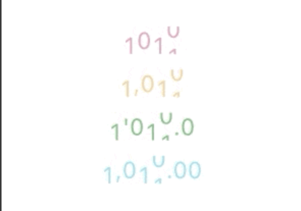
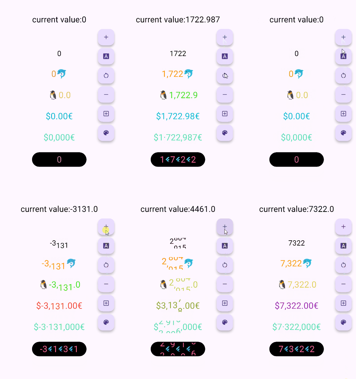
🖼 UI Effect Image & 💻 Code Example
AnimatedDigitWidget(
  value: 12531.98, // or use controller
),
AnimatedDigitWidget(
  value: 12531.98, // or use controller
  enableSeparator: true,
),
AnimatedDigitWidget(
  value: 12531.98, // or use controller
  fractionDigits: 2,
  enableSeparator: true,
),
The add a ValueColor object to valueColors, which is an array, you can add more ...,but always take the last eligible
Since version v3.3.1+1, colors have supported animated transitions instead of abrupt direct color switching, eliminating harsh transitions.
int value = 9999; // or use Controller.valueAnimatedDigitWidget(
value: value,
textStyle: TextStyle(
color: Colors.orange[200],
fontSize: 30,
),
valueColors: [
ValueColor(
//When value <= 0 , the color changes to red
condition: () => value <= 0,
color: Colors.red,
),
// you can add more ...,but always take the last eligible.
],
),
🍓Disable the initial scroll animation.
AnimatedDigitWidget(
...,
firstScrollAnimate: false// set false | >= v3.3.1+1
),
🍋Support for padding the integer part with leading zeros when the number of digits is less than the specified minimum
range: [0, 9], 🐧0 ➡️ 00、1 ➡️ 01、2 ➡️ 02 ...
AnimatedDigitWidget(
...,
fractionDigits: 0, // It must be set to 0; if there are decimal places, it's really unnecessary (wry smile)~~
enableMinIntegerDigits: true// set true, | >= v3.3.1+2
),
⚠️ value and controller cannot be both null.
⚠️ controller has higher priority.
controller - digit controller, The displayed number can be controlled via addValue and resetValue.
value - the display number.
🍑 TextStyle And BoxStyle Setting
textStyle - the numbers text style.
boxDecoration - Use with decoration of Container.
🍇 Int Type(default) Or Decimal Type Setting
fractionDigits - the fraction digits, int, default0.
🖌 Example ( 1000520.98765 ):
0 => 1000520;
1 => 1000520.9;
2 => 1000520.98;
3 => 1000520.987;
N => 1000520.[N];
The default 0 means an integer, when it is a decimal, if the value is less than the fractionDigits, it will be filled with 0 to the right, and the truncation method is used, so there is no rounding.
🍓 Numbers Free Style Setting
decimalSeparator - the decimal separator,can be replaced by other symbols in place of decimal separators, default..
enableSeparator - enable digit separator. defaultfalse not enable, only true, separateLength and separateSymbol valid.
🖌 Example (true): 1000520 => 1,000,520 (seealso separateLength or separateSymbol)
separateSymbol - the numbers separator symbol (only enableSeparator is true), make numbers much easier to read, default,.
🖌 Example ( 1000520 ):
, => 1,000,520
' => 1'000'520
- => 1-000-520
separateLength - the numbers separator length (only enableSeparator is true), separateSymbol by separator length insert, default3.
🖌 Example ( 1000520 ):
1 => 1,0,0,0,5,2,0
2 => 1,00,05,20
3 => 1,000,520
🥝 Scroll Animation Setting
duration - the animate duration, default Duration(milliseconds: 300).
curve - the animate curve, default Curves.easeInOut. look animate curve.
loop - enable loop scroll animate. default true, always scroll down, not scroll up from 9 -> 0; false, scroll up and down.
🍎 Digital Size Scheme Setting
autoSize - the default true is to automatically expand and contract according to the size of the ( number / symbol ) itself, false, the text size of the number 0 is used as the container size of each number, which can ensure the same width, but it seems that there is a slight interval between 1 and other numbers 😊 .
animateAutoSize - the animation resizing. default true, false will change directly to the size of the number/symbol.
🍒 Number prefix and suffix Setting
prefix - the text to display in front of the counter.