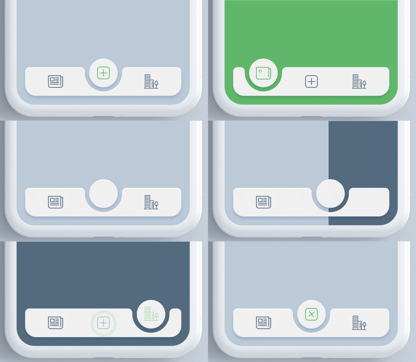
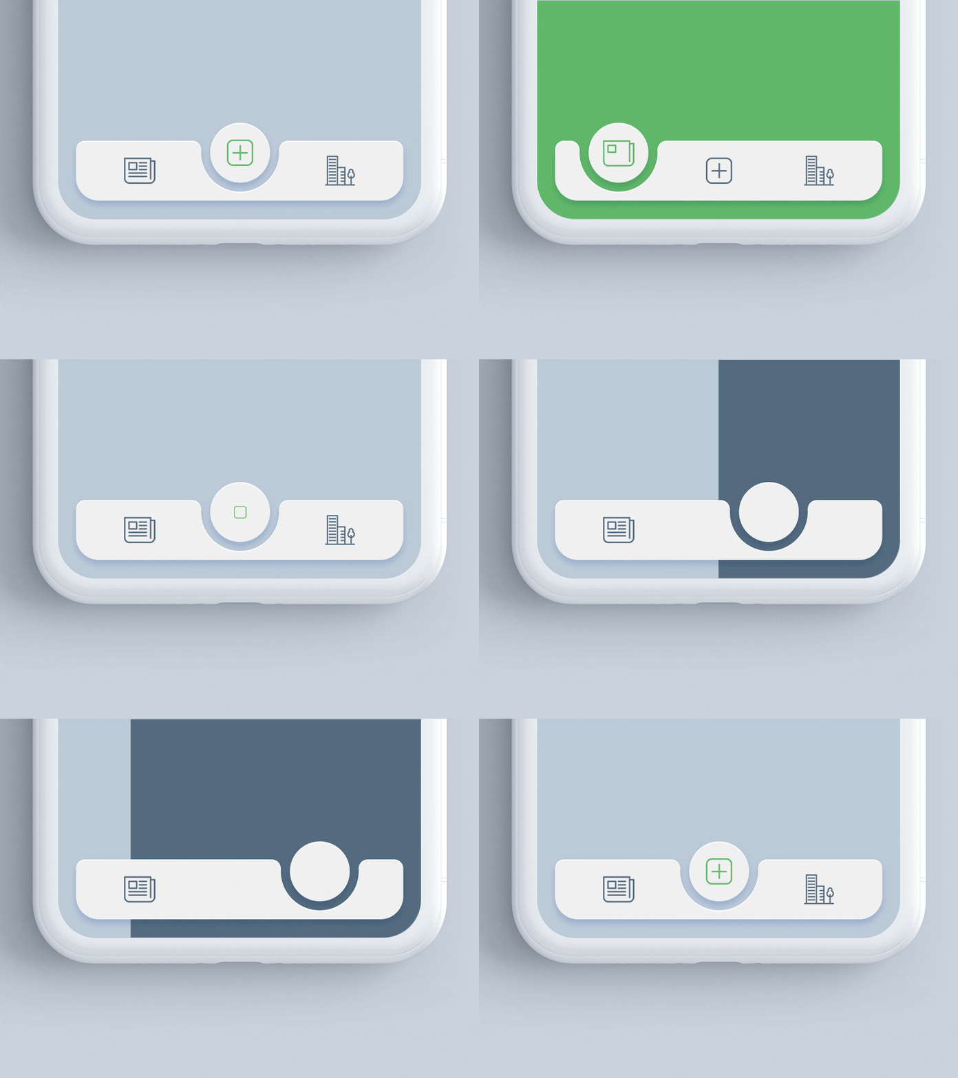
Aus öffentlichen Paketdaten erstellte Orientierung.
Das Paket animated_notch_bottom_bar ermöglicht Entwicklern die Erstellung visuell ansprechender unterer Navigationsleisten mit einem dynamischen Ausschnitt-Effekt und unterstützt beliebige benutzerdefinierte Widgets als Kinder. Es verbessert die Benutzererfahrung durch reibungslose Animationen und moderne Designästhetik. Kompatibel mit mehreren Plattformen wie Android, iOS, Web, macOS, Windows und Linux bietet es Flexibilität für plattformübergreifende Anwendungen. Das Paket ist einfach zu integrieren und anzupassen und eignet sich daher ideal für Apps, die auf ansprechende UI-Interaktionen setzen.
Anwendungsfälle
Modernes App-Interface erstellen
Verbesserung der Navigation UX
Benutzerdefinierte Bottom Bars gestalten
Cross-Platform-Anwendungen erstellen
Animierte Übergänge hinzufügen
Implementierung von notch-basierten Layouts
Hauptmerkmale
Animierter Notch-Effekt
Anpassbare Kind-Widgets
Plattformübergreifende Unterstützung
Glatte Animationen
Einfache Integration
Reaktives Design
Geeignet für
Mobile- und Web-App-Entwickler
UI/UX-Designer
Apps, die moderne Navigation erfordern
Entwickler, die animierte Komponenten suchen
Projekte mit benutzerdefinierter Unternavigation
Plattformübergreifende Flutter-Projekte
Hinweise
Kann eine Leistungsanpassung auf älteren Geräten erfordern
Eingeschränkte Anpassung der Aussparungsform
Abhängig von den Beschränkungen des übergeordneten Containers
Nicht geeignet für einfache Navigationsanforderungen
Animationen können bei minimalistischen Designs ablenken
Erfordert sorgfältige Ausrichtung mit dem Gesamt-UI-Thema
Original-README
Originaler README-Schnappschuss aus dem verknüpften Quell-Repository. Aktuelle Inhalte finden Sie im Repository.
Animated Notch Bottom Bar
A Flutter package for animating the position of selected item in bottomNavigationBar with notch like design. Inspired by react-native-tabbar-interaction plugin.
Features :
Supports any widget as as a bottom bar children.
Animates the notch toward selected item.
Create an optimized bottom navigation bar with beautiful animation.
Supports blur effect like iOS Tab View.
Getting Started
Add the dependency in pubspec.yaml:
dependencies:...animated_notch_bottom_bar:^1.0.0
Basic Usage
Place AnimatedNotchBottomBar in the bottomNavigationBar parameter of a Scaffold widget and provide NotchBottomBarController to AnimatedNotchBottomBar.
Starting with version 1.0.0 of the package, NotchBottomBarController have been added for control the animation instead of PageController. The pageController field has been removed and notchBottomBarController is required now.
AnimatedNotchBottomBar
notchBottomBarController - The controller which allows you to control the page.
bottomBarItems - Navigation items, required more than one item and less than six.
onTap - Required to listen when an item is tapped it provides the selected item's index.
color - The bottom bar's background color.
removeMargins - To remove side and bottom margins by default it's false.
bottomBarWidth - To provide width for web and desktop app.
durationInMilliSeconds - To set duration time in MilliSeconds.
showLabel: To show or hide the label under bottom bar item.
itemLabelStyle - The bottom bar's item text style.
showShadow - If false the bottom bar's elevation will be removed.
showBlurBottomBar - If true the bottom bar will look blur.
blurOpacity - To set opacity of blur effect.
blurFilterX - Creates an image filter that applies a Gaussian blur at x axis.
blurFilterY - Creates an image filter that applies a Gaussian blur at y axis.
notchColor - Customizable notch's color.
notchGradient - Add Gradient to notch.
showTopRadius - If set false the top corner radius will be removed.
showBottomRadius - If set false the top corner radius will be removed.
elevation - Set elevation of bottom bar.
bottomBarHeight - To set height of bottom bar.
BottomBarItems
title - the bottom bar item label
activeItem - the selected item.
inActiveItem - the inactive item.
Guideline for contributors
Contribution towards our repository is always welcome, we request contributors to create a pull request to the main branch only.
We’d be really happy if you send us links to your projects where you use our component. Just send an email to sales@mindinventory.com and do let us know if you have any questions or suggestion regarding our work.