Aus öffentlichen Paketdaten erstellte Orientierung.
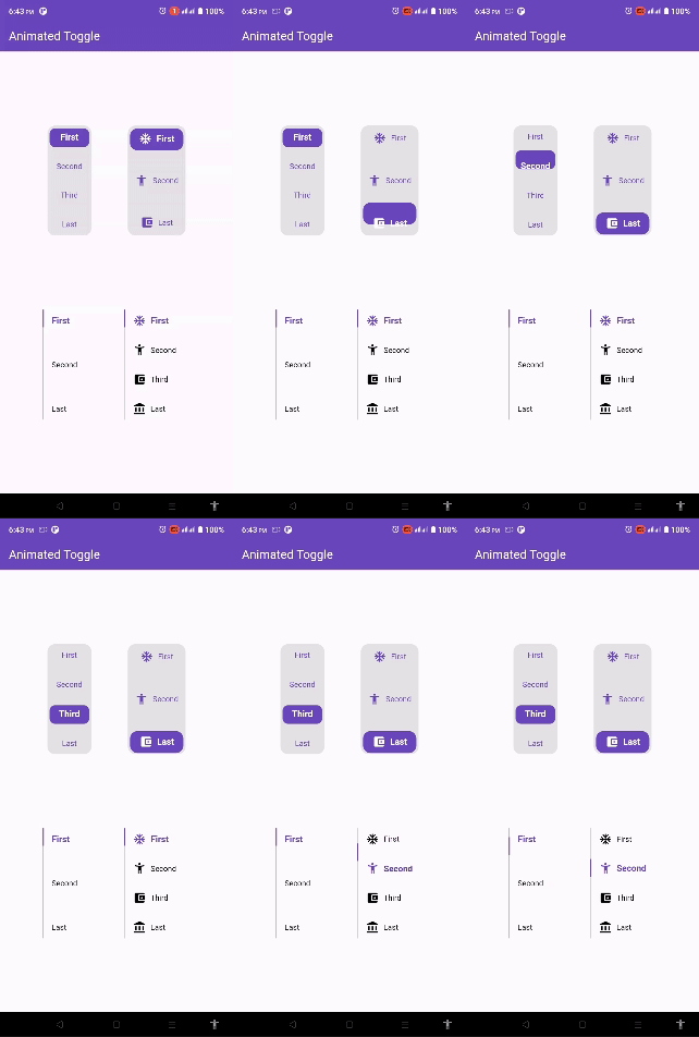
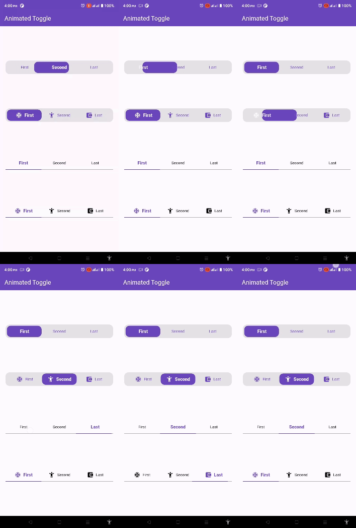
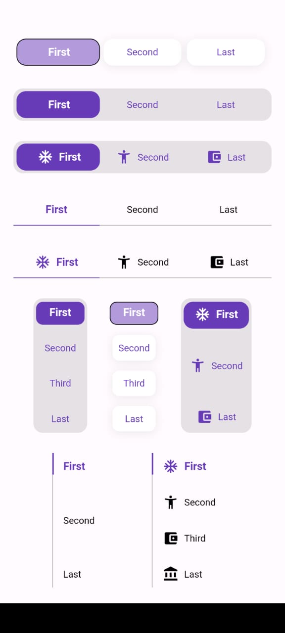
Animated Toggle ist ein Flutter-Paket, das die Erstellung benutzerdefinierter animierter Schalter vereinfacht. Es bietet reibungslose, visuell ansprechende Übergänge zwischen Ein/Aus-Zuständen mit minimalem Aufwand. Für Entwickler, die die UI-Interaktivität verbessern möchten, ohne komplexe Animationscode schreiben zu müssen, unterstützt es mehrere Plattformen wie Android, iOS, Web, macOS, Windows und Linux. Das Paket ist leichtgewichtig und lässt sich mithilfe eines einfachen Add-Befehls nahtlos in bestehende Flutter-Projekte integrieren. Ideal für Einstellungspanels, Themenumschalter oder beliebige interaktive Schaltflächen.
Anwendungsfälle
Benutzerdefinierte Themenumschalter
Benutzereinstellungsschalter
Einstellungs-UI-Komponenten
Onboarding-Flussindikatoren
Interaktive Formularelemente
Hauptmerkmale
Glatte Animationsübergänge
Anpassbare Erscheinung
Plattformübergreifende Unterstützung
Minimales Boilerplate
Einfache Integration über pub
Konfigurierbares Umschaltverhalten
Geeignet für
UI-Designer, die interaktive Elemente suchen
Entwickler, die Einstellungsbildschirme erstellen
Apps, die visuelle Rückmeldung erfordern
Flutter-Anfänger erkunden Animationen
Projekte mit Querplattform-Anforderungen
Hinweise
Beschränkt auf toggle-spezifische Anwendungsfälle
Benötigt manuelle Stilisierung für anspruchsvolle Designs
Keine integrierten Barrierefreiheitsfunktionen
Abhängig von externer Animationslogik
Nicht geeignet für komplexe Zustandsmaschinen
Möglicherweise sind zusätzliche Pakete für eine vollständige Anpassung erforderlich
Original-README
Originaler README-Schnappschuss aus dem verknüpften Quell-Repository. Aktuelle Inhalte finden Sie im Repository.
Animated Toggle
Animated Toggle Give you easy way to make your custom Animated toggle.
Installation
Add this to your pubspec.yaml:
dependencies:animated_toggle:^LastVersion
Features
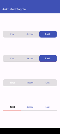
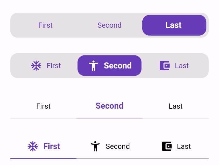
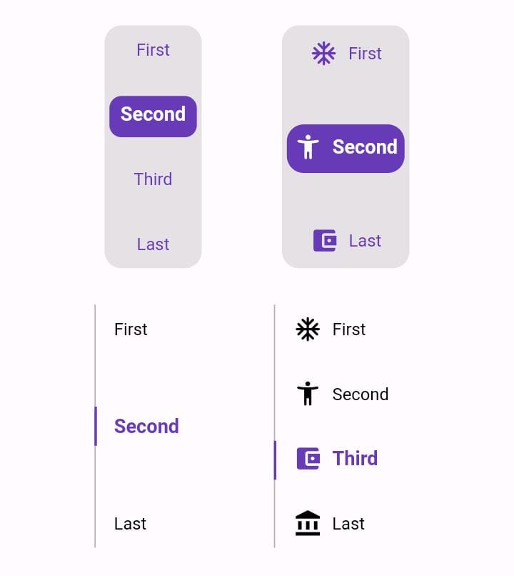
Easy to use the Animated Toggle Package you can handle all colors and width and the height and you can make it vertical or horizontal.
You can control the start from left or right if you need this for arabic or english or etc.
you can control the Text Style and the padding for the Animated Toggle.
Getting started
import'package:animated_toggle/animated_toggle.dart';
voidmain() {
}
// Start use th package in your State Widget
classMyAnimatedToggleextendsStatefulWidget{
constMyAnimatedToggle({super.key});
@overrideState<MyAnimatedToggle> createState() => _MyAnimatedToggleState();
}
class_MyAnimatedToggleStateextendsState<MyAnimatedToggle> {
@overrideWidgetbuild(BuildContext context) {
returnScaffold(
appBar: AppBar(
backgroundColor: Theme.of(context).colorScheme.inversePrimary,
title: constText('Animated Toggle'),
),
body: Center(
child: AnimatedHorizontalToggle(
taps: const ['First', 'Second', 'Last'],
// write you taps names
width: MediaQuery.of(context).size.width - 40,
height: 48,
duration: constDuration(milliseconds: 300),
initialIndex: 0,
background: Colors.black.withOpacity(0.1),
activeColor: Colors.deepPurple,
// here you can control the active text style
activeTextStyle: constTextStyle(
fontSize: 16, fontWeight: FontWeight.w600, color: Colors.white),
// here you can control the inactive text style
inActiveTextStyle: constTextStyle(
fontSize: 14,
fontWeight: FontWeight.w400,
color: Colors.deepPurple),
// the next 2 line if you need to put padding for the inactive buttons
horizontalPadding: 4,
verticalPadding: 4,
// the next 2 line if you need to put padding for the active button
activeHorizontalPadding: 2,
activeVerticalPadding: 4,
radius: 14,
// you can control the radius for the Animated widget
activeButtonRadius: 14,
// you can control the radius for the active button
onChange: (int currentIndex, int targetIndex) {
// write Your Personal Code Here
},
showActiveButtonColor: true,
// 'en' mean make the start from left other mean start from right
local:
'en', // her you can add the local to control the alignment like if you use en its the normal to start from left to right and if you use ar the will start from right to left
),
),
);
}
}
How to use Vertical Animated Toggle
classMyAnimatedToggleextendsStatefulWidget{
constMyAnimatedToggle({super.key});
@overrideState<MyAnimatedToggle> createState() => _MyAnimatedToggleState();
}
class_MyAnimatedToggleStateextendsState<MyAnimatedToggle> {
@overrideWidgetbuild(BuildContext context) {
returnScaffold(
appBar: AppBar(
backgroundColor: Theme.of(context).colorScheme.inversePrimary,
title: constText('Animated Toggle'),
),
body: Center(
child: AnimatedVerticalToggle(
taps: const ['First', 'Second', 'Third', 'Last'],
width: 80,
height: 200,
duration: constDuration(milliseconds: 300),
activeButtonHeight: 34,
initialIndex: 0,
background: Colors.black.withOpacity(0.1),
activeColor: Colors.deepPurple,
// here you can control the active text style
activeTextStyle: constTextStyle(
fontSize: 16,
fontWeight: FontWeight.w600,
color: Colors.white),
// here you can control the inactive text style
inActiveTextStyle: constTextStyle(
fontSize: 14,
fontWeight: FontWeight.w400,
color: Colors.deepPurple),
// the next 2 line if you need to put padding for the inactive buttons
horizontalPadding: 4,
verticalPadding: 4,
// the next 2 line if you need to put padding for the active button
activeHorizontalPadding: 4,
activeVerticalPadding: 2,
radius: 14,
// you can control the radius for the Animated widget
activeButtonRadius: 10,
// you can control the radius for the active button
onChange: (int currentIndex, int targetIndex) {
// write Your Personal Code Here
},
showActiveButtonColor: true,
// 'en' mean make the start from left other mean start from right
local:
'en', // her you can add the local to control the alignment like if you use en its the normal to start from left to right and if you use ar the will start from right to left
),
),
);
}
}
Additional information
Say to me in GitHub what you need to see in the package in the next update.
Wait for more feature soon.