Pakete, Repositories und App-Kategorien suchen

Cover von auth_buttons
Paketdetailsv3.0.3

auth_buttons

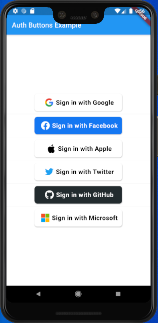
Auth Buttons ist eine Flutter-Widget-Bibliothek, die Schaltflächen für die Authentifizierung mit den beliebtesten sozialen Netzwerken wie Google, Facebook, Apple und Twitter enthält.

AndroidiOSWebmacOSWindowsLinux
30-Tage-Downloads
5000
Likes
199
Pub-Punkte
140

Paket installieren

flutter pub add auth_buttons

Paketübersicht

Aus öffentlichen Paketdaten erstellte Orientierung.

Auth Buttons ist eine Flutter-Widget-Bibliothek, die fertig verwendbare Authentifizierungsschaltflächen für beliebte soziale Netzwerke wie Google, Facebook, Apple und Twitter bereitstellt. Sie wurde entwickelt, um die Integration von Social Login-Funktionen zu vereinfachen, und bietet konsistente, visuell ansprechende Schaltflächen über alle Plattformen hinweg. Das Paket unterstützt Android, iOS, Web, macOS, Windows und Linux und gewährleistet damit plattformübergreifende Kompatibilität. Es verbessert die Benutzererfahrung, indem es Boilerplate-Code reduziert und die Implementierung von Authentifizierungsabläufen von Drittanbietern vereinfacht.

Anwendungsfälle

  • Soziale Anmeldung Integration
  • Benutzeronboarding mit sozialen Konten
  • Plattformübergreifende Authentifizierungs-Oberfläche
  • Einfache OAuth-Schaltfläche Implementierung
  • Verfeinerte Anmeldevorgänge

Hauptmerkmale

  • Vorab erstellte soziale Anmelde-Schaltflächen
  • Unterstützung für Google, Facebook, Apple und Twitter
  • Plattformübergreifende Kompatibilität
  • Konsistente Benutzeroberfläche über Geräte hinweg
  • Einfache Integration mit minimalem Aufwand
  • Anpassbare Button-Stile

Geeignet für

  • Entwickler, die Apps mit sozialen Anmeldungen erstellen
  • Projekte, die schnelle Authentifizierungs-UI-Komponenten erfordern
  • Apps für mehrere Plattformen
  • Teams, die Entwicklungs-Geschwindigkeit priorisieren
  • Frontend-orientierte Authentifizierungsimplementierungen

Hinweise

  • Zusätzliche Konfiguration für die OAuth-Einrichtung erforderlich
  • Abhängig von den zugrundeliegenden Plattform-SDKs
  • Möglicherweise ist eine benutzerdefinierte Behandlung für Fehlerzustände erforderlich
  • Beschränkt auf vordefinierte soziale Anbieter
  • Nicht geeignet für benutzerdefinierte Authentifizierungsmethoden

Original-README

Originaler README-Schnappschuss aus dem verknüpften Quell-Repository. Aktuelle Inhalte finden Sie im Repository.

auth_buttons

Github stars Pub Version

Auth Buttons is a flutter widget library, include buttons for authenticating with the most popular social networks like: Google, Facebook, Apple and too other.

Installation

  1. Add this to your packages pubspec.yaml file:
dependencies:
  auth_buttons: <^last>
  1. Install it You can install it from the command line:
$ flutter pub get
  1. Import it Now in Dart code, you can use:
import 'package:auth_buttons/auth_buttons.dart';

Recommendation

We recommend you to using show special when you want use some button. show help you importing part of library.

import 'package:auth_buttons/auth_buttons.dart'
    show GoogleAuthButton, AuthButtonStyle, AuthButtonType, AuthIconType;

We also recommend you to using the latest version.

Overview

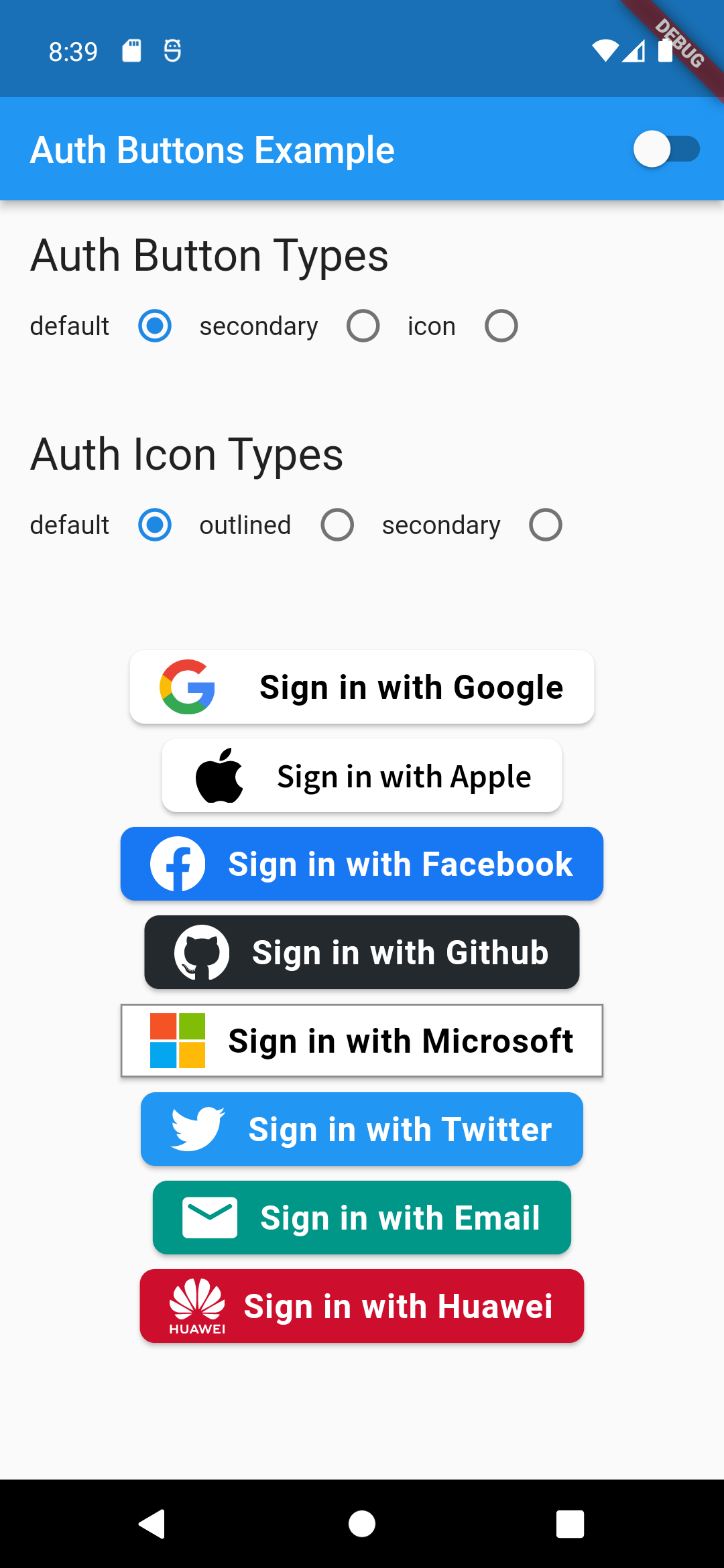
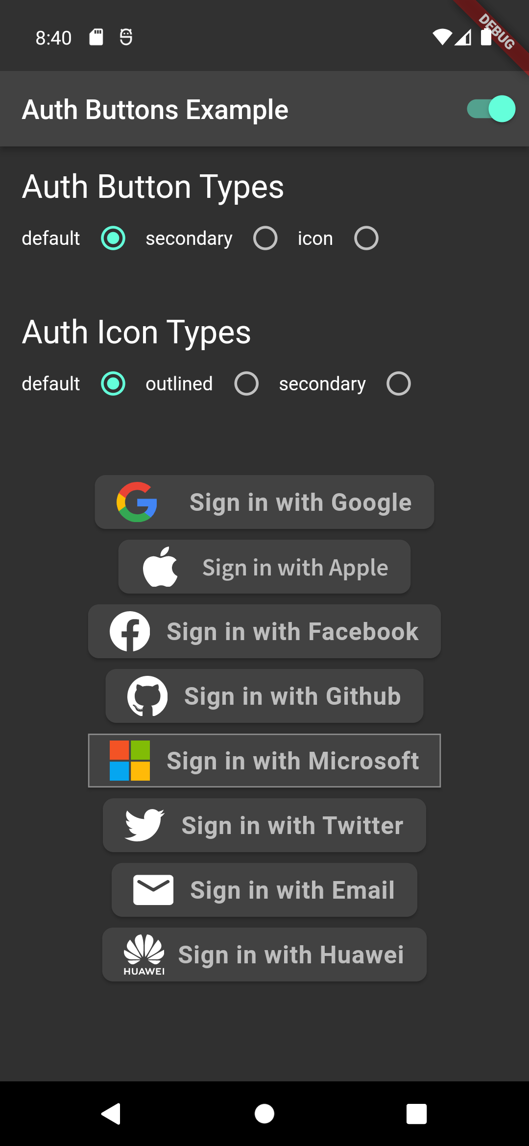
From the version 3.0.0 all AuthButtons are following the system mode. see ThemeMode for more info.

From the version 3.0.0 you're able to regroup AuthButton s for sharing style properties, to do this use the already existing AuthButtonGroup.

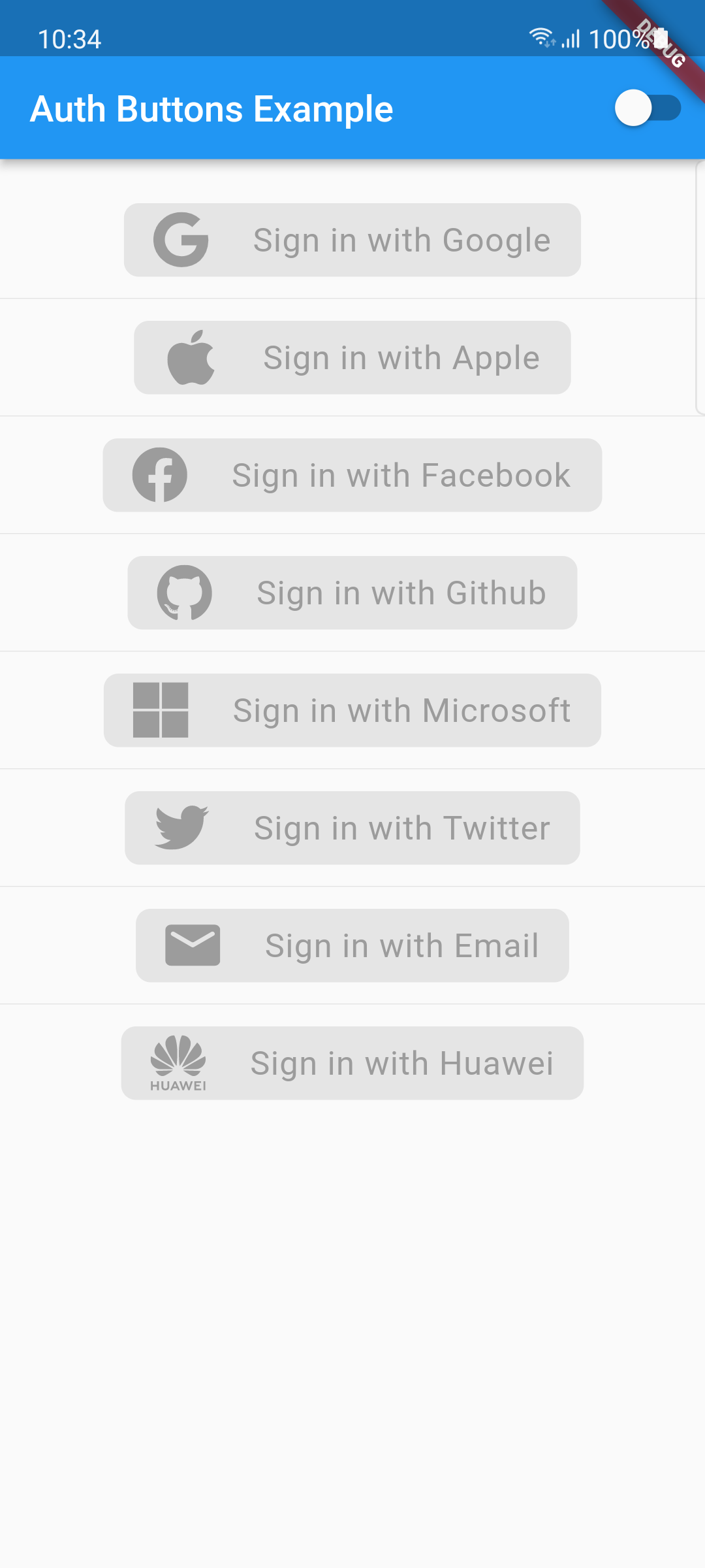
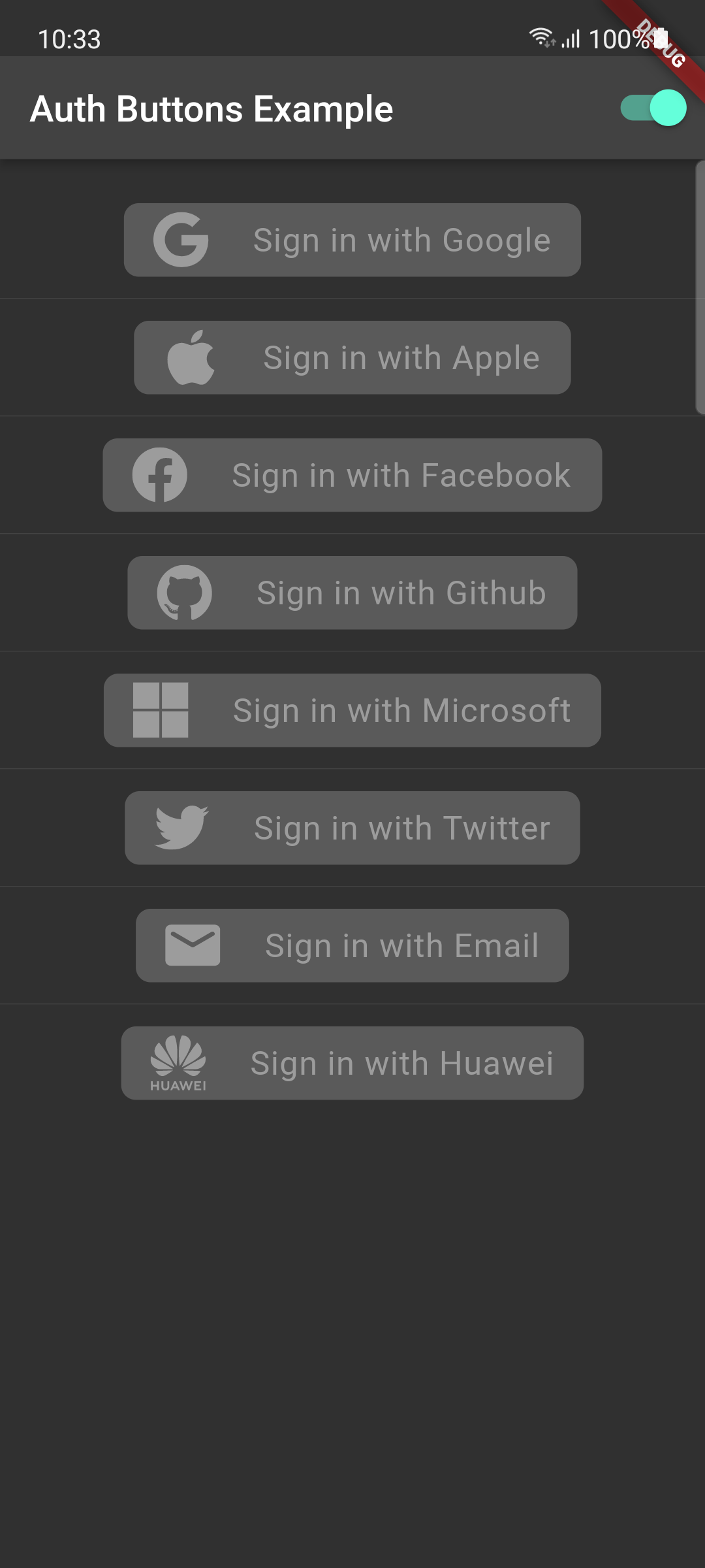
From the version 2.0.0 disabled state is supported.

  1. Enabled
  2. Disabled

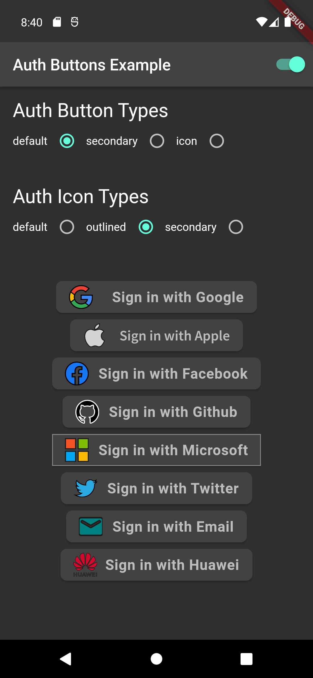
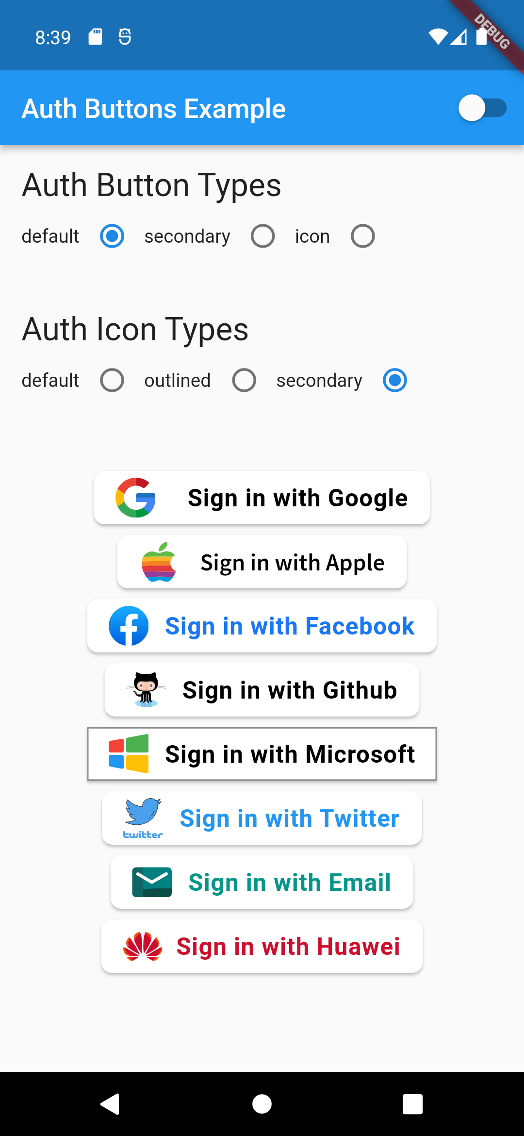
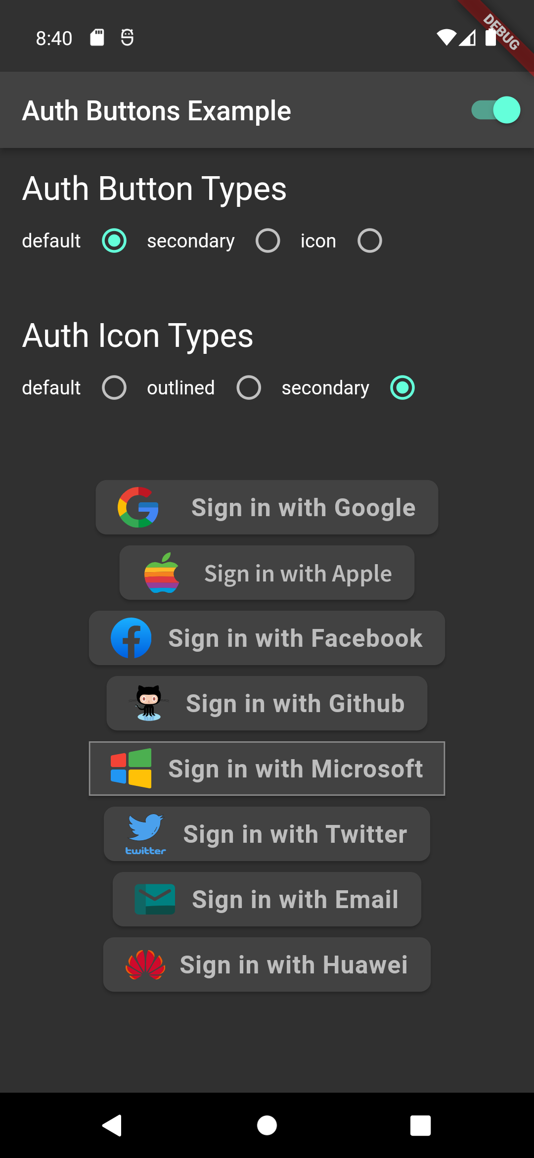
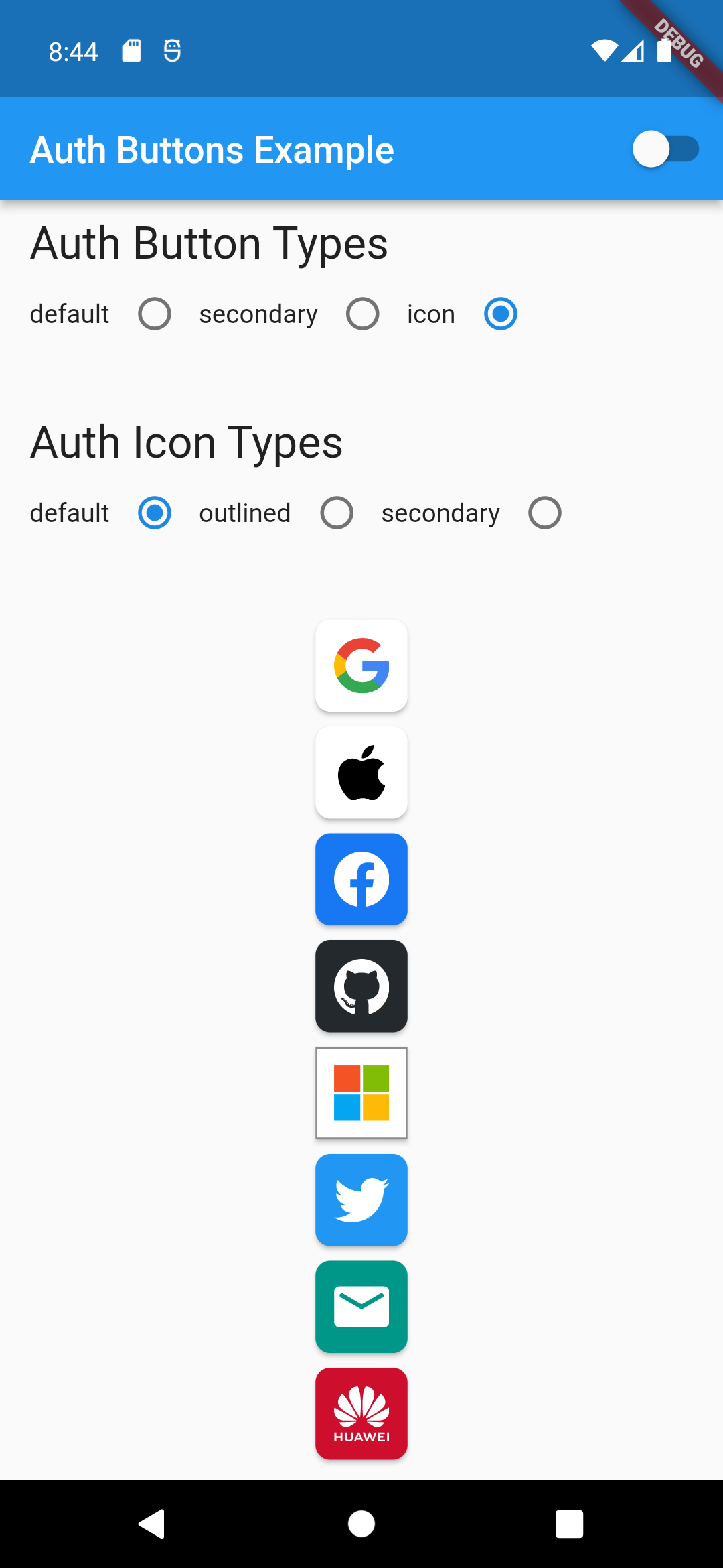
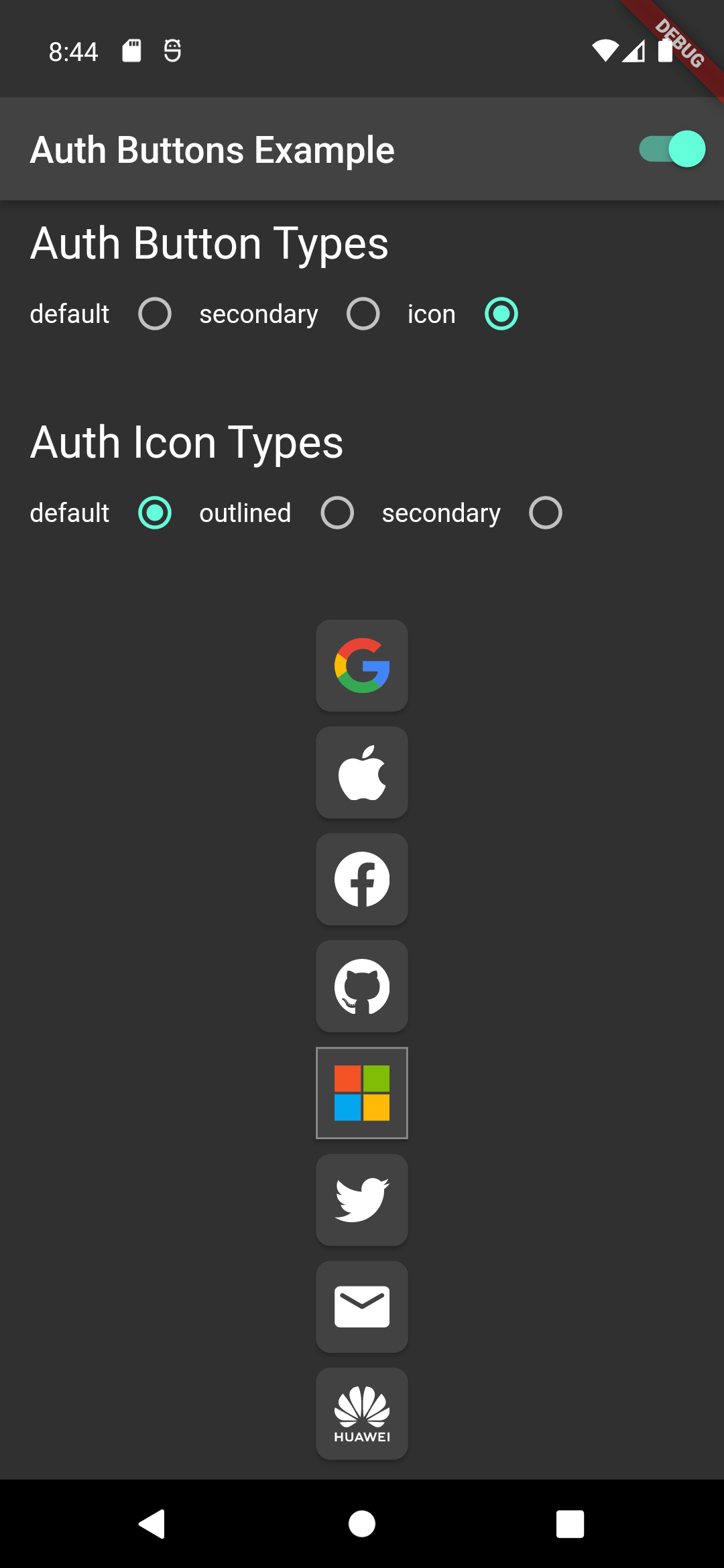
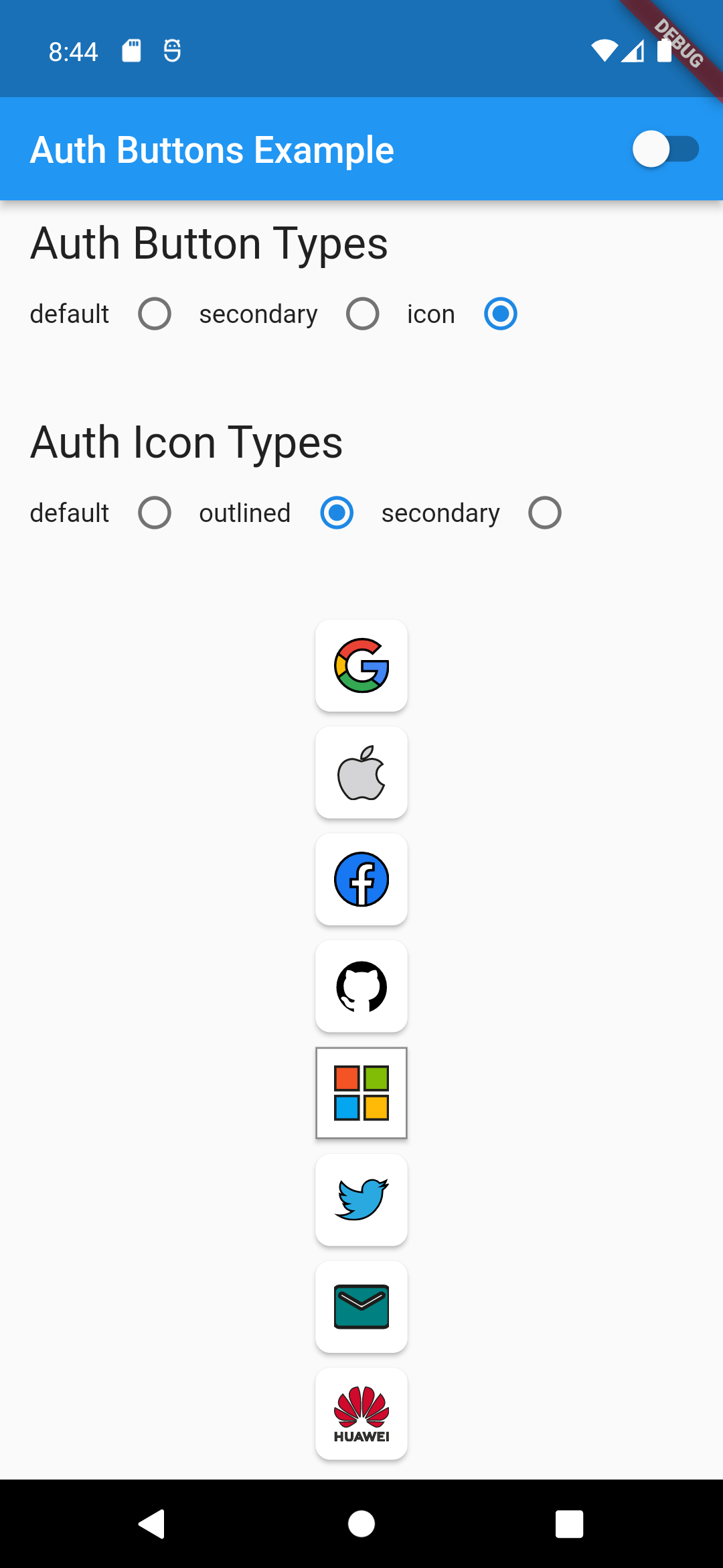
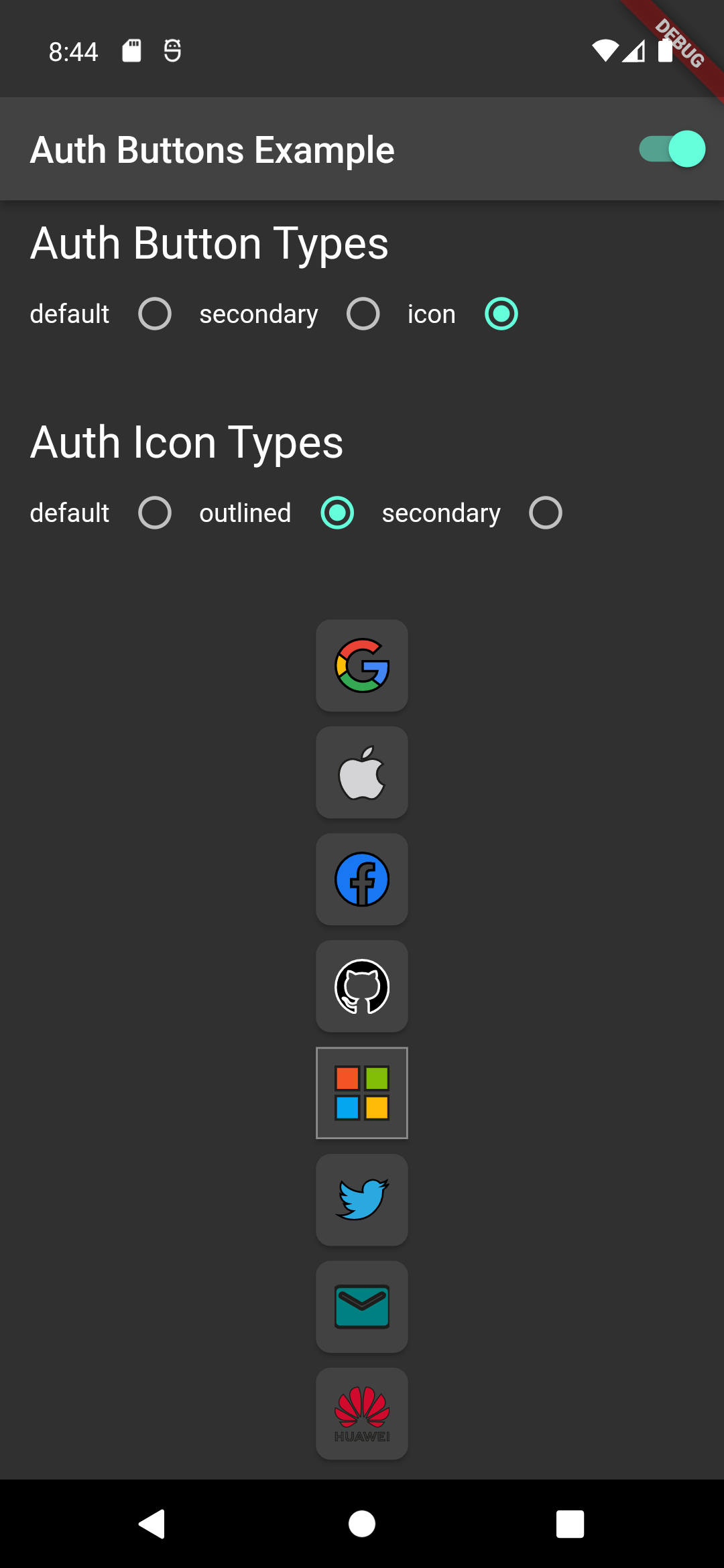
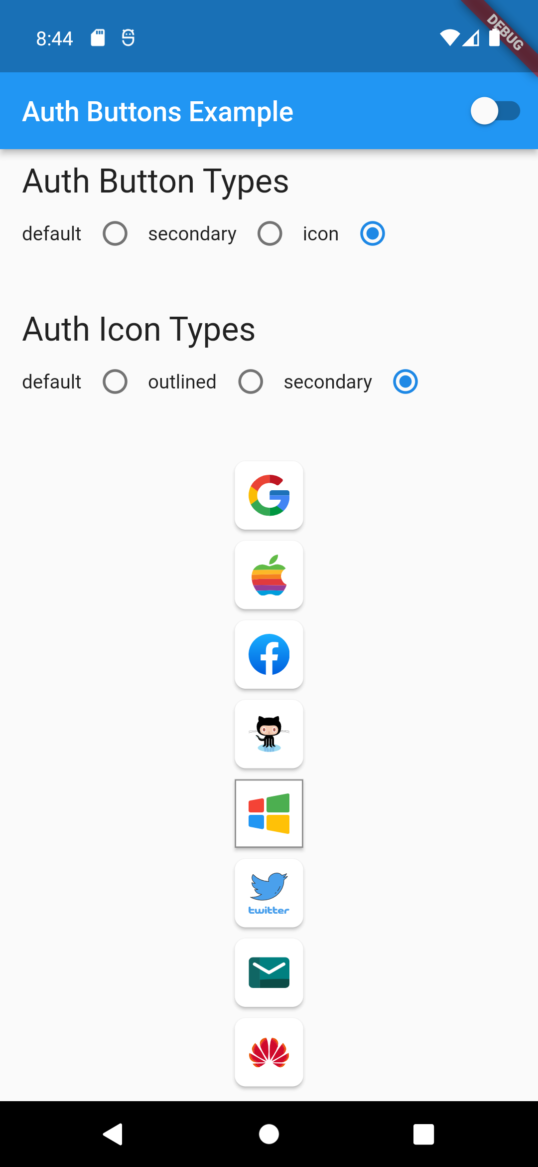
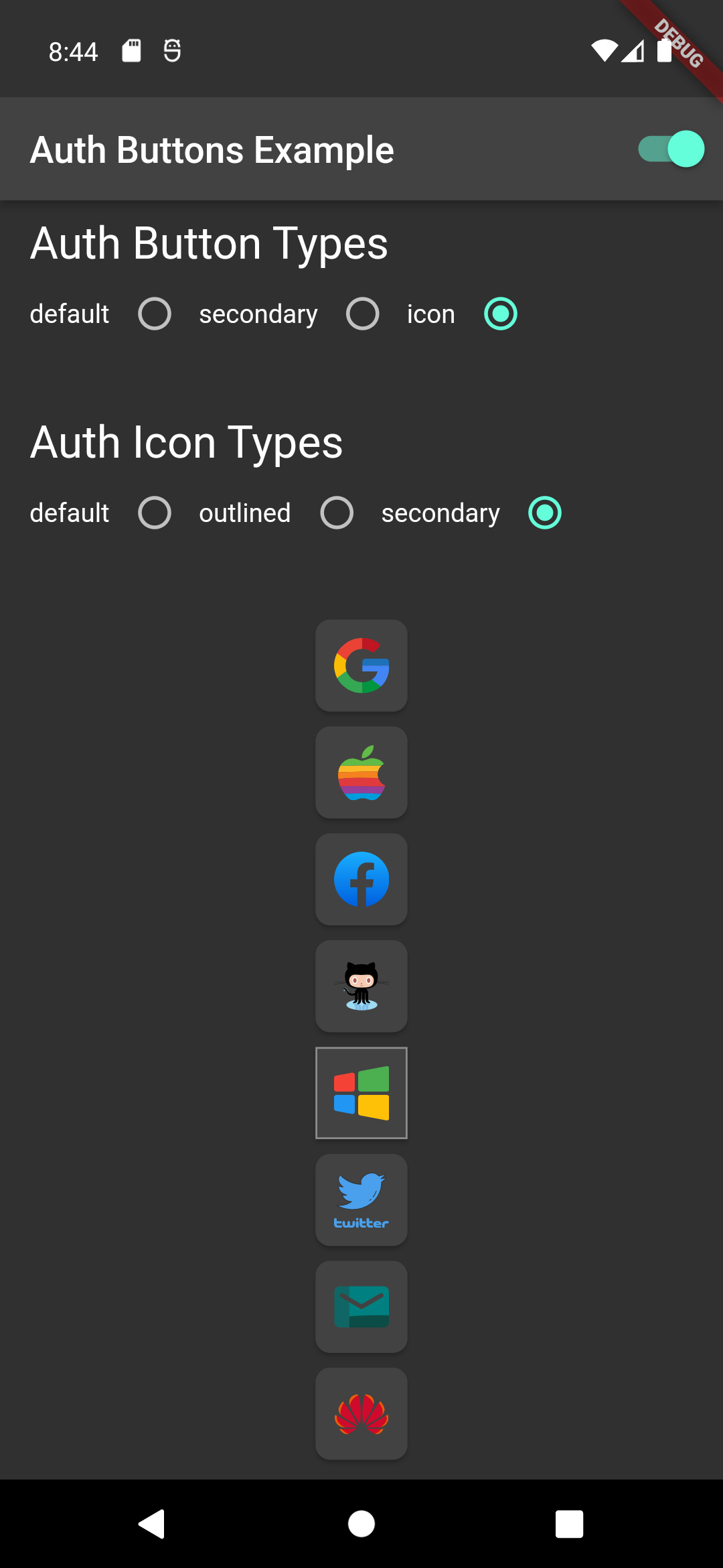
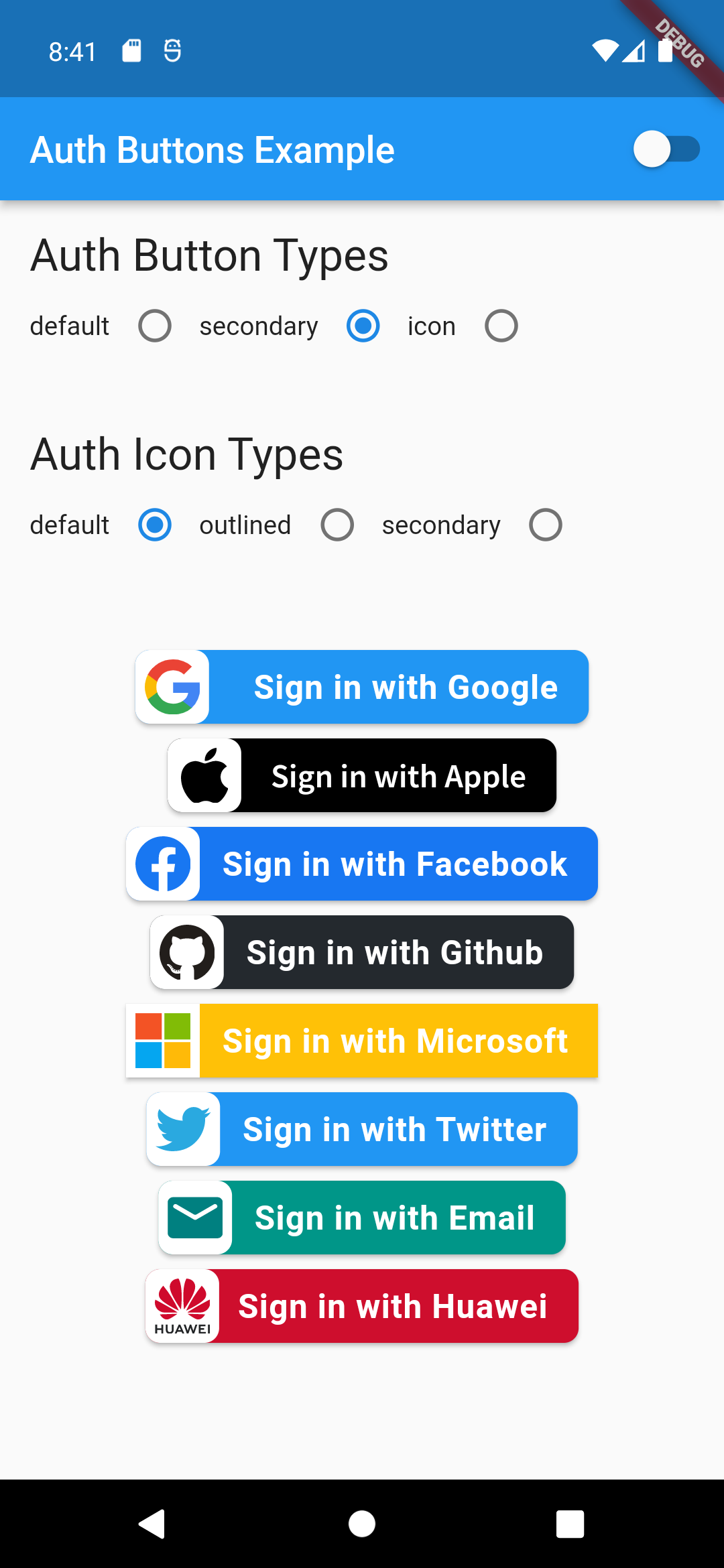
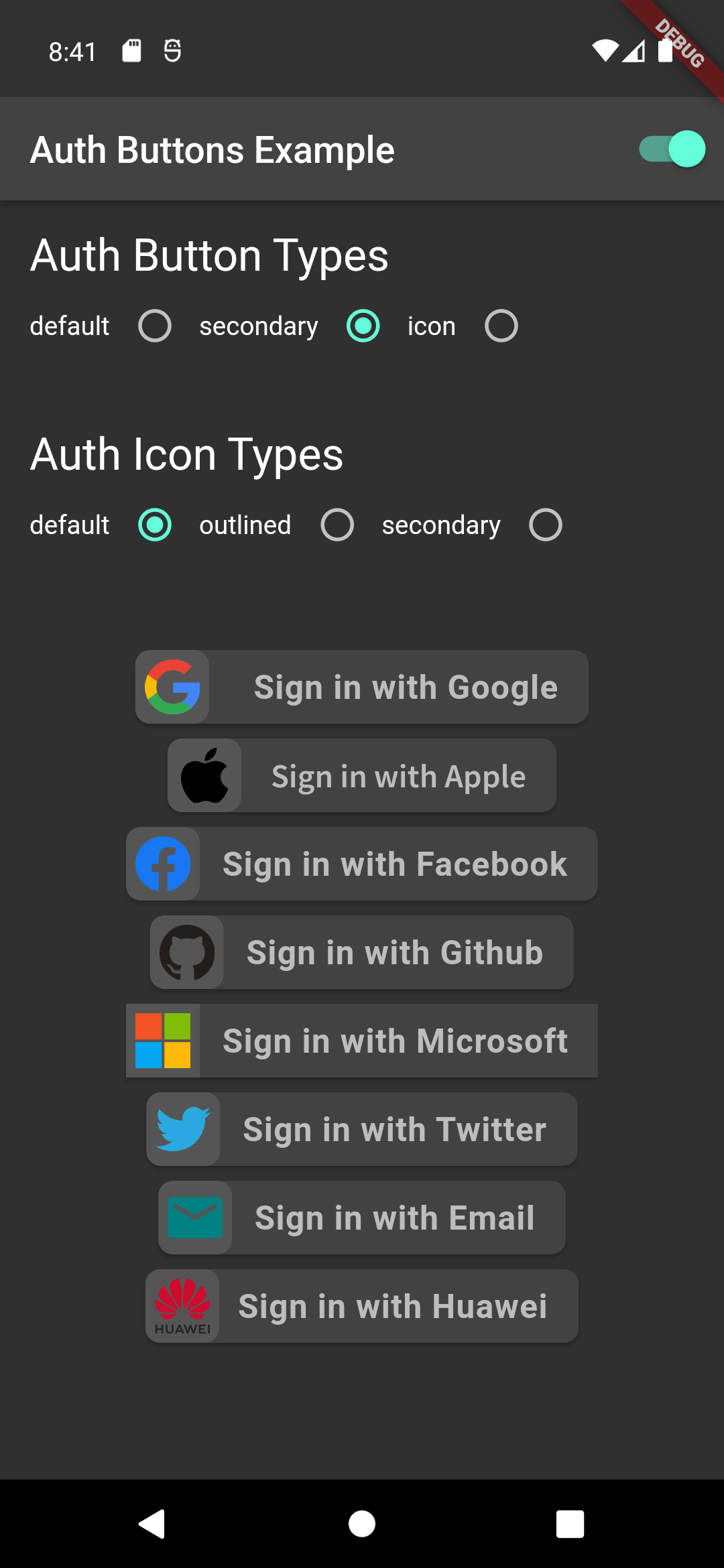
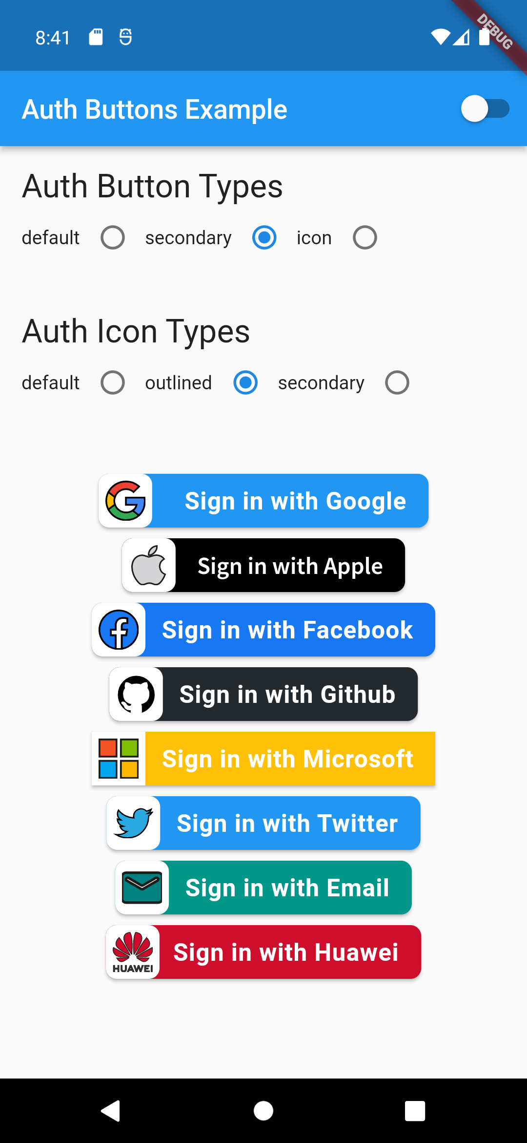
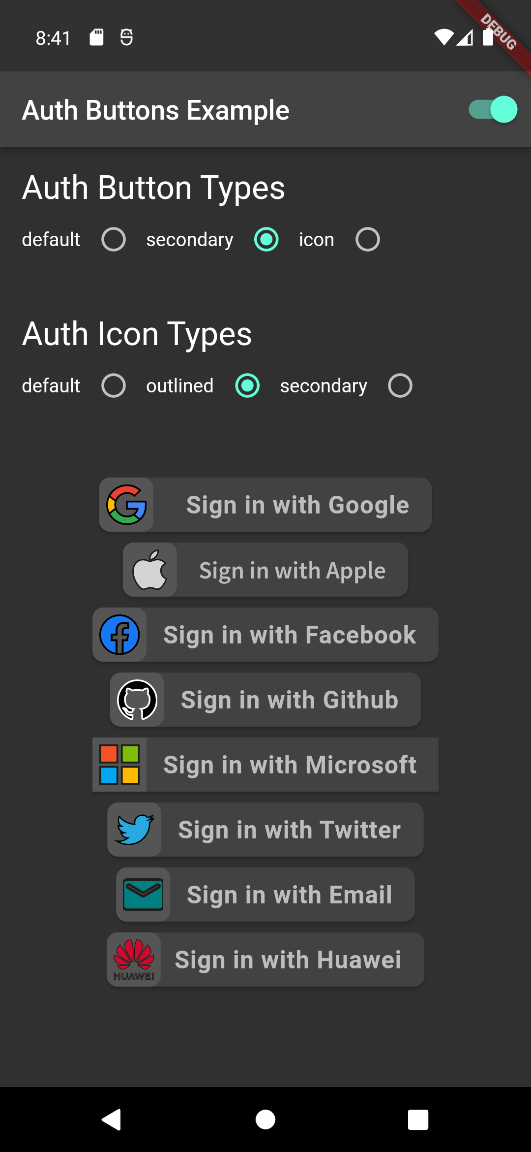
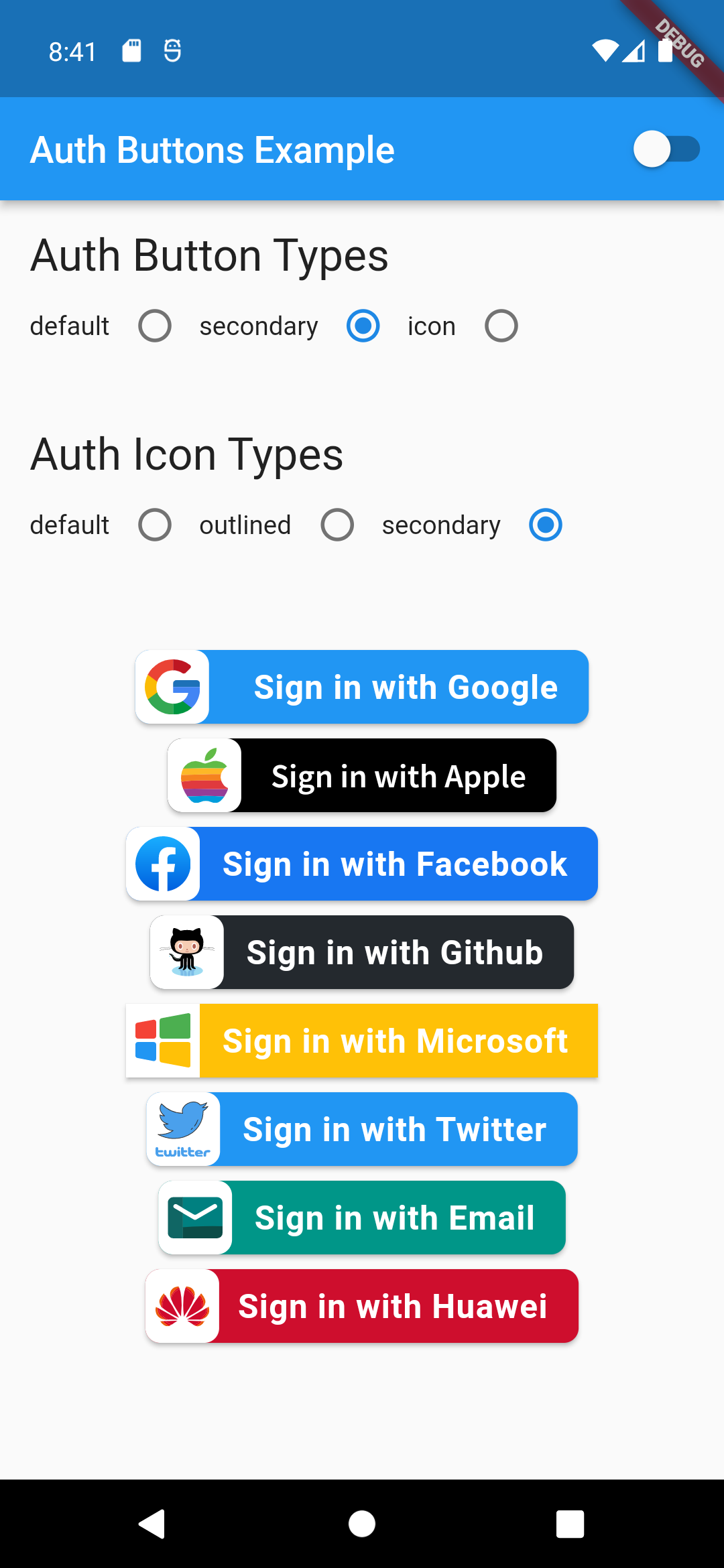
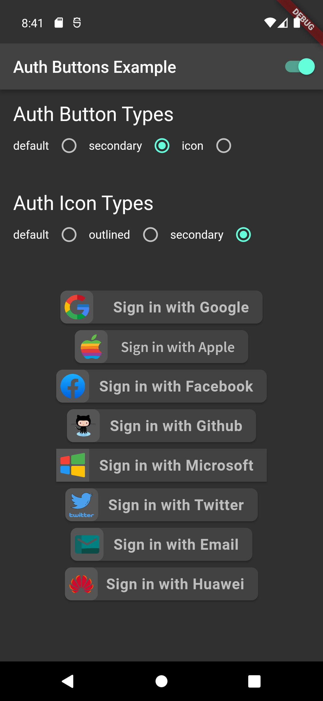
There are three Types you can choose between them:

  1. Default
  2. Icon
  3. Secondary

Suggestion

If you plain to use a non existing AuthButton like: Linkedin or any others along with the existing one, than make your custom one just use CustomAuthButton this provide you with a fast way to do so.

Using

Enabled State.

You need to use just the following code:

Default Type
GoogleAuthButton(
  onPressed: () {},
),
Light Dark
default-button-default-icon dark-default-button-default-icon
GoogleAuthButton(
  onPressed: () {},
  style: AuthButtonStyle(
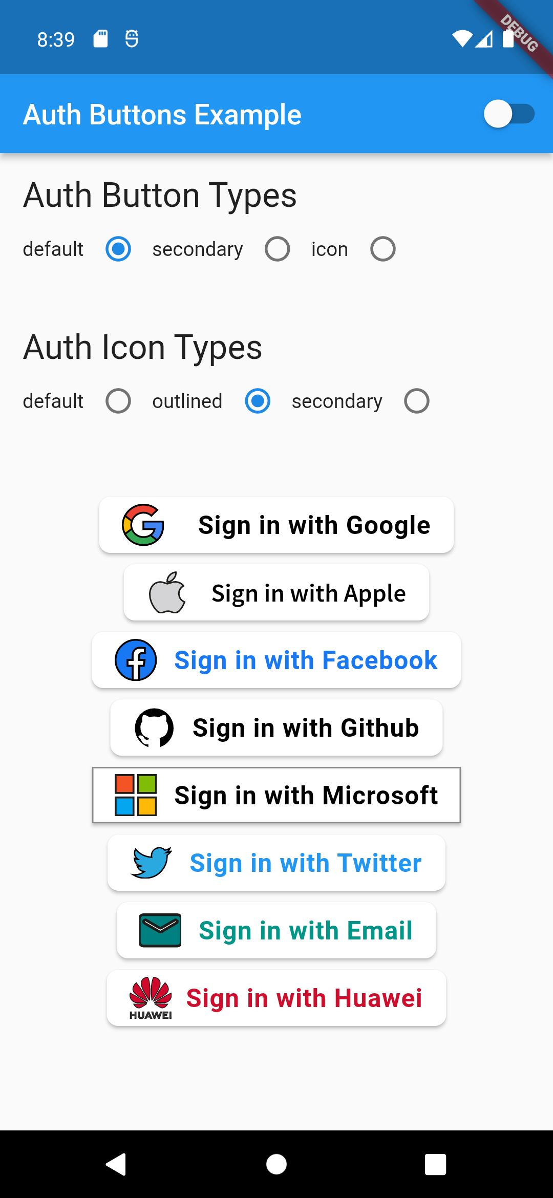
    iconType: AuthIconType.outlined,
  ),
),
Light Dark
default-button-outlined-icon dark-default-button-outlined-icon
GoogleAuthButton(
  onPressed: () {},
  style: AuthButtonStyle(
    iconType: AuthIconType.secondary,
  ),
),
Light Dark
default-button-secondary-icon dark-default-button-secondary-icon
Icon Type
GoogleAuthButton(
  onPressed: () {},
  style: AuthButtonStyle(
    buttonType: AuthButtonType.icon,
  ),
),
Light Dark
icon-button-default-icon dark-icon-button-default-icon
GoogleAuthButton(
  onPressed: () {},
  style: AuthButtonStyle(
    buttonType: AuthButtonType.icon,
    iconType: AuthIconType.outlined,
  ),
),
Light Dark
icon-button-outlined-icon dark-icon-button-outlined-icon
GoogleAuthButton(
  onPressed: () {},
  style: AuthButtonStyle(
    buttonType: AuthButtonType.icon,
    iconType: AuthIconType.secondary,
  ),
),
Light Dark
icon-button-secondary-icon dark-icon-button-secondary-icon
Secondary Type
GoogleAuthButton(
  onPressed: () {},
  style: AuthButtonStyle(
    buttonType: AuthButtonType.secondary,
  ),
),
Light Dark
secondary-button-default-icon dark-secondary-button-default-icon
GoogleAuthButton(
  onPressed: () {},
  style: AuthButtonStyle(
    buttonType: AuthButtonType.secondary,
    iconType: AuthIconType.outlined,
  ),
),
Light Dark
secondary-button-outlined-icon dark-secondary-button-outlined-icon
GoogleAuthButton(
  onPressed: () {},
  style: AuthButtonStyle(
    buttonType: AuthButtonType.secondary,
    iconType: AuthIconType.secondary,
  ),
),
Light Dark
secondary-button-secondary-icon dark-secondary-button-secondary-icon
Disabled State
Light Dark
disabled-buttons dark-disabled-buttons

Do same think with the other buttons, when you want to customize any button you can do it just passing a property which you want.

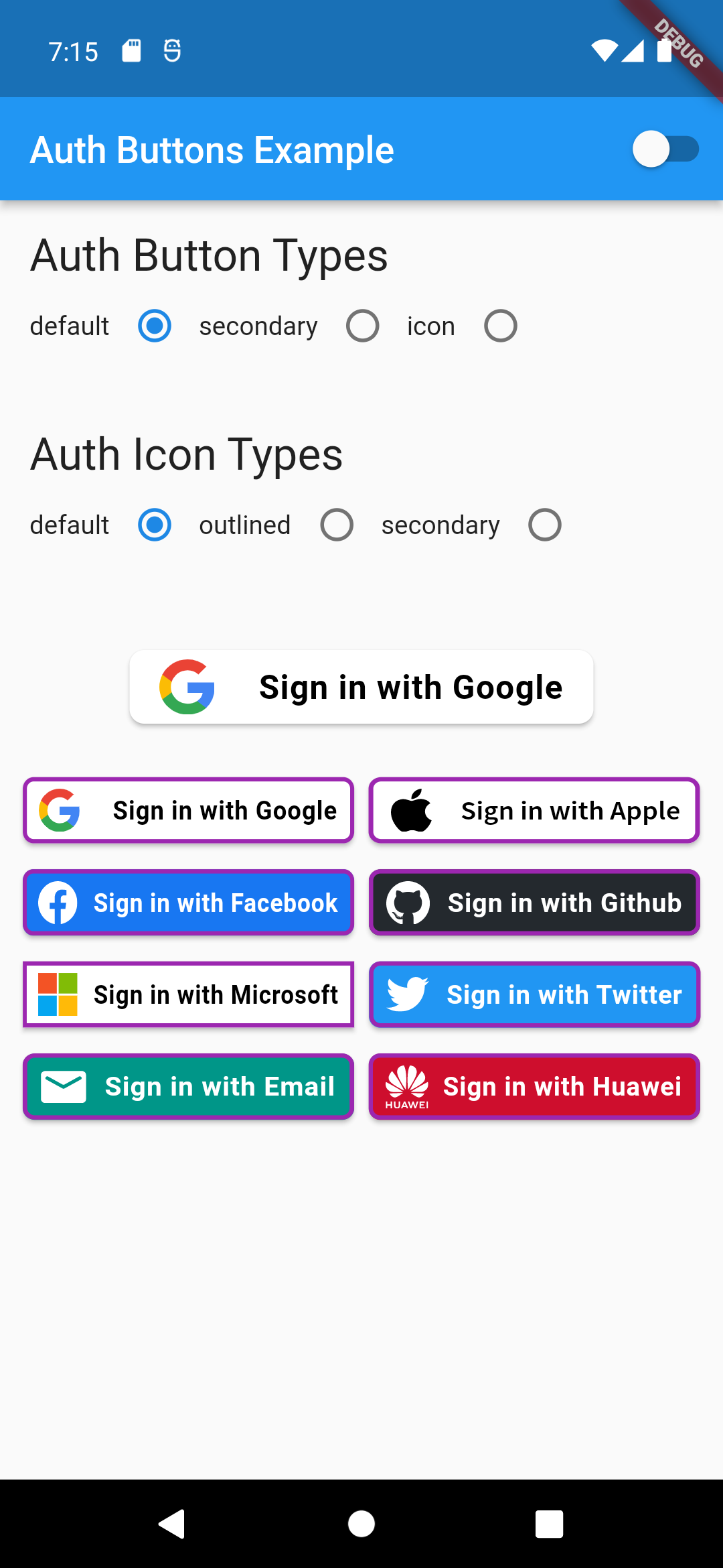
Grouped buttons

Example

auth button group usecase
AuthButtonGroup(
  style: const AuthButtonStyle(
    width: 180,
    height: 50,
    borderColor: Colors.purple,
    borderWidth: 3.0,
    margin: EdgeInsets.only(bottom: 8.0),
  ),
  buttons: [
    GoogleAuthButton(),
    AppleAuthButton(),
    //....
  ]
),
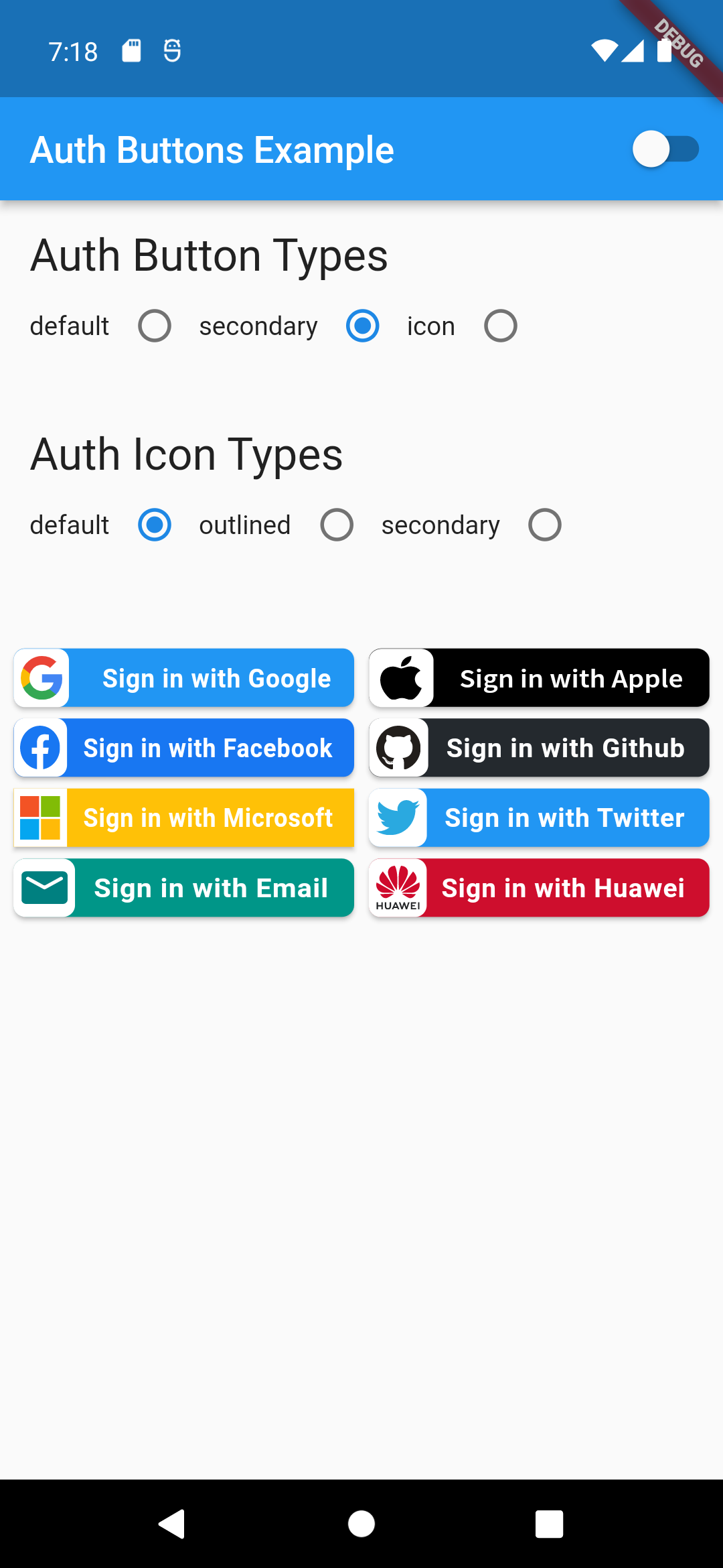
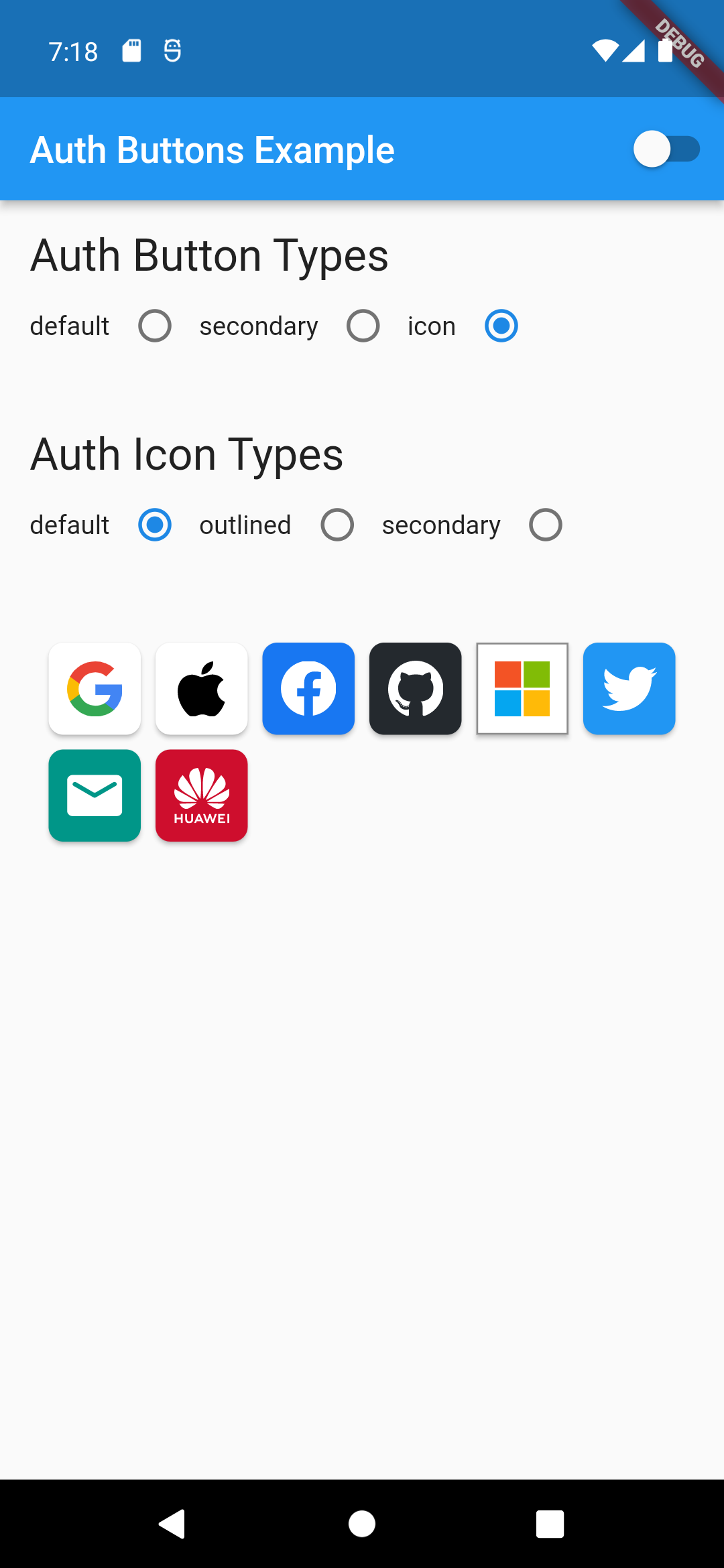
                                                                                           Secondary                                                                                               |  Icon

:-----------------------------------------------------------------------------------------------------------------------------------------------------------------------------------------------------:|:-------------------------: auth button group secondary buttons | auth-button-group-icon-buttons

Full property you can pass:

GoogleAuthButton(
  key: const ValueKey<String>(''),
  onPressed: () {},
  onLongPress: () {},
  onHover: (bool value) {},
  onFocusChange: (bool value) {},
  focusNode: FocusNode(),
  autofocus: false,
  text: 'Sign in with Google',
  isLoading: false,
  themeMode: ThemeMode.system,
  textDirection: TextDirection.ltr,
  materialStyle: ButtonStyle(),
  style: AuthButtonStyle(
    buttonColor: Colors.blue,
    splashColor: Colors.red,
    elevation: 2.0,
    borderRadius: 99.0,
    textStyle: TextStyle(),
    padding: const EdgeInsets.all(8.0),
    margin: const EdgeInsets.all(8.0),
    borderColor: Colors.amber,
    borderWidth: 3.0,
    buttonType: AuthButtonType.secondary,
    width: 300.0,
    height: 50.0,
    iconSize: 40.0,
    separator: 20.0,
    iconBackground: Colors.white,
    iconType: AuthIconType.outlined,
    shadowColor: Colors.pink,
    progressIndicatorColor: Colors.blue,
    progressIndicatorValueColor: Colors.grey[300],
    progressIndicatorStrokeWidth: 2.0,
    progressIndicatorValue: 1.0,
    iconColor: Colors.purple,
    progressIndicatorType: AuthIndicatorType.circular,
    visualDensity: VisualDensity.standard,
    tapTargetSize: MaterialTapTargetSize.shrinkWrap,
),

return up

Kategorien

Abhängigkeiten

Abhängigkeiten 2 Einträge

Quell-Repository

Projekte, die dieses Paket verwenden

Noch keine Daten verfügbar.