Pakete, Repositories und App-Kategorien suchen

Cover von black_hole_flutter
Paketdetailsv2.0.0

black_hole_flutter

Ein Paket, das alle Flutter-Hilfsfunktionen einschließt, einschließlich Erweiterungsfunktionen und häufig verwendeter Widgets

AndroidiOSWebmacOSWindowsLinux
30-Tage-Downloads
17.000
Likes
70
Pub-Punkte
160

Paket installieren

flutter pub add black_hole_flutter

Paketübersicht

Aus öffentlichen Paketdaten erstellte Orientierung.

Black_Hole_Flutter ist ein umfassendes Hilfspaket für Flutter, das häufig verwendete Erweiterungsfunktionen und wiederverwendbare Widgets in einer einzigen, einfach zu importierenden Lösung bündelt. Speziell entwickelt, um die Entwicklung zu vereinfachen, bietet es zeitsparende Werkzeuge für mehrere Plattformen wie Android, iOS, Web, macOS, Windows und Linux. Das Paket fungiert als zentraler Hub für häufig benötigte Funktionen, reduziert Boilerplate-Code und fördert Konsistenz in Flutter-Projekten. Ideal für Entwickler, die Effizienz und schnelle Prototypen suchen.

Anwendungsfälle

  • Schnelle Benutzeroberflächenentwicklung
  • Code-Wiederverwendung über Projekte hinweg
  • Häufige Aufgaben zu vereinfachen
  • Plattformübergreifende Utility
  • Prototyping
  • Boilerplate reduzieren

Hauptmerkmale

  • einheitliche Hilfsfunktionen-Erweiterungen
  • Wiederverwendbare Widgets
  • Multiplattformunterstützung
  • Minimale Einrichtung
  • Konsistenter Code-Stil
  • Erweiterbares Design

Geeignet für

  • Anfänger bis fortgeschrittene Flutter-Entwickler
  • Entwicklung von großskaligen Anwendungen
  • Teams, die Code-Konsistenz priorisieren
  • Projekte, die eine schnelle Iteration erfordern
  • Entwickler, die minimale Abhängigkeiten wünschen

Hinweise

  • Kann ungenutzte Hilfsprogramme enthalten
  • Möglichkeit von Abhängigkeitsbloat
  • Eingeschränkte Anpassung pro Funktion
  • Nicht geeignet für hochspezialisierte Anforderungen
  • Erfordert sorgfältige Überprüfung der enthaltenen Funktionen
  • Am besten geeignet, wenn der Projektumfang mit den enthaltenen Tools übereinstimmt

Original-README

Originaler README-Schnappschuss aus dem verknüpften Quell-Repository. Aktuelle Inhalte finden Sie im Repository.

🛠 A package absorbing all Flutter utility functions, including extension functions and commonly used widgets.

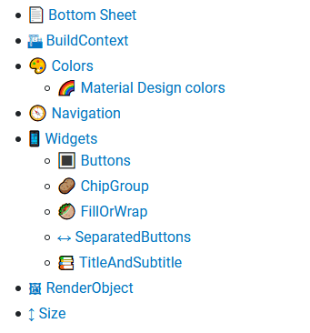
📄 Bottom Sheet

Show modal bottom sheets using: context.showModalBottomSheet().

FancyBottomSheet demo

Also, this package adds a custom FancyBottomSheet with a drag indicator at the top. You can create one using context.showFancyModalBottomSheet().

🏗 BuildContext

In Flutter, you often see the pattern <Class>.of(context) (e.g., Theme.of(context)). This package adds extension getters on BuildContext for those classes so you can just say:

Extension Shortcut for
context.colorScheme ColorScheme.of(context)
context.defaultTextStyle DefaultTextStyle.of(context)
context.directionality Directionality.of(context)
context.form Form.of(context)
context.locale Localizations.localeOf(context)
context.materialLocalizations MaterialLocalizations.of(context)
context.mediaQuery MediaQuery.of(context)
context.overlay Overlay.of(context)
context.pageStorage PageStorage.of(context)
context.scaffold Scaffold.of(context)
context.scaffoldOrNull Scaffold.of(context, nullOk: true)
context.textTheme TextTheme.of(context)
context.theme Theme.of(context)

🎨 Colors

Handy extensions on Brightness:

Extension Explanation
brightness.isDark ≙ brightness == Brightness.dark
brightness.isLight ≙ brightness == Brightness.light
brightness.opposite opposite Brightness
brightness.color Color representing this brightness, i.e.:
· Colors.white for Brightness.light
· Colors.black for Brightness.dark
brightness.contrastColor opposite of brightness.color (above)

isDark, isLight, and contrastColor can also be used on ThemeData directly.

Handy extensions on Color:

Extension Explanation
color.estimatedBrightness estimated Brightness based on color's luminance
color.isOpaque if opacity is 1.0
color.alphaBlendOn(Color background) resulting Color when drawing color on top of background
color.withAdditionalOpacity(double opacity) applies opacity by multiplying it to the existing opacity
color.withAdditionalAlpha(int alpha) like above, but with an integer alpha
color.hsl ≙ HSLColor.fromColor(color)
color.hsv ≙ HSVColor.fromColor(color)

And if you can't decide on a color, just use random.nextColor(), random.nextColorHsl() or random.nextColorHsv()!

Convert between alpha and opacity with int.alphaToOpacity and double.opacityToAlpha.

🌈 Material Design colors

Material Design specifies different opacities of white and black colors to use for text of different emphases on colored backgrounds. You can now use the highEmphasisOnColor, mediumEmphasisOnColor and disabledOnColor extension getters on Color to make your text legible! The raw opacity values are also available as MaterialColors.highEmphasisTextAlpha, MaterialColors.mediumEmphasisTextAlpha, and MaterialColors.disabledTextAlpha.

🧭 Navigation

Access your navigation-related information via extension methods:

Extension Shortcut for
context.navigator Navigator.of(context)
context.rootNavigator Navigator.of(this, rootNavigator: true)
context.modalRoute ModalRoute.of(context)

Push a new route and pop all previous routes (e.g., when signing out the user):

navigator.pushAndRemoveAll(/* new route */);
// Or using a named route:
navigator.pushNamedAndRemoveAll(/* route name */);

Log navigation events to the console:

MaterialApp(
  navigatorObservers: [LoggingNavigatorObserver()],
  // ...
)
// Prints:
// Navigator: didPush /dashboard → /articles/12345
// Navigator: didPop /dashboard ← /articles/12345

Note: This uses the name of routes, so it only works with named routes.

📱 Widgets

🔳 Buttons

Did you ever want to show a progress indicator inside a button? Or were annoyed to conditionally set a Button's onPressed to disable it? Fear no more — black_hole_flutter has got you covered!

Button demo

This screenshot only shows an excerpt of all available button types and variants.

In FancyFab (a FloatingActionButton), FancyTextButton, FancyOutlinedButton, FancyElevatedButton, FancyFilledButton, and FancyIconButton, we introduce some new parameters:

🥙 FillOrWrap
FillOrWrap demo

A layout with two different behaviors:

  • By default, all children are positioned next to each other with equal widths. This is comparable to a Row with all children wrapped in Expanded.
  • If the children are too wide to fit in a single line, or one child would become smaller than its reported minimum width, the children get positioned below each other ("wrapped"). This is similar to a Column with MainAxisSize.min.
🎯 LeftCenterRight

A layout taking optional left, center, and right children. It will try to keep center in the center of itself, even if only one of left and right is set, or they have different widths.

🟢 Circle

A circle with optional diameter, background color, padding, and child.

🖼 RenderObject

When writing a custom layout, you might find this extension on ContainerRenderObjectMixin useful:

Extension Explanation
containerRenderObjectMixin.children Returns all children using firstChild and childAfter

↕ Size

Extension Explanation
size.diagonal length of the diagonal of a rectangle with this Size
size.squaredDiagonal ≙ size.diagonal * size.diagonal
size.coerceAtLeast(Size minimum) Ensures size is not smaller than minimum in any axis
size.coerceAtMost(Size maximum) Ensures size is not larger than minimum in any axis

Kategorien

Abhängigkeiten

Abhängigkeiten 3 Einträge

Quell-Repository

Projekte, die dieses Paket verwenden