Aus öffentlichen Paketdaten erstellte Orientierung.
Blurry ist ein Flutter-Paket, das ein visuell ansprechendes Dialog-Widget mit einem Blurreffekt bietet, inspiriert vom Glas-Morph-Design. Es verfügt über integrierte Themen, die die Anpassung der Optik einfach machen und es ideal für moderne Benutzeroberflächen machen. Das Dialogfeld unterstützt mehrere Plattformen wie Android, iOS, Web, macOS, Windows und Linux und gewährleistet eine konsistente Leistung auf verschiedenen Geräten. Mit minimalem Setup über `flutter pub add blurry` können Entwickler schnell schicke, durchsichtige Dialoge in ihre Apps integrieren. Das Paket verbessert die Benutzererfahrung durch subtile visuelle Tiefe und Eleganz.
Anwendungsfälle
Moderne App-Dialoge erstellen
Implementierung von glassmorphic UI-Elementen
Transluzente Überlagerungen hinzufügen
Verbesserung der Ästhetik von mobilen und Desktop-Anwendungen
Immersive Benutzeroberflächen gestalten
Hauptmerkmale
Unschärfe-Effekt auf Dialoginhalte
Eingebaute anpassbare Themen
Plattformübergreifende Kompatibilität
Einfache Integration mit Flutter
Unterstützung für mehrere Betriebssysteme
Geeignet für
UI-Designer, die moderne Ästhetik suchen
Entwickler, die glassmorphe Schnittstellen erstellen
Apps, die elegante Overlay-Dialoge erfordern
Projekte, die mehrere Plattformen ansprechen
Teams, die sich auf das visuelle Erscheinungsbild konzentrieren
Hinweise
Leistungseinfluss auf Geräte mit geringer Leistungsfähigkeit
Begrenzte Anpassungsmöglichkeiten jenseits der bereitgestellten Themen
Mögliche Lesbarkeitsprobleme bei hoher Blur-Intensität
Erfordert sorgfältige Planung des Farbkontrasts
Passt möglicherweise nicht zu allen App-Design-Stilen
Original-README
Originaler README-Schnappschuss aus dem verknüpften Quell-Repository. Aktuelle Inhalte finden Sie im Repository.
Blurry Dialog
Features
Display simple blurry dialog popup
Offer built-in themes
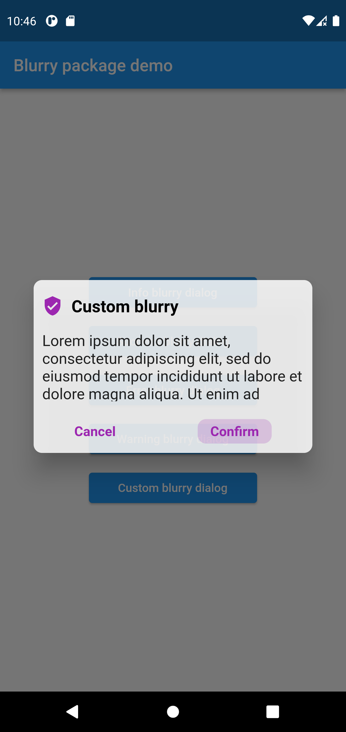
Possibility to create you custom dialog
Button click handler callbacks
Customizable text
Customizable barrier color and behavior
Customize popup size
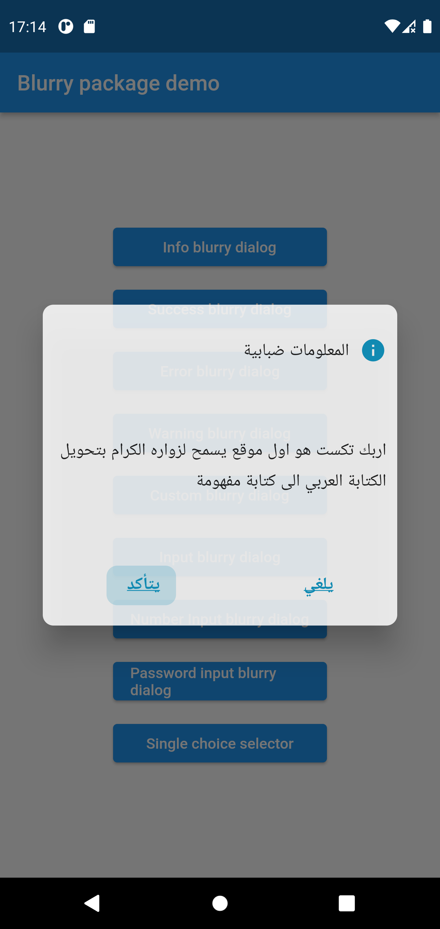
Customizable layout LTR, RTL, Center
Support arabic language
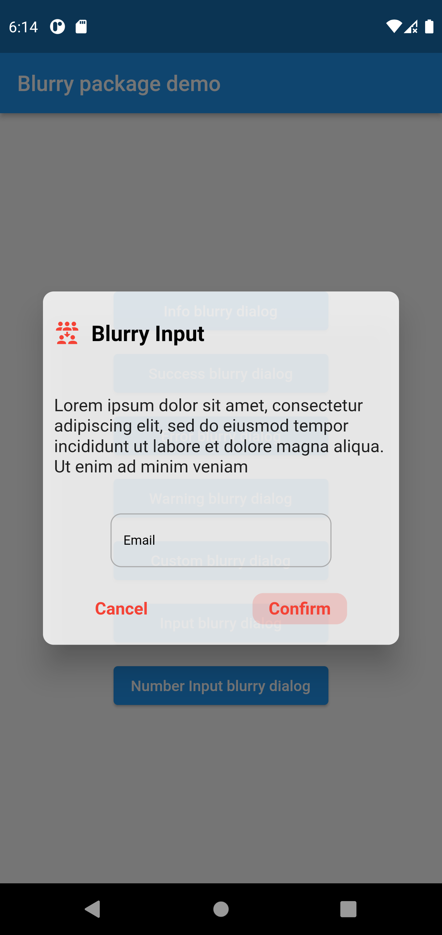
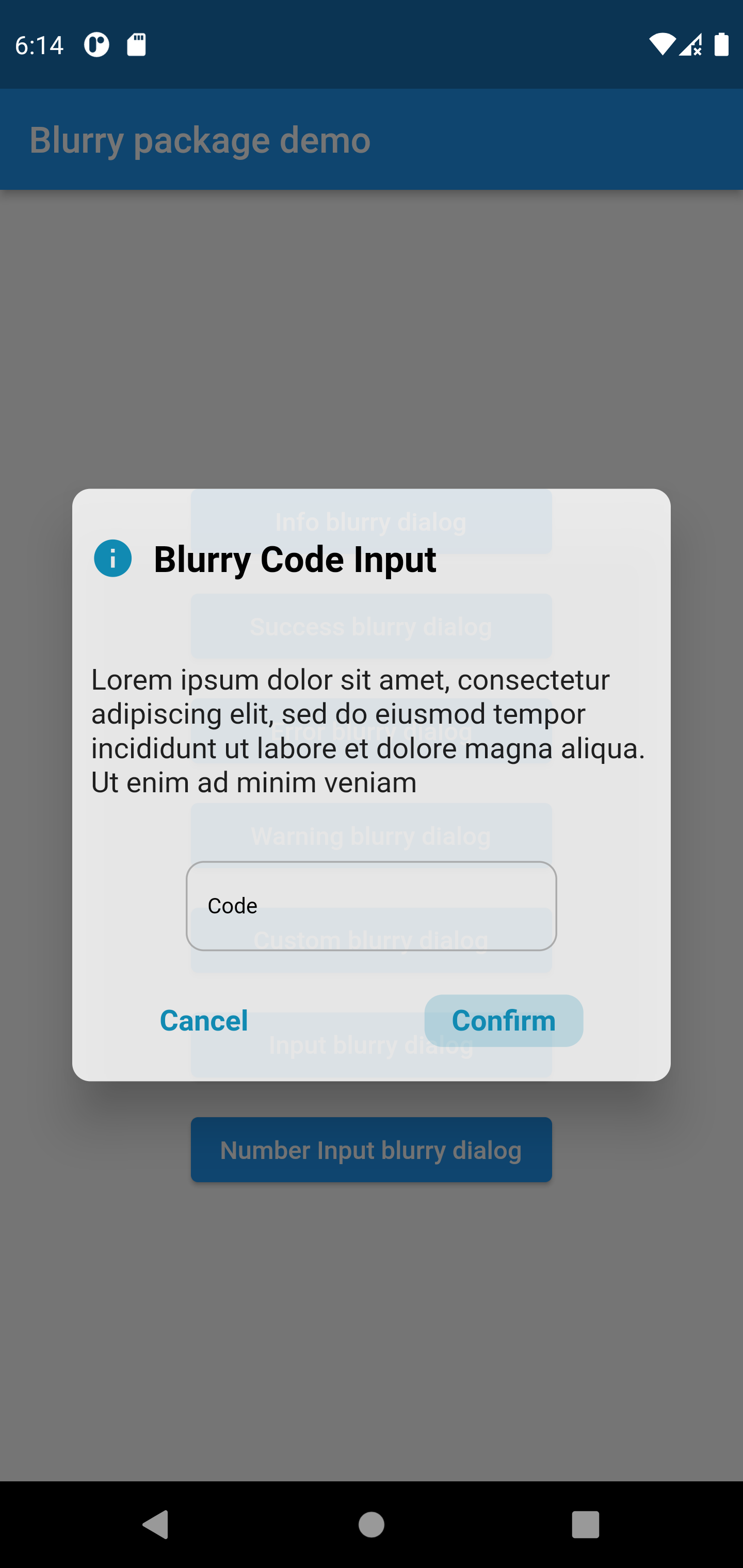
Input popup option with keyboard type
Customizable input style and input text style
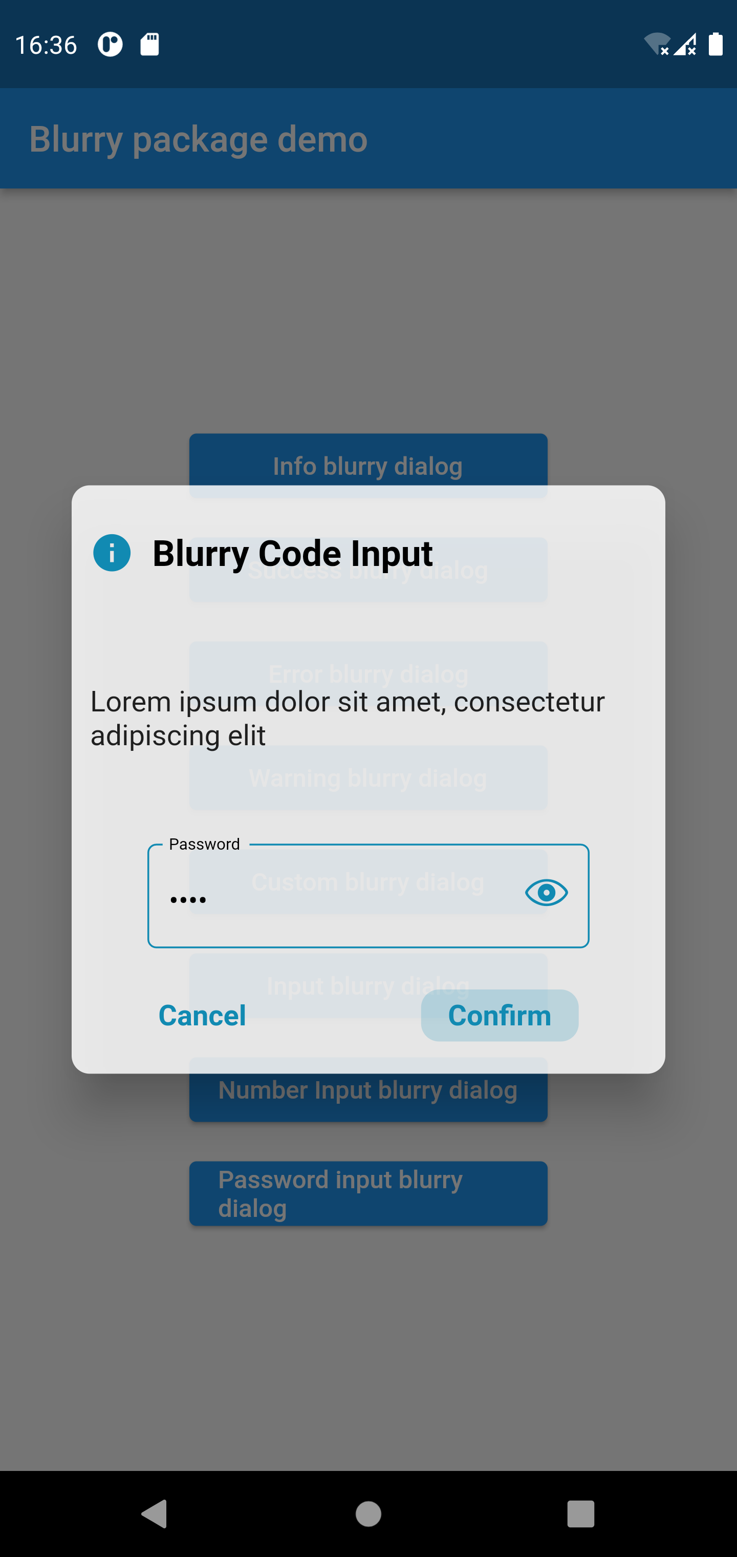
Password popup type with eye icon to view password
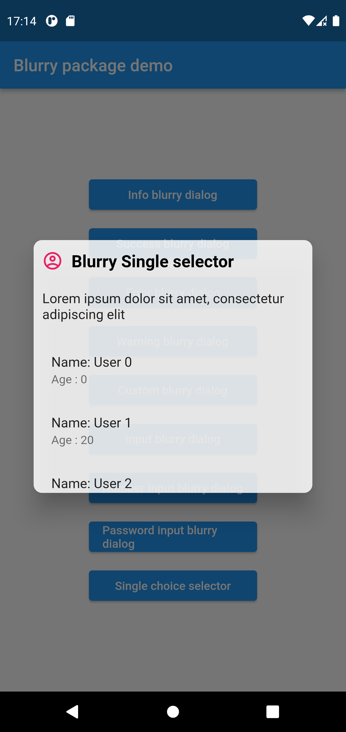
Single item selector type
Getting started
To use the blurry dialog package you need to add it in pubspec.yaml file
dependencies:blurry:^1.4.2
Usage
Parameters
///the dialog popup title, required in all blurry class constructorsfinalString title;
///the dialog description text///required in all blurry class constructorsfinalString description;
///the cancel button text, by default it's 'Cancel'finalString cancelButtonText;
///the confirm button (primary button) text stringfinalString confirmButtonText;
///the dialog theme color///will be applied on buttons and icon///not available in default types constructors (info, error, warning, success)lateColor? themeColor;
///function invoked when the primary button is pressed///required in all constructorsfinalFunction onConfirmButtonPressed;
///the callback that will be invoked when pressing on cancel buttonfinalFunction? onCancelButtonPressed;
///the icon that will be rendered in the dialog///required only when using the default constructorlateIconData? icon;
///title text style, by default it's nullfinalTextStyle? titleTextStyle;
///description text style, by default it's nullfinalTextStyle? descriptionTextStyle;
///button text style, by default it's nullfinalTextStyle? buttonTextStyle;
///the blurry dialog popup heightfinaldouble? popupHeight;
///indicate whether the cancel button will be rendered or not///by default the cancel button is displayedfinalbool displayCancelButton;
///indicates whether the popup dialog is dismissable or not///by default [dismissable = true]finalbool dismissable;
///the color of the barrier of the burry dialog///if it's null the barrier color will be the default color [Colors.black54]finalColor? barrierColor;
///the layout rendering type, LTR, RTL or center///possible values/// - ltr/// - rtl/// - center/// by default is [LAYOUT_TYPE.ltr]final LAYOUT_TYPE layoutType;
/// the input label string, required when using the input constructorlateString? inputLabel;
/// the input text field text controller/// required when using the input constructorlateTextEditingController? inputTextController;
/// the input text style by default it's just black textlateTextStyle inputTextStyle;
/// the input label style by default it's just black textlateTextStyle inputLabelStyle;
/// text input type applied on input field/// available only when using the input constructorlateTextInputType textInputType;
/// the design type of the popup, available when using input constructor/// availabele options/// {/// info,/// success,/// error,/// warning/// }/// ```late BLURRY_TYPE? type;
/// indicate whether display visibility eye icon on password fields/// available only when using `Blurry.password` constructor/// by default it's 'true'bool withVisibilityEye = true;
///list items that will be rendered in the single selector blurry popup type///available only when using `singleChoiceSelector` constructor (should be not null and not empty)lateList<Widget>? items;
///invoked when pressing on item from the list///available only when using `singleChoiceSelector`///by default pressing an element from the list will close the popuplateFunction(int)? onItemSelected;
Examples
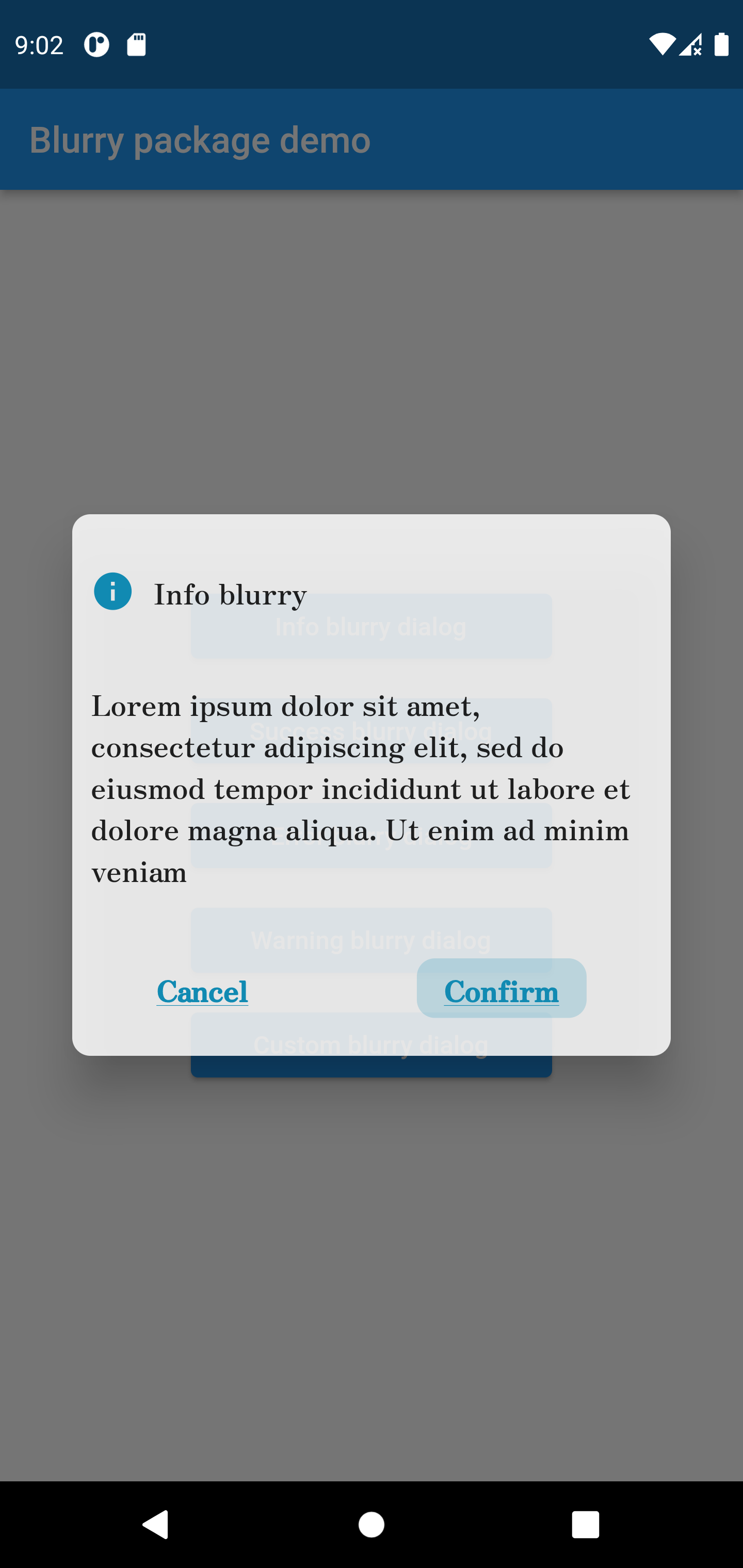
Info style blurry package
Blurry.info(
title: 'Info blurry',
description:'Lorem ipsum dolor sit amet, consectetur adipiscing elit, sed do eiusmod tempor incididuntut labore et dolore magna aliqua. Ut enim ad minim veniam',
confirmButtonText: 'Confirm',
titleTextStyle: constTextStyle(fontFamily: 'Zen'),
popupHeight: 300,
buttonTextStyle: constTextStyle(
decoration: TextDecoration.underline,
fontFamily: 'Zen'
),
descriptionTextStyle: constTextStyle(fontFamily: 'Zen'),
onConfirmButtonPressed: () {})
.show(context);
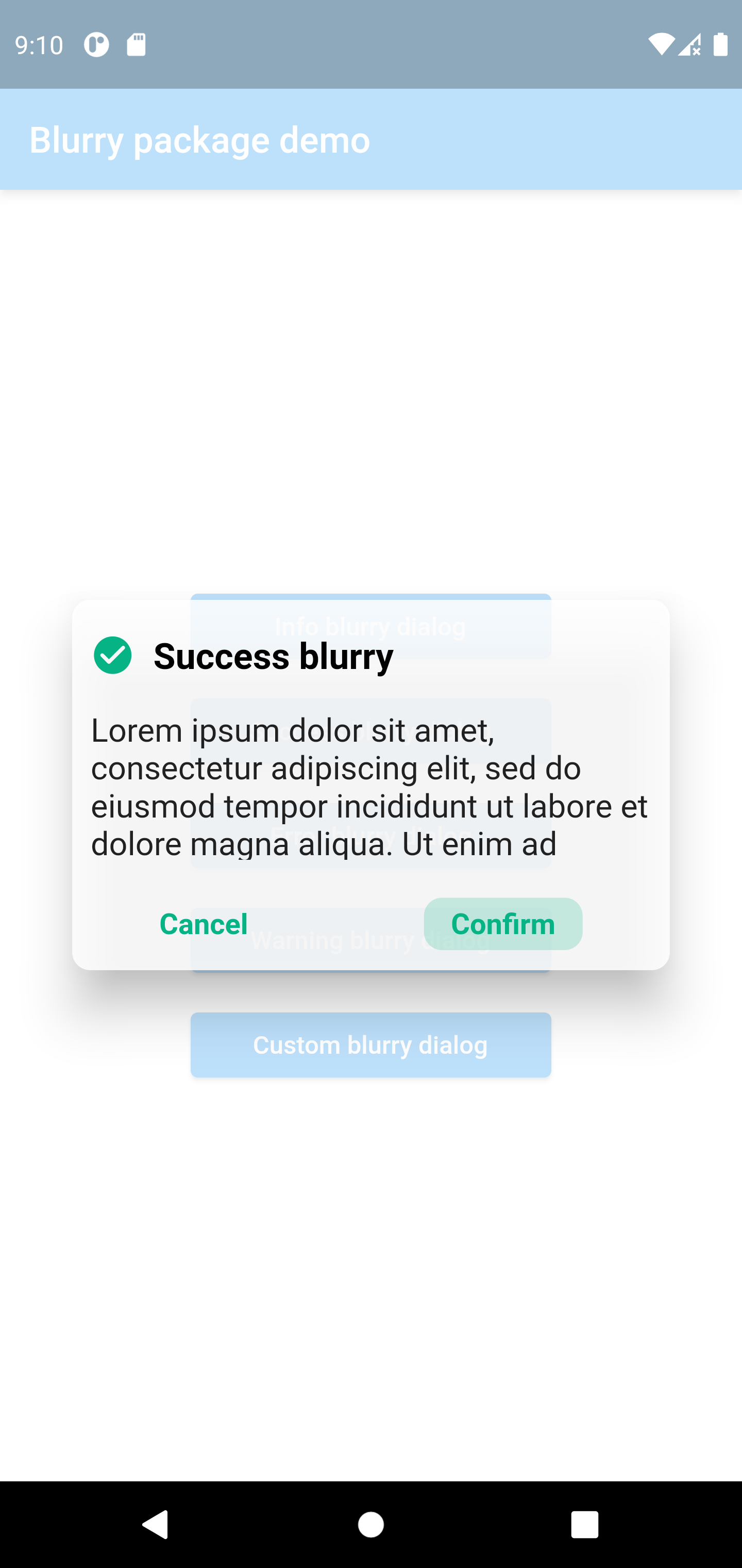
Success style blurry package
Blurry.success(
	title:  'Success blurry',
	description:
	'Lorem ipsum dolor sit amet, consectetur adipiscing elit, sed do eiusmod tempor incididunt ut labore et dolore magna aliqua. Ut enim ad minim veniam',
	confirmButtonText:  'Confirm',
	onConfirmButtonPressed: () {},
	barrierColor: Colors.white.withOpacity(0.7),
	dismissable:  false,
).show(context);
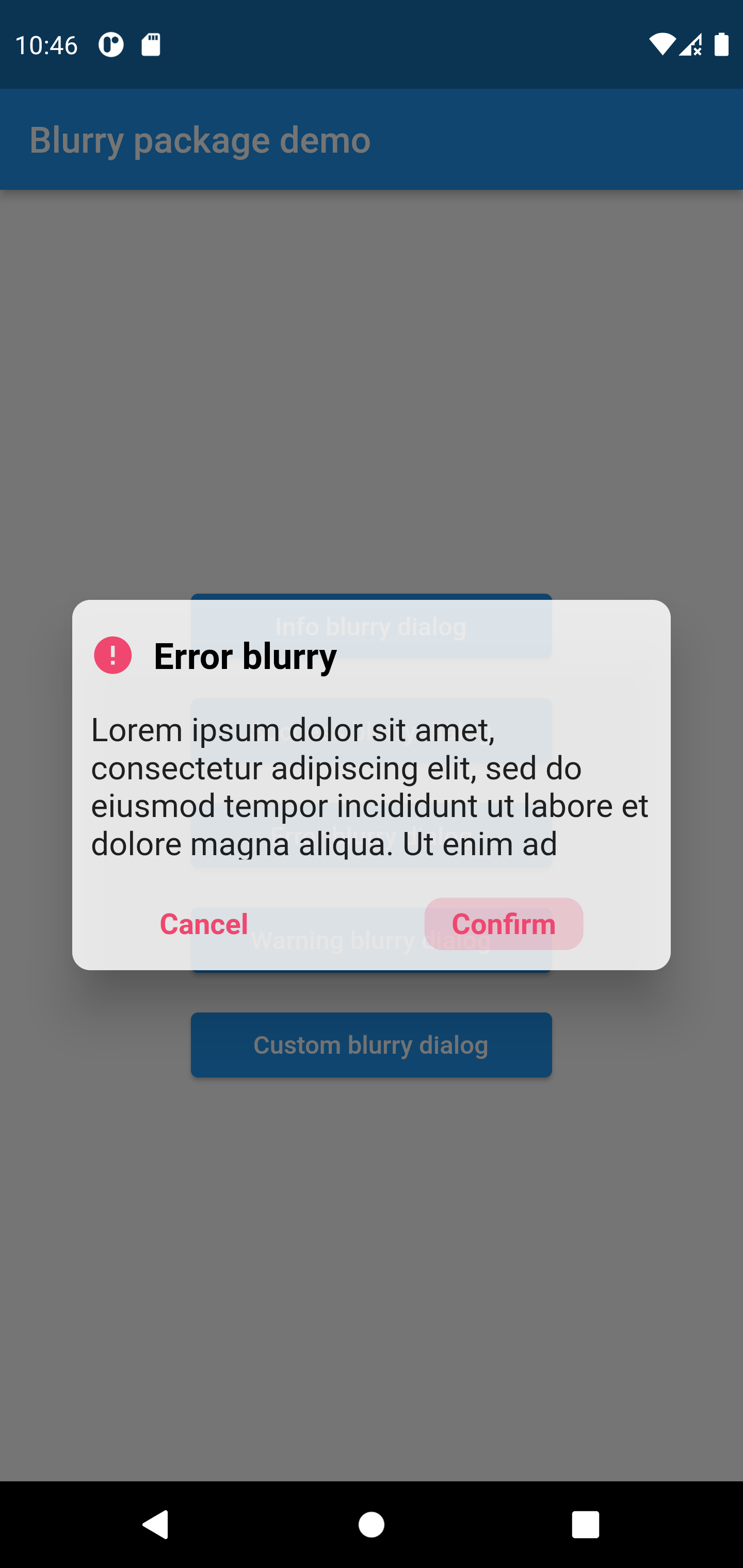
Error style blurry package
Blurry.error(
	title:  'Error blurry',
	description:'Lorem ipsum dolor sit amet, consectetur adipiscing elit, sed do eiusmod tempor incididun',
	confirmButtonText:  'Confirm',
	onConfirmButtonPressed: () {
		print('hello world');
	})
.show(context);
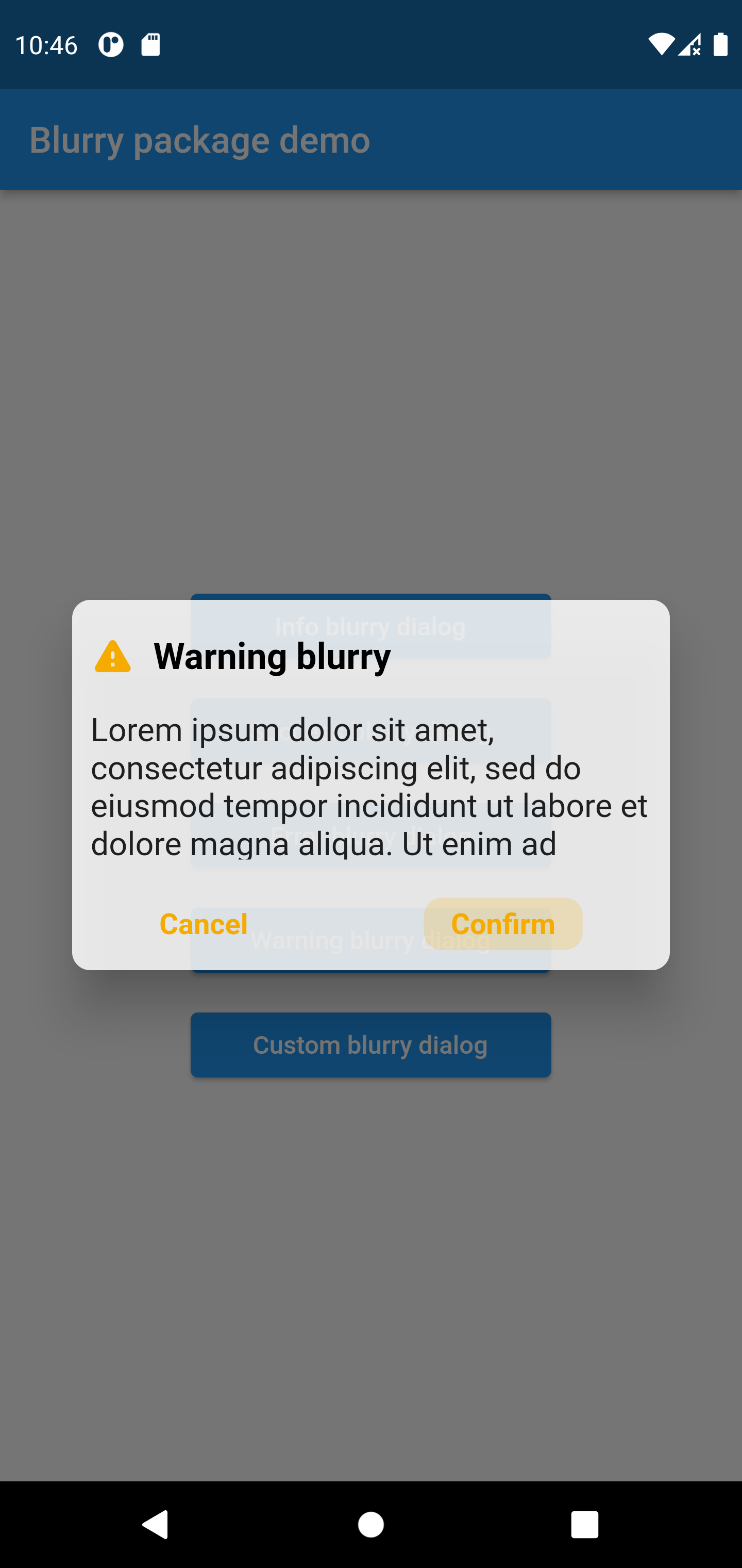
Warning style blurry package
Blurry.warning(
	title:  'Warning blurry',
	description:'Lorem ipsum dolor sit amet, consectetur adipiscing elit, sed do eiusmod tempor incididun',
	confirmButtonText:  'Confirm',
	onConfirmButtonPressed: () {
		print('hello world');
	})
.show(context);