Pakete, Repositories und App-Kategorien suchen

Cover von bottom_bar
Paketdetailsv2.0.5

bottom_bar

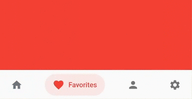
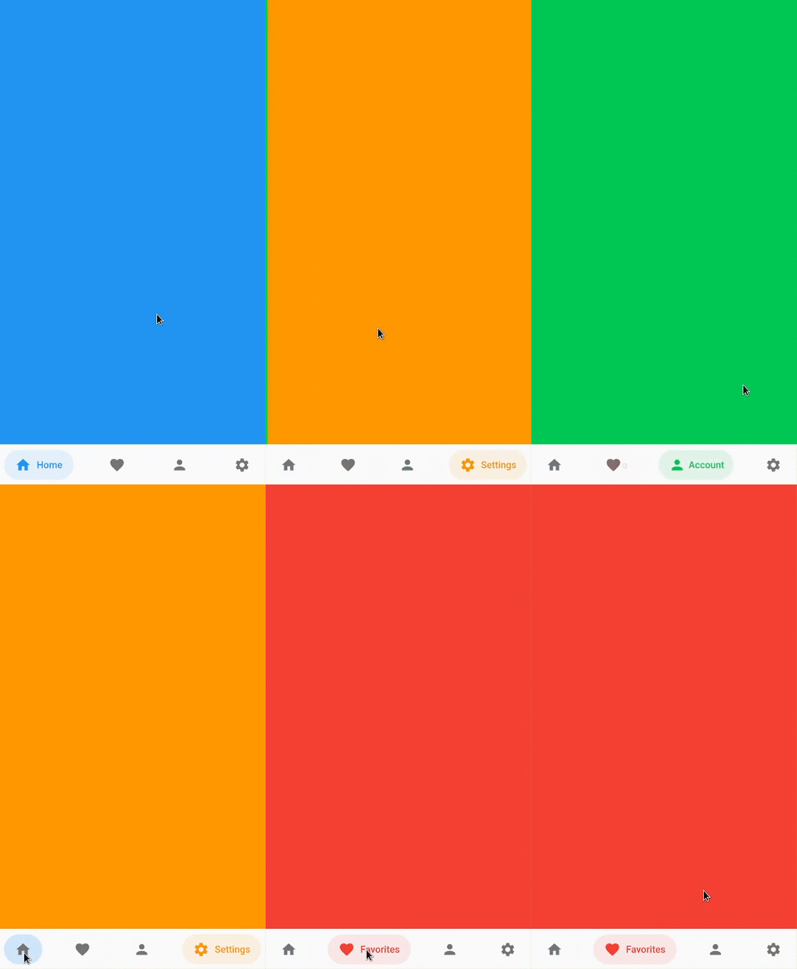
Die Bottom-Bar hilft dabei, eine optimierte Bottom-Navigation mit schönen Animationen zu erstellen

AndroidiOSWebmacOSWindowsLinux
30-Tage-Downloads
1400
Likes
137
Pub-Punkte
160

Paket installieren

flutter pub add bottom_bar

Paketübersicht

Aus öffentlichen Paketdaten erstellte Orientierung.

Bottom Bar ist ein Flutter-Paket, das Entwicklern ermöglicht, optimierte, visuell ansprechende Bottom-Navigation-Bars mit flüssigen Animationen zu erstellen. Für den Einsatz auf mehreren Plattformen entwickelt, unterstützt es Android, iOS, Web, macOS, Windows und Linux. Das Paket vereinfacht die Implementierung der Bottom-Navigation durch anpassbare Übergänge, responsive Design-Elemente und integrierte Zugänglichkeitsfunktionen. Es verbessert die Benutzererfahrung, indem intuitive Navigationsmuster auf verschiedenen Geräten bereitgestellt werden. Perfekt für Anwendungen, die eine dauerhafte Bottom-Navigation mit modernem Design erfordern.

Anwendungsfälle

  • Mobile App-Navigation
  • Web-Anwendungs-Dashboards
  • Plattformübergreifende Desktop-Anwendungen
  • Verbessertes Benutzeroberflächendesign
  • Reaktive Navigationslayouts

Hauptmerkmale

  • Glatte animierte Übergänge
  • Anpassbare Erscheinung
  • Plattformübergreifende Kompatibilität
  • Barrierefreiheitssupport
  • Integration von Responsive Design

Geeignet für

  • Entwickler, die mobile oder Web-Apps erstellen
  • designorientierte UI-Implementierungen
  • Apps mit konsistenter Navigation
  • Teams, die der Animationsqualität Priorität einräumen
  • Projekte für mehrere Plattformen

Hinweise

  • Flutter SDK-Einrichtung erforderlich
  • Eingeschränkte Anpassung über die grundlegende Gestaltung hinaus
  • Möglicherweise benötigt man zusätzliche Zustandsverwaltung
  • Nicht ideal für komplexe Registerstrukturen
  • Hängt von externem Repository für Updates ab

Original-README

Originaler README-Schnappschuss aus dem verknüpften Quell-Repository. Aktuelle Inhalte finden Sie im Repository.

Bottom Bar

Bottom bar helps create an optimized bottom navigation bar with beautiful animations.

Bottom Bar

Content

Installation

Add bottom_bar to pubspec.yaml

dependencies:
  bottom_bar: ^2.0.5

Breaking Changes

  • darkActiveColor is removed to simplify the api. Instead, use PlatformBrightness to check dark mode and adjust the color accordingly

Usage

Import the Package

import 'package:bottom_bar/bottom_bar.dart';

Example

  int _currentPage = 0;
  final _pageController = PageController();

  @override
  Widget build(BuildContext context) {
    return Scaffold(
      body: PageView(
        controller: _pageController,
        children: [
          Container(color: Colors.blue),
          Container(color: Colors.red),
          Container(color: Colors.greenAccent.shade700),
          Container(color: Colors.orange),
        ],
        onPageChanged: (index) {
          // Use a better state management solution
          // setState is used for simplicity
          setState(() => _currentPage = index);
        },
      ),
      bottomNavigationBar: BottomBar(
        selectedIndex: _currentPage,
        onTap: (int index) {
          _pageController.jumpToPage(index);
          setState(() => _currentPage = index);
        },
        items: <BottomBarItem>[
          BottomBarItem(
            icon: Icon(Icons.home),
            title: Text('Home'),
            activeColor: Colors.blue,
          ),
          BottomBarItem(
            icon: Icon(Icons.favorite),
            title: Text('Favorites'),
            activeColor: Colors.red,
          ),
          BottomBarItem(
            icon: Icon(Icons.person),
            title: Text('Account'),
            activeColor: Colors.greenAccent.shade700,
          ),
          BottomBarItem(
            icon: Icon(Icons.settings),
            title: Text('Settings'),
            activeColor: Colors.orange,
          ),
        ],
      ),
    );
  }

Parameters

BottomBar

Creates a BottomBar that displays a list of BottomBarItem
Required:
Optional:
  • backgroundColor - Background Color of BottomBar
  • height - Height of BottomBar
  • padding - Padding of BottomBar container
  • mainAxisAlignment - Describes how BottomBarItems are horizontally laid out
  • curve - Curve of animation
  • duration - Duration of animation
  • border - Border of BottomBarItem's background color
  • boxShadow - BoxShadow of BottomBar
  • itemPadding - Padding of BottomBarItem's background color
  • textStyle - TextStyle of title widget
  • showActiveBackgroundColor - Shows the background color of a selected BottomBarItem if set to true

BottomBarItem

Contains information about the item that BottomBar has to display
Required:
  • icon - Icon of BottomBarItem
  • title - Title of BottomBarItem (Typically a Text widget)
  • activeColor - Primary color of a selected BottomBarItem
Optional:
  • activeIconColor - Icon color of a selected BottomBarItem
  • activeTitleColor - Text color of a selected BottomBarItem
  • backgroundColorOpacity - Opacity of a selected BottomBarItem background color (Defaults to 15%)
  • inactiveIcon- Icon to display when BottomBarItem is not active
  • inactiveColor - Primary color of BottomBarItem when it is NOT selected

FAQ

My phone's notch is overlapping with BottomBar. How do I fix this?
  • Simply wrap BottomBar with a SafeArea widget.
How do I change the overall color of BottomBarItem when in dark mode?
  @override
  Widget build(BuildContext context) {
    bool isDarkMode = MediaQuery.of(context).platformBrightness == Brightness.dark;

    BottomBarItem(
      activeColor: isDarkMode ? Colors.orange : Colors.blue, // Is dark mode true? (Yes -> Colors.orange | No -> Colors.blue)
    ),
  }

Community Support

If you have any suggestions or issues, feel free to open an issue

If you would like to contribute, feel free to create a PR

Kategorien

Quell-Repository

Projekte, die dieses Paket verwenden