Aus öffentlichen Paketdaten erstellte Orientierung.
BottomNavyBar ist eine visuell ansprechende und animierte Bottom-Navigation für Flutter-Anwendungen. Sie integriert sich nahtlos in das aktuelle Theme der App und bietet umfangreiche Anpassungsmöglichkeiten für Farben, Symbole und Animationen. Für moderne Benutzeroberflächen entwickelt, verbessert sie die Benutzererfahrung durch flüssige Übergänge und reaktionsfreudiges Feedback auf allen Plattformen. Das Paket unterstützt Android, iOS, Web, macOS, Windows und Linux und ist daher ideal für plattformübergreifende Entwicklung. Sein sauberer und intuitiver Design macht es perfekt für Apps, die eine schicke Bottom-Navigation benötigen.
Anwendungsfälle
Mobile- und Web-Apps mit unterer Navigation
Plattformübergreifende Anwendungen
Moderne UI-Designs
E-Commerce- und Social-Media-Apps
Dashboard-Oberflächen
Hauptmerkmale
Animierte Navigationsübergänge
Themenbewusste Gestaltung
Anpassbare Farben und Symbole
Reaktives Design über Plattformen hinweg
Glatte Benutzerinteraktion
Unterstützung für mehrere Plattformziele
Geeignet für
Entwickler, die elegante Bottom-Navigation-Bars suchen
Apps für mehrere Plattformen
Designorientierte Flutter-Projekte
Projekte, die animierte Benutzeroberflächenelemente erfordern
Teams, die Benutzererfahrung priorisieren
Hinweise
Kann zusätzliche Stilisierung für komplexe Themen erfordern
Beschränkt auf den Einsatz in der unteren Navigation
Die Animationsleistung sollte auf günstigeren Geräten getestet werden
Nicht geeignet für Ober- oder Seiten-Navigationslayouts
Die Anpassung kann die Codekomplexität erhöhen
Original-README
Originaler README-Schnappschuss aus dem verknüpften Quell-Repository. Aktuelle Inhalte finden Sie im Repository.
BottomNavyBar
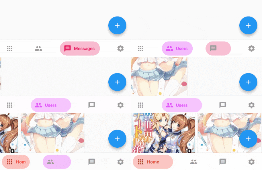
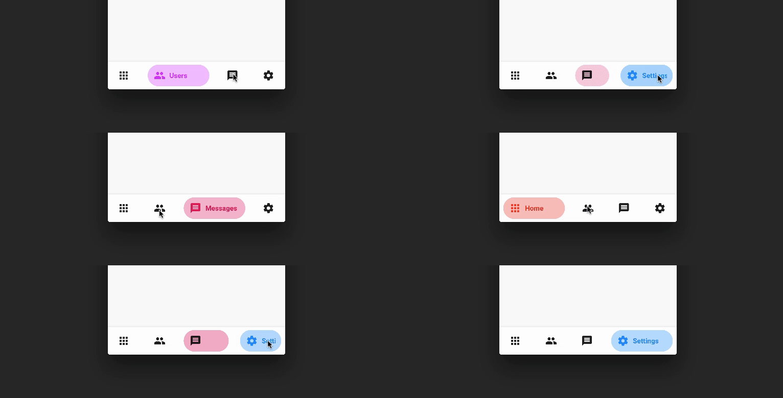
A beautiful and animated bottom navigation.
The navigation bar uses your current theme, but you are free to customize it.
Preview
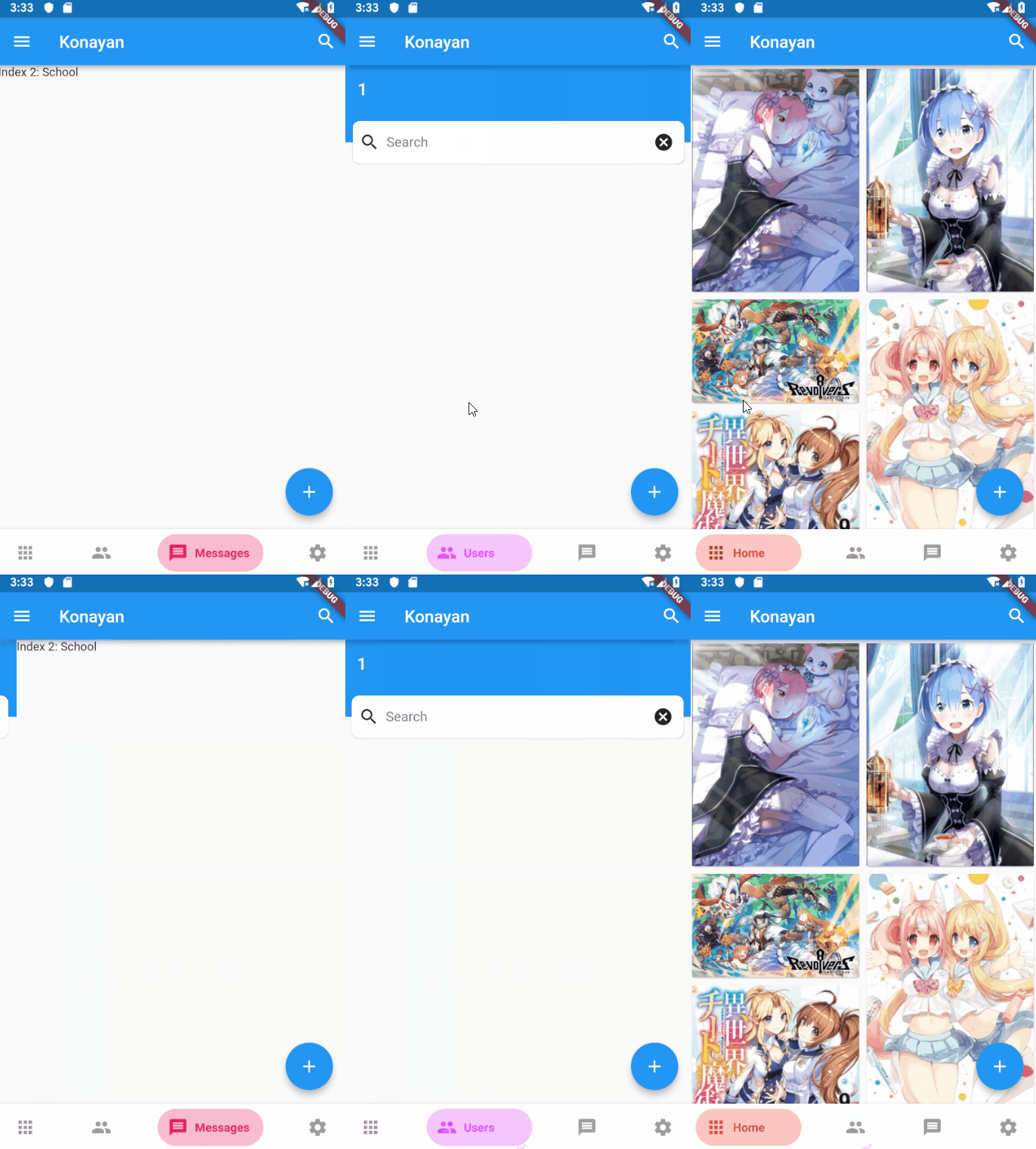
PageView
Customization (Optional)
BottomNavyBar
iconSize - the item icon's size
items - navigation items, required more than one item and less than six
selectedIndex - the current item index. Use this to change the selected item. Defaults to zero
onItemSelected - required to listen when an item is tapped it provides the selected item's index
backgroundColor - the navigation bar's background color
showElevation - if false the appBar's elevation will be removed
mainAxisAlignment - use this property to change the horizontal alignment of the items. It is mostly used when you have ony two items and you want to center the items
curve - param to customize the item change's animation
containerHeight - changes the Navigation Bar's height
showInactiveTitle - use this property show a Inactive titles. Defaults to false.
BottomNavyBarItem
icon - the icon of this item
title - the text that will appear next to the icon when this item is selected
activeColor - the active item's background and text color
inactiveColor - the inactive item's icon color
textAlign - property to change the alignment of the item title
activeBackgroundColor - the active item's background color
activeTextColor - the active item's text color
tooltipText - the tooltip text that will appear when the item is long pressed
Contributions of any kind are more than welcome! Feel free to fork and improve in any way you want, make a pull request, or open an issue.
See CONTRIBUTING.md for more info on how to contribute to this project.
License
This project is licensed under the Apache-2.0 License - see the LICENSE file for details.