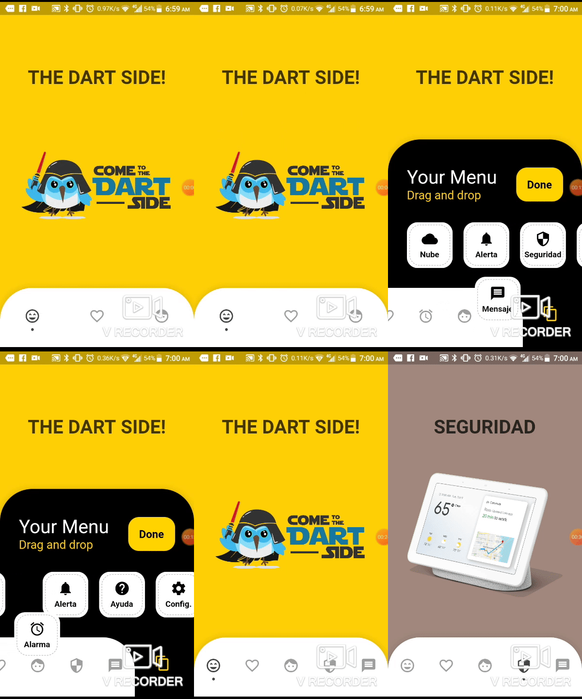
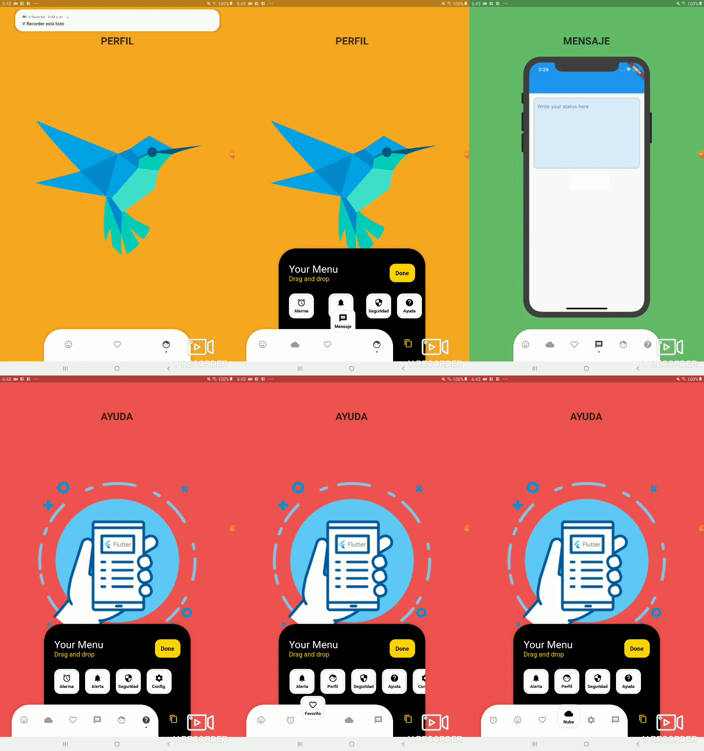
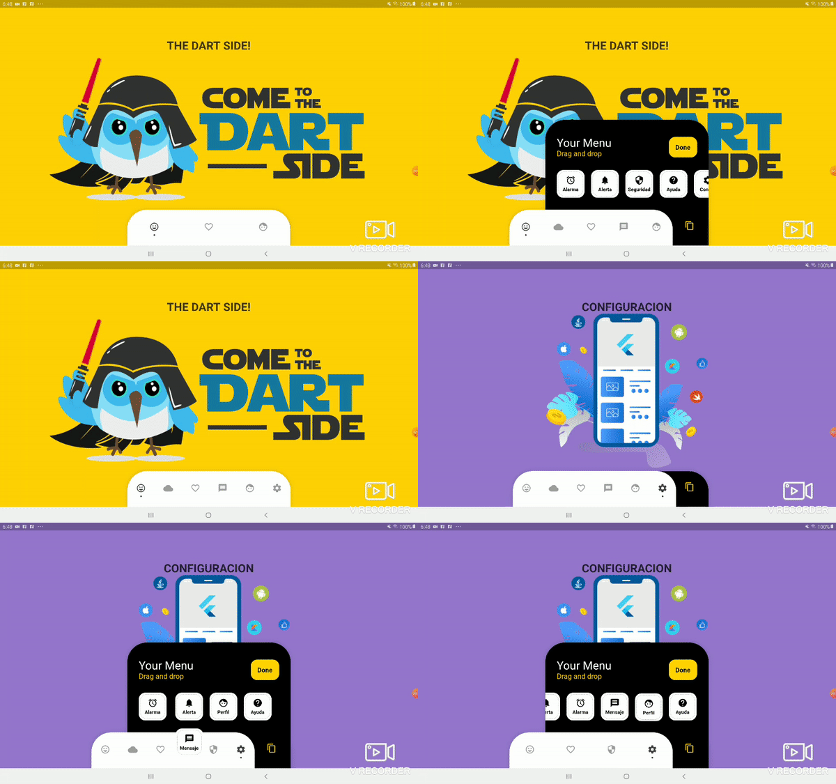
Aus öffentlichen Paketdaten erstellte Orientierung.
Eine anpassbare Bottom-Navigation in Flutter, die Benutzern ermöglicht, Elemente per Drag-and-Drop zu verschieben, um ihr Layout individuell anzupassen. Sie bietet eine dynamische, interaktive Erfahrung zum Anordnen von Navigations-Icons mit vollständiger Kontrolle über Aussehen und Verhalten. Ideal für Apps, die flexible Navigationsmuster erfordern, erhöht dieses Paket die Benutzerengagement durch intuitive Anpassungsmöglichkeiten. Die Leiste unterstützt reibungslose Übergänge und responsive Design, was sie für moderne mobile Anwendungen geeignet macht.
Anwendungsfälle
Anpassbare App-Navigation
benutzergetriebene Schnittstellenlayouts
Interaktive untere Leisten
Mobile App-Personalisierung
Dynamische Umgestaltung der Benutzeroberfläche
Hauptmerkmale
Elemente per Drag-and-Drop neu anordnen
vollständig anpassbare Punktanzeiger
Unterstützung für responsive Design
Einfache Integration mit Flutter
Unterstützt benutzerdefinierte Gestaltung
Geeignet für
Entwickler, die interaktive Navigation suchen
Apps mit nutzerzentriertem Design
Anpassbare mobile Schnittstellen
Flutter-Projekte, die dynamische Bottom Bars benötigen
designorientierte Anwendungsentwicklung
Hinweise
Eingeschränkte plattformspezifische Dokumentation
Keine eingebauten Animationen außer grundlegenden Übergängen
Erfordert manuelle Behandlung der Zustandsverwaltung
Nicht für große Anzahlen von Elementen optimiert
Möglicherweise sind zusätzliche Stile für komplexe Themen erforderlich
Original-README
Originaler README-Schnappschuss aus dem verknüpften Quell-Repository. Aktuelle Inhalte finden Sie im Repository.
Bottom Personalized Dot Bar
A bottom navigation bar that you can customize with the options you need, without any limits. You can also customize the appearance of the navigation bar.
List of items to be displayed in the navigation bar
hiddenItems
List of items that will be hidden
keyItemSelected
Item key that is selected
width
Navigation bar width
height
Navigation bar height
borderRadius
Navigation bar radius
selectedColorIcon
Selected Icon color
unSelectedColorIcon
Unselected Icon color
navigatorBackground
Navigator Container Background color
settingBackground
Setting Container Background color (Hidden items)
iconSetting
Settings button icon
iconSettingColor
Settings button icon color
settingTitleText
Setting Title Text
settingTitleColor
Setting Title color
settingSubTitleText
Setting Sub-Title Text
settingSubTitleColor
Setting Sub-Title color
doneText
Done button Text
textDoneColor
Text Done Color
buttonDoneColor
Button done color
hiddenItemBackground
Background of hidden item
iconHiddenColor
Icon Hidden Color
textHiddenColor
Text Hidden Color
dotColor
Selection Indicator Color (Dot
boxShadow
Shadow of container
onOrderHideItems
Event when you sort the hidden options, this has as parameter the list of hidden options with the new order. onOrderHideItems: (List<BottomPersonalizedDotBarItem> hiddenItems) { /* Your action */ }
onOrderItems
Event when ordering browser options, this has as parameter the list of options with the new order onOrderItems: (List<BottomPersonalizedDotBarItem> items) { /* Your action */ }
onAddItem
Event when you add a new option to the navigation bar, this has as parameters the item you add and the list of options. onAddItem: (BottomPersonalizedDotBarItem itemAdd, List<BottomPersonalizedDotBarItem> items) { /* Your action */ }
onRemoveItem
Event when you delete an option from the navigation bar, this has as parameters the element to delete and the list of hidden options. onRemoveItem: (BottomPersonalizedDotBarItem itemRemove, List<BottomPersonalizedDotBarItem> hiddenItems) { /* Your action */ }
BottomPersonalizedDotBarItem
Attribute
Description
keyItem
Unique key
icon
Item icon
name
Item name
onTap
Event with you press the item. onTap: (String keyItem) { /* Your action */ }