Aus öffentlichen Paketdaten erstellte Orientierung.
Ein Flutter-Paket, das einen anpassbaren AppBar mit einer integrierten vollständigen Kalenderansicht bietet. Es erweitert den Standard-AppBar um erweiterte Kalenderfunktionen, sodass Benutzer Termine durchsuchen, Ereignisse anzeigen und direkt innerhalb der App-Leiste mit Kalendereinträgen interagieren können. Das Paket ist für eine nahtlose Integration über mehrere Plattformen hinweg konzipiert und unterstützt Android, iOS, Web, macOS, Windows und Linux. Es ist ideal für Apps, die datenbasierte Navigation und visuellen Kalenderzugriff in einer kompakten, benutzerfreundlichen Oberfläche benötigen.
Anwendungsfälle
Datumsauswahl in App-Leisten
Ereignisplanungs-Schnittstellen
Kalendernavigation in mobilen Apps
Zeitmanagement-Anwendungen
Dashboard-Widgets mit Kalenderansichten
Plattformübergreifende Kalenderintegration
Hauptmerkmale
Vollkalenderansicht in der Appbar
Anpassbarer Datumsauswahl
Multiplattformunterstützung
Ereignishervorhebung
Glatte Datennavigation
reaktives Design
Geeignet für
Entwickler, die kalenderintensive Apps erstellen
UI-Designer, die elegante Datumssteuerungen suchen
Apps, die kompakte Kalender-Oberflächen benötigen
Plattformübergreifende Flutter-Projekte
Produktivitäts- und Terminplanungstools
Hinweise
Erfordert sorgfältige Layoutplanung
Kann die Leistung bei großen Datensätzen beeinträchtigen
Begrenzte Anpassungsmöglichkeiten jenseits der grundlegenden Gestaltung
Abhängig von plattformspezifischer Rendering
Nicht geeignet für komplexe Kalenderworkflows
Am besten geeignet für Apps mit primärer Datumsinteraktion
Original-README
Originaler README-Schnappschuss aus dem verknüpften Quell-Repository. Aktuelle Inhalte finden Sie im Repository.
Calendar AppBar
Flutter package for custom AppBar with calendar view.
The package is currently optimized for mobile devices, therefore used only for mobile devices is prefered. It also works for larger screens, although it does not follow the rules of good UI. It is planned to be optimized shortly.
Features
Define your custom color scheme
Enable or disable full-screen calendar view
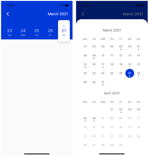
Provide a list of dates that will be marked on the calendar view
There are three required attributes of class CalendarAppBar. Attribute onDateChange is a function, which defines what happens when the user selects a date. firstDate attribute defines the first date, which will be available for selection. The date saved in lastDate attribute is the last date available for selection. At first initialization of the object, the date provided as lastDate will be selected, but will not be returned with onDateChange function.
More Custom Usage
Hide Full Screen Calendar View
This package enables the usage of a full-screen calendar view. It is displayed when the user presses on month and year text in the top right corner of the AppBar. It comes in two different versions. If the first and last date are part of the same month the full-screen calendar will be displayed as seen on the third image at the top of this file. In the other way, it will be displayed as seen in the second image. It is possible to disable the full-screen view (which is enabled by default) by adding the following code:
fullCalendar: false,
Define Your Custom Color Scheme
You can define your custom color scheme by defining white, black and accent color. Those three colors are set to Colors.white, Colors.black87 and Color(0xFF0039D9) by default. It is possible to customize those three colors as shown below.
The design is currently optimized for light mode and therefore also suggested to be used in that way to achieve better UX. Dark mode will be added soon.
Custom Padding
The horizontal padding can be customized (default it is set to 25px) by adding the following code:
padding: 10.0,
Mark Dates with Events
It is possible to provide the list of dates of type List<DateTime>, which will be marked on calendar view with a dot.
    events: List.generate(
            10, (index) => DateTime.now().subtract(Duration(days: index * 2))),
The code above will generate the list of 10 dates for every second day from today backwards.
Back Button
The last attribute of CalendarAppbar is backButton, which is default set to true. Customize that feature by setting this attribute to false.
backButton: false,
Internationalization
The newest feature the CalendarAppbar package is offering is local support for different languages. Use atribute locale to customize the language used for the plugin by adding the language code as shown below. If this atribute is not set, English language will be used.
locale: 'en',
Thank you
Special thanks goes to all contributors to this package. Make sure to check them out.
For help getting started with Flutter, view Flutter official documentation
online documentation, which offers tutorials,
samples, guidance on mobile development, and a full API reference.