Pakete, Repositories und App-Kategorien suchen

Cover von calendar_day_slot_navigator
Paketdetailsv0.0.2

calendar_day_slot_navigator

Der Calendar Day Slot Navigator ist ein anpassbarer Flutter-Widget zur Datumsauswahl mit Unterstützung für verschiedene Farbpaletten, Datumsauswahl-Szenarien und Layoutanpassungen.

AndroidiOSmacOSWindowsLinux
30-Tage-Downloads
60
Likes
25
Pub-Punkte
150

Paket installieren

flutter pub add calendar_day_slot_navigator

Paketübersicht

Aus öffentlichen Paketdaten erstellte Orientierung.

Der Calendar Day Slot Navigator ist ein anpassbarer Flutter-Widget, der für die Datenauswahl mit flexiblen Layoutoptionen und mehreren Farbschemata entwickelt wurde. Er unterstützt verschiedene Auswahlszenarien für Daten, einschließlich Einzel- und Mehrfachauswahl, und ermöglicht Entwicklern, Aussehen und Verhalten an die Designanforderungen ihrer App anzupassen. Aufgrund seiner plattformübergreifenden Kompatibilität funktioniert er nahtlos auf Android, iOS, macOS, Windows und Linux. Der Widget ist ideal für Apps, die intuitive Kalenderinteraktionen mit hoher visueller Anpassungsfähigkeit erfordern.

Anwendungsfälle

  • Datumsauswahl in Terminplanungs-Apps
  • Buchungssysteme mit Datumverfügbarkeit
  • Eventplanungs-Schnittstellen
  • Benutzerdefinierte Kalenderansichten in Produktivitäts-Tools
  • Benutzerprofil-Einrichtung mit Geburtsdatum-Eingabe

Hauptmerkmale

  • Unterstützung mehrerer Farbpaletten
  • Flexible Layout-Anpassung
  • Plattformübergreifende Kompatibilität
  • Unterstützung für Auswahl einzelner und mehrerer Daten
  • Konfigurierbare Darstellung des Tagesslots

Geeignet für

  • Entwickler, die kalenderbasierte Funktionen erstellen
  • Apps, die visuell unterschiedliche Datumsauswahlfelder benötigen
  • Projekte, die eine plattformunabhängige Datumsauswahl erfordern
  • Designorientierte Anwendungen mit benutzerdefinierten UI-Anforderungen
  • Interaktive Formulare mit Datumeingaben

Hinweise

  • Erfordert Verständnis der Flutter-Widget-Komposition
  • Könnte zusätzliche Styling für komplexe Themen benötigen
  • Eingeschränkter integrierter Lokalisierungssupport
  • Leistungseinbußen bei großen Datumsbereichen
  • Abhängig von Updates externer Pakete zur Fehlerbehebung

Original-README

Originaler README-Schnappschuss aus dem verknüpften Quell-Repository. Aktuelle Inhalte finden Sie im Repository.

📅 Calendar_Day_Slot_Navigator

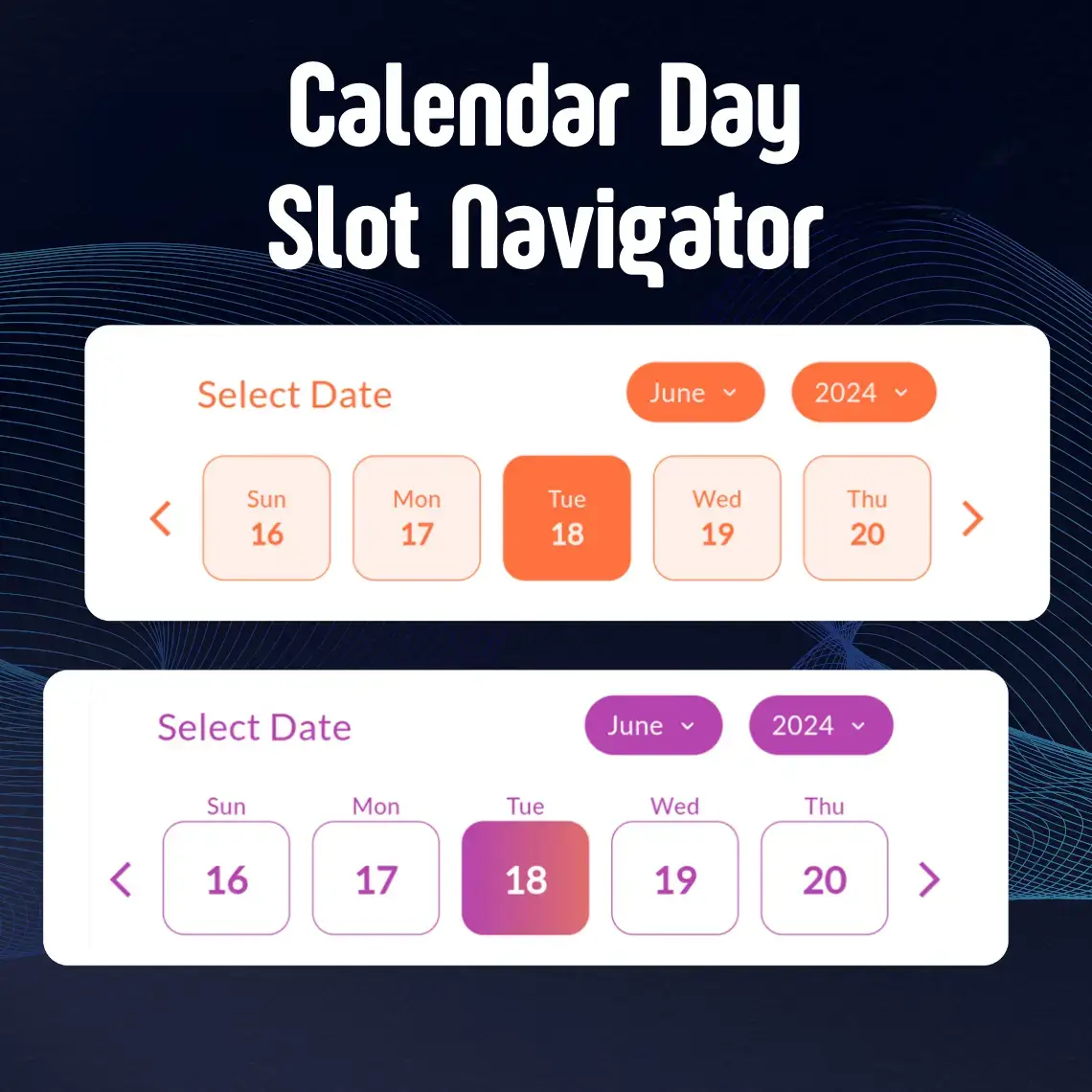
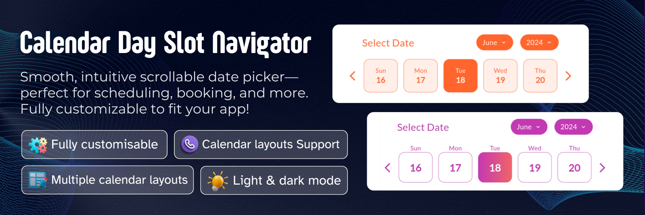
A powerful and highly customizable Flutter calendar widget that makes date selection beautiful and intuitive. Whether you're building a booking app, scheduling system, or any application that needs elegant date picking, CalendarSlot provides the flexibility and features you need.

✨ Features

  • 🌗 Theming Support

    • Seamless integration with both light and dark modes
    • Full control over colors and gradients
    • Customizable active and inactive states
  • 🎨 Advanced Customization

    • Flexible border radius for all elements
    • Custom header text and styling
    • Adjustable day box dimensions and borders
    • Support for custom fonts including Google Fonts
  • 📆 Powerful Selection Options

    • Single date selection
    • Date range selection
    • Customizable active/inactive date ranges
    • Multiple calendar layout options
  • 🎯 Flexible Display Modes

    • Inside box day display
    • Outside box day display
    • Adjustable slot length for different view sizes

🚀 Getting Started

Installation

Add calendar_day_slot_navigator to your project by including it in your pubspec.yaml:

dependencies:
  calendar_day_slot_navigator: ^0.0.1

Run pub get to install the package:

flutter pub get
Import

Import the package in your Dart file:

import 'package:calendar_day_slot_navigator/calendar_day_slot_navigator.dart';

💻 Usage Examples

Basic Implementation

Here's a simple example to get you started:

CalendarDaySlotNavigator(
  slotLength: 5,
  initialSelectedDate: DateTime.now(),
  dayDisplayMode: DayDisplayMode.outsideDateBox,
  headerText: "Select Date",
  onDateSelect: (selectedDate) {
    print("Selected date: $selectedDate");
  },
)
Custom Styling

Add beautiful gradients and custom styling:

CalendarDaySlotNavigator(
  slotLength: 7,
  dayBoxHeightAspectRatio: 8,
  initialSelectedDate: DateTime.now(),
  dayDisplayMode: DayDisplayMode.insideDateBox,
  isGradientColor: true,
  activeGradientColor: LinearGradient(
    colors: [
      Color(0xffb644ae),
      Color(0xff873999),
    ],
    begin: Alignment.topLeft,
    end: Alignment.bottomRight,
  ),
  monthYearTabBorderRadius: 15,
  dayBoxBorderRadius: 10,
  headerText: "Select Your Preferred Date",
  fontFamilyName: "Roboto",
  isGoogleFont: true,
  dayBorderWidth: 0.5,
  onDateSelect: (selectedDate) {
    print("Selected date: $selectedDate");
  },
)
Date Range Selection

Implement date range selection with specific active dates:

CalendarDaySlotNavigator(
  dateSelectionType: DateSelectionType.activeRangeDates,
  rangeDates: [
    DateTime(2024, 6, 1),
    DateTime(2024, 6, 2),
    DateTime(2024, 6, 3),
    DateTime(2024, 6, 4),
    DateTime(2024, 6, 5),
  ],
  onDateSelect: (selectedDate) {
    print("Selected date within range: $selectedDate");
  },
)

🛠️ Properties Guide

Essential Properties
Property Type Default Description
slotLength int? 7 📏 Determines how many days are displayed in each row. Useful for different screen sizes and layouts.
dayBoxHeightAspectRatio double? 6.0 📐 Controls the height of day boxes relative to their width. Higher values make boxes shorter.
dayDisplayMode DayDisplayMode outsideDateBox 🎯 Determines where day names appear relative to date boxes. Choose between outsideDateBox or insideDateBox.
Styling Properties
Property Type Default Description
activeColor Color? Theme primary 🎨 Background color for selected dates
deActiveColor Color? White ⚪️ Background color for unselected dates
isGradientColor bool? false 🌈 Enable gradient backgrounds for dates
activeGradientColor LinearGradient? null 🎨 Custom gradient for selected dates
deActiveGradientColor LinearGradient? null ⚪️ Custom gradient for unselected dates
monthYearTabBorderRadius double? 10.0 📏 Border radius for month/year selection tabs
dayBoxBorderRadius double? 8.0 📏 Border radius for individual day boxes
dayBorderWidth double? 1.0 ✏️ Width of borders around day boxes
Font Properties
Property Type Default Description
fontFamilyName String? System 🔤 Name of the font family to use
isGoogleFont bool? false 📱 Set to true when using Google Fonts
Selection Properties
Property Type Description
dateSelectionType DateSelectionType 🎯 Controls which dates can be selected
rangeDates List<DateTime>? 📅 List of dates for range-based selection types
onDateSelect Function(DateTime)? 🖱️ Callback function when a date is selected
initialSelectedDate DateTime 📍 Sets the default selected date when calendar first loads
Date Selection Types Explained
  1. activeAllDates

    • All dates in the calendar are selectable
    • Useful for unrestricted date picking
  2. activePastDates

    • Only dates before today are selectable
    • Perfect for selecting historical dates
  3. activeFutureDates

    • Only dates after today are selectable
    • Ideal for booking systems and scheduling
  4. activeTodayAndPastDates

    • Today and all past dates are selectable
    • Good for recording past events including today
  5. activeTodayAndFutureDates

    • Today and all future dates are selectable
    • Great for appointment scheduling
  6. activeRangeDates

    • Only specified dates in rangeDates are selectable
    • Useful for custom date ranges
  7. deActiveRangeDates

    • Specified dates in rangeDates are not selectable
    • Perfect for blocking out unavailable dates

📱 Display Modes

Outside Date Box Mode
dayDisplayMode: DayDisplayMode.outsideDateBox
  • Day names appear above the date boxes
  • Provides a clean, separated look
  • More space for date numbers
Inside Date Box Mode
dayDisplayMode: DayDisplayMode.insideDateBox
  • Day names appear inside the date boxes
  • More compact layout
  • Ideal for space-conscious designs

🎨 Styling Tips

  1. Color Combinations

    activeColor: Color(0xffb644ae),    // Purple for selected
    deActiveColor: Color(0xffF5F5F5),  // Light grey for unselected
    
  2. Gradient Effects

    isGradientColor: true,
    activeGradientColor: LinearGradient(
      colors: [Color(0xffb644ae), Color(0xff873999)],
      begin: Alignment.topLeft,
      end: Alignment.bottomRight,
    ),
    
  3. Border Styling

    dayBoxBorderRadius: 12,
    dayBorderWidth: 0.5,
    

💡 Best Practices

  1. Responsive Design

    • Adjust slotLength based on screen width
    • Use appropriate dayBoxHeightAspectRatio for different screen sizes
  2. Selection Types

    • Choose appropriate dateSelectionType for your use case
    • Always handle onDateSelect callback for user interactions
  3. Accessibility

    • Use sufficient color contrast
    • Provide clear header text
    • Consider font size and readability

🤝 Contributing


Made with ❤️ by the DevCodeSpace

Kategorien

Abhängigkeiten

Abhängigkeiten 4 Einträge

Quell-Repository

Projekte, die dieses Paket verwenden

Noch keine Daten verfügbar.