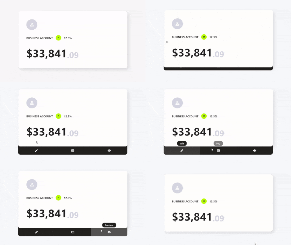
Aus öffentlichen Paketdaten erstellte Orientierung.
Card Actions ist ein Flutter-Paket, das Karten-Widgets mit anpassbaren Aktionen und interaktiven Funktionen verbessert. Es ermöglicht Entwicklern, Swip-Gesten, Touch-Interaktionen und dynamische Inhaltsänderungen zu Karten hinzuzufügen, wodurch die Benutzerengagement steigt. Das Paket ist für den Einsatz in Listen, Dashboards oder kartenbasierten Benutzeroberflächen konzipiert und unterstützt mehrere Plattformen wie Android, iOS, Web, macOS, Windows und Linux. Es lässt sich problemlos über einen einfachen pub add-Befehl in bestehende Flutter-Projekte integrieren. Sein leichtgewichtiges Design legt den Fokus auf Leistung und Benutzerfreundlichkeit und macht es ideal für moderne, responsive Karteninterfaces.
Anwendungsfälle
Interaktive Kartenwischen
Dynamische Karteninhaltsaktualisierungen
gesturegesteuerte Karteninteraktionen
Kartenbasierte Dashboards
Benutzerfeedback über Kartenaktionen
Cross-Platform-Kartenverbesserungen
Hauptmerkmale
Swipe-zu-Aktion-Unterstützung
Anpassbare Tip- und Gestenreaktionen
Leichtgewichtig und leistungsstark
Multiplattformkompatibilität
Einfache Integration mit Flutter
Erweiterbare Aktionshandler
Geeignet für
Entwickler, die kartenintensive Benutzeroberflächen erstellen
Apps, die interaktive Karten-Elemente erfordern
Plattformübergreifende mobile und Web-Anwendungen
Designsysteme mit wiederverwendbaren Kartenkomponenten erstellen
Interaktive Layouts prototypisieren
Hinweise
Erfordert Verständnis des Flutter-Gestensystems
Möglicherweise sind zusätzliche Stile für komplexe Interaktionen erforderlich
Am besten geeignet für einfache bis mittelkomplexe Kartenverhalten
Nicht für die Vollbildnavigation vorgesehen
Beschränkt auf Karteninteraktionen
Original-README
Originaler README-Schnappschuss aus dem verknüpften Quell-Repository. Aktuelle Inhalte finden Sie im Repository.
Features
✨ Simple Use
⚙️ Great Customization
🌍 Expand the functionality of your cards
🛑 Not use for mobile devices, will soon be available for use on those platforms.
Getting Started
To use this card actions package, you need to add the dependencies in pubspec.yaml file.
dependencies:card_actions:^0.0.1
Use
To use card actions is very simple, just wrap your card with our CardActions widget,
CardActions(
    ...
    child: YourCard() // here would be your card
)
Basic Setup
CardActions needs the parameters width, height and actions
width is the width of the widget
height is the height of the widget
actions is a list of CardActionButton.
CardActions(
    width: //your card width
    height: // your card height
    actions: <CardActionButton>[
        CardActionButton(
            icon: Icon(
                Icons.edit,
                color: Colors.white,
            ), // Icon
            label: 'edit',
            onPress: () {},
        ), // CardActionButton
    ]
    child: yourCard(), // here would be your card
)
If you want to change the direction of the hover, you can use the axisDirection property of the CardAction to change it.
the axisDirection property receives a enum of type CardActionAxis at the moment we only have bottom and right.
CardActionAxis.bottom
CardActionAxis.right
Example
To make this example, we will need to configure more things, but it will be very simple, the first thing is that we change the background color for it we have to use the property backgroundColor then an important part is that we change the design of the cursor when it is on top of the buttons and this we can do it in two ways:
In the CardAction we have the buttonsCursor property that serves to change the cursor to ALL the buttons.
In the CardActionButton we have the cursor property to change the cursor to that specific button.
Important.
If you use both options at the same time the button will prioritize its own cursor setting over the global setting with buttonsCursor.
and finally we add the necessary functions to the buttons by means of its onPress method.