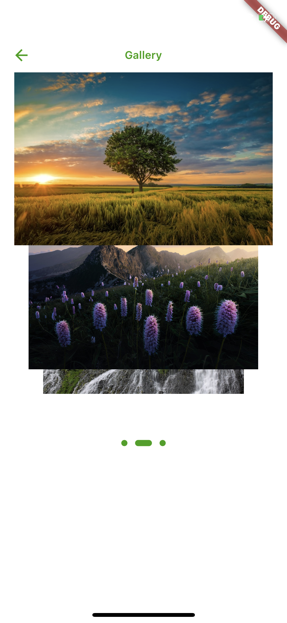
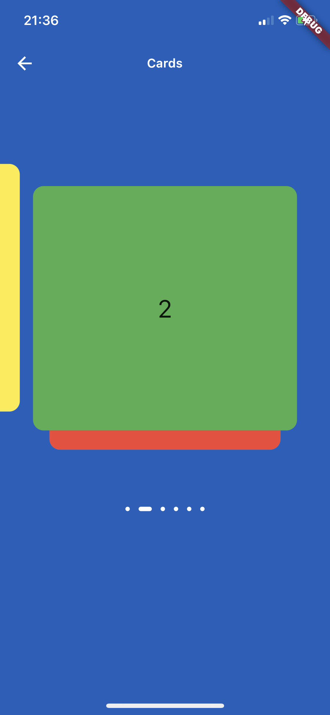
Aus öffentlichen Paketdaten erstellte Orientierung.
Card Slider ist ein Flutter-Paket, das eine ziehbare Bildkarussell bietet, mit dem Benutzer durch Karten wischen oder ziehen können. Es eignet sich hervorragend zum visuell ansprechenden Präsentieren von Bildern, Produkten oder Inhalten. Der Slider unterstützt reibungslose Übergänge und intuitive Gesten über mehrere Plattformen hinweg. Mit Fokus auf Leistung und Benutzerfreundlichkeit wurde er nahtlos in Apps mit interaktiver kartenbasierten Navigation integriert. Perfekt für Galerien, Produktpräsentationen oder Onboarding-Bildschirme.
Anwendungsfälle
Bildgalerien
Produktpräsentation
Onboarding-Bildschirme
Interaktive Schieberegler
Inhaltskarussells
Hauptmerkmale
Drag-Gesten-Unterstützung
Glatte Übergänge beim Schieben
Plattformübergreifende Kompatibilität
Anpassbare Kartenansicht
Eingebaute Swip-Animationen
Geeignet für
Mobile-App-Entwickler
UI/UX-Designer
E-Commerce-Anwendungen
Portfolio-Websites
Interaktive Prototypen
Hinweise
Gestenverarbeitung muss eingerichtet werden
Kann für große Datensätze Optimierung erfordern
Begrenzte integrierte Gestaltungsoptionen
Nicht geeignet für nicht-bildbasierten Inhalt
Die Leistung hängt von der Anzahl der Karten ab
Original-README
Originaler README-Schnappschuss aus dem verknüpften Quell-Repository. Aktuelle Inhalte finden Sie im Repository.
card_slider
A draggable Flutter image carousel slider on swipe or drag! Card slider for carousel images and widgets. This widget works on both Android & iOS.
Installing
Add the following to your pubspec.yaml file:
dependencies:card_slider:^1.0.5
Maintaining card_slider
Thank you everyone for the support surrounding this project! card_slider has grown far larger than I could have ever imagined, so parsing through all the feature requests and new issues has taken me more time than I'd like. If you're interested in helping maintain this project, please send me an email at asylzatwww@gmail.com. As a sidenote, I'll always try to make sure that this project is compatible with the latest version of Flutter.
Simple Usage
There are two ways which the CardSlider can easily be added to your project.
Using the CardSlider slides as widgets.
Using the CardSlider slides as images
Using the CardSlider slides as widgets inside scrollable Column.
CardSlider slides as widgets
This method uses widgets as a slide cards. For example:
CardSlider slides as widgets inside scrollable Column widget
This method uses widget as a slide cards inside scrollable column, instead of using SingleChildScrollView use the code below which uses ListView, otherwise GestureDetector won't work. For example:
bool _dragOverMap = false;
finalGlobalKey _pointerKey = GlobalKey();
_checkDrag(Offset position, bool up) {
if (!up) {
// find your widgetRenderBox box = _pointerKey.currentContext!.findRenderObject() asRenderBox;
//get offsetOffset boxOffset = box.localToGlobal(Offset.zero);
// check if your pointerdown event is inside the widget (you could do the same for the width, in this case I just used the height)if (position.dy > boxOffset.dy &&
position.dy < boxOffset.dy + box.size.height) {
setState(() {
_dragOverMap = true;
});
}
} else {
setState(() {
_dragOverMap = false;
});
}
}
@overrideWidgetbuild(BuildContext context) {
List<Color> valuesDataColors = [
Colors.purple,
Colors.yellow,
Colors.green,
Colors.red,
Colors.grey,
Colors.blue,
];
List<Widget> valuesWidget = [];
for (int i = 0; i < valuesDataColors.length; i++) {
valuesWidget.add(Container(
decoration: BoxDecoration(
borderRadius: BorderRadius.circular(12.0),
color: valuesDataColors[i],
),
child: Align(
alignment: Alignment.center,
child: Text(
i.toString(),
style: constTextStyle(
fontSize: 28,
),
),
)));
}
returnScaffold(
appBar: AppBar(
title: constText("Slide inside column widget"),
),
body: Listener(
onPointerUp: (ev) {
_checkDrag(ev.position, true);
},
onPointerDown: (ev) {
_checkDrag(ev.position, false);
},
child: ListView(
// if dragging over your widget, disable scroll, otherwise allow scrolling
physics:
_dragOverMap ? constNeverScrollableScrollPhysics() : constScrollPhysics(),
children: [
Column(
children: [
for (int i = 0; i < 3; i++)
constListTile(title: Text("Tile to scroll")),
constDivider(),
],
),
// Your widget that you want to prevent to scroll the ListviewContainer(
color: Colors.amberAccent,
key: _pointerKey, // key for finding the widget
height: 350,
width: double.infinity,
child:
CardSlider(
cards: valuesWidget,
bottomOffset: .0008,
cardHeight: 0.75,
containerHeight: MediaQuery.of(context).size.height - 100,
itemDotOffset: 0.55,
)
,
),
Column(
children: [
for (int i = 0; i < 3; i++)
constListTile(title: Text("Tile to scroll")),
constDivider(),
],
),
],
),
),
);
}
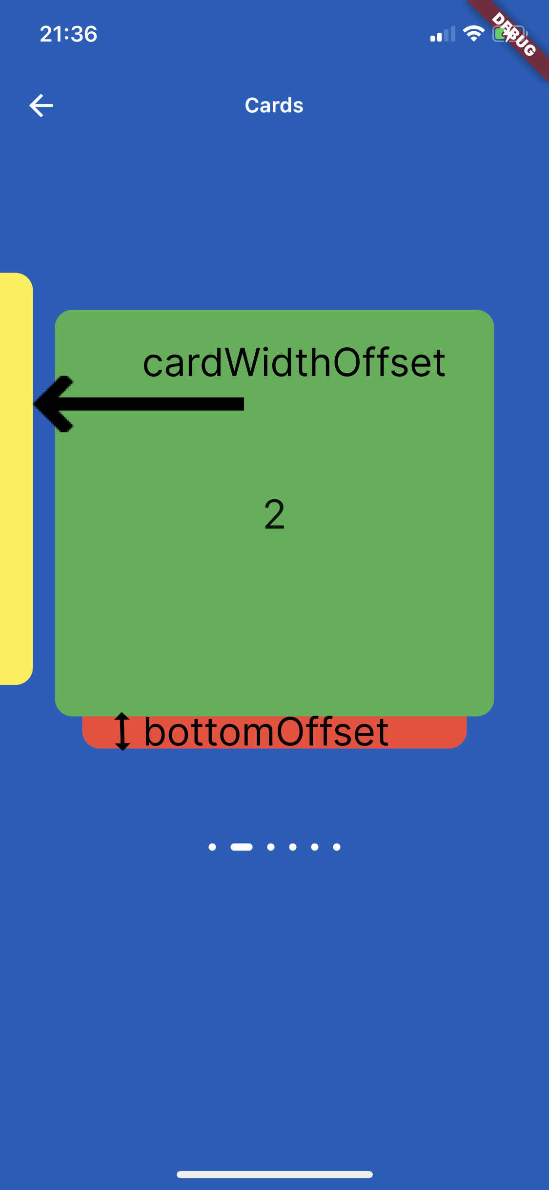
Screenshots
On the image below is shown how to use parameters cardWidthOffset, cardHeightOffset, bottomOffset :
Custom Usage
There are several options that allow for more control:
Properties
Description
cards
The List of Widgets for slider
slideChanged
Optional Event fired when ever slide is changed, (sliderIndex){ } sliderIndex has a value of a current slide.
blurValue
Optional blurValue used for blurring the slider
blurOnClick
Optional blurOnClick is method which listens if users clicks over blurred slider to be able to remove blurry
sliderBackGroundWidget
Optional widget which placed on the background of slider, can be placed logo or any other image or widget .
itemDotWidth
Optional is a width of dots under slider showing current location.
bottomOffset
Optional is a double value, the height of a bottom of previous slide
cardWidth
Optional is a width of a slides
cardHeight
Optional is a height of a slides
cardWidthOffset
Optional is a width which is used for how far slide must go on in horizontal distance when swiping or dragging
cardHeightOffset
Optional is a height which is used for how far slide must go on in vertical distance when swiping or dragging
itemDot
Optional is a widget by which can be changed the dots of th slider position
containerWidth
Optional is a width of main Container
containerHeight
Optional is a height of main Container
containerColor
Optional is a color of main Container
itemDotOffset
Optional is a distance to position itemDot under slides
🔢 Get Current Slide Index
You can listen to slide changes and get the current slide index using the slideChanged callback.