Pakete, Repositories und App-Kategorien suchen

Cover von contained_tab_bar_view
Paketdetailsv0.8.0

contained_tab_bar_view

Kapselt TabController, TabBar und TabBarView in einem einzigen anpassbaren Widget.

AndroidiOSWebmacOSWindowsLinux
30-Tage-Downloads
5950
Likes
189
Pub-Punkte
160

Paket installieren

flutter pub add contained_tab_bar_view

Paketübersicht

Aus öffentlichen Paketdaten erstellte Orientierung.

ContainedTabBarView ist ein anpassbarer Flutter-Widget, der TabController, TabBar und TabBarView zu einem einheitlichen Baustein kombiniert. Er vereinfacht die Implementierung von Tab-Interfaces, indem er Zustandsverwaltung und Layout automatisch behandelt, sodass Entwickler sich auf Design und Inhalt konzentrieren können. Das Paket unterstützt alle wichtigen Plattformen wie Android, iOS, Web, macOS, Windows und Linux und ist daher ideal für plattformübergreifende Anwendungen. Mit sauberen, intuitiven APIs verbessert es die Codelesbarkeit und reduziert Boilerplate. Besonders nützlich ist es zum Erstellen von navigationsintensiven Benutzeroberflächen mit mehreren Tabs.

Anwendungsfälle

  • Tab-Navigation in mobilen und Web-Anwendungen erstellen
  • Komplexe Tab-Schnittstellen-Implementierungen vereinfachen
  • Wiederverwendbare Tab-Komponenten über Projekte hinweg erstellen
  • Dynamische Tab-Layouts implementieren
  • Entwicklung von reaktiven Tab-Dashboards

Hauptmerkmale

  • Einzelnes Widget zur Kapselung von TabController, TabBar und TabBarView
  • Eingebaute Statusverwaltung für Registerkarten
  • Anpassbare Erscheinung und Verhalten
  • Plattformübergreifende Unterstützung
  • Minimale Boilerplate erforderlich
  • Unterstützt dynamisches Hinzufügen/Entfernen von Registerkarten

Geeignet für

  • Entwickler, die vereinfachte Tab-Oberflächen suchen
  • Projekte, die eine konsistente Tab-Navigation erfordern
  • Plattformübergreifende Flutter-Anwendungen
  • UI-Komponenten, die wiederverwendbare Tab-Logik benötigen
  • Teams, die wartbaren Code priorisieren

Hinweise

  • Kann zusätzliche Stilisierung für erweiterte Anpassungen erfordern
  • Beschränkt auf Standard-Tab-Muster ohne tiefe Anpassung
  • Abhängig von den integrierten Tab-Widgets von Flutter
  • Nicht ideal für stark abweichende Tab-Verhaltensweisen
  • Am besten geeignet für typische tabbasierte Navigationsabläufe

Original-README

Originaler README-Schnappschuss aus dem verknüpften Quell-Repository. Aktuelle Inhalte finden Sie im Repository.

ContainedTabBarView

pub package

ContainedTabBarView encapsulates TabController, TabBar and TabBarView into a single, easy to use Widget and lets you customize its appearance without worrying about internal workings of "TabBar ecosystem".


Usage

All of the below examples can be found under example, each written as a simple StatelessWidget.

Basic

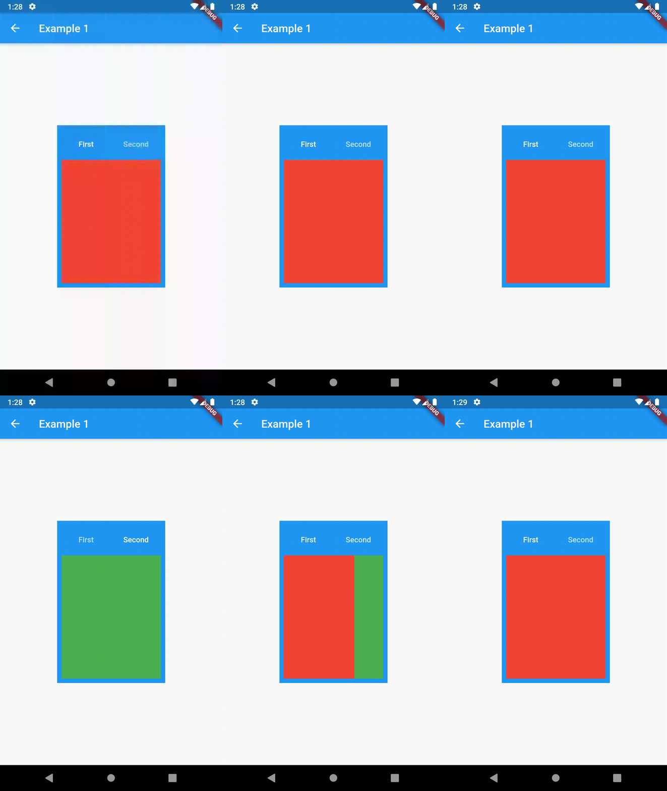
Basic usage includes putting a ContainedTabBarView into a Container whose constraints it will obey. Putting a ContainedTabBarView directly into a body of a Scaffold will, expectedly, draw it full-screen.

// Example 1
import 'package:contained_tab_bar_view/contained_tab_bar_view.dart';

...

Container(
  padding: const EdgeInsets.all(8.0),
  color: Colors.blue,
  width: 200,
  height: 300,
  child: ContainedTabBarView(
    tabs: [
      Text('First'),
      Text('Second'),
    ],
    views: [
      Container(color: Colors.red),
      Container(color: Colors.green)
    ],
    onChange: (index) => print(index),
  ),
),

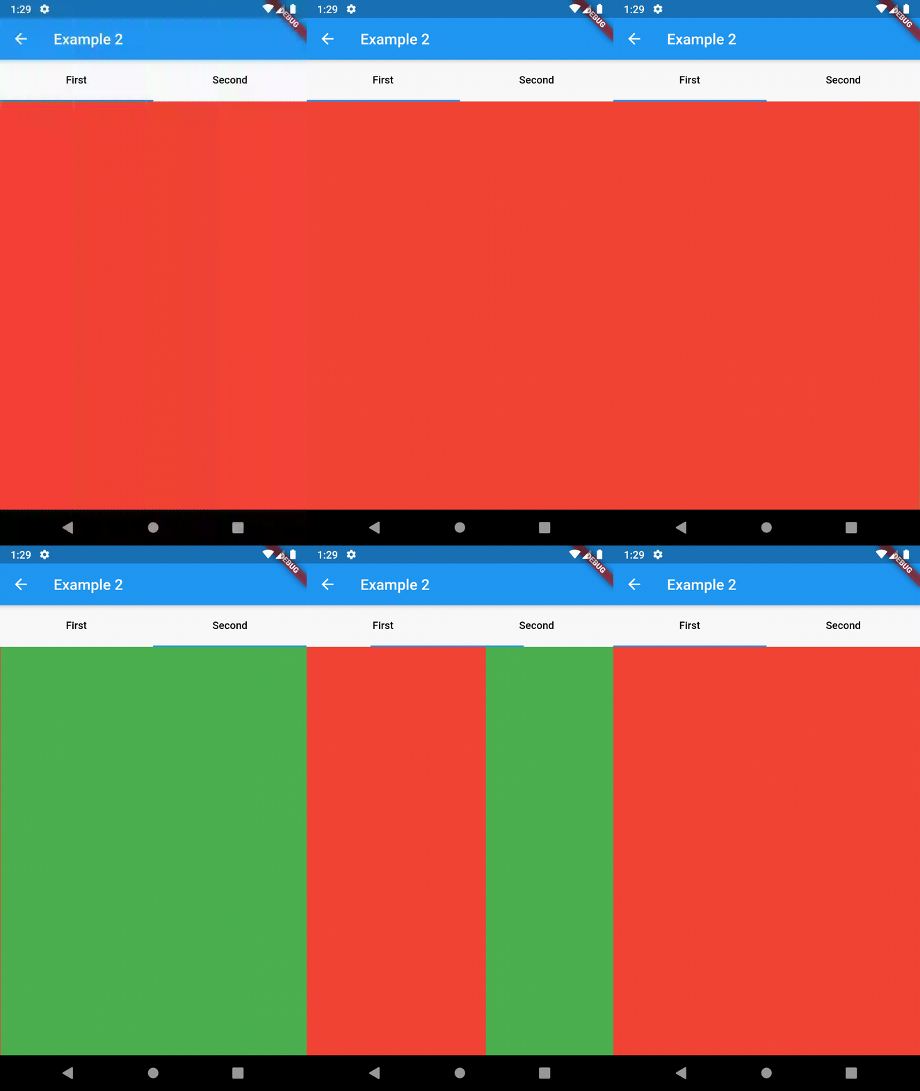
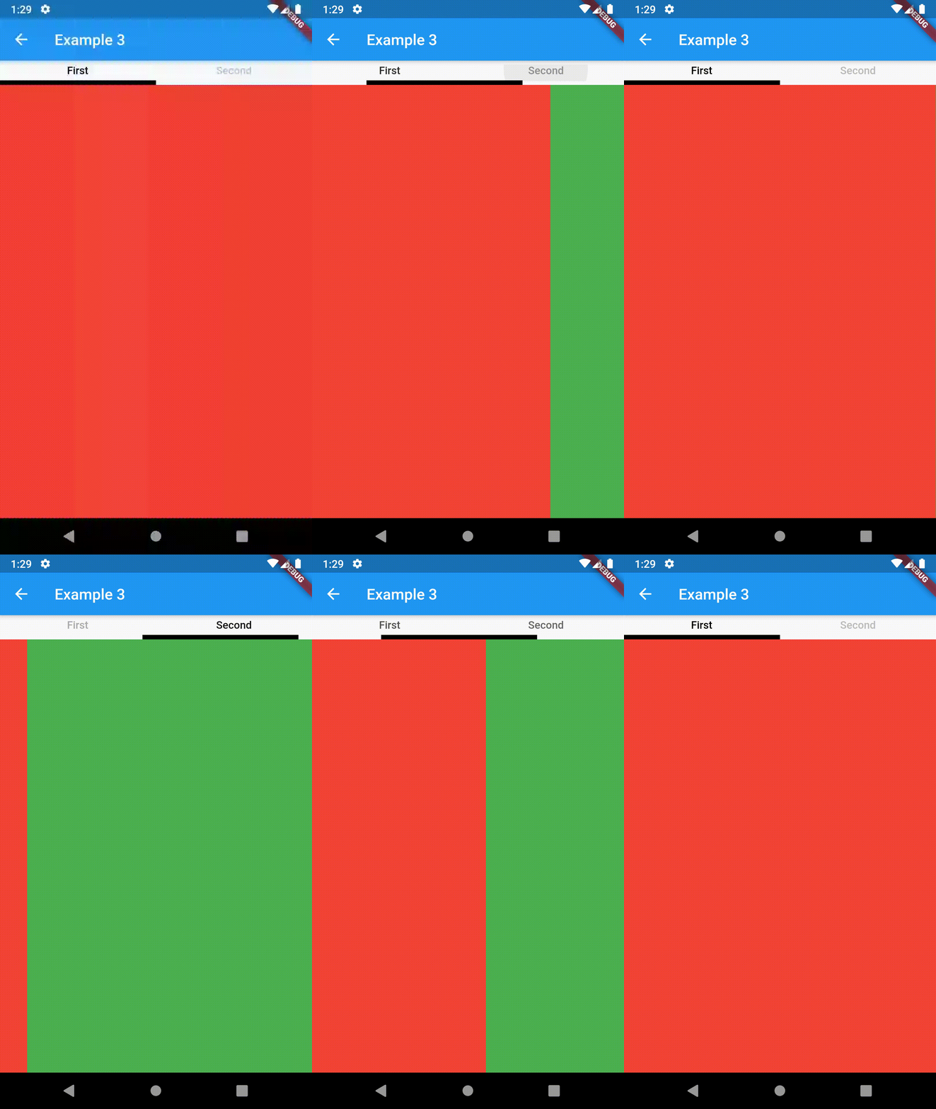
example 1 example 2 example 3

Intermediate

TabBarProperties

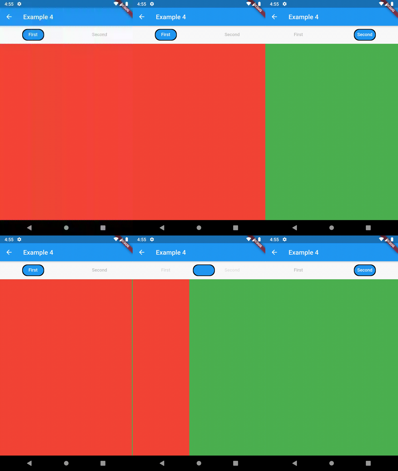
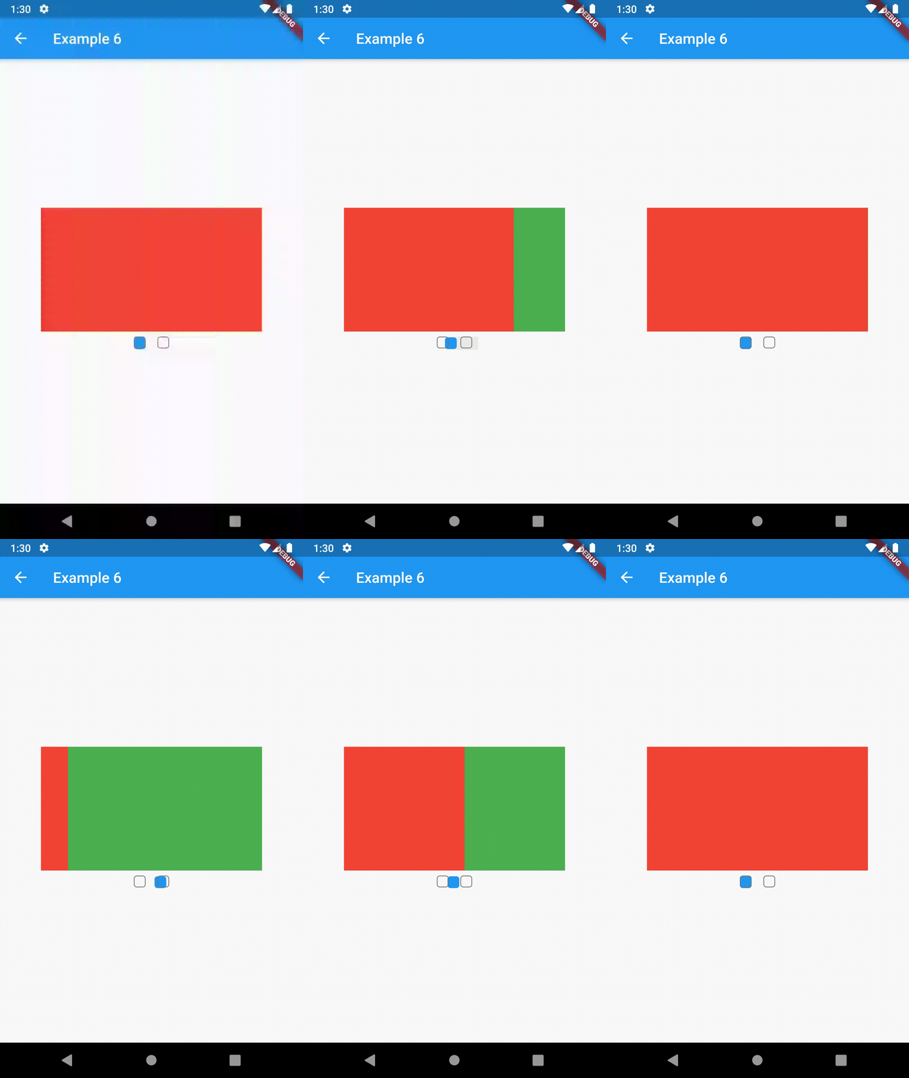
All the properties that can be set for a TabBar are accessible for setting via tabBarProperties. Also, there are many more for the customization of TabBar's appearance. To create your own ("container-based") indicator, you can use ContainerTabIndicator decoration (see examples 4 and 6) which is a part of this package, but also a separate package whose documentation can be found here. Of course, you can use any other tab bar indicator of your liking.

Property Type Default value Description
width double / The width of TabBar. If not set, it's full available width.
height double kToolbarHeight The height of TabBar. The TabBarView takes the available height minus this value.
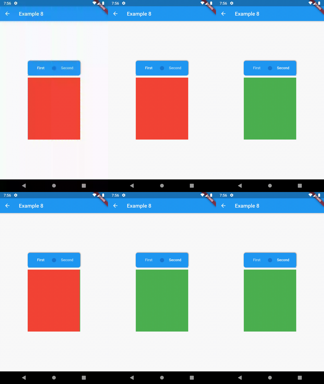
background Container / Container that is behind the tabs. See example 8.
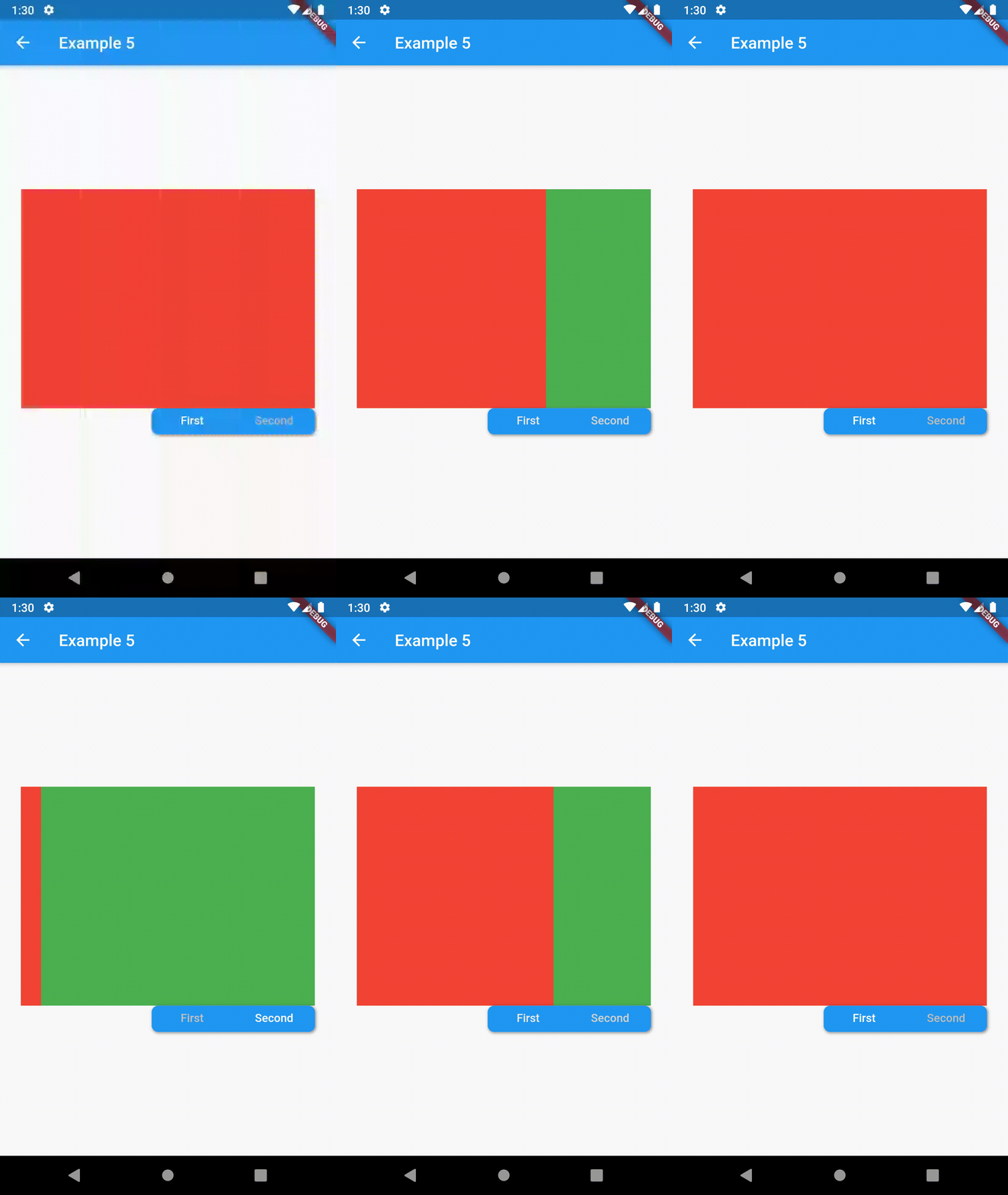
position TabBarPosition TabBarPosition.top Position of TabBar in respect to it's TabBarView. See example 5.
alignment TabBarAlignment TabBarAlignment.center Alignment of TabBar (if it's width is not full available) within TabBar-TabBarView flex. See example 5.
padding EdgeInsets const EdgeInsets.all(0.0) The TabBars padding. See example 4.
margin EdgeInsets const EdgeInsets.all(0.0) The TabBars margin. See example 8.
indicator Decoration / The decoration for the active tab. You can use ContainerTabIndicator for various customization. See example 4. Also, see TabBar documentation
indicatorColor Color / see TabBar documentation
indicatorPadding EdgeInsetsGeometry const EdgeInsets.all(0.0) see TabBar documentation
indicatorSize TabBarIndicatorSize / see TabBar documentation
indicatorWeight double 2.0 see TabBar documentation
isScrollable bool false see TabBar documentation
labelColor Color / see TabBar documentation
labelPadding EdgeInsetsGeometry const EdgeInsets.all(0.0) see TabBar documentation
labelStyle TextStyle / see TabBar documentation
unselectedLabelColor Color / see TabBar documentation
unselectedLabelStyle TextStyle / see TabBar documentation
TabBarViewProperties

All the properties that can be set for a TabBarView are accessible for setting via tabBarViewProperties.

Property Type Default value Description
dragStartBehavior DragStartBehavior DragStartBehavior.start See TabBarView documentation
physics ScrollPhysics (platform specific) See TabBarView documentation

For example, if you want to disable swiping behavior on the TabBarView, set the option like this:

ContainedTabBarView(
  ...
  tabBarViewProperties: TabBarViewProperties(
    physics: NeverScrollableScrollPhysics(),
  ),
)
TabBarPosition
enum TabBarPosition { top, bottom, left, right }
TabBarAlignment
enum TabBarAlignment { start, center, end }
Intermediate Examples
// Example 5
ContainedTabBarView(
  tabs: [
      Text('First'),
      Text('Second'),
  ],
  tabBarProperties: TabBarProperties(
    width: 200,
    height: 32,
    background: Container(
      decoration: BoxDecoration(
        color: Colors.blue,
        borderRadius: BorderRadius.all(Radius.circular(8.0)),
        boxShadow: [
          BoxShadow(
            color: Colors.black.withOpacity(0.4),
            spreadRadius: 0.5,
            blurRadius: 2,
            offset: Offset(1, -1),
          ),
        ],
      ),
    ),
    position: TabBarPosition.bottom,
    alignment: TabBarAlignment.end,
    indicatorColor: Colors.transparent,
    labelColor: Colors.white,
    unselectedLabelColor: Colors.grey[400],
  ),
  views: [
    Container(color: Colors.red),
    Container(color: Colors.green),
  ],
)

example 4 example 5 example 6

Advanced

Change tab from another Widget

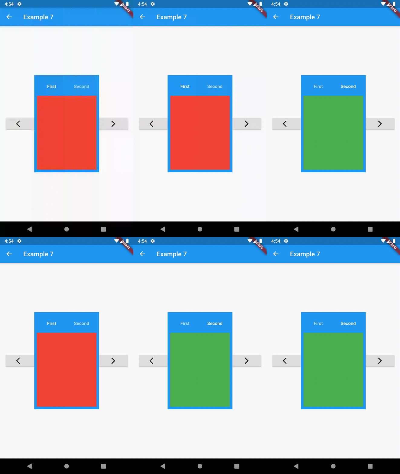
To control the state, i.e. move to another tab, from outside of ContainedTabBarView create it with a GlobalKey and then use methods exposed from state: animateTo(), next() and previous().

// Example 7
class Example7 extends StatelessWidget {
  @override
  Widget build(BuildContext context) {
    GlobalKey<ContainedTabBarViewState> _key = GlobalKey();
    ContainedTabBarView containedTabBarView = ContainedTabBarView(
      key: _key,
      tabs: [
        Text('First'),
        Text('Second'),
      ],
      views: [
        Container(color: Colors.red),
        Container(color: Colors.green),
      ],
    );

    return Scaffold(
      appBar: AppBar(
        title: Text('Example 7'),
      ),
      body: Row(
        mainAxisAlignment: MainAxisAlignment.center,
        children: [
          ElevatedButton(
            onPressed: () => _key.currentState?.previous(),
            child: Icon(Icons.arrow_back_ios),
          ),
          Center(
            child: Container(
              padding: const EdgeInsets.all(8.0),
              color: Colors.blue,
              width: 200,
              height: 300,
              child: containedTabBarView,
            ),
          ),
          ElevatedButton(    
            onPressed: () => _key.currentState?.next(),
            child: Icon(Icons.arrow_forward_ios),
          ),
        ],
      ),
    );
  }
}
Advanced Examples

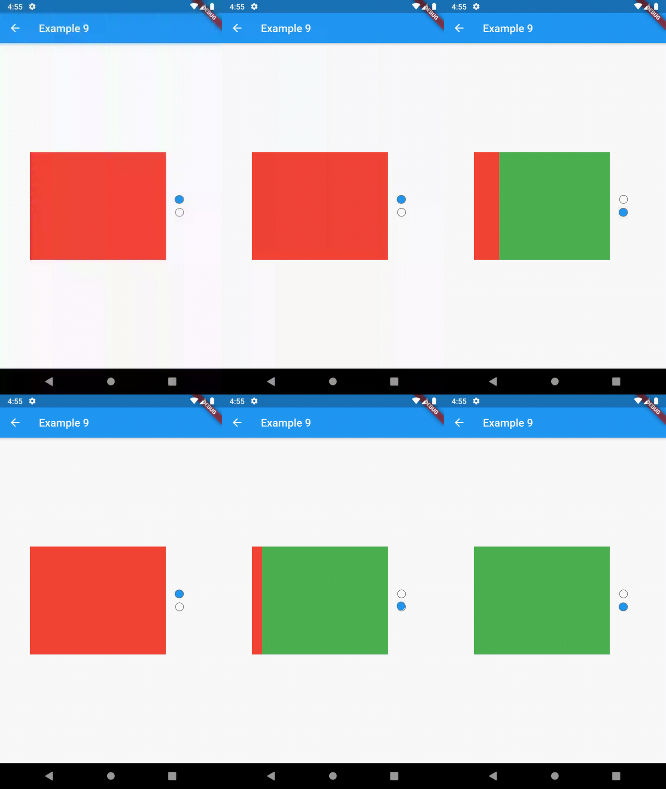
example 7 example 8 example 9

Contributing

This package is still in early stages. If you notice any bugs, please file an issue. If you are willing to fix or enhance things yourself, you are very welcome to make a pull request.

Kategorien

Abhängigkeiten

Abhängigkeiten 1 Einträge

Quell-Repository

Projekte, die dieses Paket verwenden