Pakete, Repositories und App-Kategorien suchen

Cover von control_style
Paketdetailsv0.1.2

control_style

Fügt Flutter-basierten Textfeldern, Schaltflächen und anderen Steuerelementen zusätzliche Dekoration hinzu. Dadurch wird eine bessere Anpassung der Benutzeroberfläche ermöglicht.

AndroidiOSWebmacOSWindowsLinux
30-Tage-Downloads
17.400
Likes
25
Pub-Punkte
160

Paket installieren

flutter pub add control_style

Paketübersicht

Aus öffentlichen Paketdaten erstellte Orientierung.

ControlStyle ist ein Flutter-Paket, das die visuelle Erscheinung von Benutzeroberflächensteuerelementen wie Textfeldern und Schaltflächen durch anpassbare Dekorationen verbessert. Es ermöglicht Entwicklern, das Aussehen und Gefühl standardmäßiger Widgets einfach anzupassen, ohne wiederholten Stilcode schreiben zu müssen. Mit Unterstützung für alle wichtigen Plattformen vereinfacht es die Anpassung der Benutzeroberfläche für konsistente, professionelle Designs. Das Paket lässt sich über einen einfachen pub add-Befehl nahtlos in bestehende Flutter-Projekte integrieren.

Anwendungsfälle

  • Anpassen von Textfeld-Rändern
  • Verbesserung der Buttonästhetik
  • Erstellen einheitlicher UI-Themen
  • Verbesserung der Formular-Eingabevisualisierung
  • Designkonsistenz vereinfachen
  • Dekorative Effekte zu Steuerelementen hinzufügen

Hauptmerkmale

  • Einfache Integration mit Flutter-Widgets
  • Plattformübergreifende Kompatibilität
  • Erweiterbares Dekorationssystem
  • Minimale Boilerplate-Anforderung
  • Unterstützt responsive Design
  • Themengebundene Gestaltung

Geeignet für

  • UI-Designer, die auf visuelle Perfektion abzielen
  • Entwickler, die Formulare erstellen
  • Teams, die konsistente Designsysteme pflegen
  • Apps mit benutzerdefinierten Steuerelement-Aussehen
  • Projekte mit engen UI-Fristen
  • Flutter-Anfänger erkunden Widget-Styling

Hinweise

  • Kann zusätzliche Konfiguration für komplexe Layouts erfordern
  • Beschränkt auf visuelle Verbesserungen (keine funktionalen Änderungen)
  • Abhängig von Flutter's Rendering-Pipeline
  • Möglicher Leistungseinbruch bei vielen dekorierten Steuerelementen
  • Nicht geeignet für nicht-visuelle Anpassungsanforderungen
  • Erfordert Verständnis des Widgetbaums von Flutter

Original-README

Originaler README-Schnappschuss aus dem verknüpften Quell-Repository. Aktuelle Inhalte finden Sie im Repository.

Applies additional appearance settings to Flutter text fields, buttons and other controls. Currently supports: outer shadow, inner shadow, border, inner gradient.

Try it out: example

Intro

The Flutter library provides limited opportunities to set up the appearance of controls. You usually make this customisation by wrapping the components into a Container widget and configuring it using the decoration parameter. Such an approach has limitations as it leads to increasing the volume of work and complicating the code. Especially time consuming in this case is creating animations for switching between different appearances depending on a state of a control.

In addition, this approach works incorrectly when you are adding shadows to text fields in combination with errorText and helperText:

Container issue

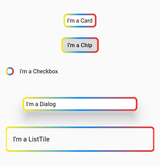
This package helps to solve the aforementioned problem. It provides the most common customisation features for control elements which have shape field such as buttons, text fields, Card, Chip, Checkbox, Dialog, Drawer, inks, ListTile, Material, NavigationBar.

The package provides the same customisation parameters to all controls, which allows for identically decorating any of the controls.

final outlinedShape = DecoratedOutlinedBorder(
  borderGradient: const GradientBorderSide(
    gradient: LinearGradient(colors: [Colors.yellow, Colors.blue, Colors.red]),
    width: 2,
  ),
  child: RoundedRectangleBorder(borderRadius: BorderRadius.circular(8)),
);

...
  Column(children: [
    const SizedBox(height: 16),
    Card(child: const Padding(padding: EdgeInsets.all(8.0), child: Text("I'm a Card")), shape: outlinedShape),
    const SizedBox(height: 16),
    Chip(label: const Text("I'm a Chip"), shape: outlinedShape),
    const SizedBox(height: 16),
    Row(children: [Checkbox(value: false, onChanged: (value) {}, shape: outlinedShape), const Text("I'm a Checkbox")]),
    const SizedBox(height: 16),
    Dialog(child: const Padding(padding: EdgeInsets.all(8.0), child: Text("I'm a Dialog")), shape: outlinedShape),
    const SizedBox(height: 16),
    ListTile(title: const Text("I'm a ListTile"), shape: outlinedShape),
    const SizedBox(height: 16),
  ]);
...

Control examples

Features

Demo

The package enables outer shadow, inner shadow, border and inner gradient styles for Flutter’s standard controls. These can be applied without using external control widgets.

Usage

You can customize all your controls at once via the theme setting of MaterialApp, or separate controls through changing their own styles.

To use the plugin with inputs, you need to wrap InputBorder with DecoratedInputBorder and configure its parameters.

For example, the code:

    MaterialApp(
      theme: ThemeData(
        inputDecorationTheme: InputDecorationTheme(
          border: OutlineInputBorder(
            borderRadius: BorderRadius.circular(8),
          ),
        ),
      ),
    );

should be updated to:

    MaterialApp(
      theme: ThemeData(
        inputDecorationTheme: InputDecorationTheme(
          border: DecoratedInputBorder(
            shadow: const [
              BoxShadow(
                color: Colors.blue,
                blurRadius: 12,
              )
            ],
            child: OutlineInputBorder(
              borderRadius: BorderRadius.circular(8),
            ),
          ),
        ),
      ),
    );

For buttons, you need to wrap OutlinedBorder with DecoratedOutlinedBorder and configure its parameters.

Hence, this code:

    MaterialApp(
      theme: ThemeData(
        primarySwatch: Colors.blue,
        outlinedButtonTheme: OutlinedButtonThemeData(
            style: ElevatedButton.styleFrom(
          shape: RoundedRectangleBorder(
            borderRadius: BorderRadius.circular(8),
          ),
        )),
      ),
    );

should be updated to:

    MaterialApp(
      theme: ThemeData(
        primarySwatch: Colors.blue,
        outlinedButtonTheme: OutlinedButtonThemeData(
            style: ElevatedButton.styleFrom(
          shape: DecoratedOutlinedBorder(
            shadow: const [
              BoxShadow(
                color: Colors.blue,
                blurRadius: 12,
              )
            ],
            child: RoundedRectangleBorder(
              borderRadius: BorderRadius.circular(8),
            ),
          ),
        )),
      ),
    );

The examples above show how to decorate all the controls at once.

In case you need to decorate separate element, you need to configure its styles:

    TextField(
      decoration: InputDecoration(
          border: DecoratedInputBorder(
        shadow: const [
          BoxShadow(
            color: Colors.blue,
            blurRadius: 12,
          )
        ],
        child: OutlineInputBorder(
          borderRadius: BorderRadius.circular(8),
        ),

      )),
    );

    ...

    ElevatedButton(
      onPressed: () {},
      child: const Text("Button"),
      style: ElevatedButton.styleFrom(
          shape: DecoratedOutlinedBorder(
        shadow: const [
          BoxShadow(
            color: Colors.blue,
            blurRadius: 12,
          )
        ],
        child: RoundedRectangleBorder(
          borderRadius: BorderRadius.circular(8),
        ),
      )),
    );
Animation

To configure element state change animations, use the usual Flutter’s approach.

TextButton(
  onPressed: () {},
  child: const Text("Text button"),
  style: ButtonStyle(
    shape: MaterialStateProperty.resolveWith((states) {
      return DecoratedOutlinedBorder(
        shadow: [
          GradientShadow(
            gradient: states.contains(MaterialState.pressed)
                ? const LinearGradient(colors: [Colors.red, Colors.green, Colors.cyan])
                : const LinearGradient(colors: [Colors.blue, Colors.blue]),
            blurRadius: 12,
          )
        ],
        child: RoundedRectangleBorder(borderRadius: BorderRadius.circular(8)),
      );
    }),
  ),
)

Animation

Outer shadow

Add the shadow parameter to DecoratedInputBorder or DecoratedOutlinedBorder.

For adding a single-colour shadow, use BoxShadow.

TextButton(
  onPressed: () {},
  child: const Text("Text button"),
  style: TextButton.styleFrom(
      shape: DecoratedOutlinedBorder(
    shadow: const [
      BoxShadow(
        color: Colors.blue,
        blurRadius: 12,
      )
    ],
    child: RoundedRectangleBorder(borderRadius: BorderRadius.circular(8)),
  )),
);

Color shadow

For applying a gradient-shadow, use GradientShadow. It is different from BoxShadow only in that instead of color it uses the gradient parameter.

TextButton(
  onPressed: () {},
  child: const Text("Text button"),
  style: TextButton.styleFrom(
      shape: DecoratedOutlinedBorder(
    shadow: const [
      GradientShadow(
        gradient: LinearGradient(colors: [Colors.red, Colors.green, Colors.cyan]),
        blurRadius: 12,
      )
    ],
    child: RoundedRectangleBorder(borderRadius: BorderRadius.circular(8)),
  )),
)

Gradient shadow

Inner shadow

Add innerShadow for DecoratedInputBorder or DecoratedOutlinedBorder.

For adding a single-colour shadow, use BoxShadow.

TextButton(
  onPressed: () {},
  child: const Text("Text button"),
  style: TextButton.styleFrom(
      shape: DecoratedOutlinedBorder(
    innerShadow: const [
      BoxShadow(
        color: Colors.blue,
        blurRadius: 12,
      )
    ],
    child: RoundedRectangleBorder(borderRadius: BorderRadius.circular(8)),
  )),
)

Inner shadow

For applying a gradient-shadow, use GradientShadow. It is different from BoxShadow only in that instead of color it uses the gradient parameter.

TextButton(
  onPressed: () {},
  child: const Text("Text button"),
  style: TextButton.styleFrom(
      shape: DecoratedOutlinedBorder(
    innerShadow: const [
      GradientShadow(
        gradient: LinearGradient(colors: [Colors.red, Colors.green, Colors.cyan]),
        blurRadius: 12,
      )
    ],
    child: RoundedRectangleBorder(borderRadius: BorderRadius.circular(8)),
  )),
)

Inner gradient shadow

Background

Add the backgroundGradient parameter of the Gradient type to DecoratedInputBorder or DecoratedOutlinedBorder.

TextButton(
  onPressed: () {},
  child: const Text("Text button"),
  style: ButtonStyle(
    shape: MaterialStateProperty.resolveWith((states) {
      return DecoratedOutlinedBorder(
        backgroundGradient: LinearGradient(colors: [Colors.blue.withOpacity(0.5), Colors.blue.withOpacity(0.2)]),
        child: RoundedRectangleBorder(borderRadius: BorderRadius.circular(8)),
      );
    }),
  ),
)

Background gradient

Border

Add the borderGradient or GradientBorderSide parameter to DecoratedInputBorder or DecoratedOutlinedBorder. This parameters differ from the Flutter’ BorderSide in that they use gradient parameter instead of color.

TextButton(
  onPressed: () {},
  child: const Text("Text button"),
  style: ButtonStyle(
    shape: MaterialStateProperty.resolveWith((states) {
      return DecoratedOutlinedBorder(
        borderGradient: const GradientBorderSide(
          gradient: LinearGradient(colors: [Colors.red, Colors.green, Colors.blue]),
          width: 3,
        ),
        child: RoundedRectangleBorder(borderRadius: BorderRadius.circular(8)),
      );
    }),
  ),
)

Gradient border

BorderShadow in Detail

The wrappers DecoratedInputBorder and DecoratedOutlinedBorder reach an element’s border through the child parameter and apply stylization above the default border of this element. In case of an outer shadow, the shadow’s part above the control then gets cut off in order to create an illusion of the shadow being located behind the control.

how it works

Decorative styles are applied above the layer that contains an element’s border. Hence, when it comes to buttons, such stylisation overlaps the inner area of an element. Using transparent colours hence used to address this issue. This limitation is due to Flutter itself.

Background overlap issue

Compatibility

The following borders have been tested.

Inputs:

  • UnderlineInputBorder
  • OutlineInputBorder

Buttons:

  • BeveledRectangleBorder
  • CircleBorder
  • ContinuousRectangleBorder
  • RoundedRectangleBorder
  • StadiumBorder

Issues

  • Shadows may overlap nearby elements.

Shadow overlap issue

  • The decoration of the inner area of the button overlaps the button itself.

Background overlap issue

Kategorien

Quell-Repository

Projekte, die dieses Paket verwenden

Noch keine Daten verfügbar.