Pakete, Repositories und App-Kategorien suchen

Cover von convex_bottom_bar
Paketdetailsv3.2.0

convex_bottom_bar

Ein Flutter-Paket, das ein ConvexAppBar implementiert, um eine konvexe Registerkarte in der unteren Leiste anzuzeigen. Theming wird unterstützt.

AndroidiOSWebmacOSWindowsLinux
30-Tage-Downloads
18.300
Likes
2950
Pub-Punkte
150

Paket installieren

flutter pub add convex_bottom_bar

Paketübersicht

Aus öffentlichen Paketdaten erstellte Orientierung.

ConvexBottomBar ist ein Flutter-Paket, das eine visuell einzigartige konkave untere Navigationsleiste mit glatten Animationen und anpassbaren Themen bietet. Es verbessert die Standard-Navigationserfahrung durch einen abgerundeten, dynamischen Tab-Design, der sich auf Android, iOS, Web, macOS, Windows und Linux hervorhebt. Das Paket unterstützt Theme-Anpassung, sodass Entwickler das Erscheinungsbild der Leiste an die Designsprache ihrer App anpassen können. Ideal für Apps, die moderne, ansprechende Navigationsoberflächen suchen.

Anwendungsfälle

  • Moderne Navigation für mobile Apps
  • Anpassbare Bottom-Tabs
  • Plattformübergreifende UI-Konsistenz
  • Erhöhung der Benutzerengagement durch visuelles Design
  • Apps mit Fokus auf ästhetische Attraktivität

Hauptmerkmale

  • konvex geformter Tab-Design
  • Eingebaute Animationseffekte
  • Themenunterstützung
  • Plattformübergreifende Kompatibilität
  • Einfache Integration in Flutter-Apps
  • Reaktive Tab-Interaktionen

Geeignet für

  • designorientierte Flutter-Anwendungen
  • Mobile Apps mit einzigartiger Navigation
  • Entwickler, die animierte untere Balken wollen
  • Projekte für mehrere Plattformen
  • UI/UX-Designer, die mit Flutter arbeiten

Hinweise

  • Kann zusätzliche Stilisierung für komplexe Themen erfordern
  • Leistungseinfluss auf Geräten mit geringer Leistungsfähigkeit
  • Eingeschränkte Anpassungsmöglichkeiten über die integrierten Optionen hinaus
  • Nicht ideal für minimalistische Designs
  • Mögliche Layout-Konflikte mit anderen Widgets

Original-README

Originaler README-Schnappschuss aus dem verknüpften Quell-Repository. Aktuelle Inhalte finden Sie im Repository.

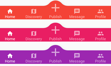
appBar preview

pub.dev github coverage likes popularity build status license

English | 简体中文


The official BottomAppBar can only display a notch FAB with an app bar, and sometimes we need a convex FAB. BottomAppBar and NotchShape's implementation inspires this ConvexAppBar.

Online example can be found at https://appbar.codemagic.app.

convex_bottom_bar is now a Flutter Favorite package!

Here are some supported style:

fixed react badge chip
fixedCircle reactCircle flip
textIn titled tab image
button fixed corner

How to use

Typically ConvexAppBar can work with Scaffold by setup its bottomNavigationBar.

The ConvexAppBar has two constructors. The ConvexAppBar() will use the default style to simplify the tab creation.

Add this to your package's pubspec.yaml file, use the latest version Pub:

dependencies:
  convex_bottom_bar: ^latest_version
import 'package:convex_bottom_bar/convex_bottom_bar.dart';

Scaffold(
  bottomNavigationBar: ConvexAppBar(
    items: [
      TabItem(icon: Icons.home, title: 'Home'),
      TabItem(icon: Icons.map, title: 'Discovery'),
      TabItem(icon: Icons.add, title: 'Add'),
      TabItem(icon: Icons.message, title: 'Message'),
      TabItem(icon: Icons.people, title: 'Profile'),
    ],
    onTap: (int i) => print('click index=$i'),
  )
);

Flutter Version Support
As Flutter is developing fast. There can be breaking changes. We will be trying to support the stable version and beta version through different package versions.

Stable Flutter Version Package Version More
>=3.7.0 >=3.2.0 Since v3.7.0, the stable version changed the DefaultTabController api
>=1.20 >=2.4.0 Since v1.20, the stable version changed the Stack api
<1.20 <=2.3.0 Support for stable version such as v1.17, v1.12 is not going to be updated

Features

  • Provide multiple internal styles
  • Ability to change the theme of AppBar
  • Provide builder API to customize a new style
  • Add badge on the tab menu
  • Elegant transition animation
  • Provide hook API to override some of the internal styles
  • RTL support

Table of contents

Theming

The bar will use default style, you may want to theme it. Here are some supported attributes:

Attributes Description
backgroundColor AppBar background
gradient gradient will override backgroundColor
height AppBar height
color tab icon/text color
activeColor tab icon/text color when selected
curveSize size of the convex shape
top top edge of the convex shape relative to AppBar
cornerRadius draw the background with topLeft and topRight corner; Only work with fixed tab style
style style to describe the convex shape: fixed, fixedCircle, react, reactCircle, ...
chipBuilder custom badge builder, use ConvexAppBar.badge for default badge

Badge

If you need to add a badge on the tab, use the ConvexAppBar.badge to get it done.

badge demo

ConvexAppBar.badge({0: '99+', 1: Icons.assistant_photo, 2: Colors.redAccent},
  items: [
    TabItem(icon: Icons.home, title: 'Home'),
    TabItem(icon: Icons.map, title: 'Discovery'),
    TabItem(icon: Icons.add, title: 'Add'),
  ],
  onTap: (int i) => print('click index=$i'),
);

The badge() method accepts an array of badges; The badges is a map with tab items. Each value of entry can be either String, IconData, Color or Widget.

Single Button

If you only need a single button, checkout the ConvexButton.

button

Scaffold(
  appBar: AppBar(title: const Text('ConvexButton Example')),
  body: Center(child: Text('count $count')),
  bottomNavigationBar: ConvexButton.fab(
    onTap: () => setState(() => count++),
  ),
);

Style Hook

Hook for internal tab style. Unlike the ConvexAppBar.builder, you may want to update the tab style without defining a new tab style.

Warning:
This hook is limited and can lead to overflow broken if the size you provide does not match with internal style.

StyleProvider(
  style: Style(),
  child: ConvexAppBar(
    initialActiveIndex: 1,
    height: 50,
    top: -30,
    curveSize: 100,
    style: TabStyle.fixedCircle,
    items: [
      TabItem(icon: Icons.link),
      TabItem(icon: Icons.import_contacts),
      TabItem(title: "2020", icon: Icons.work),
    ],
    backgroundColor: _tabBackgroundColor,
  ),
)
class Style extends StyleHook {
  @override
  double get activeIconSize => 40;

  @override
  double get activeIconMargin => 10;

  @override
  double get iconSize => 20;

  @override
  TextStyle textStyle(Color color) {
    return TextStyle(fontSize: 20, color: color);
  }
}

RTL Support

RTL is supported internally, and if you define the TextDirection inside the app, the AppBar should work fine. Both RTL and LTR can be configured through Directionality:

Directionality(
  textDirection: TextDirection.rtl,
  child: Scaffold(body:ConvexAppBar(/*TODO ...*/)),
)

Custom Example

If the default style does not match your situation, try with ConvexAppBar.builder(), allowing you to custom nearly all the tab features.

Scaffold(
  bottomNavigationBar: ConvexAppBar.builder(
    count: 5,
    backgroundColor: Colors.blue,
    itemBuilder: Builder(),
  )
);

// user defined class
class Builder extends DelegateBuilder {
  @override
  Widget build(BuildContext context, int index, bool active) {
    return Text('TAB $index');
  }
}

Full custom example can be found at example.

FAQ

Please file feature requests and bugs at the issue tracker.

Donate

You like the package ? Buy me a coffee :)

ko-fi

Kategorien

Quell-Repository

Projekte, die dieses Paket verwenden

Ranglisten